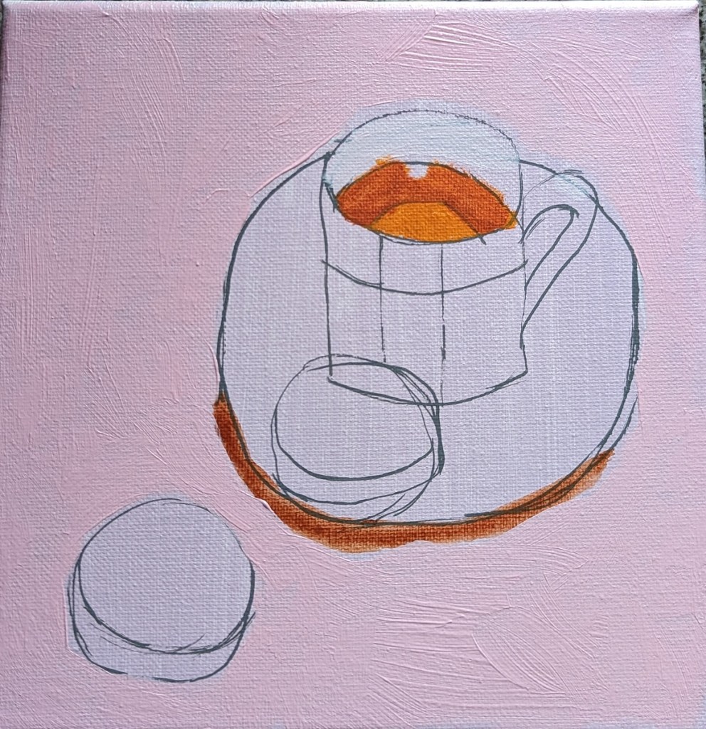
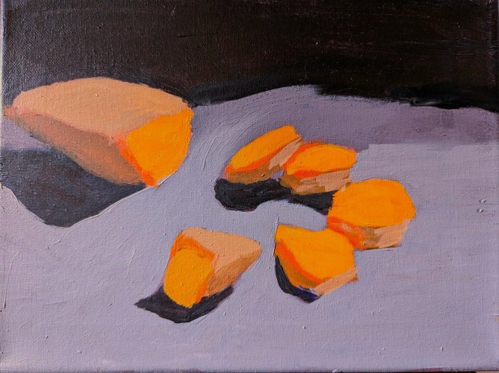
Here’s the finished painting, based on Will Kemp’s still life e-book. I posted the work-in-progress here.

Here’s the finished painting, based on Will Kemp’s still life e-book. I posted the work-in-progress here.
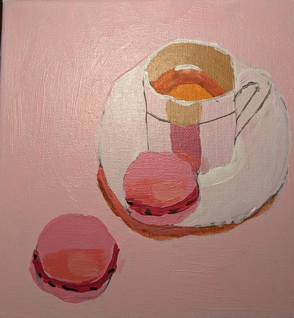
I am working on one of the still life projects in the E-book I bought at Will Kemp’s Art School online. This particular painting is focused on an analogue color scheme of red (pink) and purple.
Another artist I found and follow on YouTube and his personal site is Will Kemp, from the UK. He is classically trained, and began with painting in oils, later switching to acrylics because he was working in an area not properly ventilated for the paint thinners and solvents he had been using.
Will Kemp has multiple YouTube videos, online tutorials on his website, online classes for sale (and downloading) in acrylics, and I am finding his style as a useful enhancement to what I’m learning from Paint Coach.
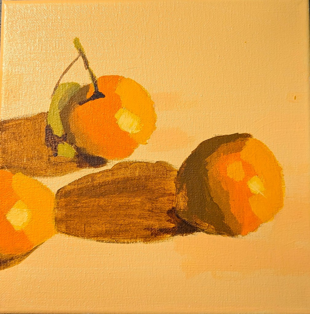
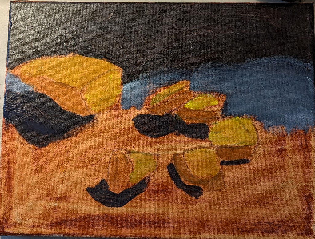
I bought Kemp’s Still Life Acrylic Project E-Book, and am working through it. First up was a project that involved painting a group of clementines. Much of the focus is on setting up your colors by color mixing, which is something I need to learn about.
This was painted on an 8×8 canvas.
This is an 8×8 painting of a watermelon slice, and the palette I used.


This is a still life from one of the Beginner “Painting Paths” offered on Patreon by the Paint Coach. The idea is to block out your darks and lights first, and use that as a value “road map” in completing the painting, gradually adding more detail.
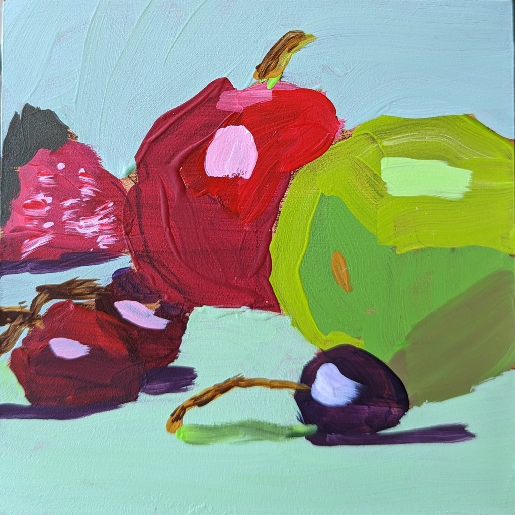
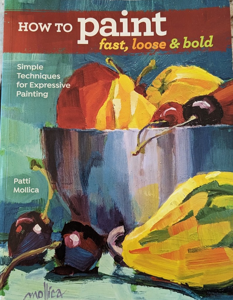
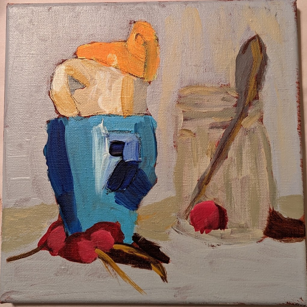
The still life of fruit is yet another study from Patti Mollica’s book How to Paint Fast, Loose and Bold: Simple Techniques for Expressive Painting.
As far as my efforts in copying still life demonstrations from various painting teachers, this is one of my better ones in my opinion. I’m most pleased with the dark red (purple) cherry.
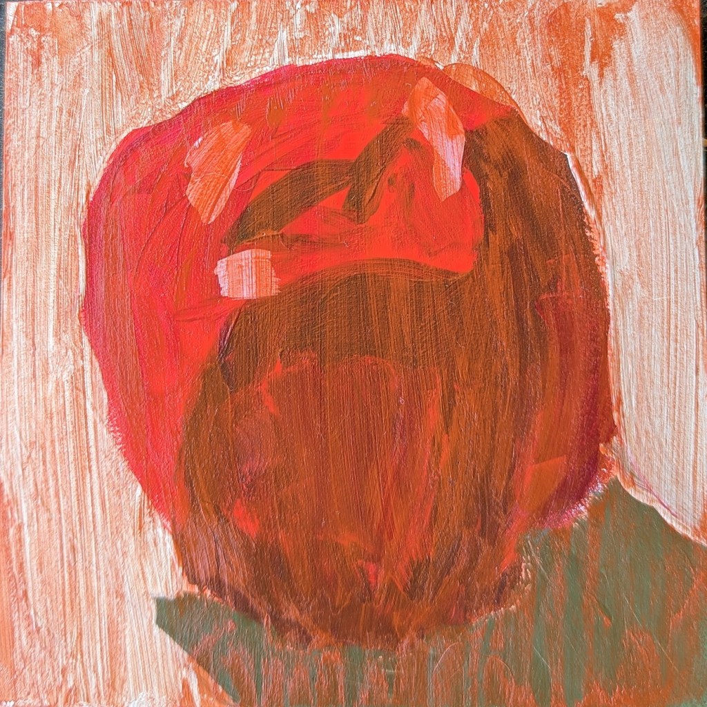
That said, all the stems I painted are sloppy — I need to practice painting thin lines. And the brushwork on the red apple is awful. The paint choices as well could be improved — the red is so transparent you can see through to the raw sienna underpainting, and my charcoal pencil outline. Sigh.
I wish I had taken a photo of this red apple before I applied a glaze of Naphthol Red (PR112) and Satin Glazing medium, but I didn’t. It was inspired by Patti Mollica’s How to Paint Fast, Loose and Bold: Simple Techniques for Expressive Painting (also mentioned in yesterday’s post).
This was painted on 5×5″ gesso board.
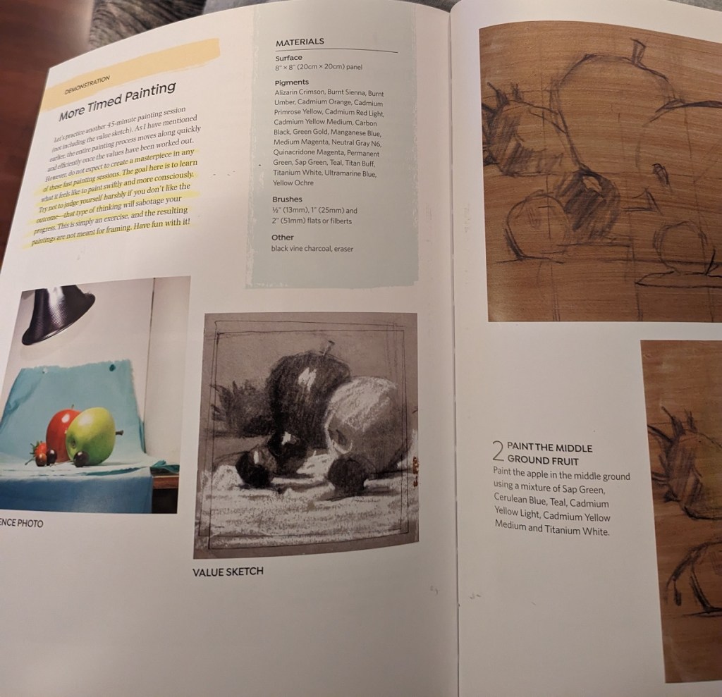
Because Patti Mollica works in acrylics, I bought her book How to Paint Fast Loose & Bold. Obviously, as a professional artist, she too focuses on values and shapes, and starting from big to small. Her book is valuable to me because I’m using acrylics.
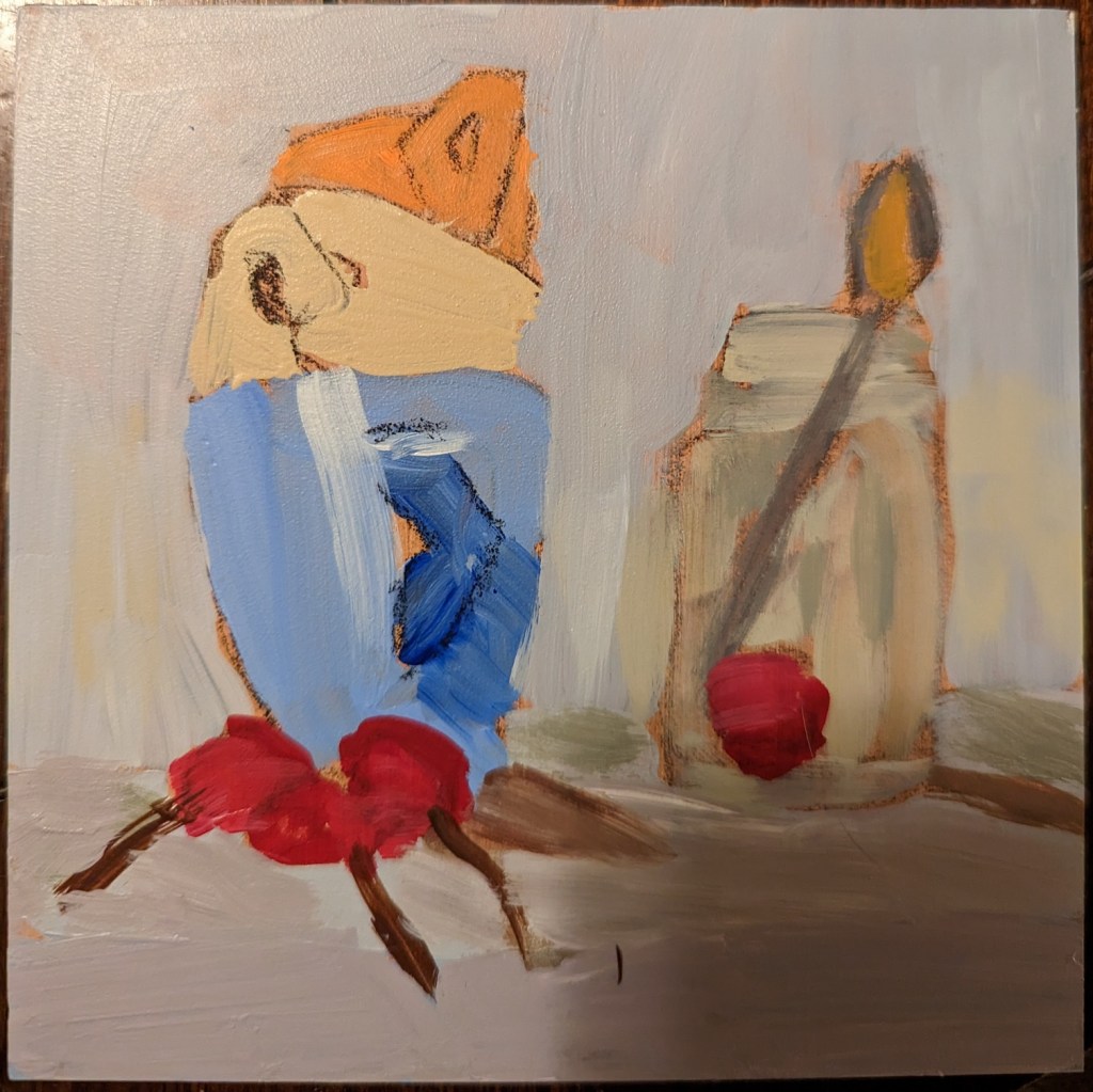
In the book she demos one of her paintings (Stacked, 8×8), which I did on a 5×5 gesso panel, and a second time on an 8×8 canvas. She did an underpainting in burnt sienna (and generally uses Golden brand paints). I found burnt sienna (Blick heavy body) to be quite dark. For drawing the initial shapes, I used a charcoal pencil.
I’m pleased with my drawing — which you can see in my “in progress” photo — but clearly have work to do on brushwork and color mixing!
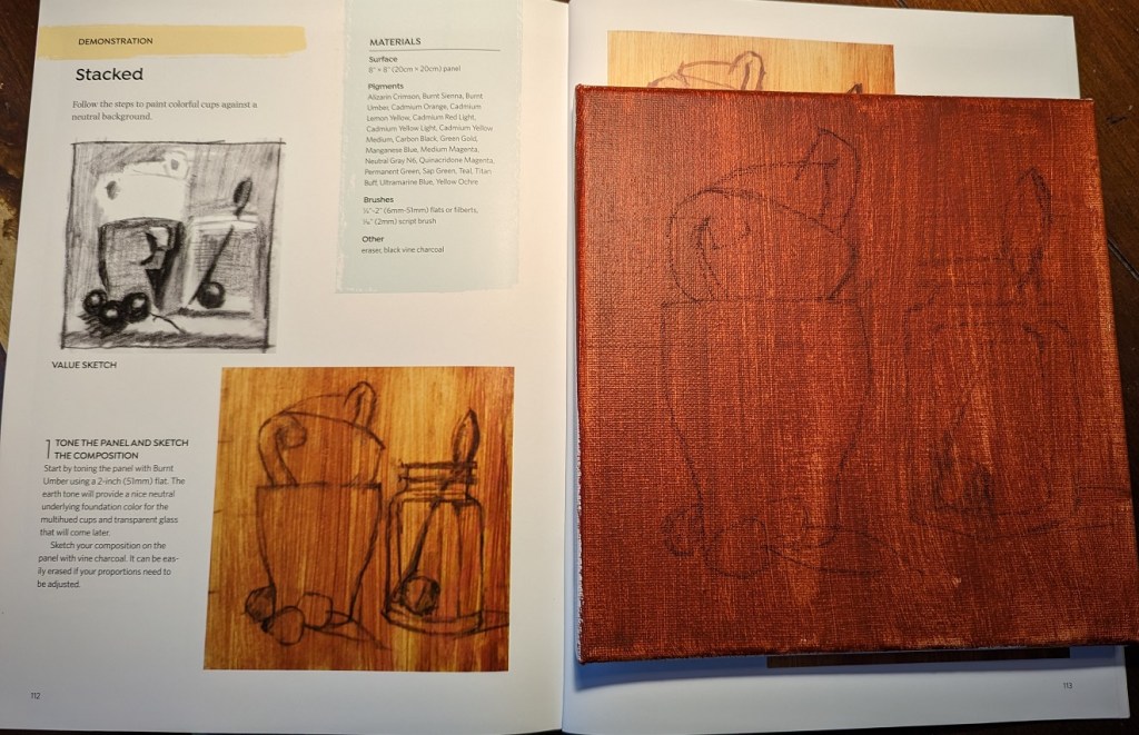
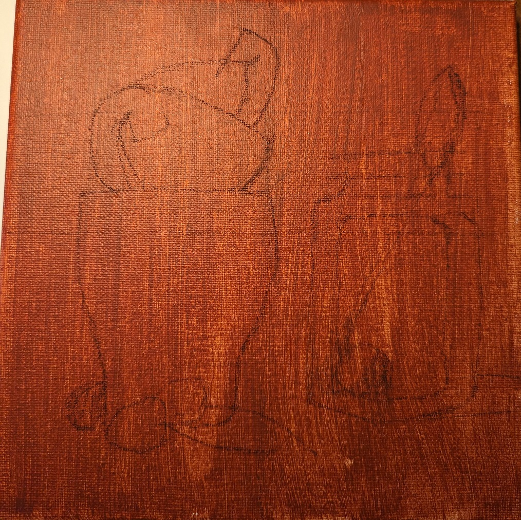
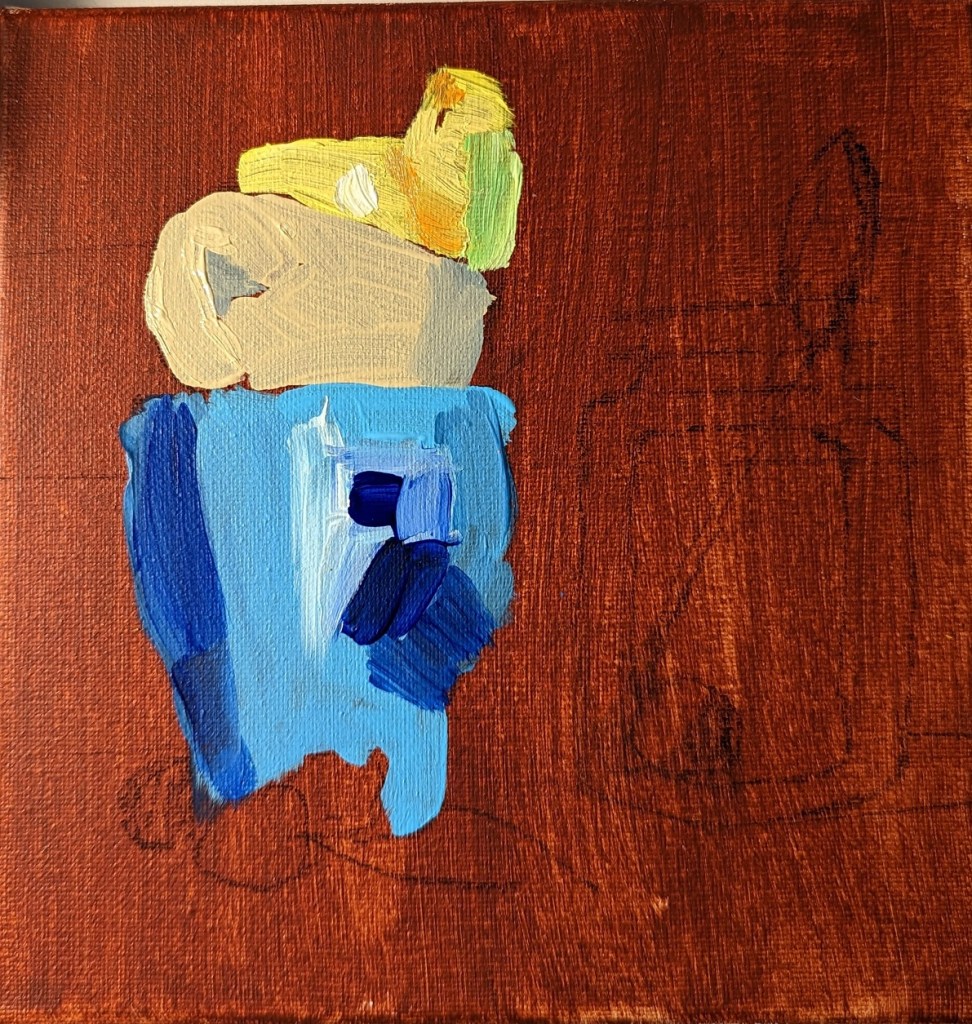
Below is the 5×5 version which I did first. The dark area in the lower right of the image is an artifact of my photography.
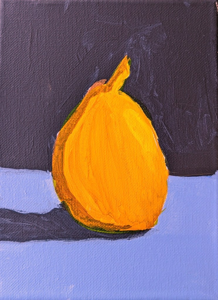
Nothing special about the results of this study, which I found on Patreon… I used a glaze of yellow and satin glazing medium on top of the brightest side of the pear. Might as well use some of the features of acrylic painting.