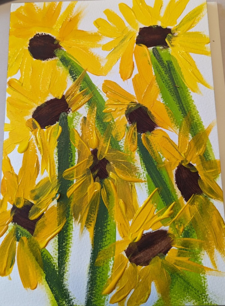
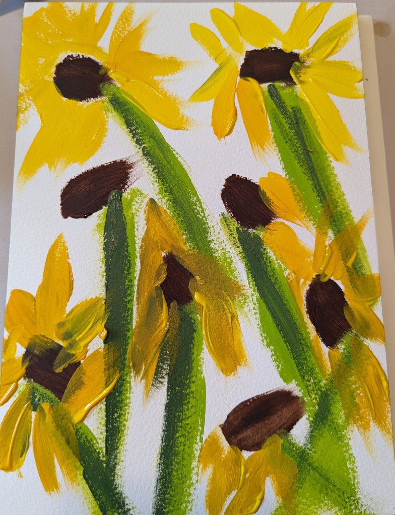
After doing a quickie version in pastels, I decided to a similar scene in acrylics. This was done on 7×10 300-lb. cold-pressed watercolor paper.
Here’s the work-in-progress (right) and the finished version (left).

After doing a quickie version in pastels, I decided to a similar scene in acrylics. This was done on 7×10 300-lb. cold-pressed watercolor paper.
Here’s the work-in-progress (right) and the finished version (left).
I decided the background was too gloomy with that gray blue, so painted over it with Golden’s Neutral Gray 7.
I used the blurred reference photo from the PaintCoach Patreon site, and listened here and there to the video, but ultimately I decided to go with my interpretation of the colors rather than trying to copy color for color the instructor’s work.

We had a baseball game to go to in the afternoon (for Independence Day) so I wasn’t able to get more done on this painting. However, I have the base colors in for the roses.
I need to watch the PaintCoach‘s YouTube to understand what he did for the flower stalks, and the finishing touches.
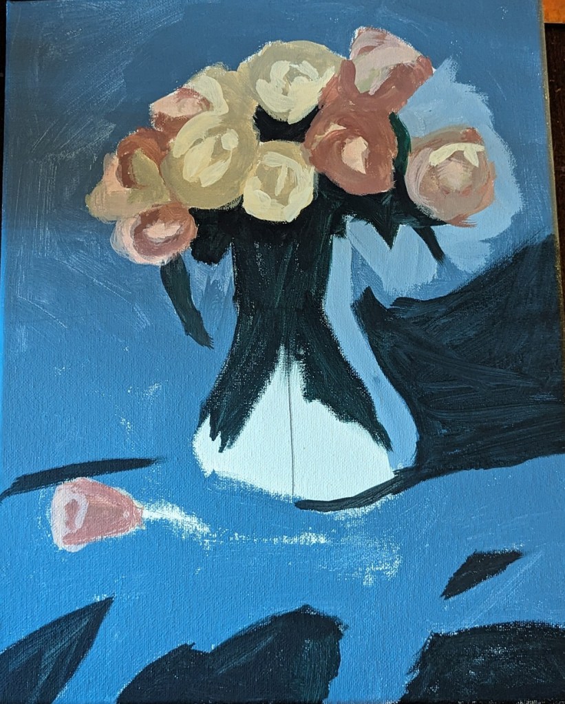
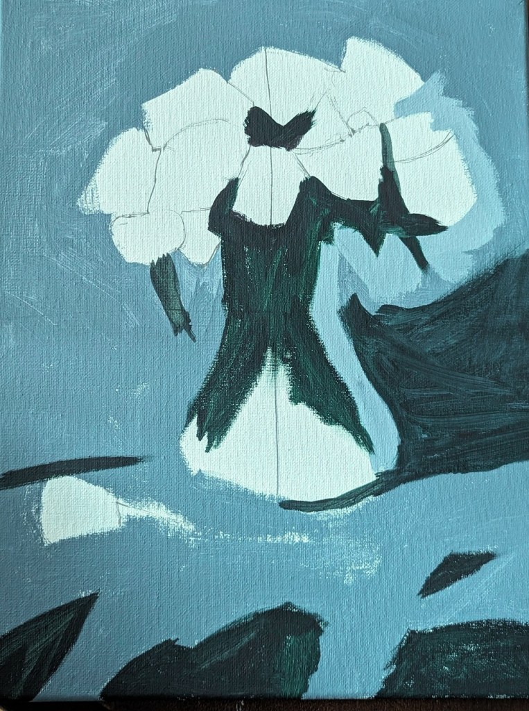
I’m trying roses now, using a reference photo from PaintCoach’s Patreon site. This is the background done, on a 11×14 canvas.
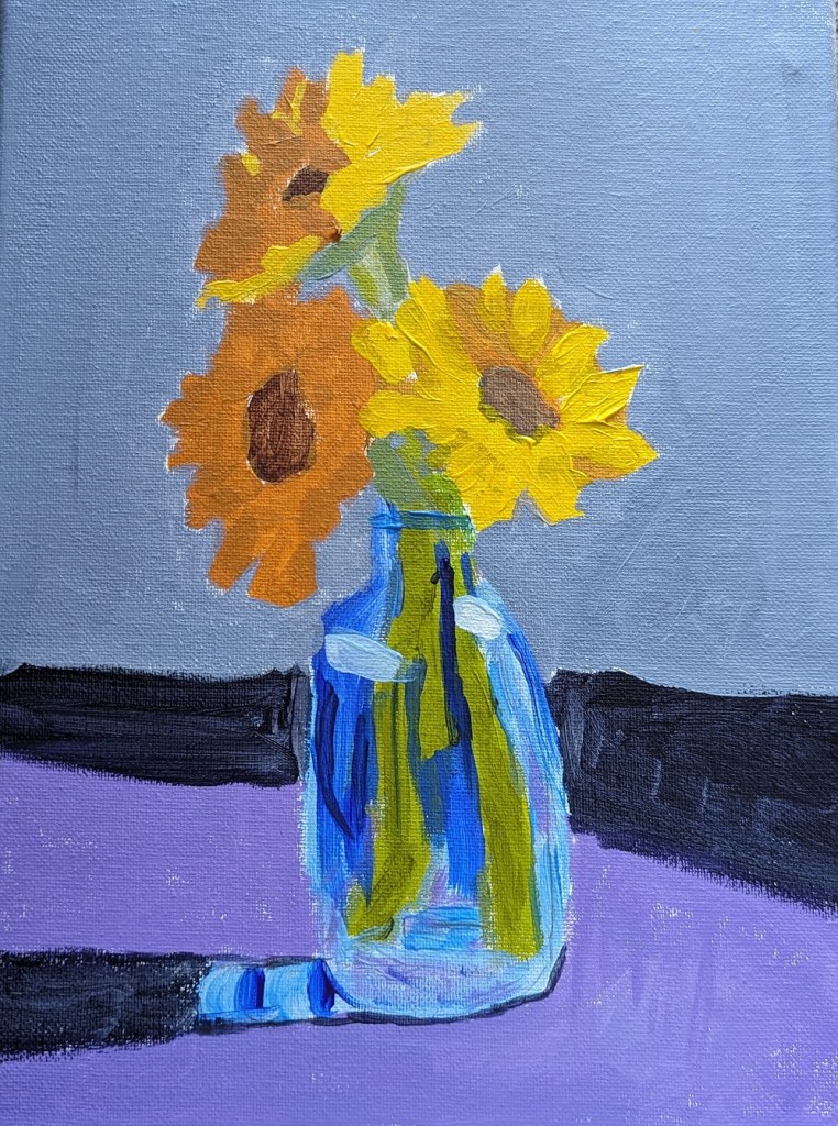
This 9×12 painting of a vase of sunflowers is from one of the PaintCoach Patreon lessons. I’m on a sunflower roll…
For the stems, I used my Liquitex BASICS Green Gray, my new Green Earth, and Phthalo Green (Yellow Shade) with Liquitex Cad-Free Yellow.
For the petals, I used Cad-Free Yellow, Yellow Ochre, and Cad-Free Orange desaturated with Ultramarine Blue.
The vase was done with Ultramarine Blue, Cerulean Blue and Titanium White.
I wanted to try a monotonal work; this was done on a 6×8 canvas. The painting is based on an image by experimentMR from Pixabay.
I think it looks better at a distance.


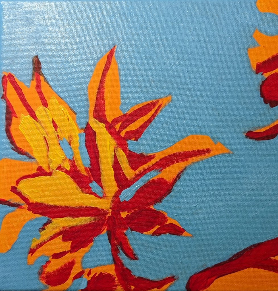
Here is the completed work. The orange I left untouched from the initial wash of color, adding alizarin crimson and yellow for the brighter and darker parts of the leaves.
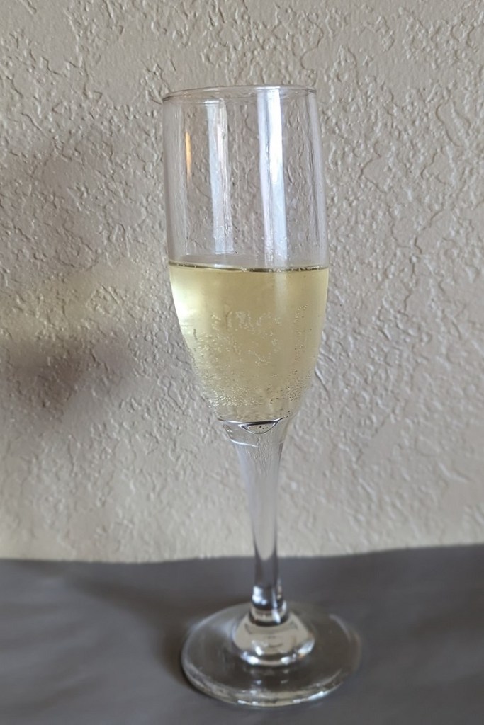
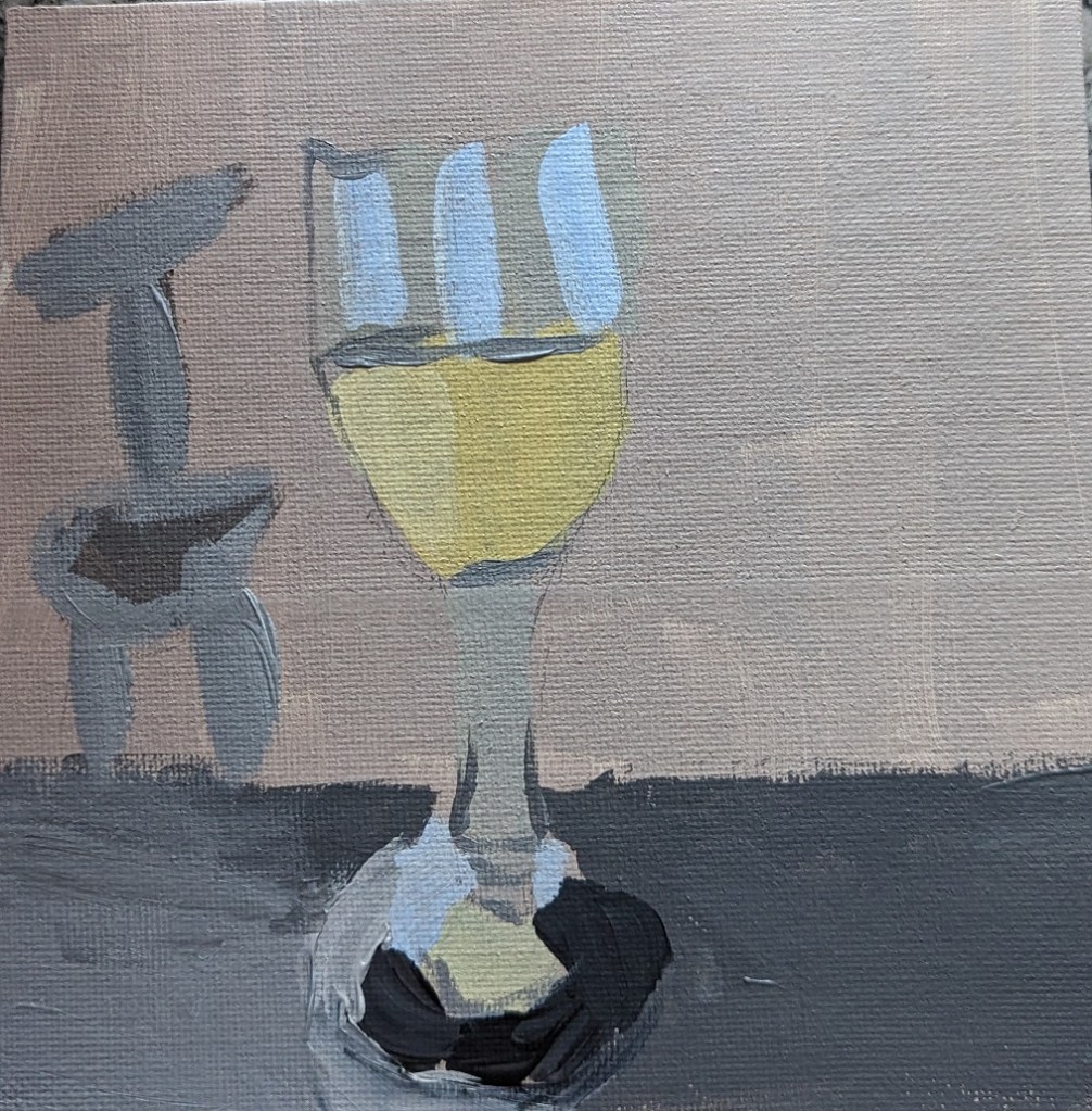
When professional artists and art teachers (in books and online — probably also in real life) say, yes, you’re going to do a lot of bad paintings, and just keep going…. well, this is one of those bad paintings, lol.
What I do like is that I got the yellow-white of the wine pretty good. The shadow, ugh, not so much.
The other online classes I bought included a color mixing class from Will Kemp, a British artist who works with oil and acrylics.
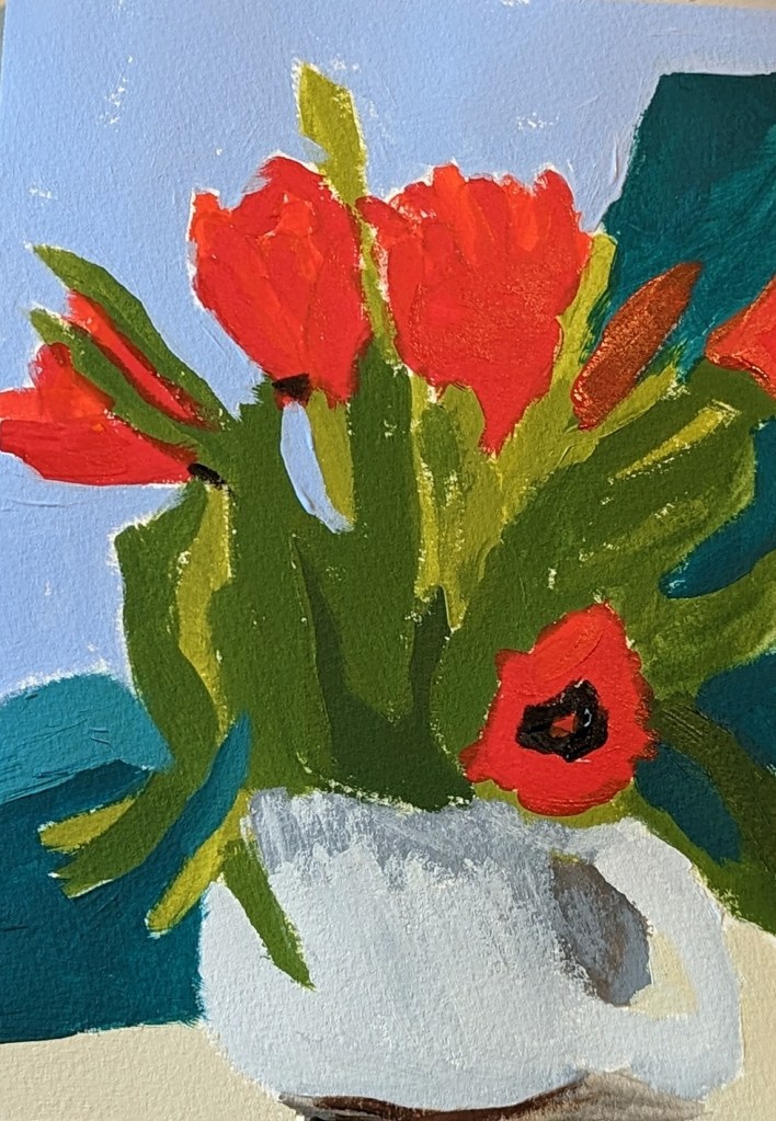
These tulips were done on 7×10 watercolor paper. The finished work is on the right, but appears too blue. The true color of the table and the vase are on the left.