
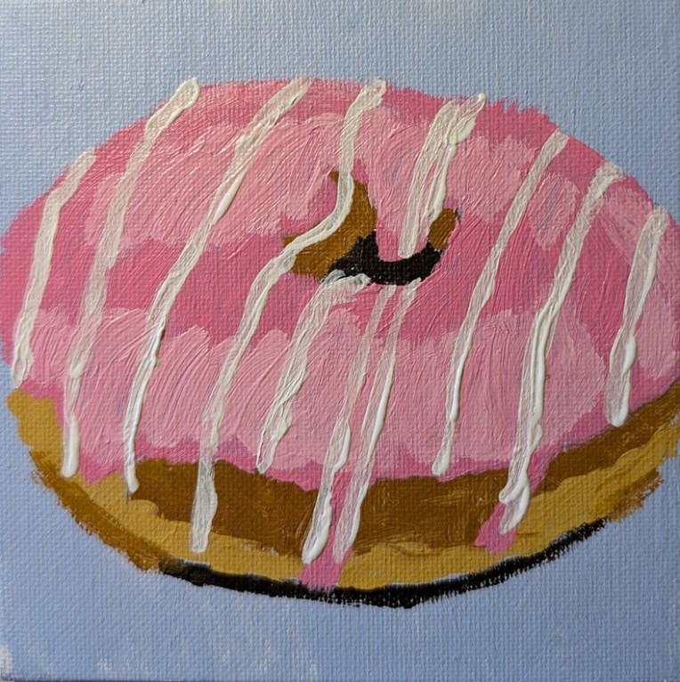
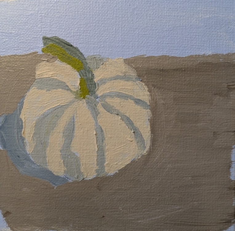
I continued on with my 5×5 canvas panels, after painting the candy in the previous post. The pink doughnut was from a reference photo used in Fresh Paint’s “Paint More in 2026” week back in January, and the white miniature pumpkin is one of my own references. (Right now the pumpkin is outside sitting on the lap of our skeleton right by our porch.)
Author: cathmary1030
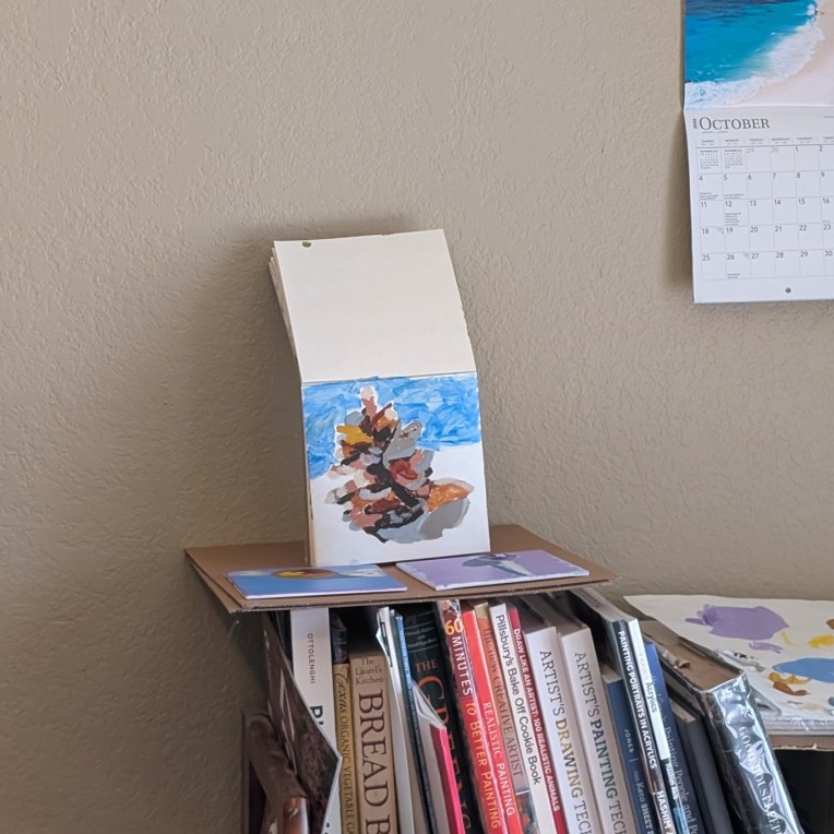
Can you tell what this is?
I was inspired by Teddi Parker’s art on Instagram to do a study of a pine cone. Does it look like one to you? I’m not certain it does to me, but it’s better from a distance. I mostly used Burnt & Raw Umber, and Burnt & Raw Sienna, sometimes mixed with white, and then some Buff White (Blick Artist brand). This was painted on 6×6 SoHo Acrylic Canvas Paper.
“Super Simple Studies” — from Fresh Paint
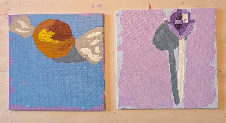
I just discovered this lesson on the Fresh Paint website, and thought I would knock out two of the four items (I’m skipping the barn and the autumn leaf for now) while I decide what to paint next, and draw out anything I need to draw out. Both of these pieces of candy were done on 5×5 canvas panels. The orange candy was done in Burnt Sienna, with Cadmium Yellow Medium added to lighten and then further lighten. The lollipop was done in Dioxazine Purple with Titanium White to lighten consecutively.
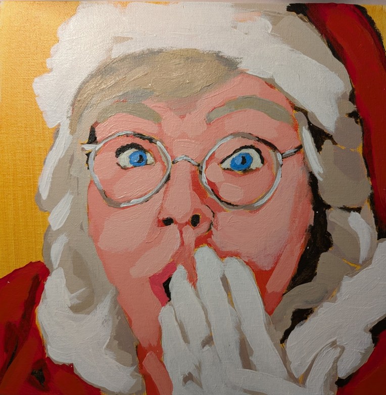
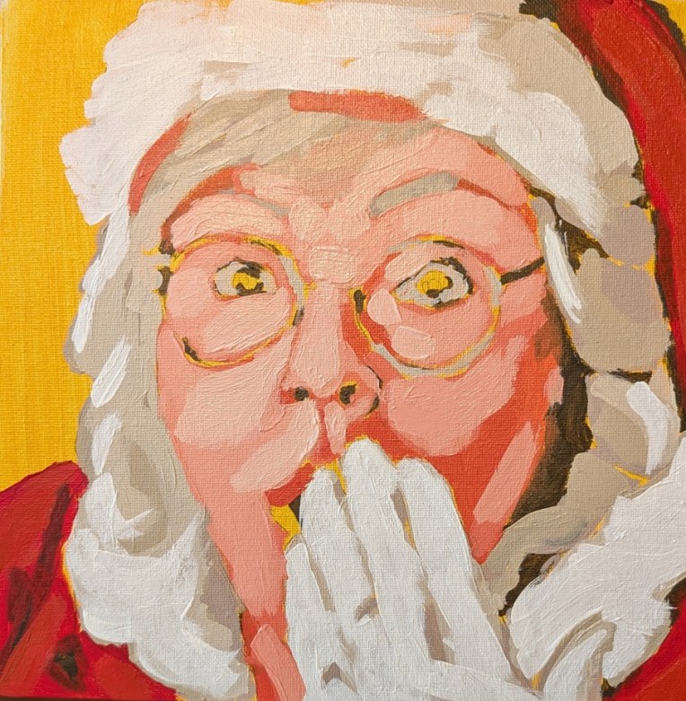
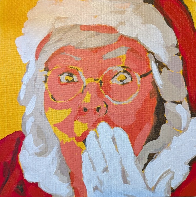
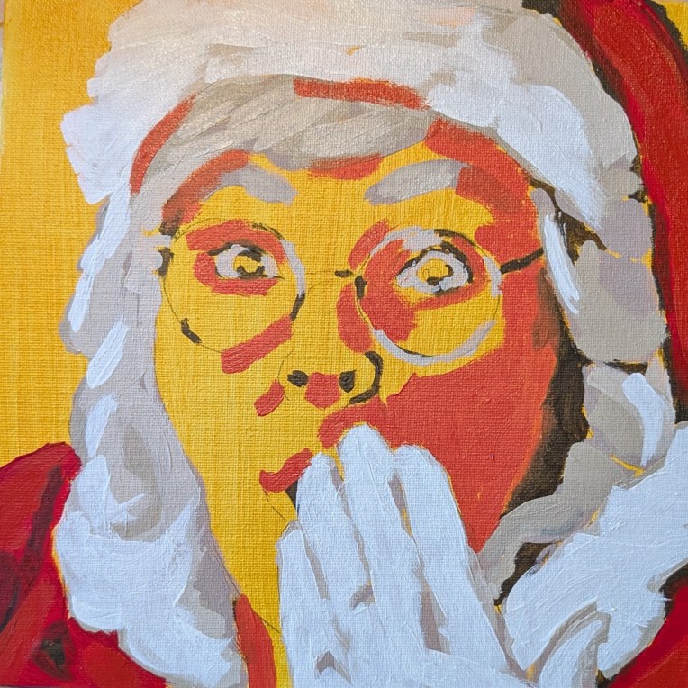
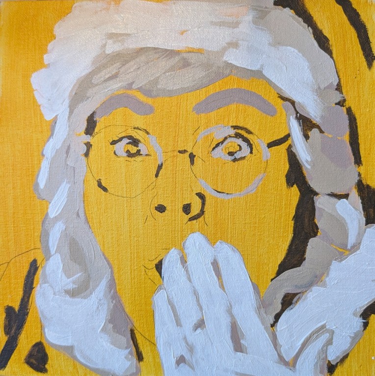
Mrs. Claus — from Fresh Paint
I sure had a lot of fun doing this — one of the offerings from the VIP side of Fresh Paint. I don’t know where Ali Kay got the reference, but I followed along (to some extent) her video.
I had toned this 10×10 canvas some time ago in India Yellow Hue from Golden Paints. India Yellow Hue is transparent, and is a mix of PY150, PY175 and PR122. For my darks, I used Golden’s Raw Umber. For the reds, I used Blick’s Artist Grade Alizarin Crimson Hue, and then a mix of Blick’s Pyrrole Red (PR 254) with some Yellow Ochre and White.
For the skin tone, I used PR170 (Naphthol Crimson) and Liquitex’s Cad-Free Lemon Yellow, a combo I had tested out before and liked — I just kept adding white as necessary.
I decided to include some of the “messy middle” paintings in this post.
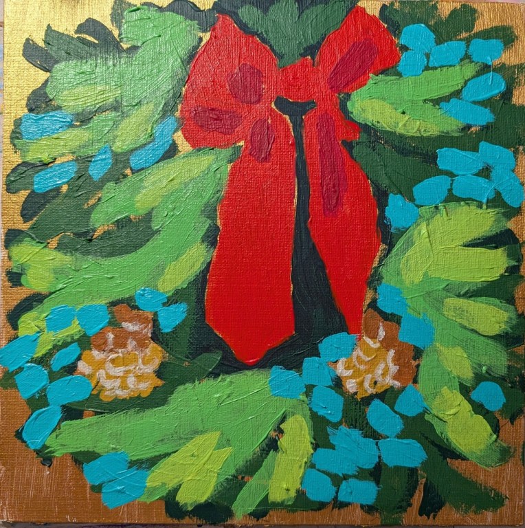
Holiday Wreath – Calling it Done
This wreath is based on a photo by Tim Mossholder on Unsplash, but I also referred significantly to the painting that Ali Kay did in the Fresh Paint class. Unfortunately, too many layers when using heavy body paint isn’t so smooth, so ridges do show, which is irritating.
My effort is more impressionistic than even Ali’s so one just gets the sense of green, but not pine boughs and various evergreens. Oh well, moving on, and glad to have put to use this canvas with the gold metallic paint!
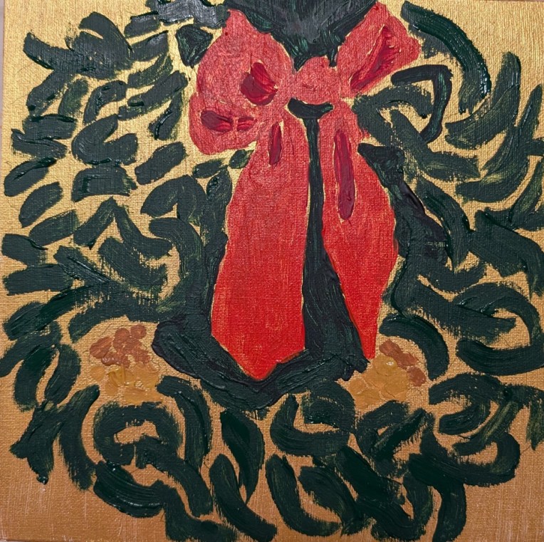
Holiday Wreath in process
You know how you buy paints you find out you don’t need (or can’t figure out a use for later)? That was me.. I bought Lascaux paints a few years ago: a set of 3 (silver and two shades of gold). So, I’m painting this wreath on a 10×10 canvas panel that I painted first in one of the golds.
The wreath is based on a photo by Tim Mossholder on Unsplash, and also I’m referring to the Fresh Paint video class where Ali Kay paints it. There are many more layers — and shades of green — to come, but as it stands now, it has a certain impressionistic feel.
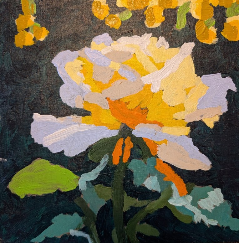
Sunlit Rose — Complete!
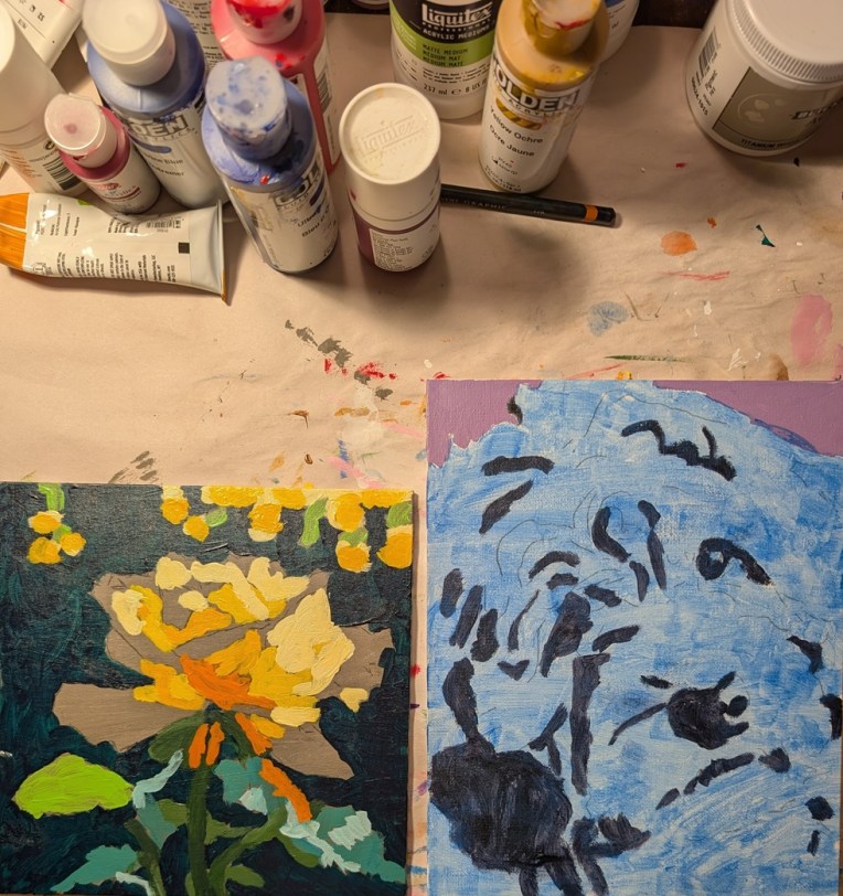
I finished the sunlit rose, and have started on the Goldendoodle, a Christmas wreath, and a portrait of Mrs. Claus.
Paintings in Process
The sunlit rose is from the Brave Artist Week from Acrylic University; the Goldendoodle dog is from one of the Fresh Paint online classes.
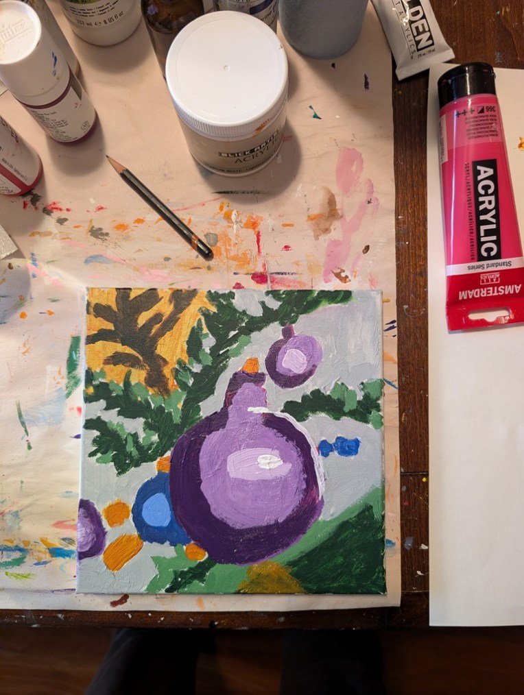
Holiday Ornament — Fixed (more or less)
Well, of course I had to fix the thing because it looked like an infected wound — ugh. I acknowledge that one of my weaknesses as a beginning artist is fixating on following the reference photo too closely. True mark of a beginner, lol.
In any case, here is the fixed version, both close up and (currently) among the paintings on my mantel. From where I write this — my “studio” triples as 1) the dining room table, 2) my “office” when I work from home 2 days a week, and 3) my painting area, the ornament painting doesn’t look half bad. (I’m twice as far from my fireplace as from where I took the photo.)
Latest “greatest” 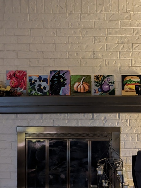
Taken from a distance of about 10 feet

