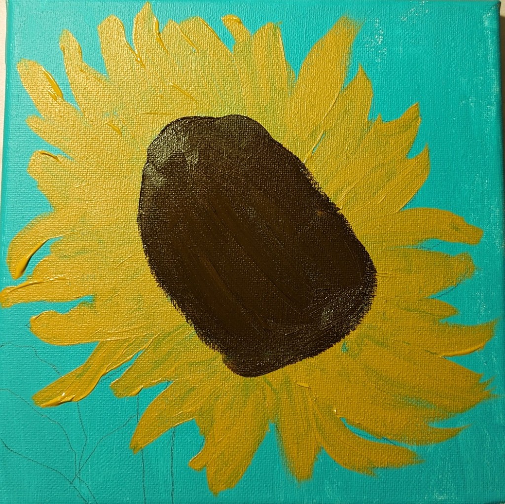
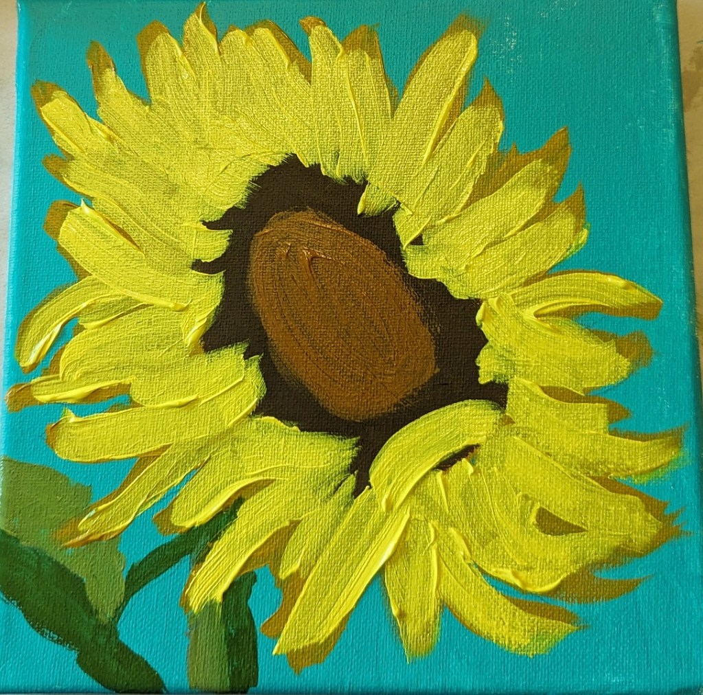
Sunflower #6

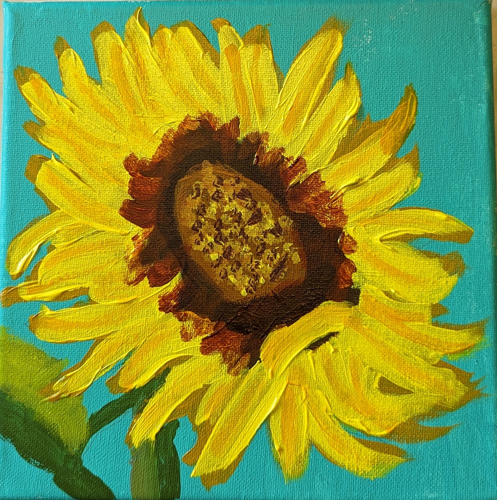
I’ve been unsatisfied with my sunflower painting so the other day I googled “how to paint sunflowers in acrylics”. The search results were a bounty of different YouTube videos. Well, naturally, some sunflower paintings appealed to me more than others so I watched about half a dozen.

What I found was, naturally, everyone has their own way of painting sunflowers. Some start with the background, some start with the dark center of the flower. However, the colors they chose for painting the flower were largely in sync across the board — and with my own paintings: yellow, yellow ochre, burnt sienna, burnt umber, etc. etc.

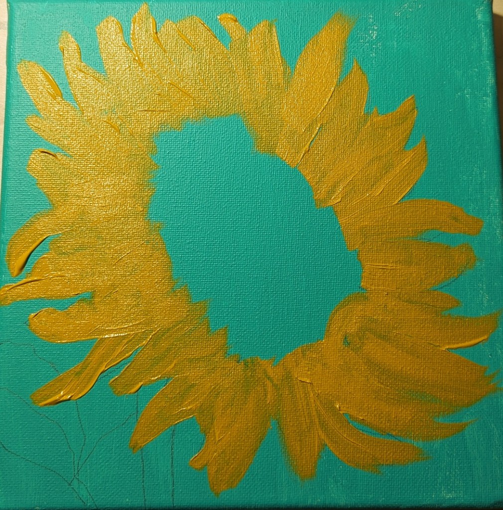
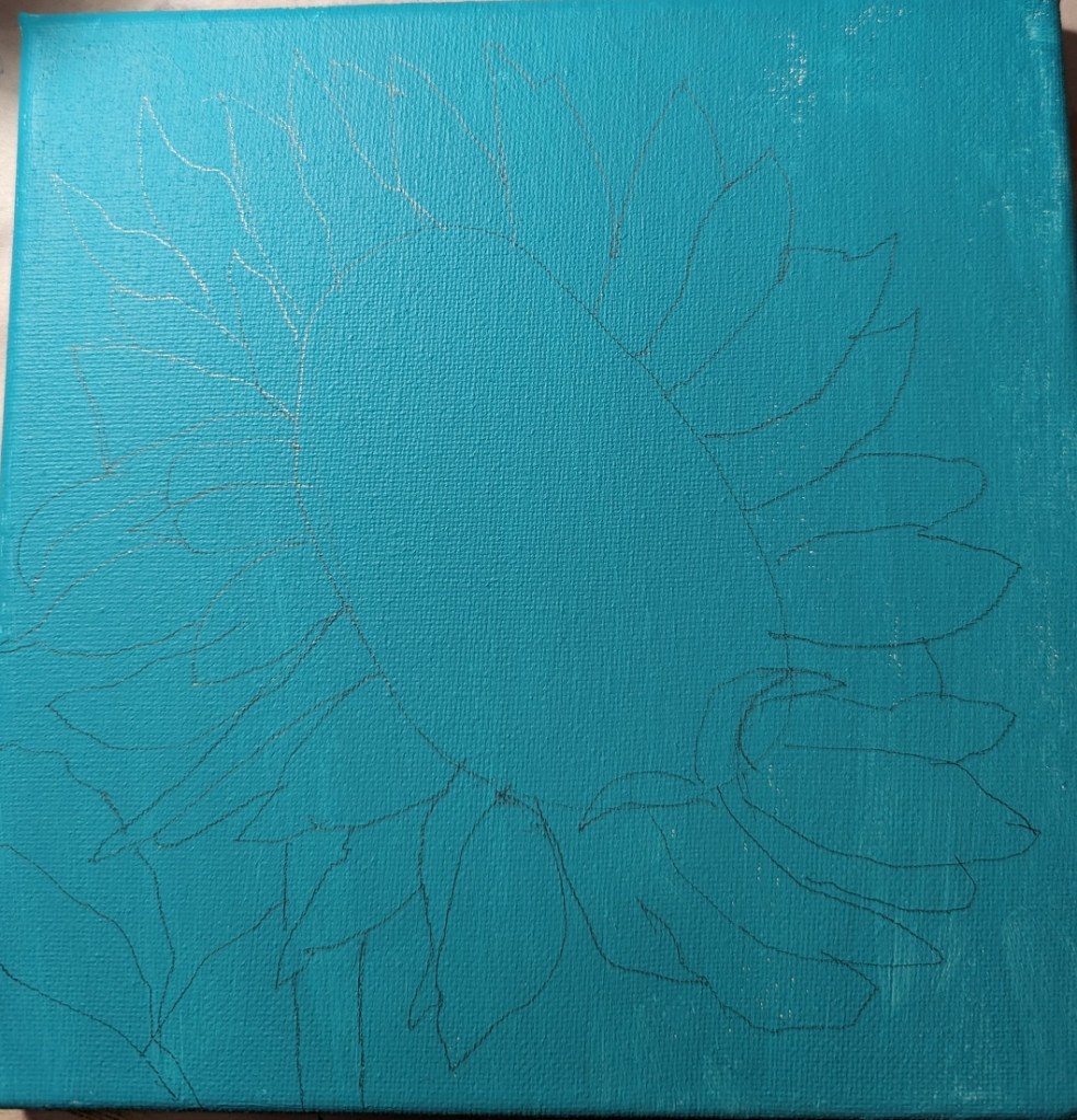
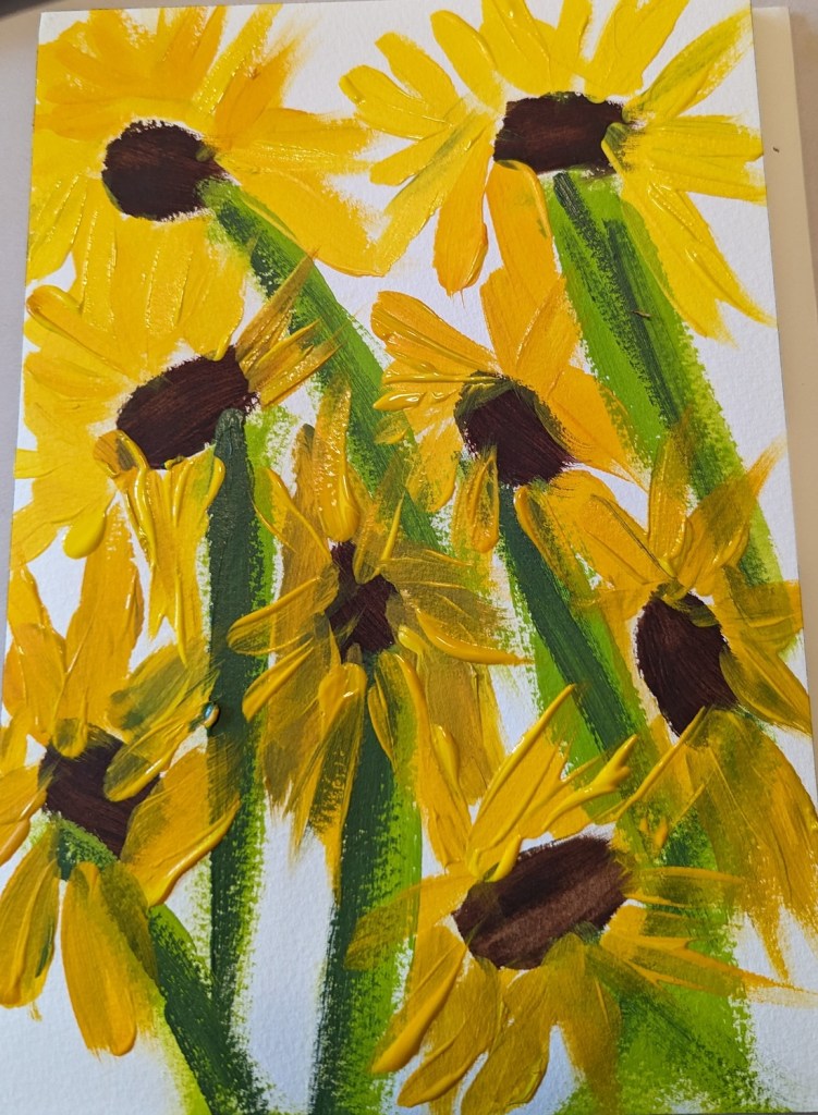
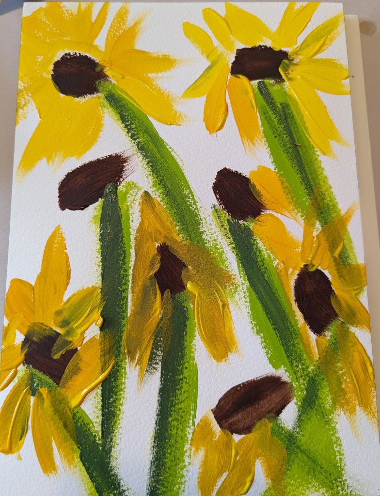
One process I decided to try, though, was to do more layering of the petals, and start with a round of yellow ochre first, applying the brighter yellow afterwards. This painting on an 8×8 canvas was just from my imagination, and the mix of all the sunflower pictures I’ve been looking at lately.
Yellow Rose

I wasn’t particularly satisfied with my pink and white roses in the vase a few posts back so I tried winging this one (on 6×8 watercolor paper). I like the colors, but this is a pretty abstract “symbolic” rose.

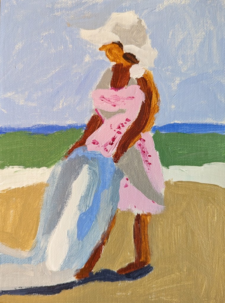
After Steve Strode… After Peggi Kroll-Roberts (Copying a master)

I recently purchased the June 2019 of Leisure Painter which had an article by Steve Strode about the basics of acrylics. He suggests you model good painters, and gives an example in the magazine of his painting based off of Peggi Kroll-Roberts‘ style.

This is the first figure I’ve ever painted, and my goal was 1) just to do one, and 2) was trying to focus on using minimal brush strokes — just to boldly attempt it, in other words.

Quick Study: November Morning Sky

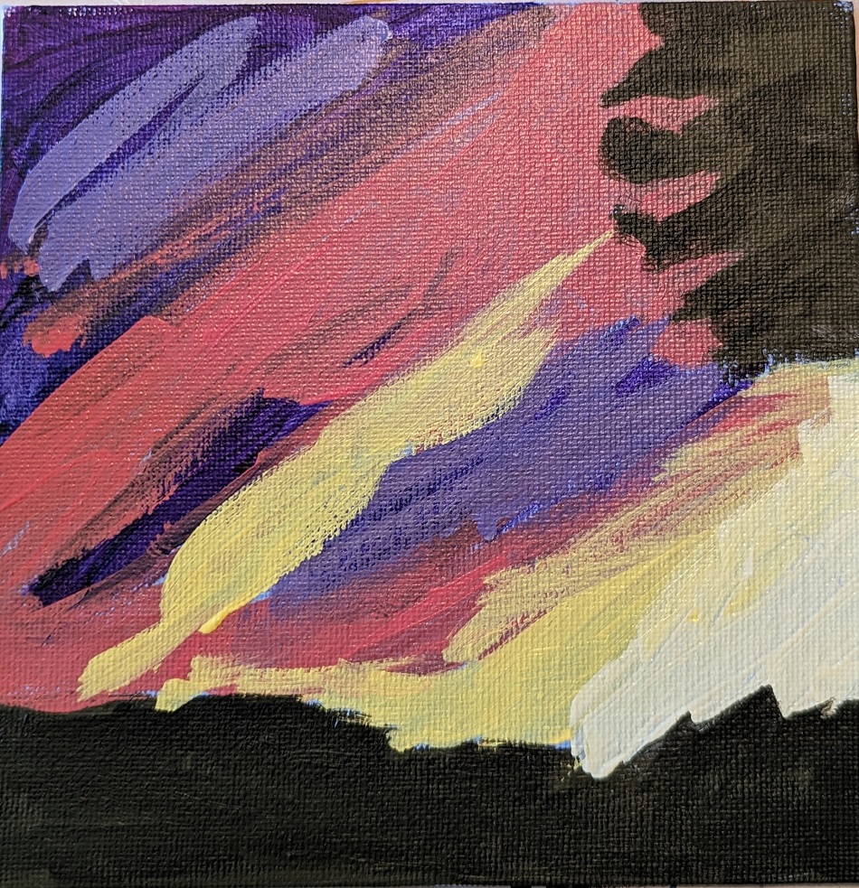
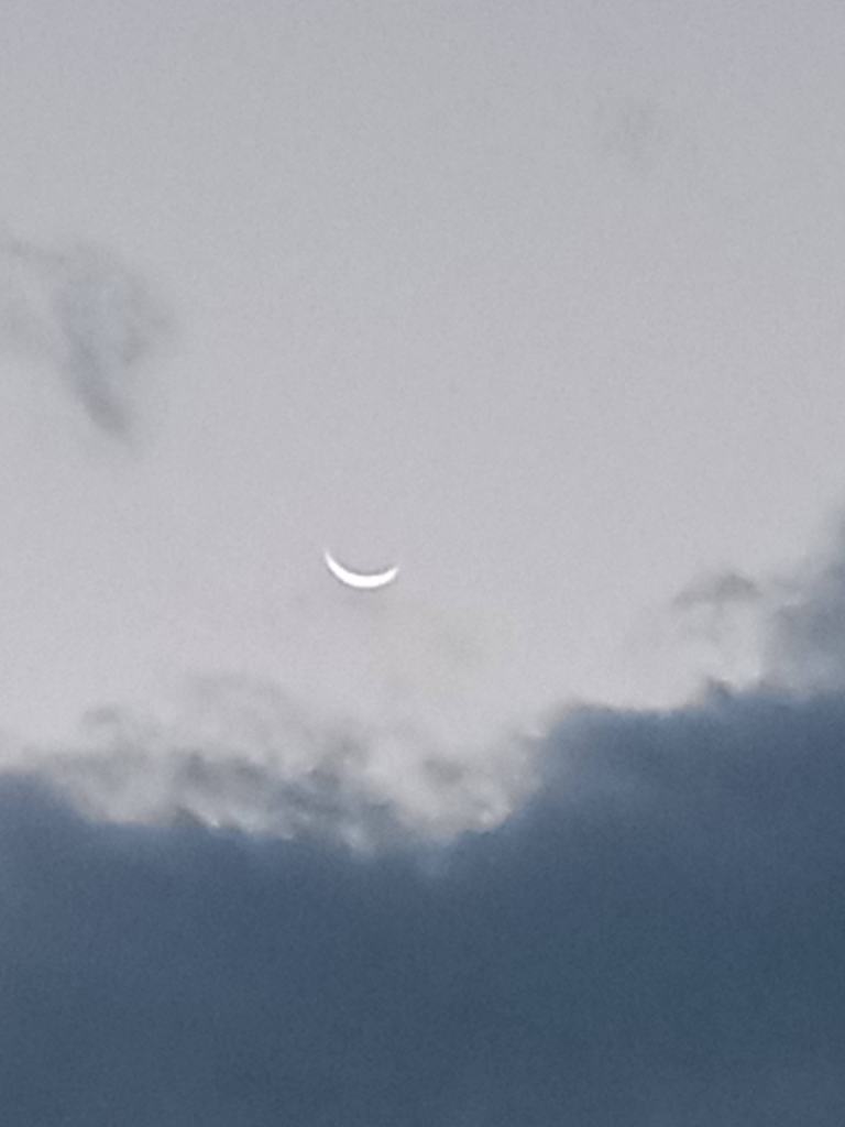
This painting was done in acrylic on a 4×6 piece of 300 lb. cold-pressed watercolor paper. It’s based off of a photo I took of the waning crescent Moon one morning back in November 2021.

I felt the original image of the sky was too gray and blue, so I changed it up at bit. The sky was painted with Liquitex BASICS blue gray; the pink is Cadmium Red Medium Hue from Golden, and the Moon is Titanium White mixed with Hansa Yellow Light (PY 73).

Negative Spaces Study: Adventures in Acrylic

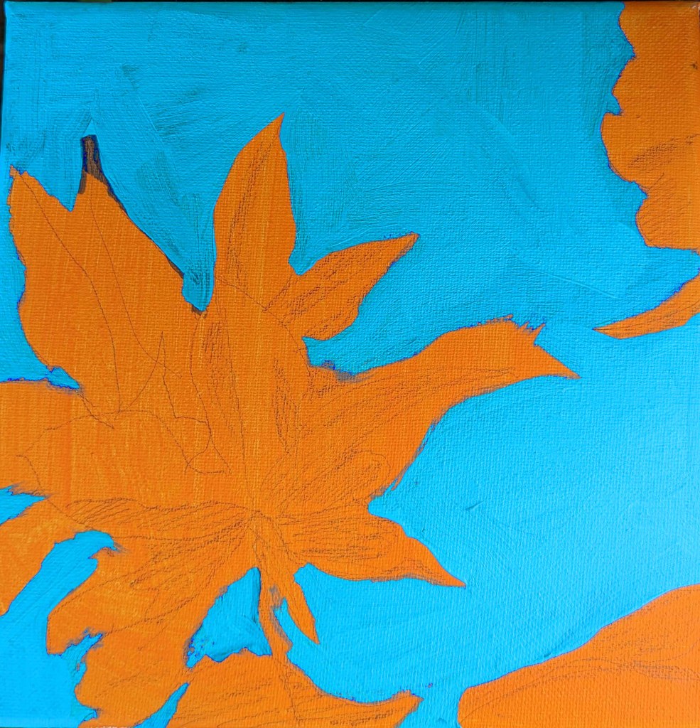
One more study I’ve done in the Adventures in Acrylic class. I did not do the fluorescent orange spray paint, and this time, instead of using my Perinone Orange (a close substitute), I went with Liquitex’s Cad-Free Orange paint, more soothing to my eyes.

Then I did a free-hand drawing in pencil of some of the orange leaves from the reference photo provided in the class, and did some light shading of the shadow areas as I saw them.

My blue was a mix of Utrecht’s cerulean blue (fluid) and Liquitex’s soft-body Light Blue Permanent (I think it is). I used a long-handled small bright brush to paint in the negative spaces.

This is really an in-progress painting, but I’m tempted to leave it as it is and go on to something else. We’ll see!

Playing with Palette Knives

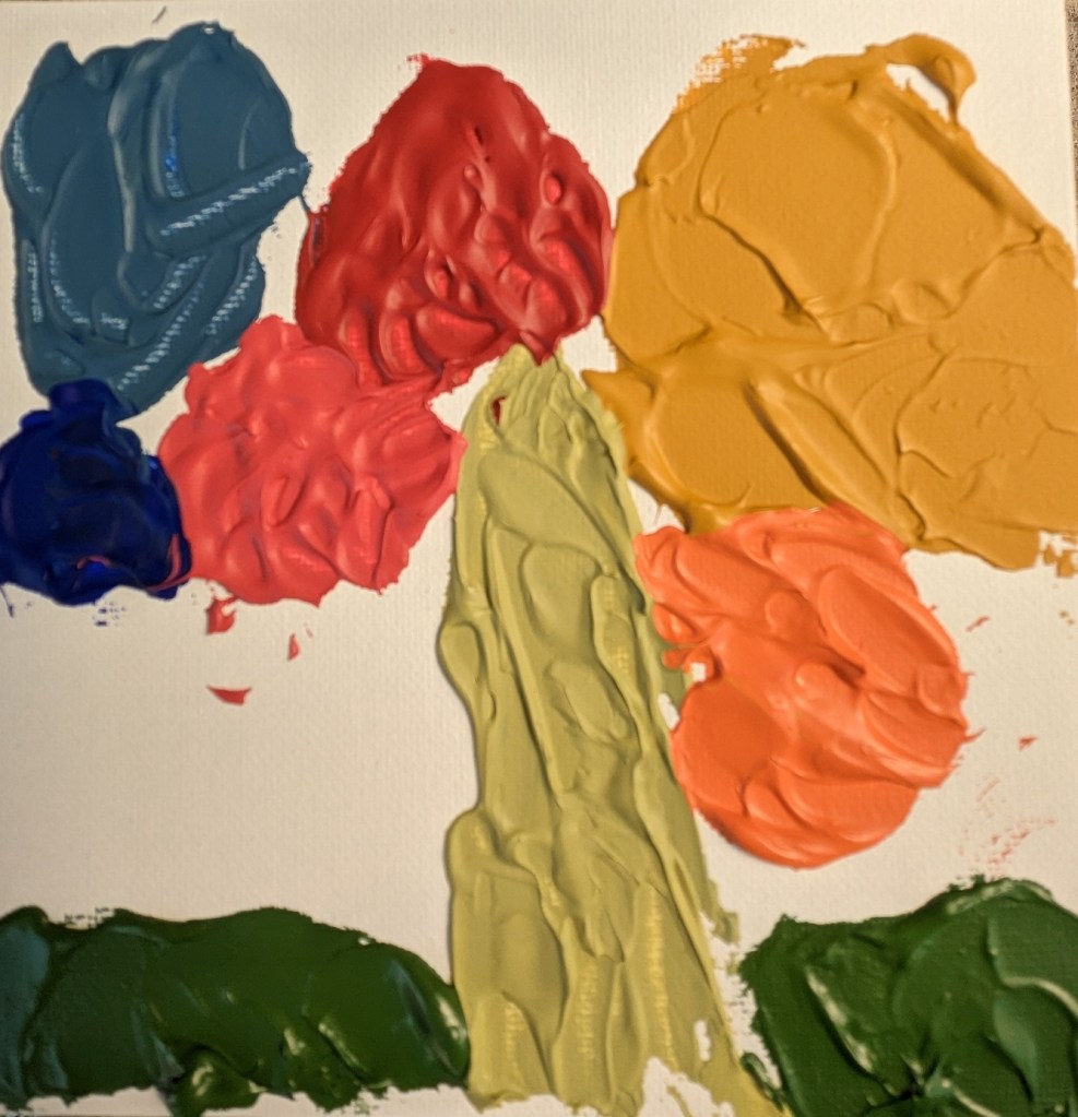
I bought some LUKAS CRYL Pastos Heavy Body Artist Acrylics a while back, so I thought I’d try them out. To my surprise, they weren’t more heavy-body than Liquitex or Golden. The blue and yellow didn’t make a decent green; the red and yellow didn’t make a great orange (I had to add some Liquitex Cad-Free orange).

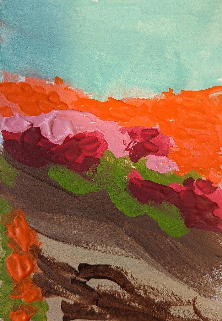
I tried out the different colors — except for black and white — on a 6×6 canvas panel. Further below, I did an abstract of azaleas on 4×6 watercolor paper.