Red Poppies: Adventures in Acrylic

The next-up item in the Marla Baggetta Adventures in Acrylic course was these red poppies. She suggested we use fluorescent orange spray paint for our background; instead, I used my perinone orange paint by Chroma Atelier Interactive, which I find wildly fluorescent!

Using the reference photo, I drew the poppies in pencil over the painted canvas, and then watched her video, closed up my laptop, and did my best from-memory version. At the very end, you use a white gel pen to outline as you see fit; here, I reviewed the image of her final work, and then just winged it.

This was fun!

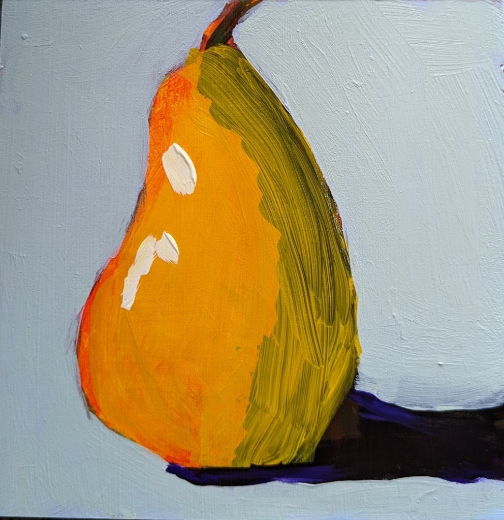
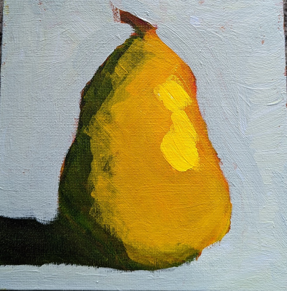
Glazed Pear: Round 3

This is the last pear I did — I’m sick of pears for the moment! — and this was done on slippy-slidey gessoboard. (I’m almost done with my stash of that stuff and am in no hurry to buy more.) In this one, I did the final yellow glaze only on the pear itself, and before I added the highlight.

Funny thing, after all this pear painting, I was at the grocery store today, and for the first time I really noticed all the pears in the produce section; each type has its own shape. I think of this shape as somewhat close to a “classic” pear, but that’s really the Bosc pear. Some are short and squat more like gourds or squash.

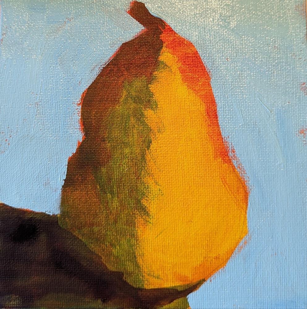
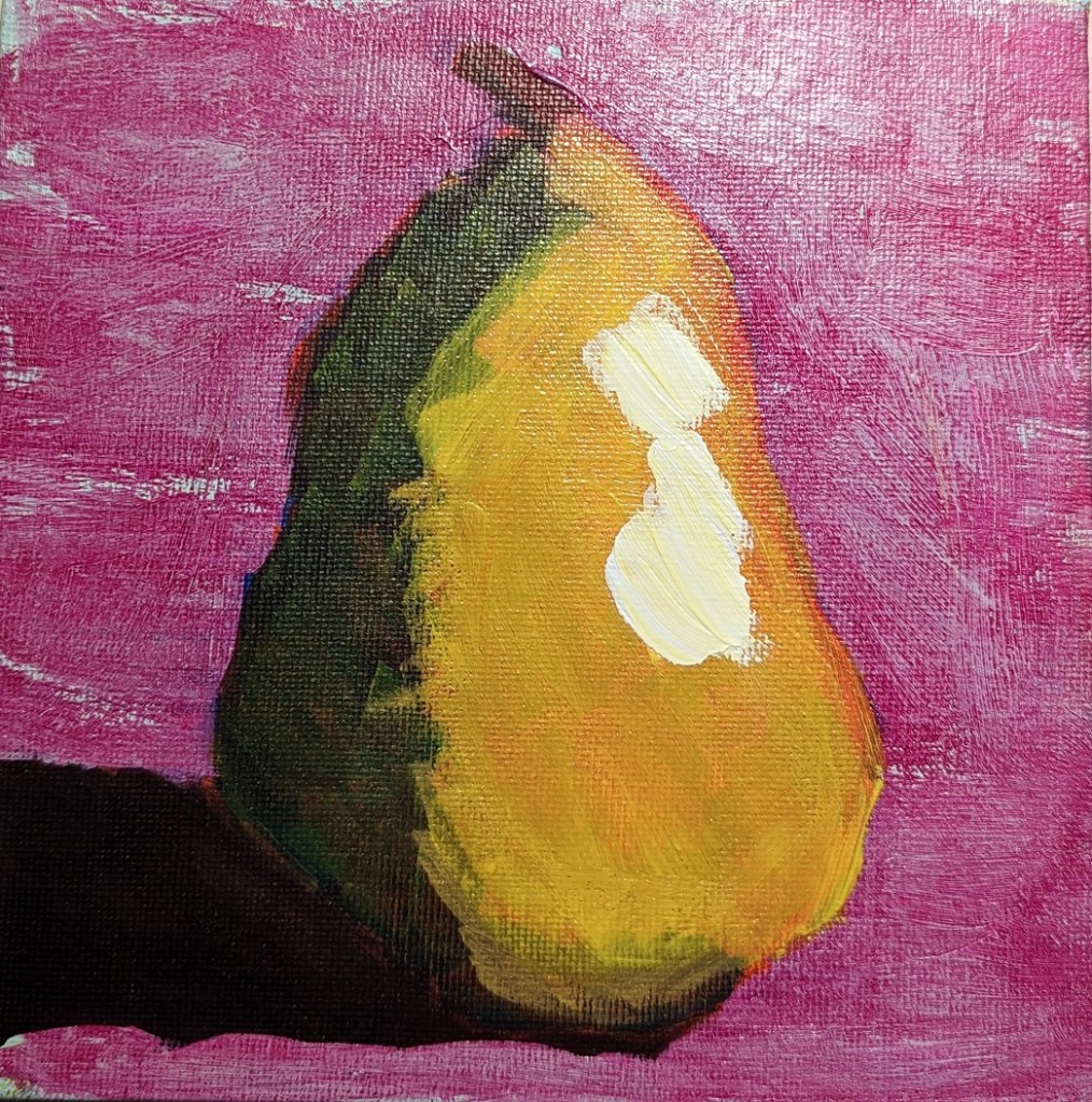
Glazed Pear: Round 2

This is work from the Marla Baggetta class I mentioned the other day. These pears were done after I watched the video provided, so they’re closer to how she did it, but not entirely. I took a series of in-progress photos; sometimes we’re glazing, sometimes we’re painting. The very bottom photo at the end is the final result; everything skews yellow because a yellow glaze was the last step.

I’m not entirely sold on the layering and layering of glazes; seems like a lot of extra work. It seems to me to make more sense when using pastels than when using acrylics,

This was done on an 8×8 canvas.

My First-Ever ACEO’s

ACEO is an acronym for “Art Cards, Editions and Originals” and their standard size is 2-1/2 x 3-1/2 inches. I bought a packet for 10 ACEO watercolor papers by Swarthmore a few years ago, but never used them.

These I did using hard and soft pastels, just for the heck of it, as I was watching HGTV. The green palm tree is based off a Winslow Homer watercolor I have a print of. I’d like to do some using acrylics at some point.

More Bright Yellow & Testing out Paint Markers

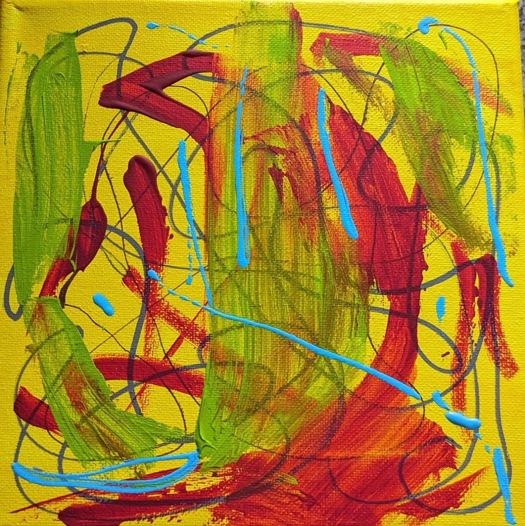
As noted yesterday, I had extra yellow paint, so I had painted an 8×8 canvas. I decided to test out some of the acrylic paint markers I just bought, as well as some of the new paint I bought (Amsterdam Expert — a brand I haven’t tried before).

The Amsterdam Expert paint in yellowish green was so thick that I wiped off much of it with a paper towel, hence the smear. I also used some of my alizarin crimson, and Liquitex soft body light blue.

The paint markers are cool; I first heard about them from the Still Life Acrylics e-book I bought from Will Kemp Art School. Kemp uses the paint marker as his drawing tool. (I’ve tried compressed charcoal and charcoal pencil for my drawing tool, and the charcoal smears into the paint.)

Got Some Oils & some “OPEN” Acrylics

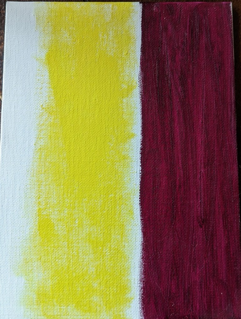
I’m still wanting to try oil paints, but am spooked by how thick they are — and the need to thin them without solvents. Ugh! But the colors are gorgeous! That violet is luscious; however, it took nearly a week to be touch dry.

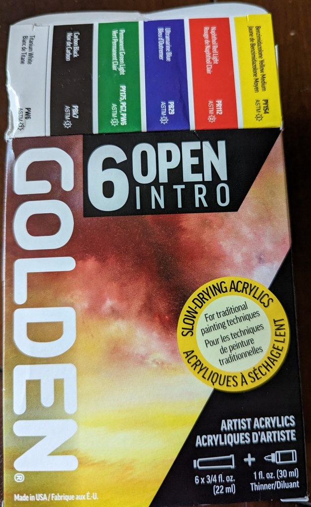
That said, acrylics can dry so fast, so I’d also like to try Golden’s Open Acrylics to increase the working time.

Small Seascapes Project

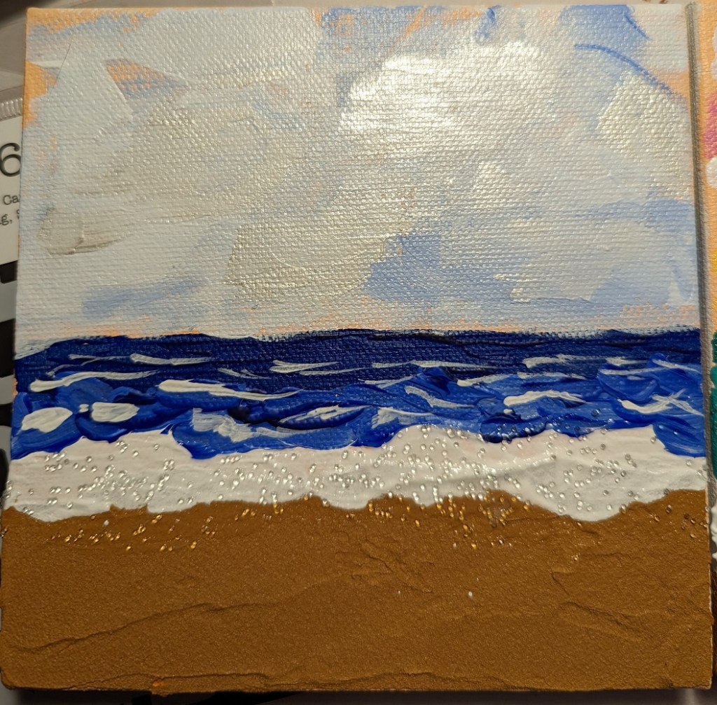
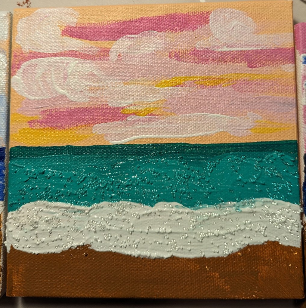
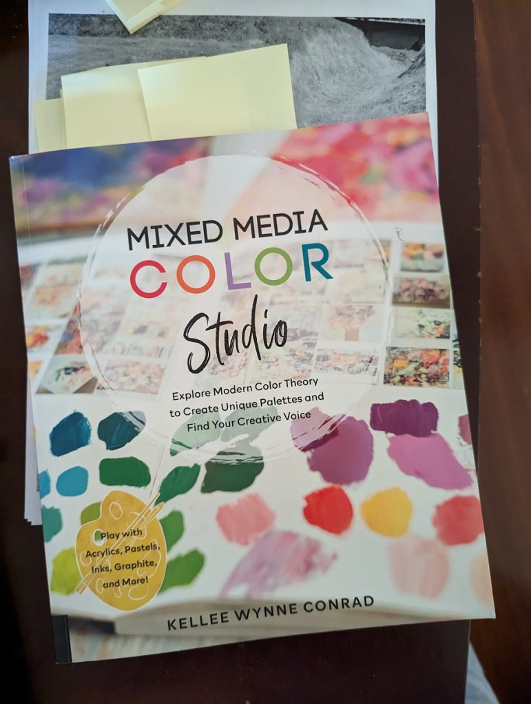
Using the Mixed Media Color Studio book by Kellee Wynne Conrad, I followed along with the seascape project. The author used 4×4 wood panels, but I used 6×6 blocks. The author used only paint, but I used Liquitex Basic Coarse Texture Medium from my sister’s stash to mix in with my burnt sienna/yellow ochre paint as “sand”. I also finished off the foamy waves with Liquitex Glass Beads, painting over the dried paint.

(I also tried mixing paint with the glass beads, as you can see below with the green sea scene; unfortunately, you lose the light effects with the glass — didn’t care for that.)

The upper-right photo also includes the clouds painted with Golden Heavy Body Iridescent paint. Not sure how useful that paint is, but couldn’t resist buying some to try it out.