I did this a few months back, testing out my new Aquarelle pencils, which take a wash of water after you lay down the graphite.
It is taken from a photo of mine when I stood on one of the bridges in Cork City, Ireland some years back.


I did this a few months back, testing out my new Aquarelle pencils, which take a wash of water after you lay down the graphite.
It is taken from a photo of mine when I stood on one of the bridges in Cork City, Ireland some years back.
My last few works — a portrait and a “portrait” of the Asaro head — have been in the cartoon realm, so I’m skipping posting those for now!
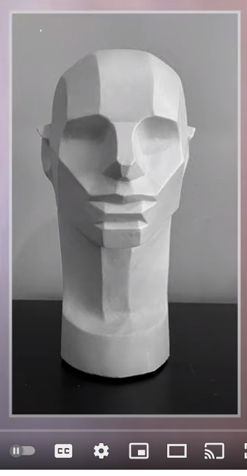
Instead, I found a video on YouTube that walks you through drawing the “Loomis Head” and converting it (for lack of a better term) to a planar head (what the artist calls the “memorized Asaro head”). After watching that, I drew the planar head on my 8×10 canvas with willow charcoal.
What I discovered in my failed attempt at painting the Asaro head is that the color Ivory Black is fairly transparent, and doesn’t cover well. I ended up going to Michael’s and bought some Mars Black from Liquitex Basics. It’s student grade compared to the artist grade Ivory Black, but wow, what a difference!
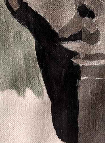

Anyway, here’s the Asaro head done; sage green for the background.


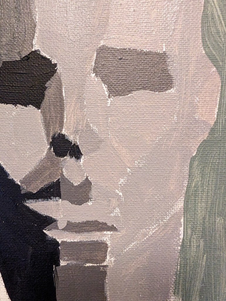
Below is a copy of the reference photo I used to paint, as well as a close-up of my value changes. In some cases like the upper lip, the value change is too abrupt, while in other cases there’s not enough of a value change. I’ll have to keep practicing.
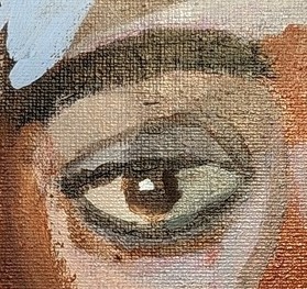
Drawing eyes is not the same as painting eyes! (I think I can draw them better than I can paint them.)
The first eye is from the head-scarf lady (with the highlight added). The second painted eye is from another PaintCoach Patreon tutorial. The drawn eyes are from the Draw Awesome online class I took in 2022.
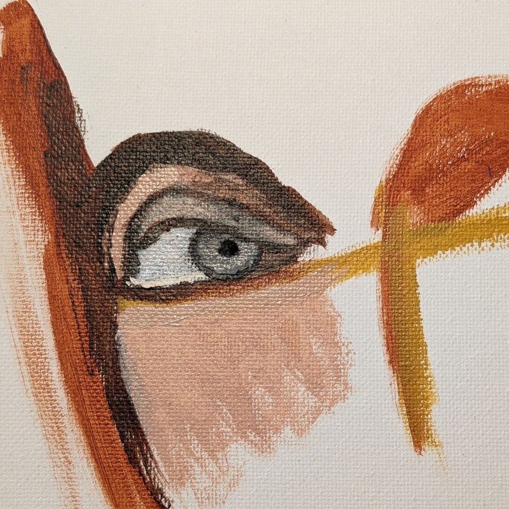
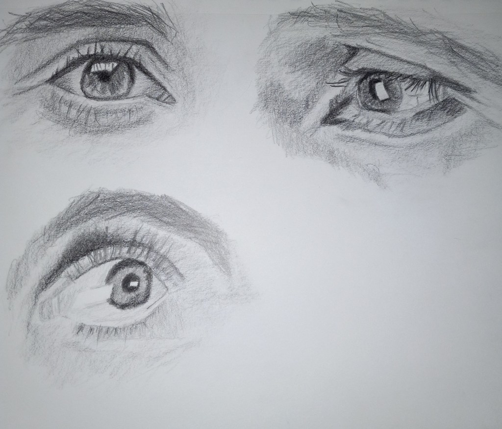
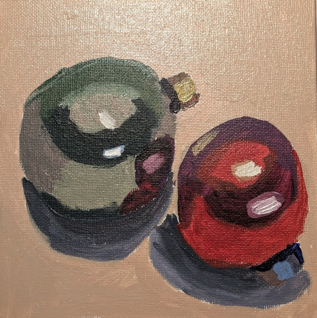
I did this work in acrylic on a 6×6 canvas board that I added a layer of acrylic gesso to before I started.
In doing this “still life” (for lack of a better term) today, I scored a victory of sorts. I only used the 3 primaries (lemon yellow, alizarin crimson, and ultramarine blue) plus titanium white. And I got all those different colors! I’m finally moving forward on the journey of intuitively mixing colors! Cheers!


I was inspired by landscape painting books I was reading about value studies, and notans, so I painted this 6×6 study. The idea being that the diagonal line of “posts” makes an otherwise horizontal painting more dynamic.

Some time back I had painted this 6×6 canvas panel with cerulean blue, so today I used that for my sunflower. The petals are layered with cadmium-free orange as the base (although it looks like yellow ochre now that it’s painted on the blue). Then I mixed azo yellow with some yellow ochre. Finally, the top layer is cadmium-free yellow. The center is burnt umber light, with some yellow ochre, and then purple and yellow denoting the seeds.

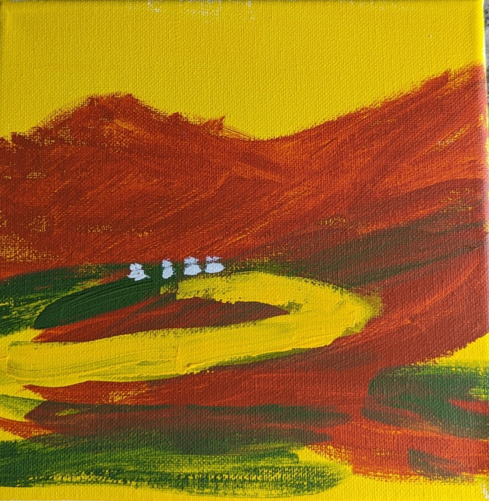
I haven’t painted (or drawn) for weeks, so today I was just playing with paint without any ideas in my head of what to paint. But after the red oxide paint dried, I rotated the 8×8 canvas, and it suddenly seemed to me like the Sangre de Christo mountains in New Mexico. To that end, I added the chromium green, the yellow “road” and the white dots (lights in houses along the road?)
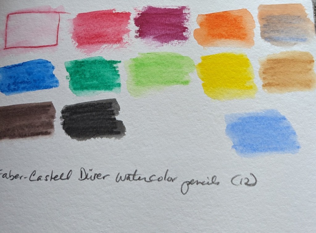
I’ve been enjoying my graphite Aquarelle pencils so well that I bought some watercolor pencils to try them out.
I purchased 3 different sets of 12 pencils: Faber-Castell Albrecht Durer; Caran d’Ache Museum Aquarelle, and Derwent Inktense Pencil Set.
I used the pencils on my 300-lb watercolor paper, applying water afterwards. One thing I noticed is that each 12-pencil set has relatively similar colors. The Albrecht Durer set includes a white pencil which I don’t see a lot of use for — unless you’re using it on toned sketch paper? My initial thought is I was gypped, lol.
The Derwent Inktense pencils, once wetted, are clearly more intense than either the Faber-Castell or Caran d’Ache pencils. On the other hand, the Faber-Castells seem to wash more smoothly (for lack of a better term) in that my back-and-forth pencil lines are less obvious than the Caran d’Ache or the Inktense pencils.
Now I need to try them out on some drawings to see how I really like them.


This painting was done by “winging it” — meaning, no specific reference photo. I wanted to try building out my sunflower with a base of green petals. Below is the result. I’ve layered the petals with Liquitex cadmium-free lemon, and cadmium-free yellow medium, as well as yellow ochre and dioxazine purple.
I did this on a piece of 6×8 300-lb. watercolor paper.


