Drawing Hair…With Willow Charcoal

Today I watched a “Drawing TogetherArtistsNetwork video on YouTube about drawing hair, which is something I have trouble with — I typically draw “spaghetti hair” which, of course, is totally wrong. Now I’m learning to more accurately draw hair by drawing the shapes and masses, then just adding striations.

The reference photo is here.

This study was done on Strathmore drawing paper, using only medium willow charcoal (Winsor & Newton) and my trusty kneadable eraser. I used a paper towel and my finger for blending. Willow charcoal, it turns out, is awesome! So easy to erase or rub out and start again!

I was not focused on replicating the profile, but rather getting a sense of the hair mass.

Christmas Ornaments: my own version

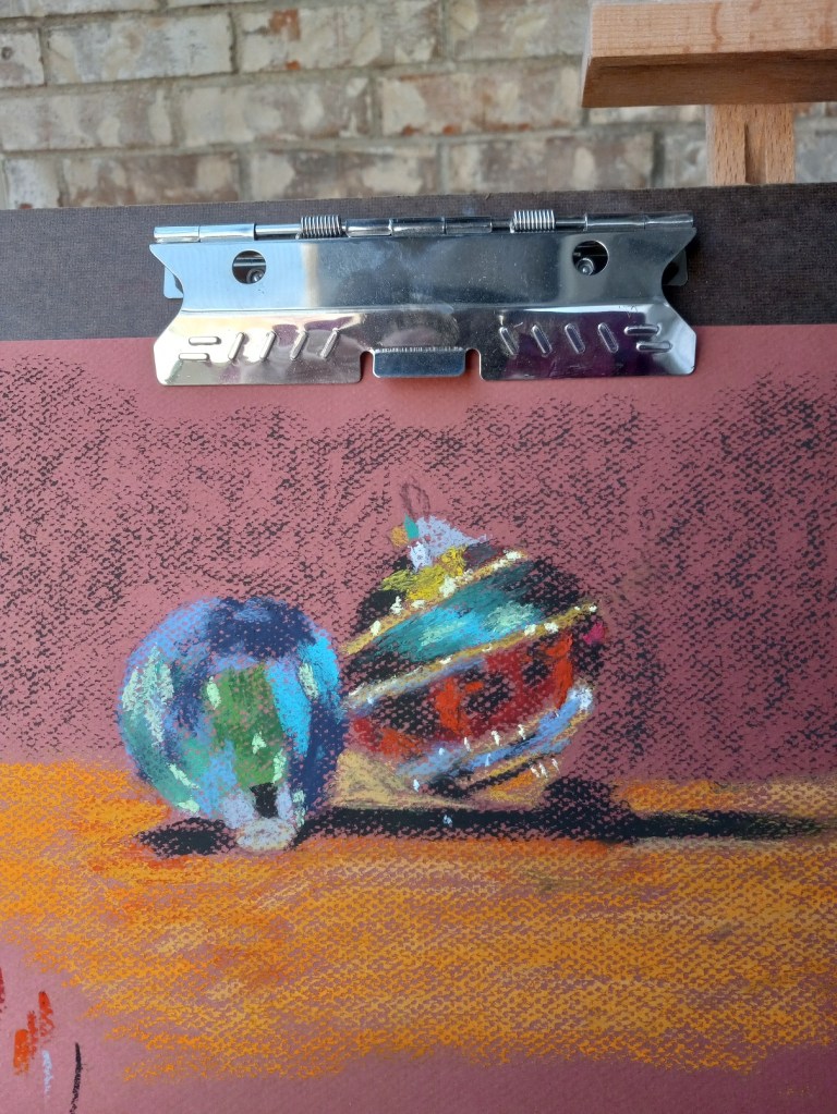
I used a Hahnemühle non-sanded pastel paper from my sampler set to draw the pair of ornaments taken from my fireplace decorations.

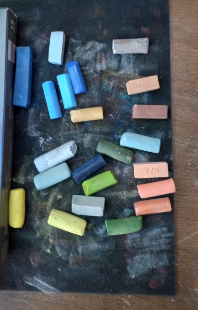
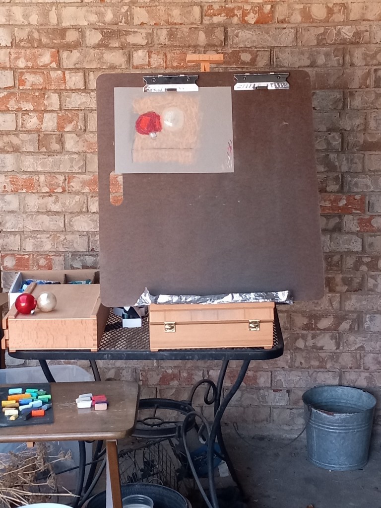
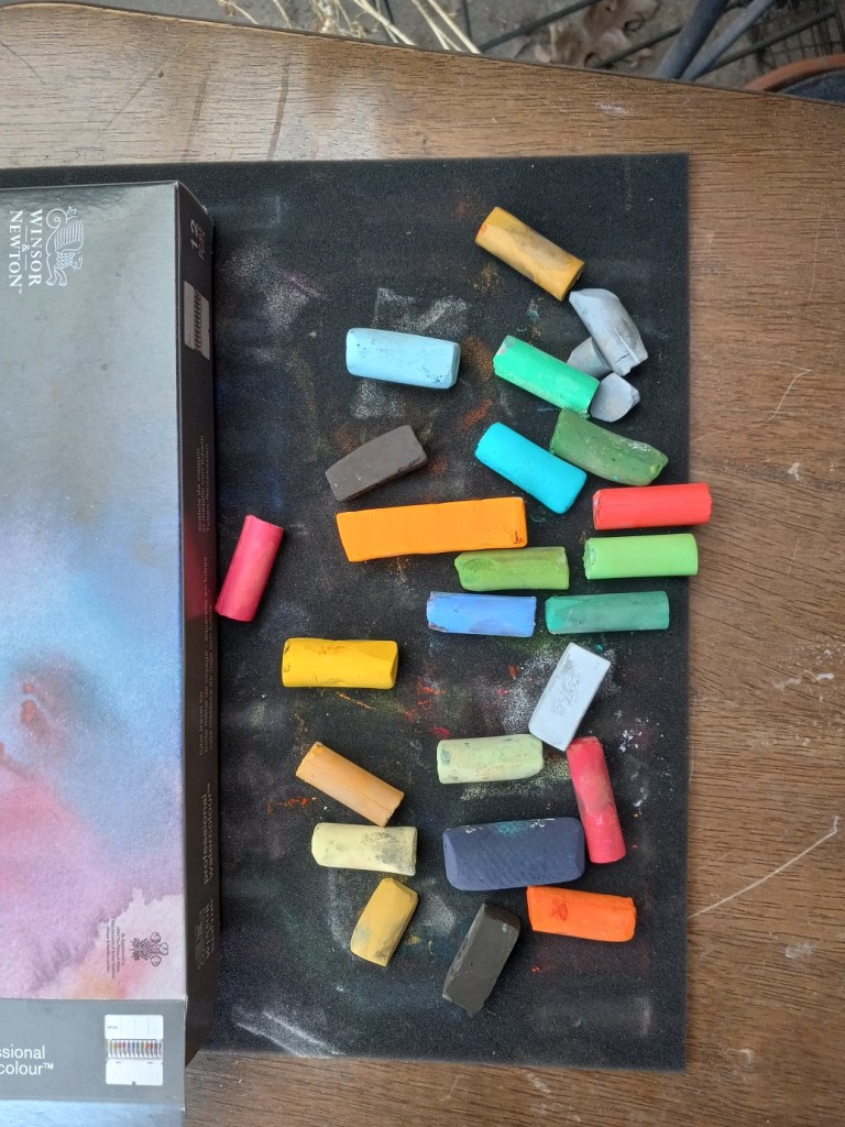
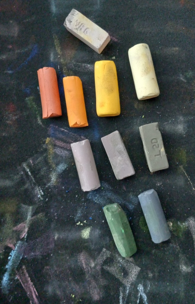
I took a photo of the entire easel scene; you can see the reference objects on the left. I also took a photo of the ornaments, and the color palette I used.

I was painting from life rather than the photo reference; the photo looks somewhat bluer and I was standing at a slightly different position taking the photo than when I was actually pasteling.

Christmas ornaments: Follow-along with Marla Baggetta

I watched Marla Baggetta’s YouTube video from December 2019 in which she did a pastel painting of Christmas tree ornaments. I then attempted to copy her work to get a feel for how she laid colors for each ornament.

My copied work was done on Canson Mi-Teintes (the Red Earth shade) on the “honeycomb” textured side because I messed up the initial drawing on the smooth side. The initial drawing was done using vine charcoal, and then I used the sticks shown below for color. It looks best from far away!

Next up is trying a painting using some of my own ornaments.

My First Landscape

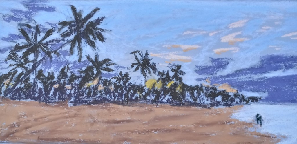
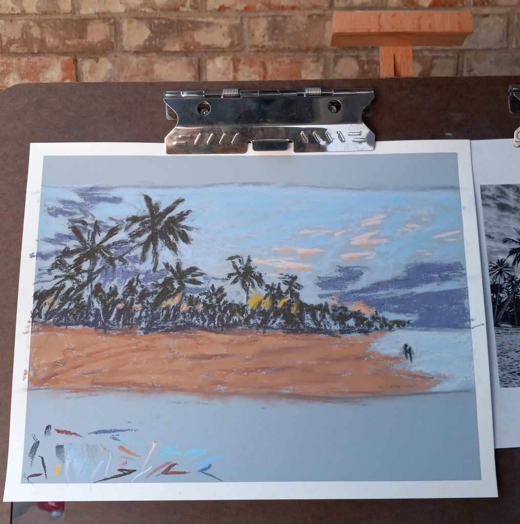
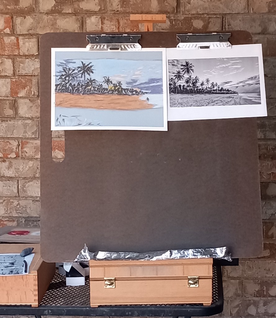
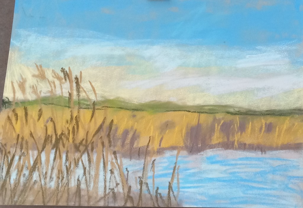
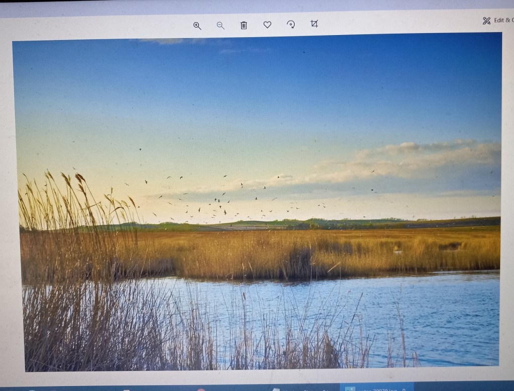
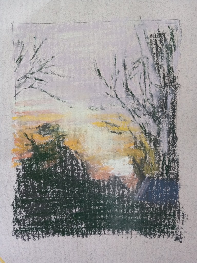
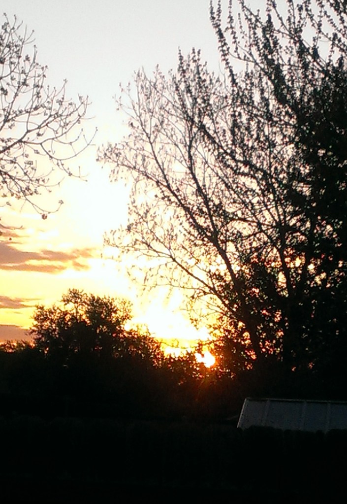
Today I did my own landscape painting based on a photo of a sunrise I took several years ago in our backyard.

I used Clairefontaine Ingres paper, which is unsanded, and not too bad. It was a pale tan color (and part of my unsanded paper sample I purchased from Jackson’s Art a year ago.) The initial drawing was done in vine charcoal. And I kept the size to 8×6.

Follow-Along: Gail Sibley’s Red Bowl

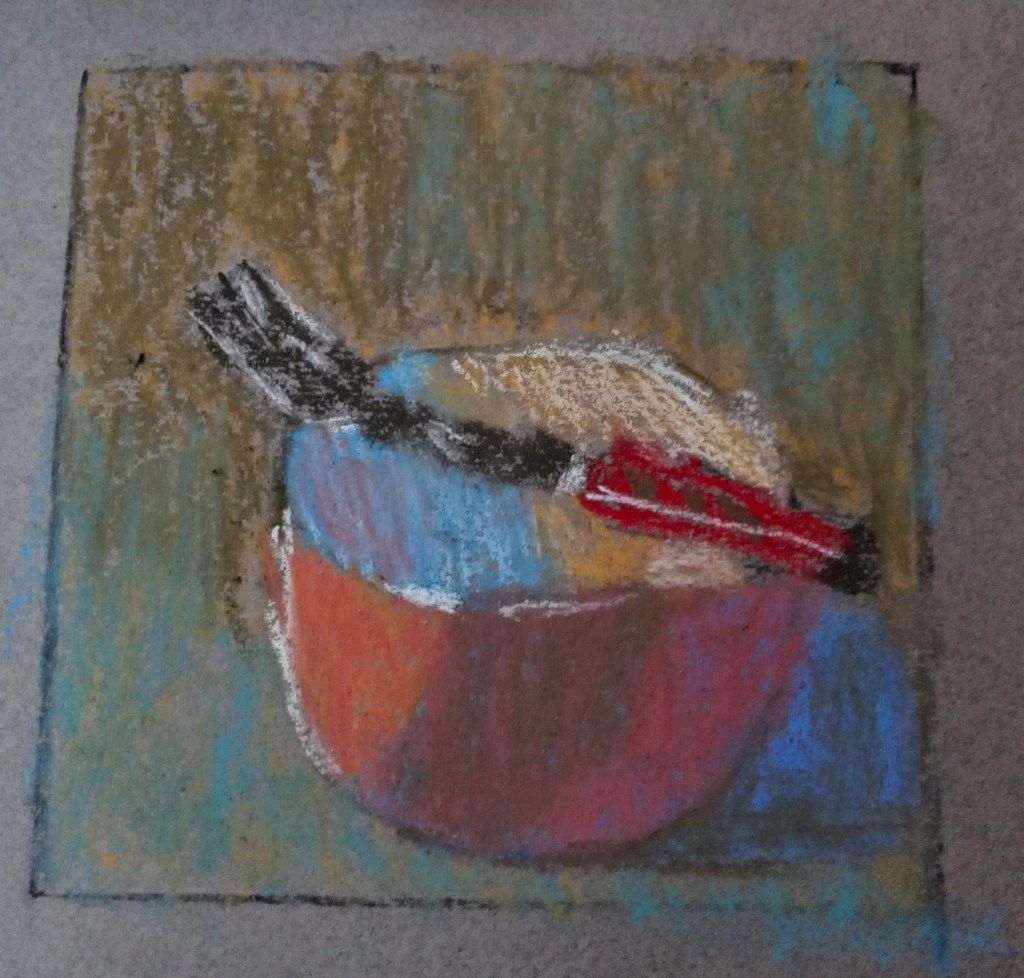
Gail Sibley has a video on YouTube wherein she uses white pastel paper, and a set of Terry Ludwig’s “Best Loved Basics” to paint a red-orange bowl with a fork balanced on it.

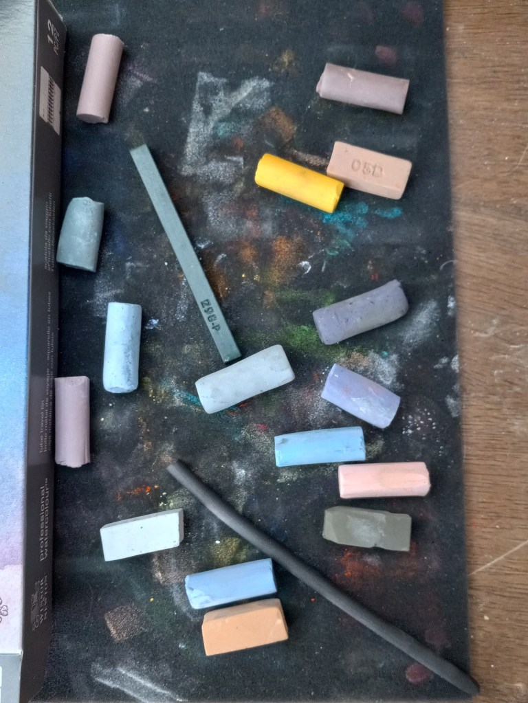
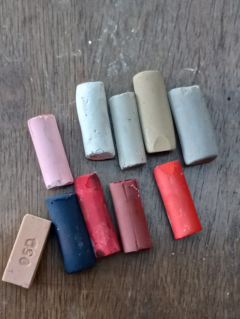
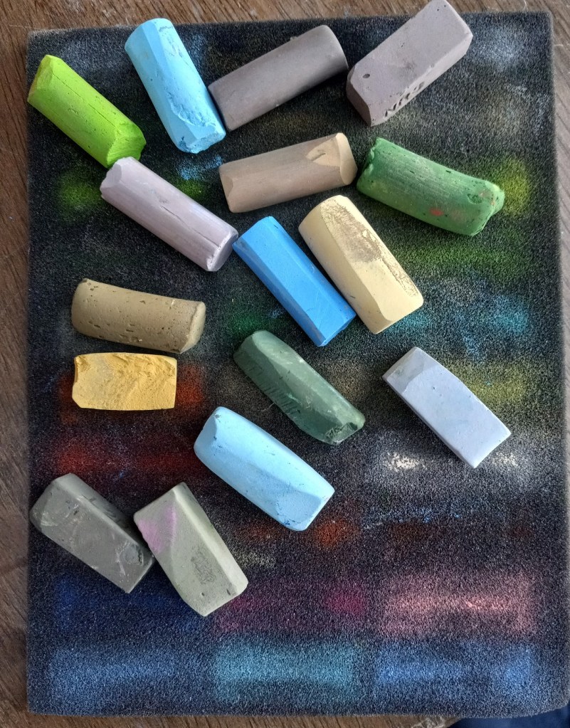
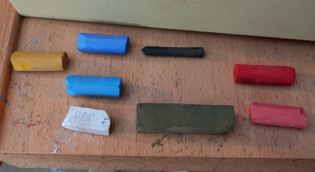
I decided to try my own hand at painting the red bowl. The paper I used was a gray-toned Canson Mi Teintes, and, since I don’t have Terry Ludwig pastels, I used a random set of 8 pastels (only 7 shown), making my best guess as to a close match to what Gail was using. I used vine charcoal to sketch the bowl on the pastel paper, and 2B charcoal pencil in the preliminary planning sketch.

I also created a grayscale version of the photo of the bowl, and the values are skewed. The background should not be darker than the cast shadow. Ditto for the shadow in the middle of the bowl, appearing like a gray stripe. It should not have been darker than the cast shadow.

I may tweak this painting tomorrow, if the paper can hold any more pastel.

More Studies: Using Canson Mi-Teintes

Today I used some of my pieces of Canson Mi-Teintes paper, after reading some of Karen Margulis’ blog posts about loving the paper.

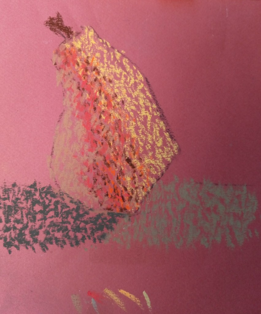
Since I’m still focused on pears and different mark-making styles, I decided to use stippling on a sheet of Terracotta tinted Mi-Teintes paper.

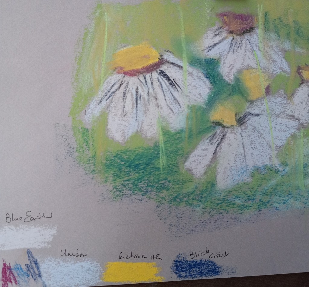
Then, after admiring the way Margulis makes her daisies, I attempted to copy her style (also on a piece of Mi-Teintes). I took Margulis’ advice to use a light touch, but I also did not do too much layering.

My experiment was largely to see which pastels work best on this paper. I noted the results at the bottom — Blue Earth and Richeson Hand-Rolled covered the paper much better than Unison or Blick Artists’ Soft Pastels. (Of course, that may also be the function of my skill level.)