The “500 Challenge” — or maybe just 200?

I am currently reading Maggie Price’s 2007 book Painting with Pastels: Easy Techniques to Master the Medium. In it, she mentions taking the “500 challenge” — something she learned from attending a demonstration by pastelist Eric Michaels. The idea is, you paint from life, “en plein air” — and do it 500 times. Ideally, you work small (8×10 or smaller) and fast (no more than 1 hour). Finishing a painting is not the goal; rather, the point is to just get out there and paint. Regularly.

Maggie says, “It was the single best piece of advice I ever had about painting”. (p. 117) She also says not to worry about finishing any given piece — she called them “color studies” — and to number and date them so you can go back and see the change in your work. She noticed a change in her own work after just 50 paintings, with improvement in skill markedly showing at 100 and again at 200.

This actually relates to Karen Margulis‘ “daily painting” concept on which she built her blog. The more you paint, the quicker you’ll accrue skill.

To that end, here is #1 of my “plein air” color studies — of the neighbor’s oak tree I can see part of from my backyard. Right now, I’m shooting for 200 plein air “color studies”. We’ll see what happens after I reach #50, #100 and #200.

A Karen Margulis Follow-Along On Patreon: A Bird’s nest

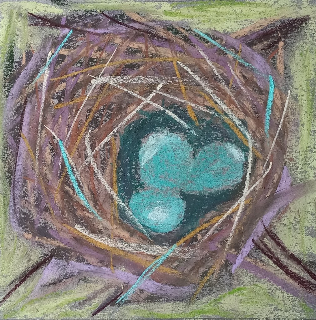
Today I painted a bird’s nest based off of one of Karen Margulis‘ paintings. The step-by-step demo is on her Patreon site and can be accessed here (paywall; subscriber site). All the colors used are based on her work. Karen says in this Patreon post: “I DO give permission for you to share your paintings done from my demos on social media provided that you credit me and link to this Patreon group.
I did this practice work on a gray-toned sheet of Canson Mi-Teintes.

We had a robin who nested in our persimmon tree this past summer and I took pictures of the babies in the nest, as well as the mother bird sitting on the nest. Now that I have an idea how to paint a bird’s nest in pastel, I’m going to use my own reference photo. We had a robin who nested in our persimmon tree this past summer and I took pictures of the babies in the nest, as well as the mother bird sitting on the nest

The sticks I used
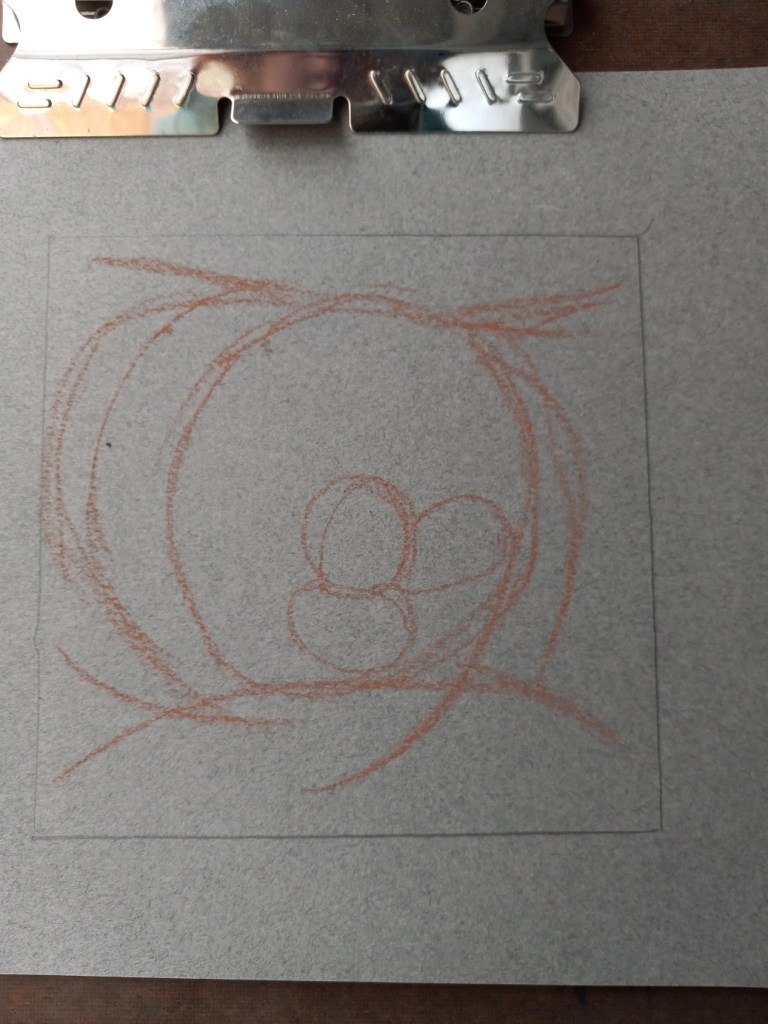
the initial sketch
my copy of Karen’s work

Rethinking the Reedy Lake

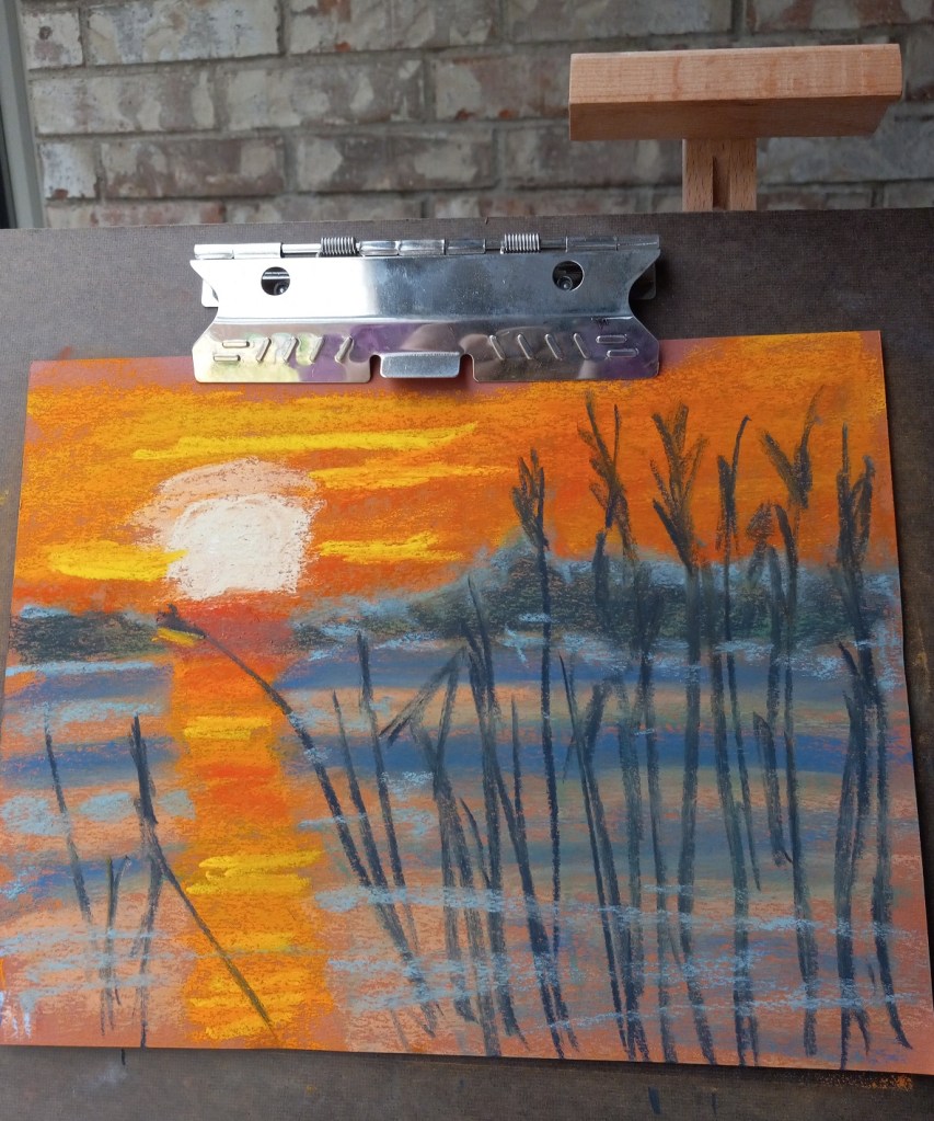
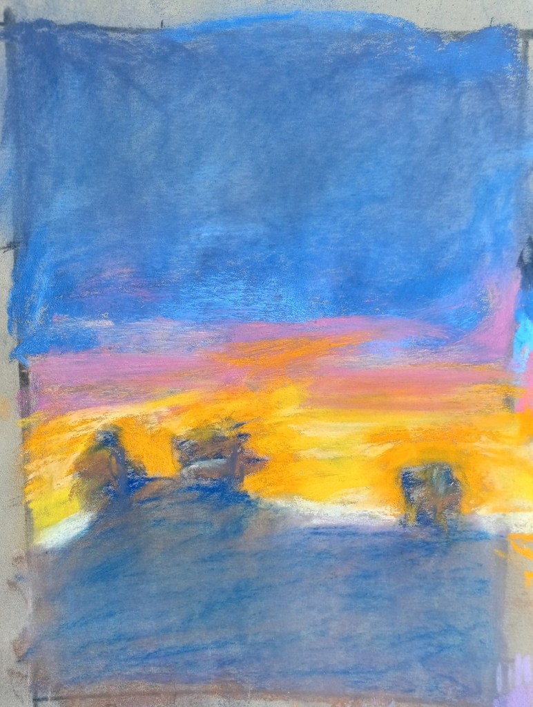
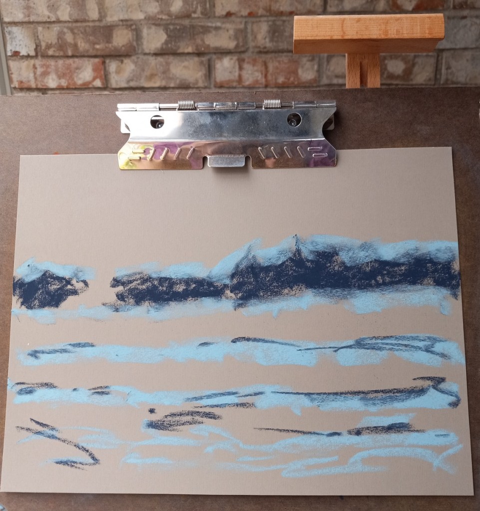
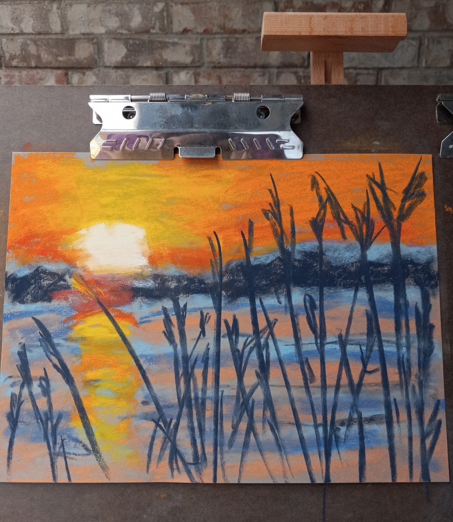
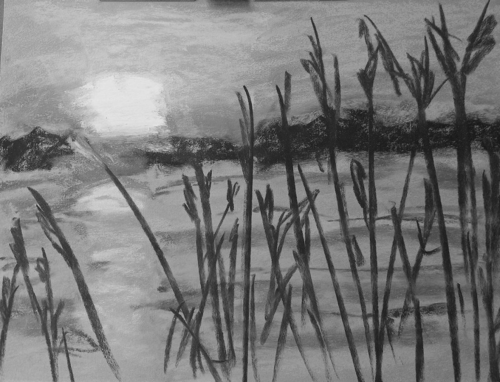
There are so many things wrong with this picture — where do I begin?

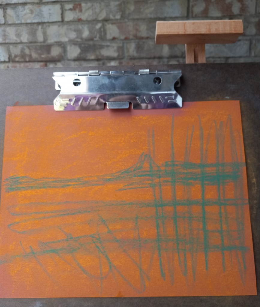
underpainting on Canson
finished painting on Canson

First of all, were I to do this again — IF I did the NuPastel underpainting — I would blend it in to the paper more effectively. I think I’d stick with the orange, but am undecided about the blue. I might try a medium green since green complements the red of the paper, and would blend in with the orange NuPastel and with the dark blue reeds.

The second, more obvious, item is the sun’s reflection on the water. That should have been a vertical line straight down the paper using the side of my pastel stick. And the water should have been painted in smoother, broader strokes. In fact, it might be better, compositionally, to assume still quiet water rather than the rippling water seen in the reference image.

I will have to redo this work and see what develops — hopefully, a better picture!

Rethinking Composition: Poppies at Lake Louise

Okay, I think I’ve figured it out! The composition in the color study from the last post is utterly BORING!! Not to mention the dark mountain shapes looming over the scene… they just distract. The dark shapes take the viewer’s eye completely away from what I wanted to be the focus — the poppies against the lake. Worse, they look so forbidding and foreboding that it is completely off-putting — I just want to look away at something else entirely!

I’m cropping the photo further so that only the poppies, the foreground grasses (for the yellow-green counter-balance to the red flowers), and the teal blue lake show.

As with the color study, the tree at the right of the photo will be excluded in the painting I do.

UPDATE (next day): Now that I look at the photo again, I might just leave the tree. It occurs to me that what I know to be the lake might instead be seen as a smaller pond with distant mountains (the darker blue water current) and a blue sky (the lighter blue at the top of the photo). Hmmm. Something to think about.

Using NuPastel as Underpainting… Paper Differences

Sometimes doing the NuPastel thing doesn’t make sense to me. I noticed on one of my follow-along courses that the suggested paper to use was dark blue Pastelmat, and the suggested underpainting was to be done in Blue Spruce NuPastel. But the instructions in the form of a PDF clearly showed a taupe-colored paper, because Blue Spruce doesn’t really show up on a dark blue paper!

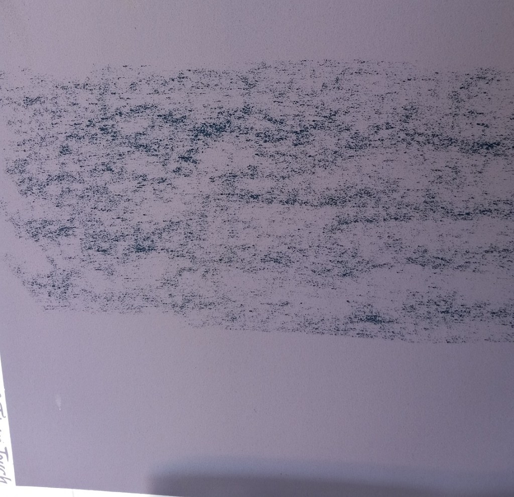
In any case, I tested the NuPastel by using a light touch on two different papers: the dark blue Pastelmat (where it went on “like butter”) and gives more coverage, even without rubbing it in, and the twilight Canson Touch, where it was hard and scratchy, and seemingly added no value at all!

PastelMat
Canson Touch

I later attempted to brush it out of both papers, and failed. All it did was smear and grind in. Ugh!

Evaluating the Follow-along Sunset

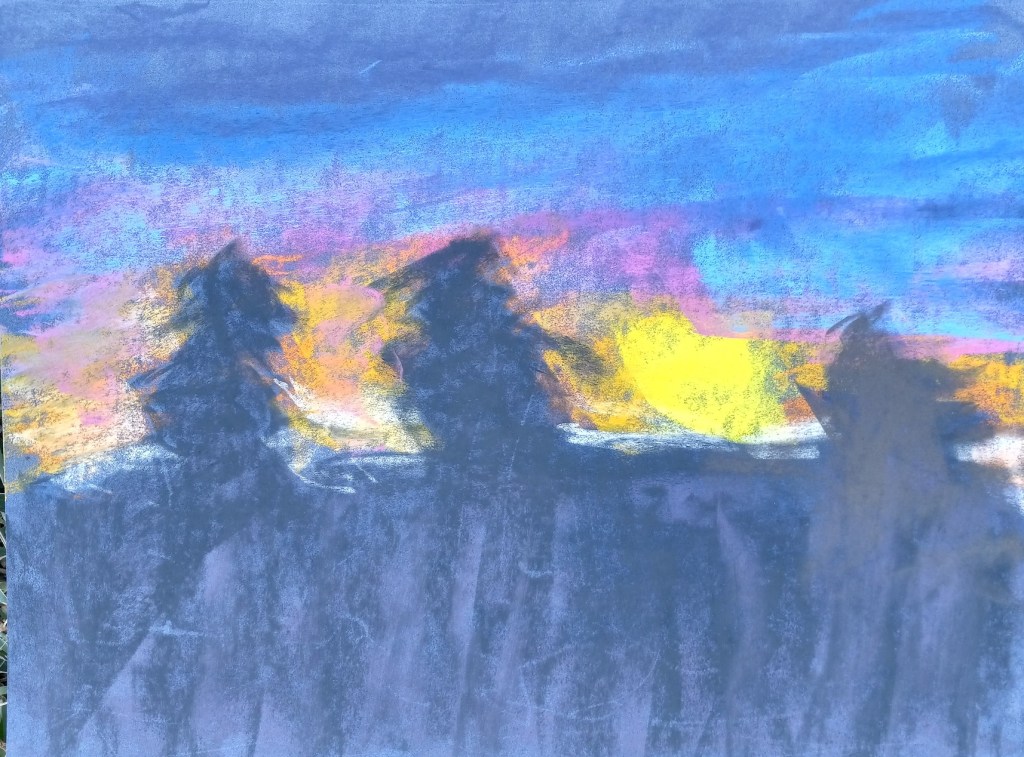
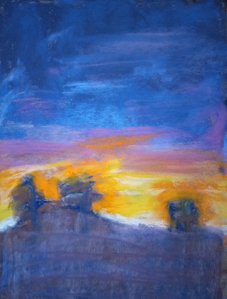
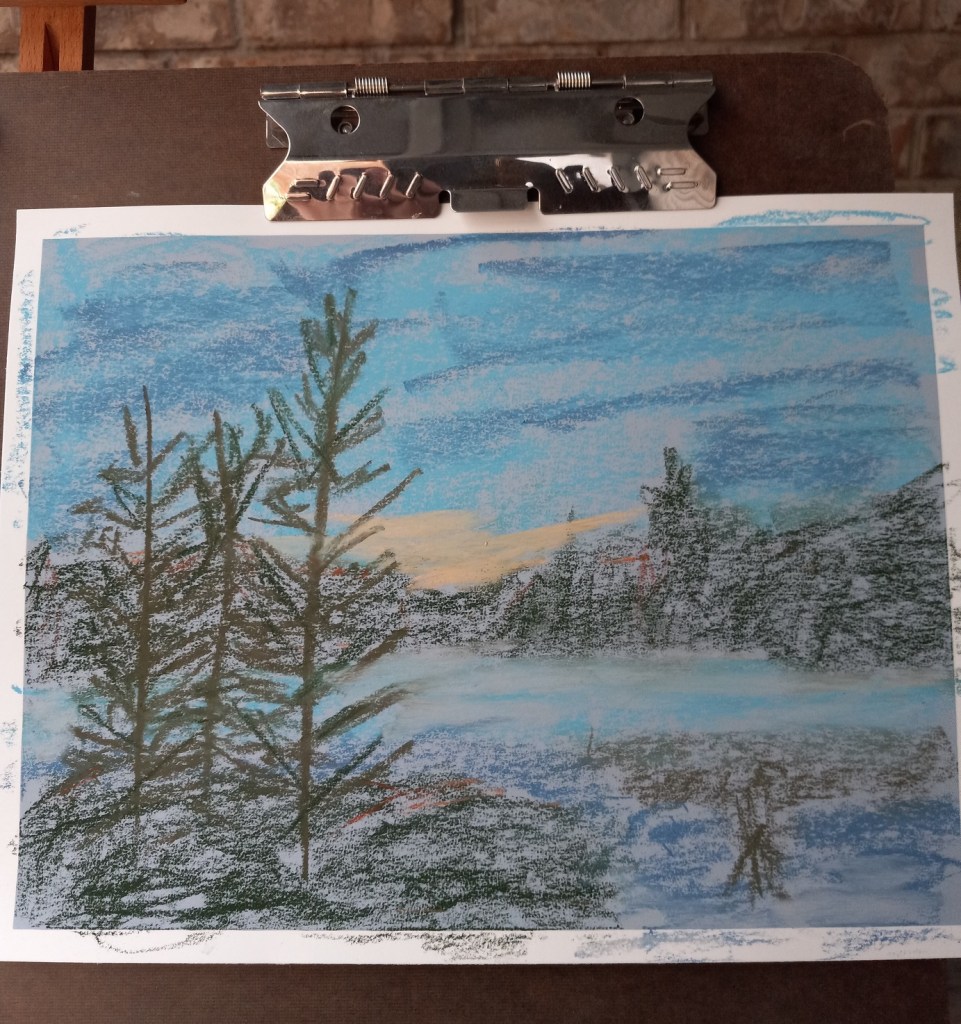
Two of the things I recognized as being at issue with my follow-along painting from Marla Baggetta’s Sunsets in Pastel course are: my heavy touch (which led to “mud”) and my poor job at the underpainting.
The original picture is below on the right. To counteract the muddiness, I experimented with removing excess pastel in the ground area as well as the upper sky by using an inexpensive bristle brush.

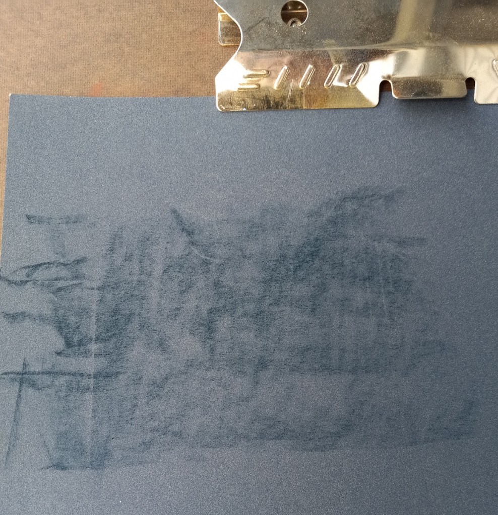
The brush-off showed yet another problem — the underpainting which amounted to nothing more than a scribble. I should have done a wet wash, or a dry wash and not leave the scribbles!

That said, another thing was that I used the Blue Spruce NuPastel on Pastel Premier paper (320 grit); I had difficulty moving the hard pastel around.

So I decided to make a second attempt at the scene, being careful to keep a LIGHT touch.

After brushing off excess pastel

3 Times a Hot Mess… But at least I’ve Learned something!

This project was based on an image by MustangJoe from Pixabay. I used Colourfix Smooth in Blue Haze all three times, as well as using the same palette.

All three efforts were failures, but at least I learned a few things.

Attempt #1

First time around, I did an underpainting (of the dark areas only) using a Blue Violet NuPastel. Using this color was a BAD idea! Why? Because I would later add a dark gray-green, and a reddish brown on top of that blue violet, which made mud. Ugh!

First time around, I also used too heavy a hand, in effect scribbling with the pastels trying to cover the paper. Bad idea — too heavy a hand can ALSO create mud.

First time around, the pine trees were cartoonish. But I was so frustrated with the mud mess I didn’t care at that point!

Attempt #2

  • My second attempt was successful in that I maintained a much lighter touch. But I still had mud because I still did the Blue Violet underpainting before using the dark green and the reddish brown.
  • The pine trees were rendered a little bit more like the photo, which pleased me.
  • I struggled with laying down color with certain pastel sticks. I ended up mostly with broad strokes done vertically, which doesn’t really work for the sky.

Attempt #3

  • This time I skipped the underpainting — whew! Still had mud because the gray-green and the orangey-brown are NOT a good pairing!
  • Had better luck with making marks for the sky, but the colors are not quite right to my mind. In analyzing the source image, I realize there is more of a lavender hint to the darks rather than green brown.

I need to try colors with more purple and less green and brown. I may need to experiment with papers which have more grit.

Reference photo
Sticks used
Violet Blue NuPastel

Attempt #1
Attempt #2
Attempt #3

Two Landscape Studies: Different Papers

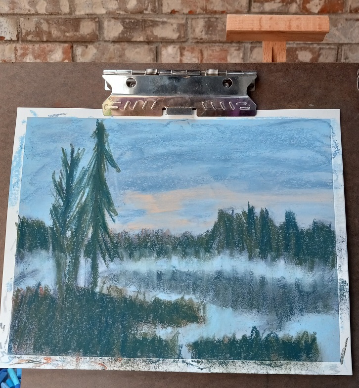
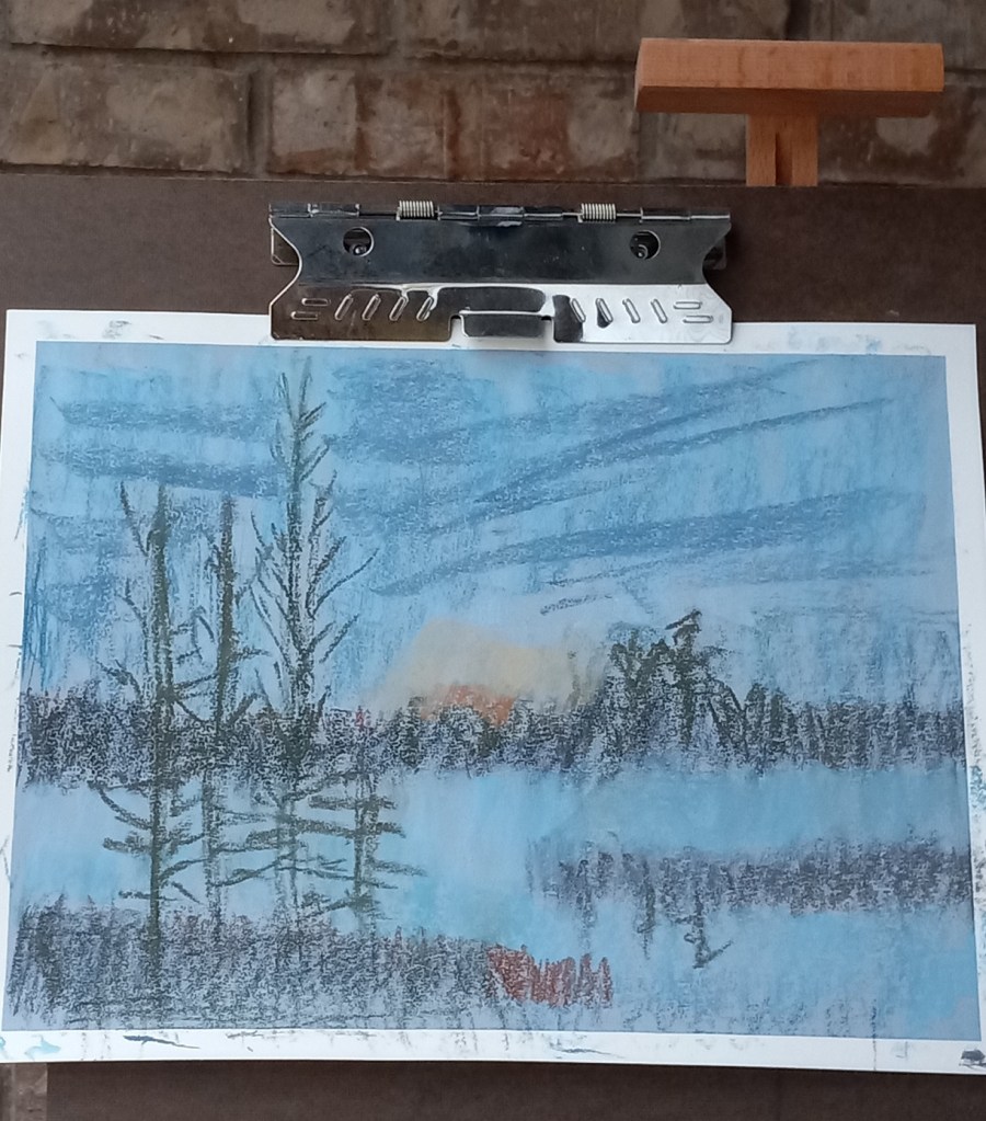
Today I did two landscapes using the same reference photo, and the same pastels, but two different papers and underpainting.

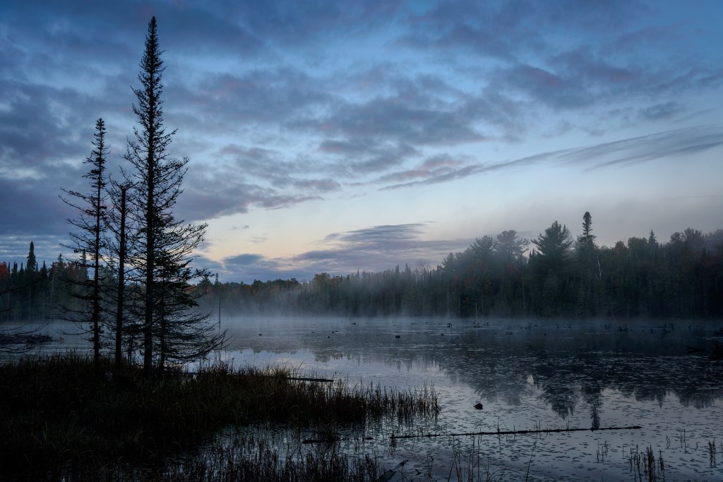
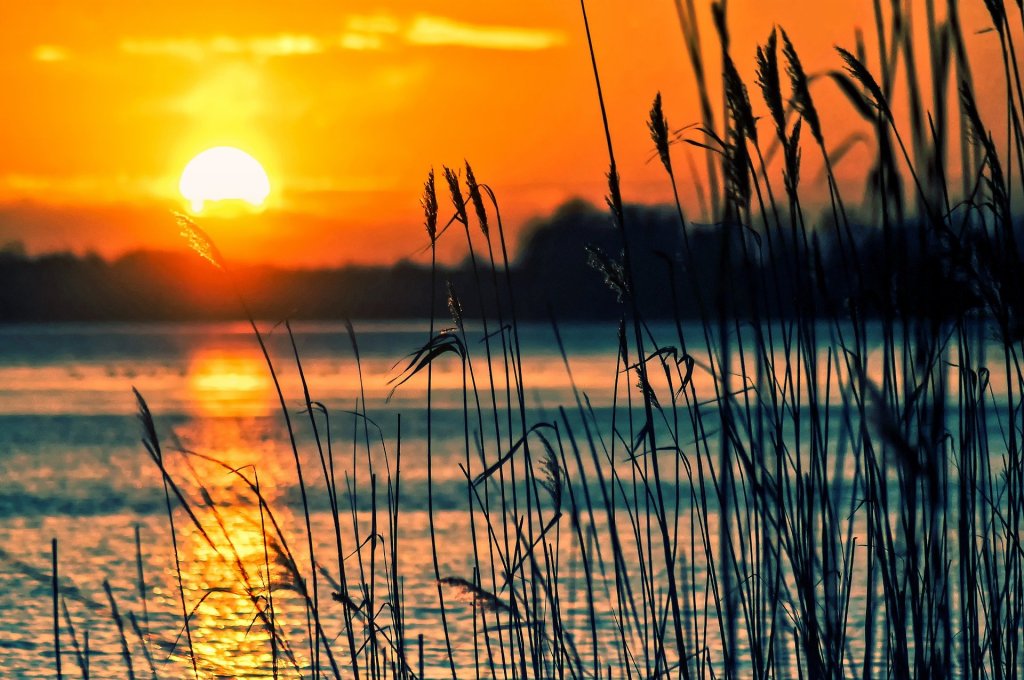
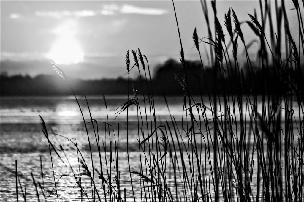
The reference photo was from an image by Tomasz Marciniak from Pixabay. I made it grayscale to verify there was sufficient difference in values.

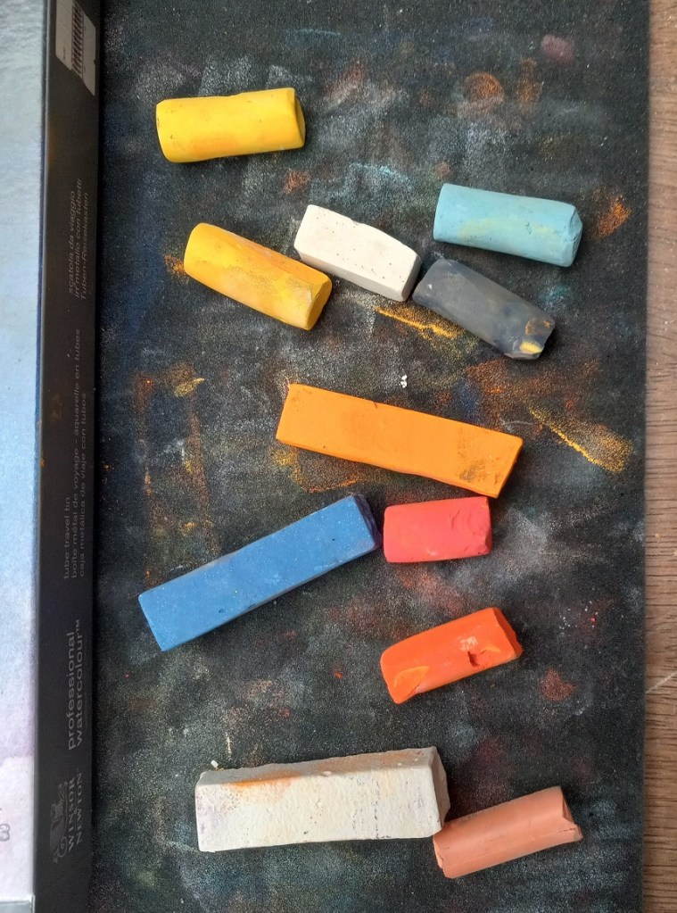
The pastels I used were Great American, Blick Artists’ Soft Pastels, Richeson Hand-rolled, and Blue Earth.

Pastels for sunset at the lake

The first painting was done on Canson Mi-Teintes (smooth side) in the Red Earth tint. I did an underpainting with NuPastels (212 – Deep Orange, and 378 – Erin Green).

The second painting was done without any kind of underpainting, and using Pastel Premier paper in Italian Clay, a 320 grit sanded paper.

Here are the 3 pictures in grayscale: the original photo, the pastel on Canson paper, and the pastel on Pastel Premier.

Here are the three images in color (same order):