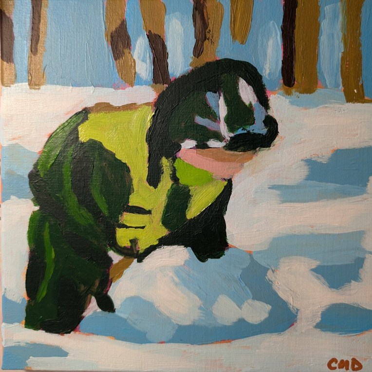
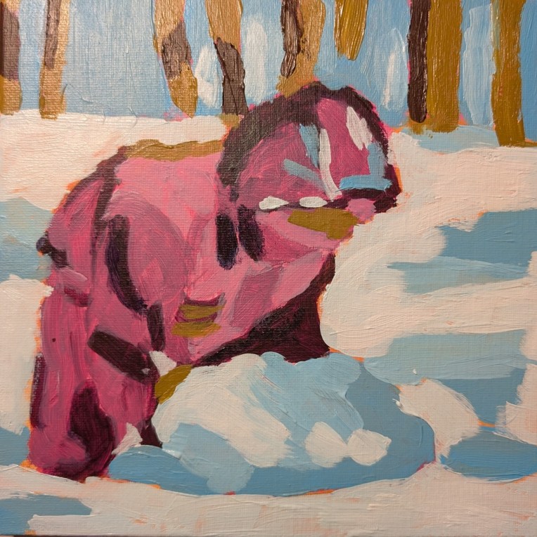
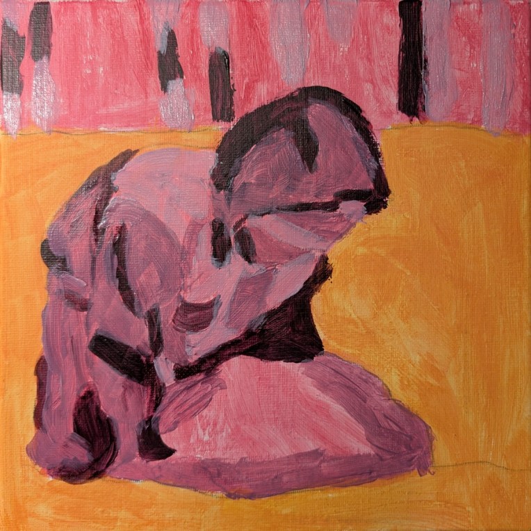
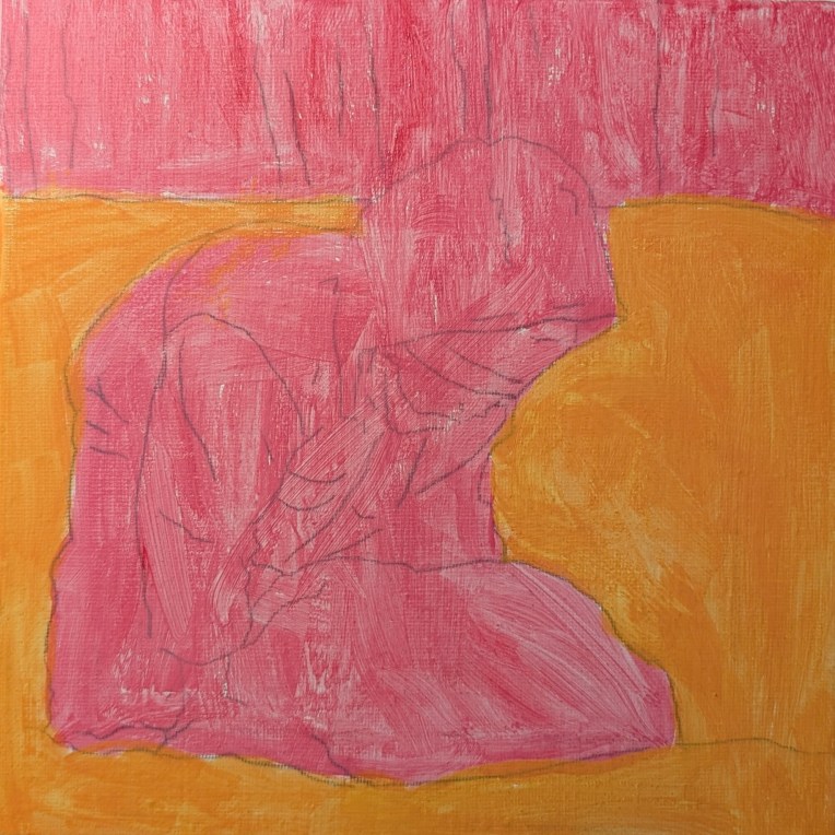
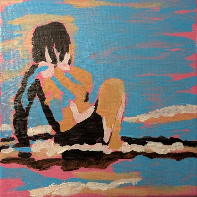
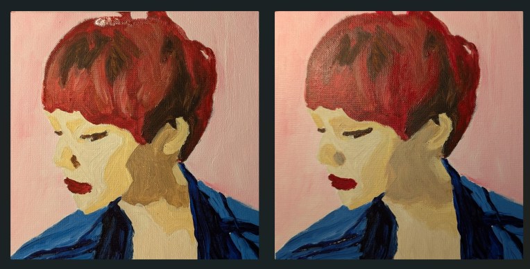
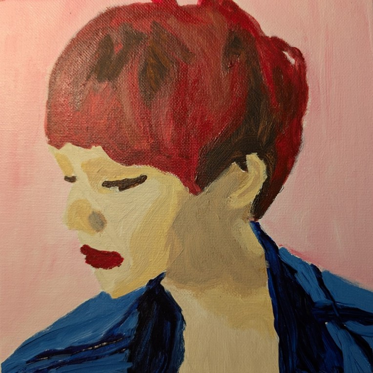
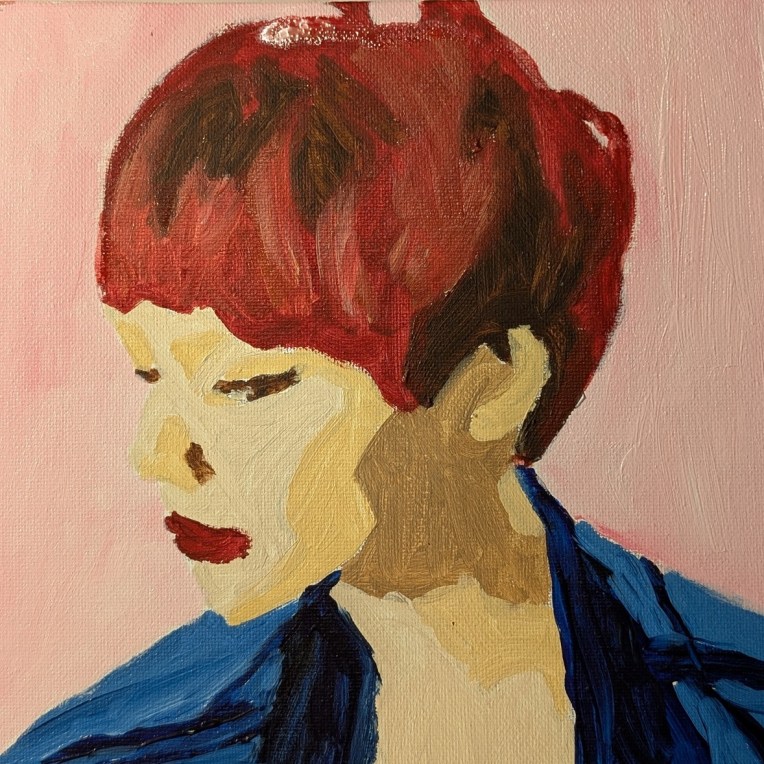
Travels Near & Far – Dianna Shyne – Week #1 (mini Painting challenge)

To boost my confidence after not painting for over a year I signed up for another 52-week mini painting challenge at Acrylic University. This one is called “Travels Near & Far” and Dianna Shyne is the artist. I like her paintings almost as much as I like Jed Dorsey’s, so why not?

Week #1 (called “Last Rays”) comes from a reference photo she took on previous visits to Prince Edward Island. I’ve been to PEI myself — couldn’t resist checking out the tourist attractions related to that famous fictional character Anne Shirley (aka Anne of Green Gables) — so I understand the appeal.

This was painted on a 6×6 Claybord panel, toned in pink.


52 Mini Paintings Challenge: Week #38

I went the entire 2025 calendar year without painting AT ALL — I was in ICU at the first of the year, and later, dealing with my dad’s metastatic cancer and eventual death. Just wasn’t inclined to pick up a brush.

Back in 2024 I started Jed Dorsey’s mini painting challenge series, but about halfway through the year I got bored of copying someone else’s artwork, so started skipping around with the mini challenge weeks. I only did about half of the 52 so now will do a few more of the remaining — those that most appeal to me.

This is the week 38 painting for Jed Dorsey’s Mini Painting Challenge at Acrylic University. It’s called “Mountain Atmosphere” and is based on a reference photo by Ravi Pinisetti. 6×6 canvas panel, toned in a medium-dark gray.

Holiday Candy… Acrylic University Challenge

This was painted on a 12×12 canvas panel, and is based on a paint-along work done by Dianna Shyne in Acrylic University for a winter challenge back in December 2023 (before I had joined AU as a member).

I started out following her, but then I gave up and focused just on the reference photo for guidance.

My husband thought they were Christmas lights until I had completed the tags. (That said, I’m now working on a piece that IS of Christmas lights, part of this year’s winter challenge. Hopefully, I’ll have it done before Dianna’s paint-along this Friday.)

Beach Birds

As with my sunflower painting posted the other days, this is on a 6×6 “Claybord” panel with the undertone painting done in metallic paint — this time silver. I still don’t care for the slippery metallic paint and/or the Claybord.

The beach birds are based on one of the 7 challenges demonstrated at the 2024 Summer “Challenge” at Acrylic University. For drawing out the scene the birds and key lines of the waves), I used a Posca paint pen (uni® POSCA® PC-5M, Earthtone Water-Based Paint Markers (8 Pack)) in a navy blue color that I bought at Michael’s.

Painting the scene, I used just 4 colors: Ultramarine Blue, Anthraquinone Blue, Payne’s Gray and White.

Big and Bold: Chickadee

This bird was painted on a 11×14 canvas which I toned with Blick Studio neutral gray — but I should have added at least one layer of gesso. (Cheap “pre-gessoed” canvases are less and less appealing to me.)

This is from another class on the Acrylic University website, originally shown to the public on YouTube for a brief period of time back in January 2022. The focus of the week’s classes was “Radiant Landscapes” and this class was about going big and bold with your brushstrokes to paint a chickadee.

There were 4 ways suggested to “go bold”: 1) limit yourself to 30 minutes painting (and that’s it, no going back later); 2) Limit yourself to a certain number of brushstrokes — say, 50, or 75; 3) use a large brush throughout; 4) paint with your non-dominant hand

I went with a larger brush than I typically use, and I had a lot of fun with this painting. It makes me happy to look at.

52 Mini Paintings Challenge: Week #19

This is the week 19 painting for Jed Dorsey’s Mini Painting Challenge at Acrylic University. (I’ll get back to weeks 17 and 18 some other time). It’s called “Roses for Mom” and is based on a reference photo by Ann Dorsey. 6×6 canvas panel, toned in Naphthol Red.

I listened to the video of the class weeks ago — we’re already up to week 23 — and just used a grayscale printout of the photo as my reference. For the roses, the darkest red is Quinacridone Magenta, otherwise it’s just Naphthol Red with varying amounts of Titanium White.

This was a fun one to paint.

Monochromatic Man… a “Fresh Paint” lesson

Back in March, I posted about painting a vase of purple tulips, from a one-off online class by Ali Kay. I had decided I would consider joining her “Fresh Paint” membership, which from what I can tell operates more or less like Jed Dorsey’s Acrylic University.

So, the doors opened for a limited time last week, and I joined for a year. We’ll see how it goes. I like the work she posts on Instagram, and I like her subject matter — a lot of people and animal portraits, as well as flowers.

This painting is actually based off of an Unsplash photo. I struggled a bit with her process, which seemed a little bit paint-by-number to me, but I wanted to try it. Hardest for me is remembering to leave touches of the underpainting visible, as I’m used to often painting on white canvas and skipping the whole underpainting thing. Also I rarely layer to the extent she does — but perhaps I should.

She also primarily works from photographs, and transfers the key lines from the photo to the substrate so you focus on painting rather than drawing. Also, she works on gessoed wood panels, using fluid acrylics, while I’m working on canvas using heavy-body acrylics so the flow is obviously different. (It’s too hot where I live to use a lot of fluid acrylics — they dry in something like 2 minutes.)

I’d like to try doing this on a wood panel to see the effect; I might like it. But I’ve got a stash of canvas to work through first.