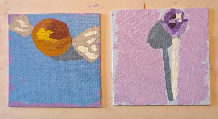
I just discovered this lesson on the Fresh Paint website, and thought I would knock out two of the four items (I’m skipping the barn and the autumn leaf for now) while I decide what to paint next, and draw out anything I need to draw out. Both of these pieces of candy were done on 5×5 canvas panels. The orange candy was done in Burnt Sienna, with Cadmium Yellow Medium added to lighten and then further lighten. The lollipop was done in Dioxazine Purple with Titanium White to lighten consecutively.
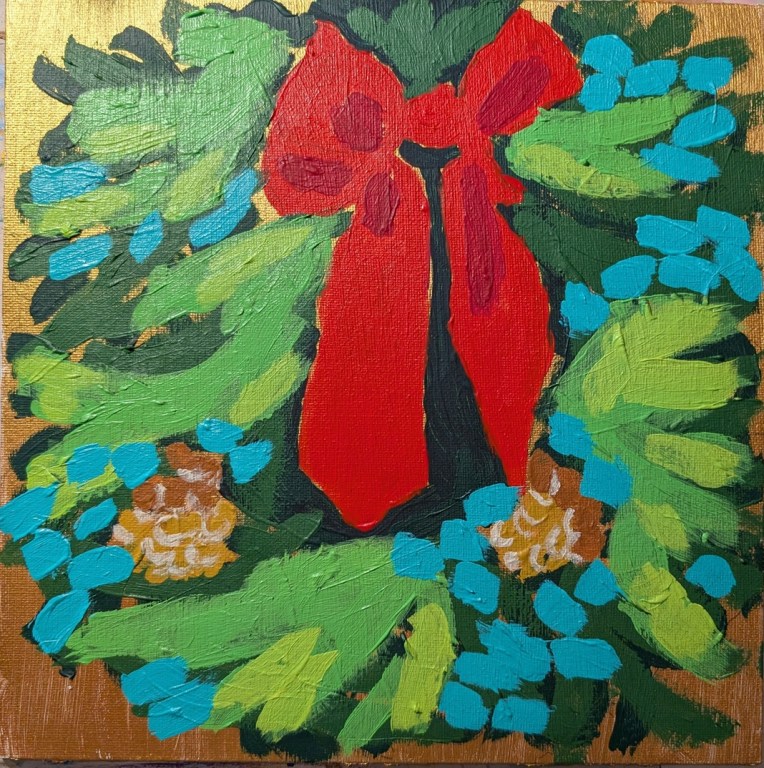
This wreath is based on a photo by Tim Mossholder on Unsplash, but I also referred significantly to the painting that Ali Kay did in the Fresh Paint class. Unfortunately, too many layers when using heavy body paint isn’t so smooth, so ridges do show, which is irritating.
My effort is more impressionistic than even Ali’s so one just gets the sense of green, but not pine boughs and various evergreens. Oh well, moving on, and glad to have put to use this canvas with the gold metallic paint!
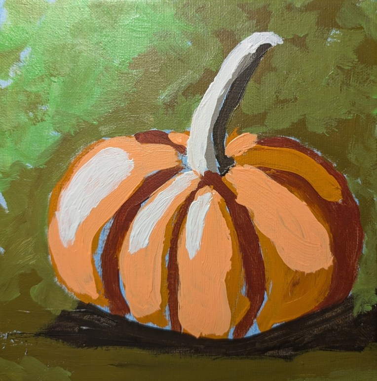
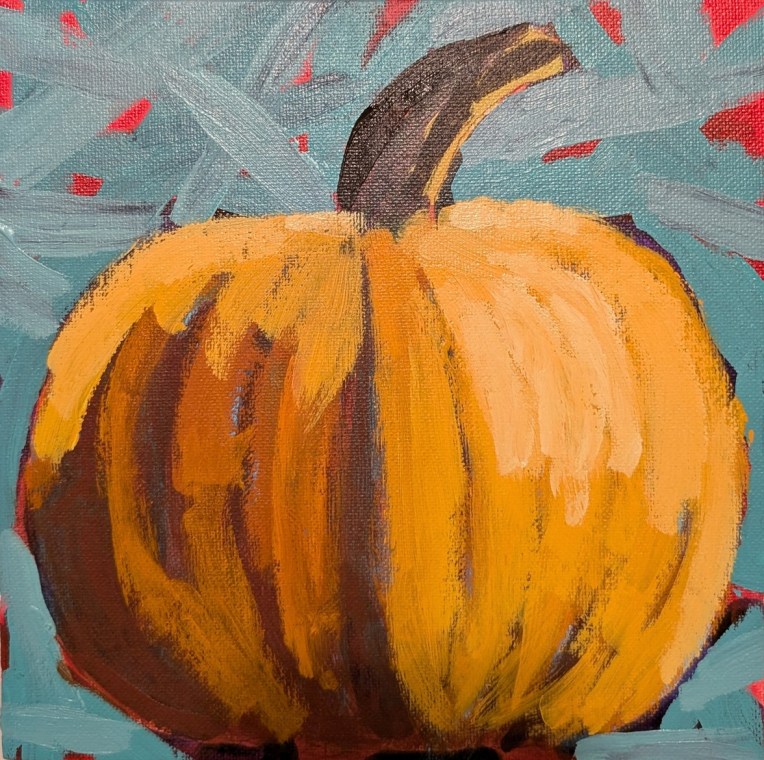
I had a lot of fun painting this one and I’m quite satisfied with the result — although at first, I thought “small pumpkin, ugh, how boring”. This was one of the offerings of Paint Week ’26 that Ali Kay Fresh Paint was offering the last week of September. Mine is not exactly like hers — partly because I don’t want to copy exactly, and partly because she uses Golden Fluid Acrylics. While I have some of those, mostly right now I’m using Liquitex Heavy Body (although I have no particular attachment to any given brand. So, naturally, my colors were different.
The olive gray-green was made from Raw Umber and Cad Yellow Medium; I then lightened it with one of those pre-mixed paints all the brands have (in this case, “Vivid Lime Green”). In the upper left corner, it’s mostly straight Vivid Lime Green (which is a mix of phthalo green, titanium white and the yellow PY97).
My underpainting was cerulean blue; I don’t particularly care for the magenta that Ali uses in a lot of her paintings. It was difficult not to paint over all of it, but I managed, and I’m pleased with how it turned out.
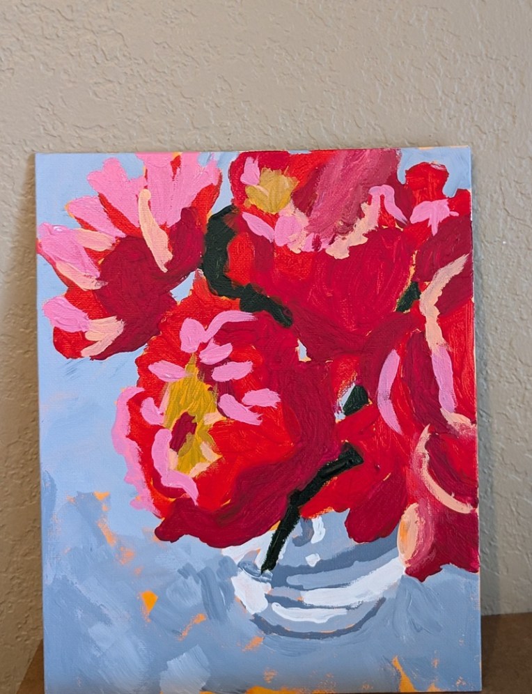
Today I finished the “Peony Bouquet” painting from Ali Kay’s Fresh Paint class (which will actually take place in October). I used her modified reference photo, as well as her own painting (the orange underpainting, the blue-gray background, etc.) as my jumping-off point.
What looks black in the photo is actually dark green. The reds are a mixture of Quinacridone Magenta (PR 122), Pyrrole Red (PR 254) and Quinacridone Rose (PV 19).
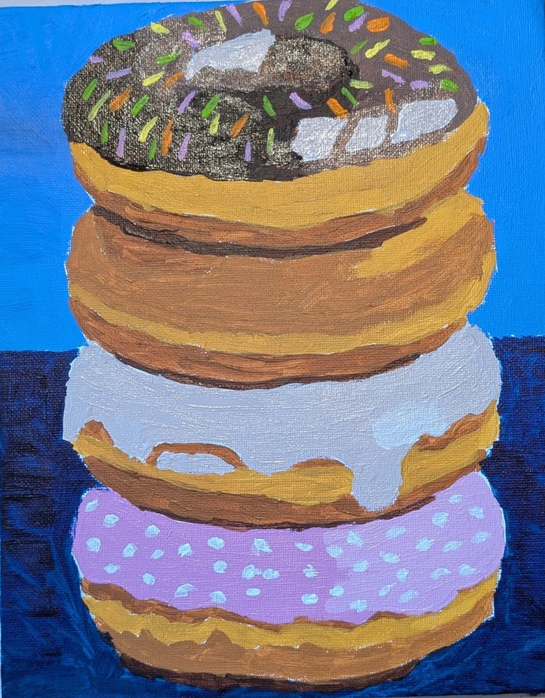
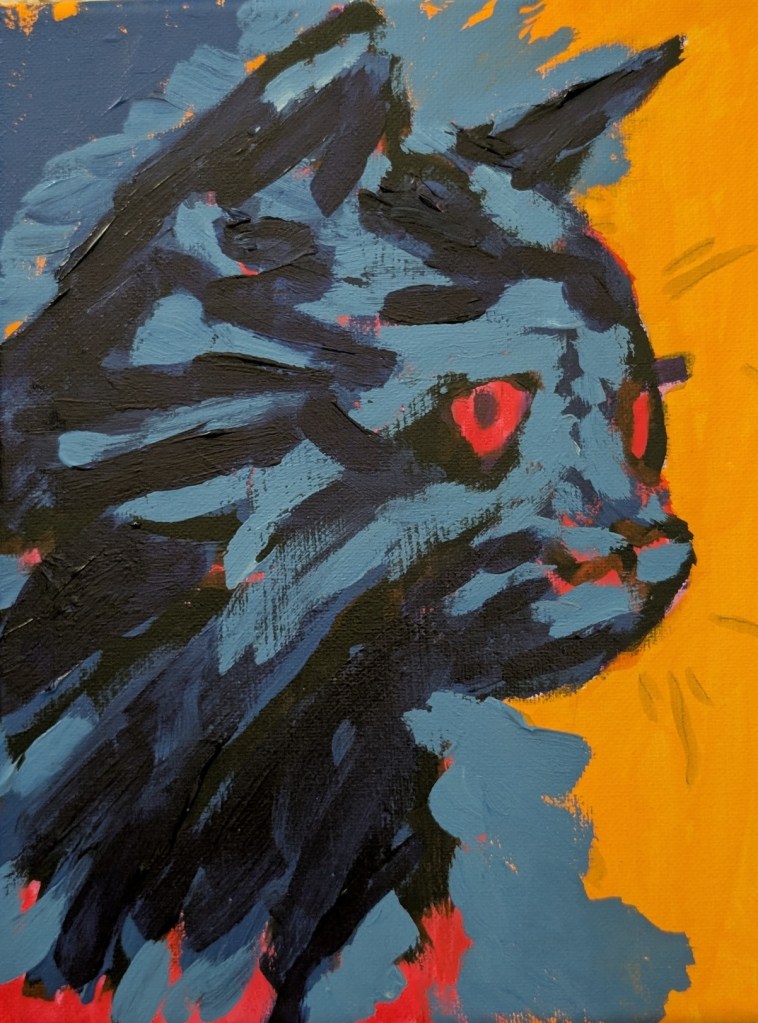
I got this reference from a January 2026 Open Studio Hours Session for Fresh Paint VIP members. I didn’t attend the session, and went my own way with the colors. This was painted on an 8×10 canvas panel.
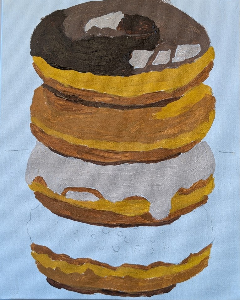
I painted glazing medium on top of the dark paint after it was dry — turns out that’s a mistake. (Hence the weird blur on the finished painting on the left.] It’s better to mix in the glazing medium with the paint so that it ends up shiny and glossy like frosting. Live and learn! I may redo when I have more time.
I’ve completed the Fresh Paint pumpkin and am ready to move on from the Halloween theme. Nearer the actual date, I’ll post a group of all the Halloween paintings I’ve done
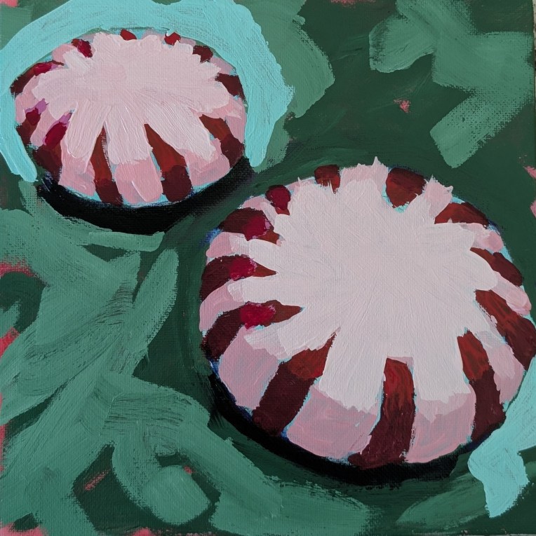
I completed the Fresh Paint peppermints painting today; here it is. I followed the instructor’s methodology far more closely for this painting than I usally do.
Well, I finished it. I’m satisfied with my choice of colors, but I just got lost in the shapes. Likely due to how I traced the image. I’m not sure the value mapping helped me, meaning at first I followed along with the Fresh Paint class (video), but then I broke away and just used the reference image. I should have stuck with one method. Maybe.
All in all, this looks better in a thumbnail. I’m calling it done, though, and moving on.
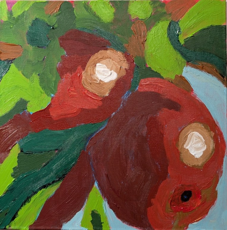
Yes, it’s another WIP from a Fresh Paint lesson (although I’m diverging from the color choices of the instructor to some degree.) For one thing, I went pack and painted over the Quinacridone Magenta with my Naphthol Red, as my magenta looked magenta pink, while the instructor’s video shows what to my eyes is plain ol’ red.
And I skipped the instructor’s Phthalo Blue/Quinacridone Magenta combo for my favorite Anthraquinone Blue (PB60) (which reads as a black-blue straight out of the tube).