I painted this on an 8×8 canvas, based on a reference photo I got from a Fresh Paint lesson (by Ali Kay Studios). I mostly dry-brushed this work, and did not follow the Fresh Paint lesson at all, preferring to use the reference photo.

I painted this on an 8×8 canvas, based on a reference photo I got from a Fresh Paint lesson (by Ali Kay Studios). I mostly dry-brushed this work, and did not follow the Fresh Paint lesson at all, preferring to use the reference photo.
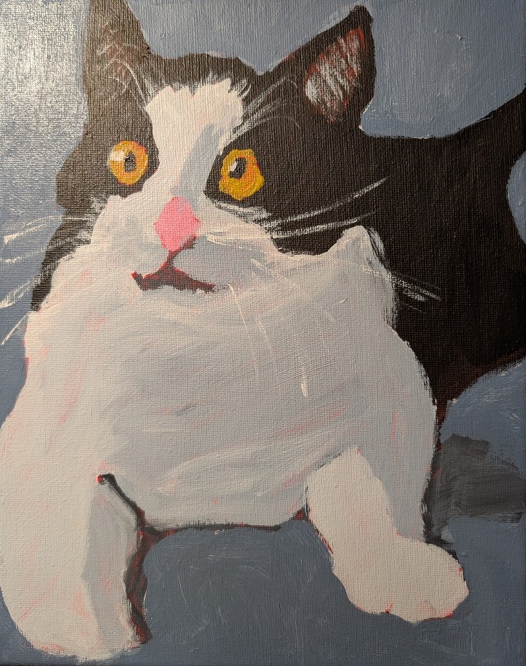
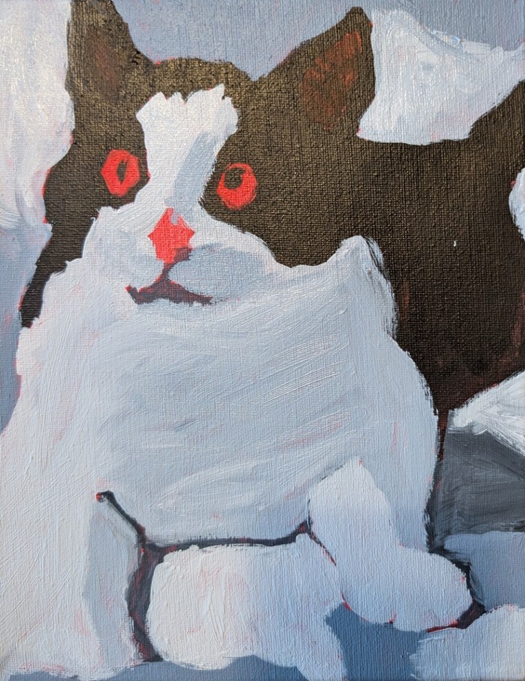
Okay, I’m done with this. I revised the background, modified the eyes and nose, and added whiskers, and ear fur (dry brush). I wish I hadn’t used the red for the undertone, but it is what it is.
Reference photo by Milada Vigerova on Unsplash
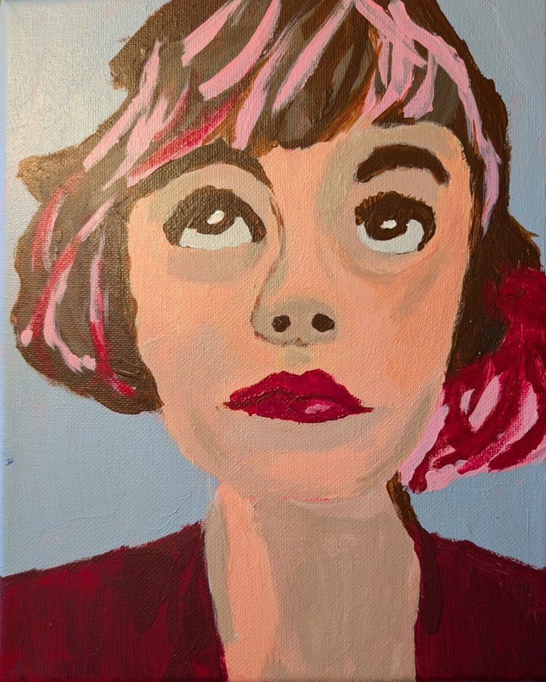
I am painting this on an 8×10 canvas which I toned in a cadmium red hue over a year ago. It’s based off a photo on Unsplash that was then enhanced (eyes yellower, shadows bluer, etc. etc.) by Ali Kay of Fresh Paint. (I’m enrolled at that virtual classroom for some of Ali Kay’s lessons.)
Photo by Milada Vigerova on Unsplash
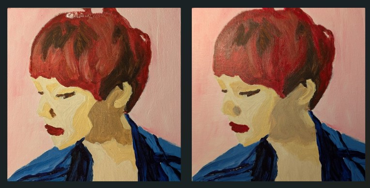
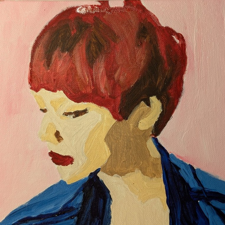
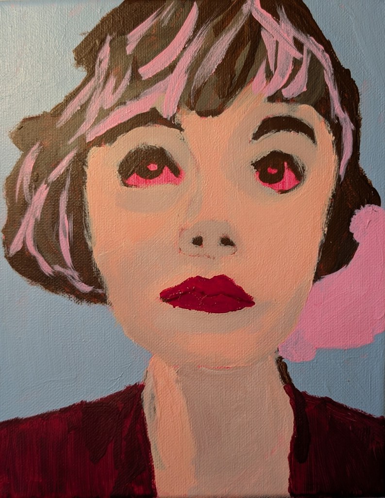
As I said in my last post, I did end up going back and modifying my painting from the 4th weekly exercise of Let’s Face It 2026 (taught by Laurie Johnson).
My goal was to blend the paint more thoroughly in the face so that there wasn’t such a harsh change from light to shadow. The new version is on the right.
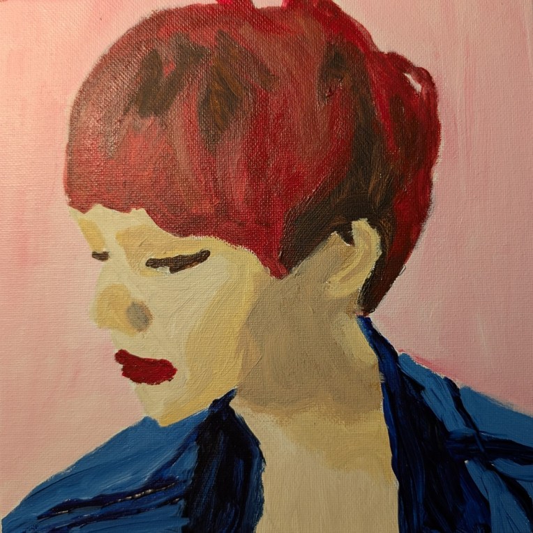
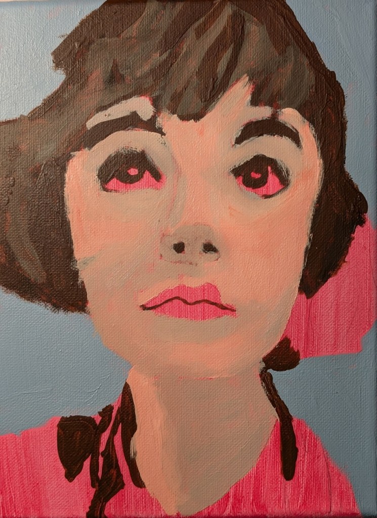
I did this portrait in acrylic on an 8×8 canvas panel as a part of the 4th weekly exercise of Let’s Face It 2026. It was taught by Laurie Johnson. I modified the reference photo in Adobe’s Photo Essentials, using the “Cutout” feature (set at 4) to make the skin shading lines. (Now I need to blend better!) I am thinking of redoing the whole thing. We’ll see. (In the meantime, she looks better in miniature.)
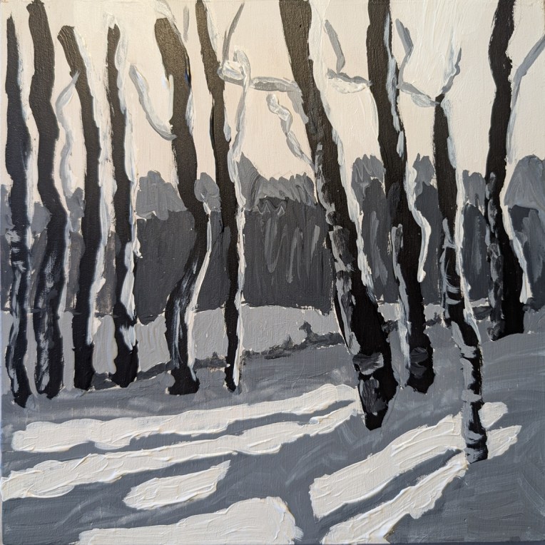
Earlier in January I watched a paint-along by Jed Dorsey of Acrylic University for their Bloom Membership level. He painted this scene from one of his own photos, and his painting was striking in its use of color, reflecting a golden sky from the sun setting behind the trees in the distance.
I was all set to try that myself. But when I downloaded the reference photo and a photo of his painting, on a whim, I set the saturation to zero — and found I absolutely LOVED the black and white version. So I decided to try painting it to play with the values.
This was done strictly as a study, on an 8×8 wood panel that I had gessoed a while back. The sky, in fact, is simply the white gesso. (It’s more yellow here in the photo than it is in real life.) I deliberately painted the snow thick just for the heck of it.
A year ago I signed up for Let’s Face It 2025, a 52-week series of portrait lessons which you can either follow along with or use as inspiration for your own fully original art, but I never did a single exercise. This was Week One and it was taught by Kara Bullock.
I have yet to complete any of the years I bought (2023 through 2025) although I just signed up for the 2026 version, but there are actually only a few weeks in each of the years which interest me, and they’re on my to-do list.
This one was done on an 8×10 canvas toned in quinacridone rose (PV 19), and I don’t have the photo credit information, but am guessing it’s on Unsplash or Pixabay. “In progress” photos are below. I used a lot of Burnt Umber, Raw Umber, Titanium White, and a crimson color (PR 264).
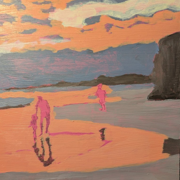
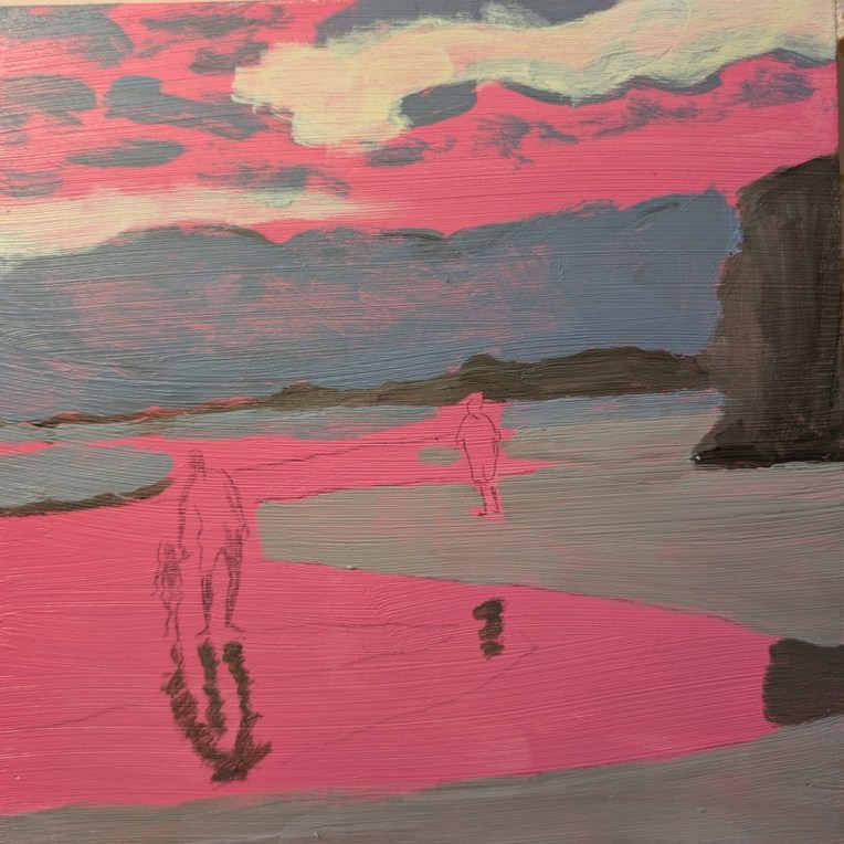
For what it’s worth, I’m done with this painting from Acrylic University‘s 2024 Summer Challenge based off a photo by Doug Greenman of a Puerto Rico beach.
I’m not super excited about it. I don’t like the orange — but come to think of it, I really didn’t like the magenta tone on the board to start with. (Maybe I should’ve started by painting over that!)
One thing I AM happy with is the father and child figures, and their reflection.
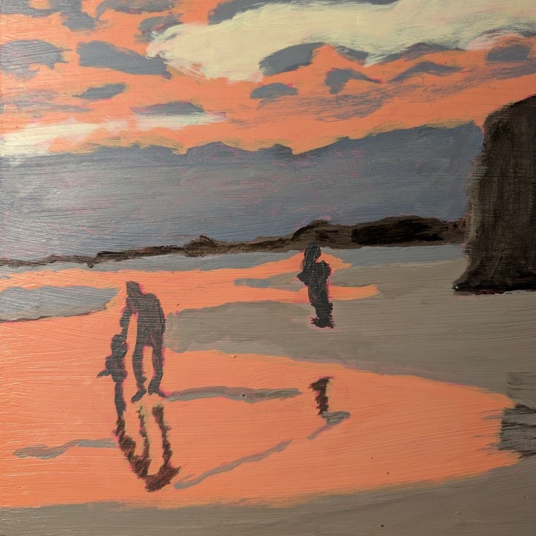
I am working on a painting from Acrylic University‘s 2024 Summer Challenge which Jed Dorsey painted using a photo by Doug Greenman of a Puerto Rico beach.
The first thing I did was crop the reference photo fully square and reduce the contrast significantly, as well as brighten so that the sky and sea look mostly orange.
I am using an 8×8 wooden panel which I had toned in a magenta color months ago, The cliff, the distant shore, and the reflections of the figures are all painted in shades of Raw Umber & Titanium White. Then I added Ultramarine Blue to that mixture to paint the sand, the bank of low dark clouds above the horizon, and the wisps of clouds above. The bright spot is a yellow and white mix; the orange is Naphthol Crimson, Cad-Free Yellow Light (Liquitex) and white.