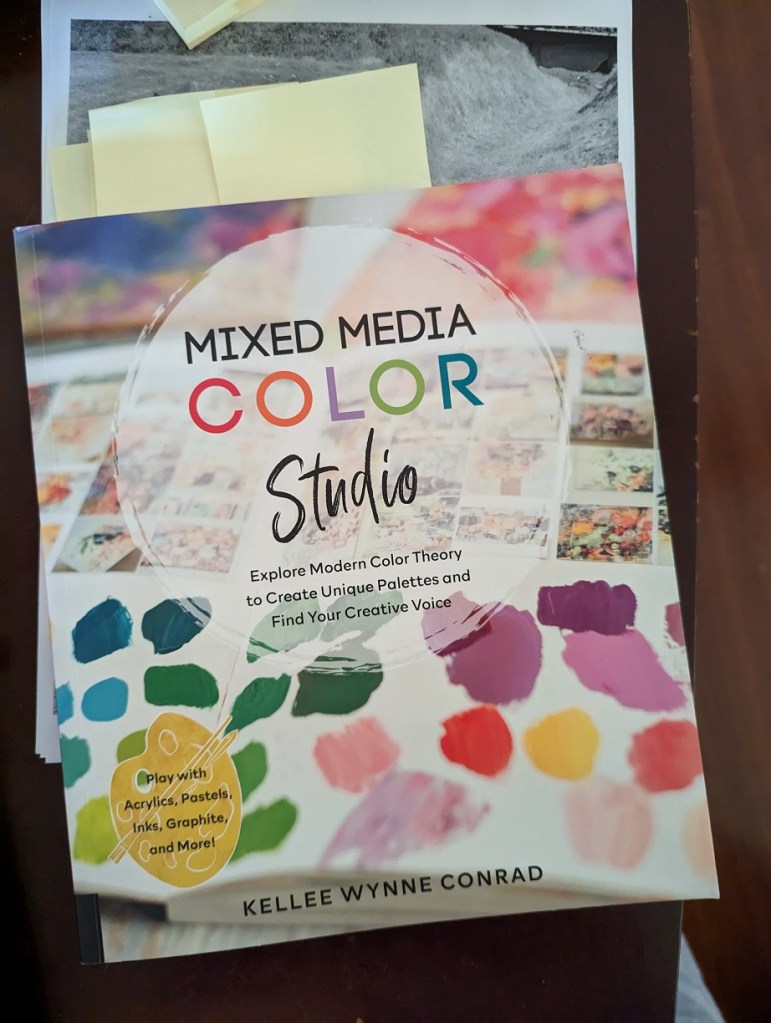
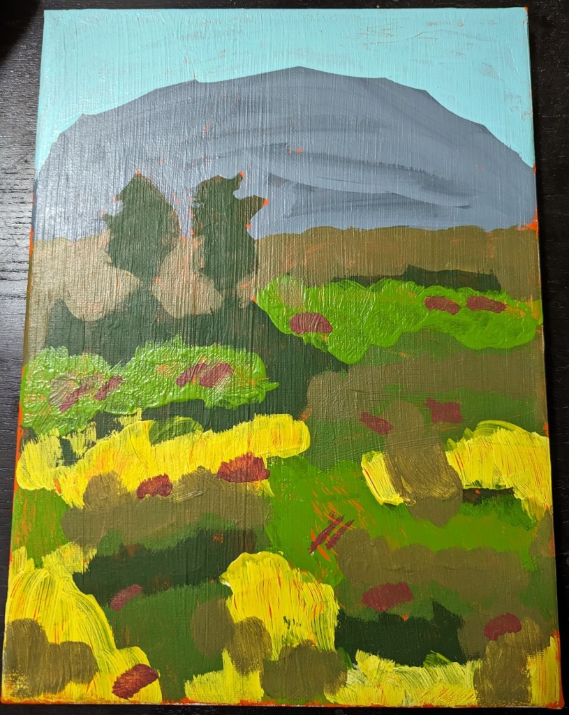
Using a demo project in Mixed Media Color Studio by Kellee Wynne Conrad, I attempted a landscape scene. And unfortunately I used a vivid fluorescent orange paint as background. This was a huge mistake!
The entire landscape became, for me, an exercise in trying to paint over the vivid orange, so I got very sloppy. I also discovered that my yellow paint was entirely too transparent — and that I need to pay attention to how transparent or opaque the paint I’m using is.
I also broke basic landscape rules around atmospheric perspective, in that the more distant the shapes (mountains, trees, etc.) are, the bluer they should be.


