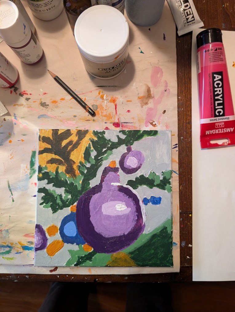
Holiday Ornament — Fixed (more or less)

Well, of course I had to fix the thing because it looked like an infected wound — ugh. I acknowledge that one of my weaknesses as a beginning artist is fixating on following the reference photo too closely. True mark of a beginner, lol.

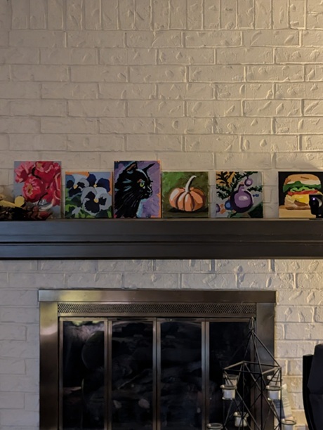
In any case, here is the fixed version, both close up and (currently) among the paintings on my mantel. From where I write this — my “studio” triples as 1) the dining room table, 2) my “office” when I work from home 2 days a week, and 3) my painting area, the ornament painting doesn’t look half bad. (I’m twice as far from my fireplace as from where I took the photo.)
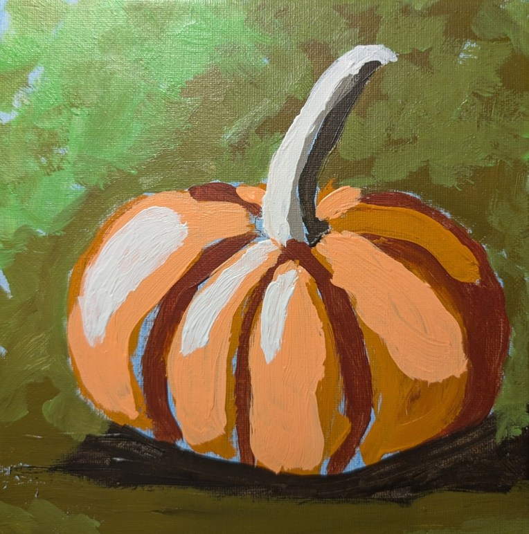
Small Pumpkin for Paint Week ’26

I had a lot of fun painting this one and I’m quite satisfied with the result — although at first, I thought “small pumpkin, ugh, how boring”. This was one of the offerings of Paint Week ’26 that Ali Kay Fresh Paint was offering the last week of September. Mine is not exactly like hers — partly because I don’t want to copy exactly, and partly because she uses Golden Fluid Acrylics. While I have some of those, mostly right now I’m using Liquitex Heavy Body (although I have no particular attachment to any given brand. So, naturally, my colors were different.

The olive gray-green was made from Raw Umber and Cad Yellow Medium; I then lightened it with one of those pre-mixed paints all the brands have (in this case, “Vivid Lime Green”). In the upper left corner, it’s mostly straight Vivid Lime Green (which is a mix of phthalo green, titanium white and the yellow PY97).

My underpainting was cerulean blue; I don’t particularly care for the magenta that Ali uses in a lot of her paintings. It was difficult not to paint over all of it, but I managed, and I’m pleased with how it turned out.

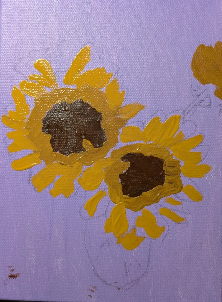
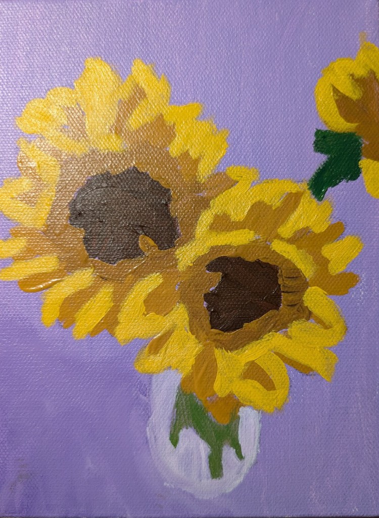
Sunflowers in a Vase

This painting was done on a 6×8 canvas (Blick Premier — I surprisingly liked it) and it’s based off of one of my own photos. The background is Dioxazine Purple (PV23) tinted with Titanium White, as a complementary color to the various tones of yellow (Yellow Ochre, and Cad Medium Yellow mixed with Yellow Ochre).

While I’m not entirely happy with this effort, on the whole, I think it’s one of my better sunflower paintings.

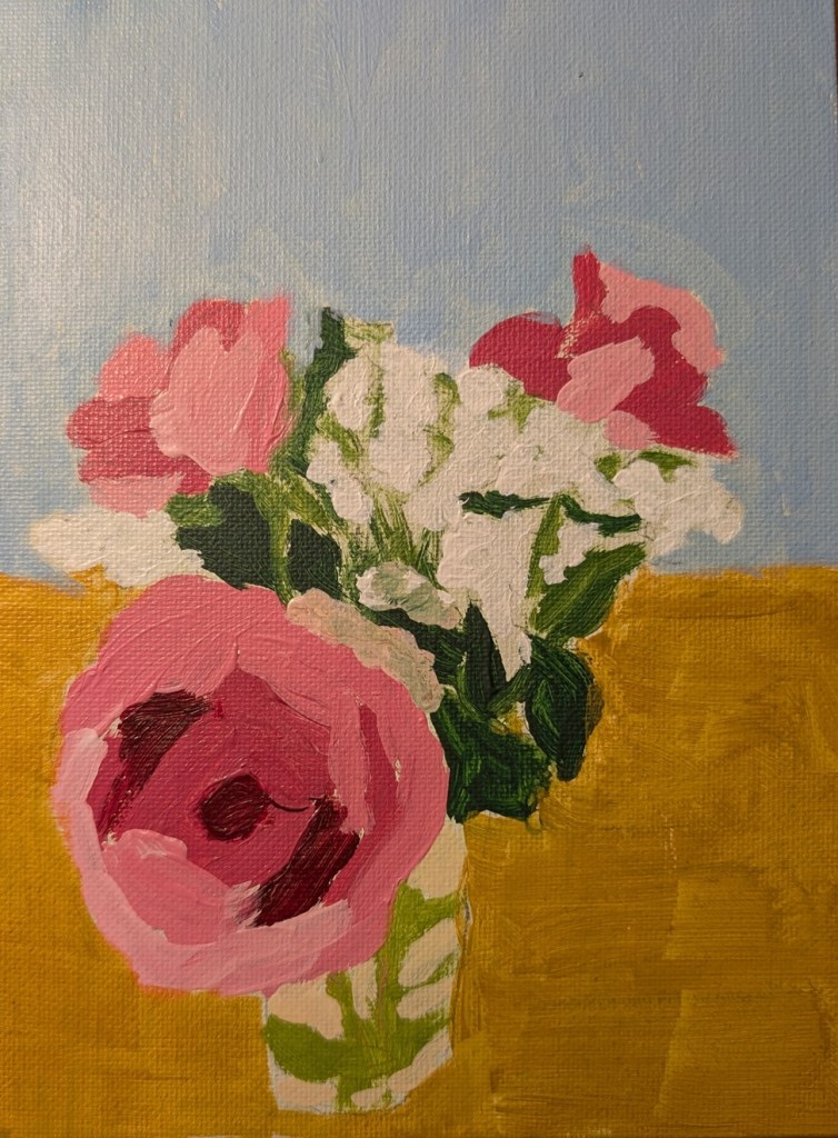
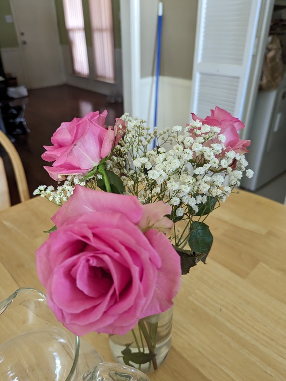
Pink Roses in a Vase

I took this photo back in the summer of 2023 and, as I was browsing through my pics of floral scenes, thought about painting it. Roses are difficult for me — but maybe I need to let go of that negative thought and tell myself roses are fun to paint! (Actually, this bouquet WAS fun to paint knowing I was doing it “solo”, and not copying someone else’s painting or using someone else’s reference photo.)

I used a 6×8 canvas panel for this one.

Sunflower

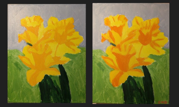
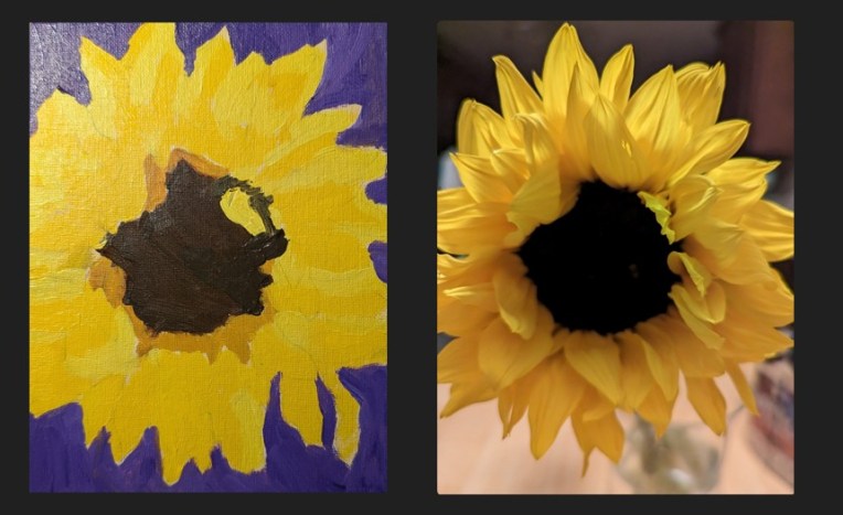
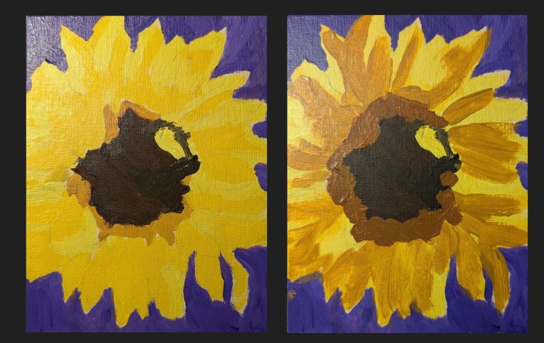
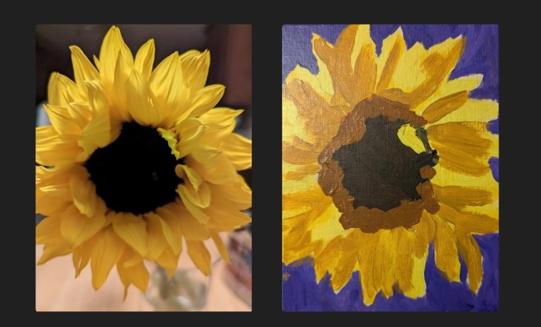
For once, I’m painting from a reference photo of my own! My first attempt was garbage, as you can see below, because my values were completely off relative to the photo on the right. You can barely see that I actually have two shades of yellow for the petals in the painted version.

So, I tried again a few days later, just painting over the old version. And this is the comparison between the old painting and the new. Still not happy with it, but it looks better from a distance, lol!

Just for grins, here’s the comparison between my photo and the new painting.

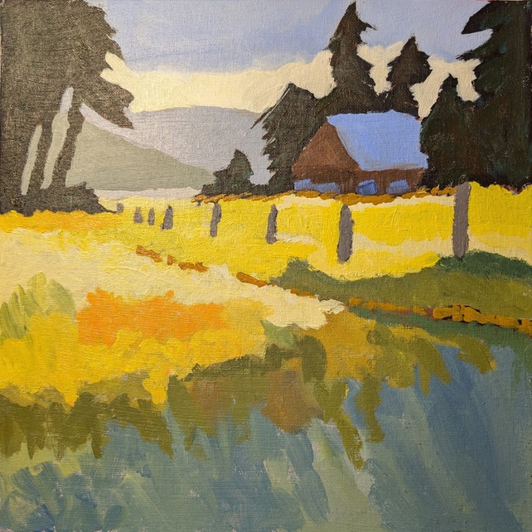
Fields of Gold… Calling it Done

I actually finished this days ago, and then forgot to post to WordPress, so here is the finished work. (This was from the painting Jed Dorsey calls “Golden Fields & Rustic Barns” from his Jed Dorsey’s YouTube channel called “For the Love of Painting”.

12×12 canvas panel, freehand drawing, and doing my best to copy.

Now I’m going to do a few paintings based on my own photographs — “going solo” as it were. No leaning on online teachers!

The Messy Middle… a painting from a “Bloom with Jed” lesson.

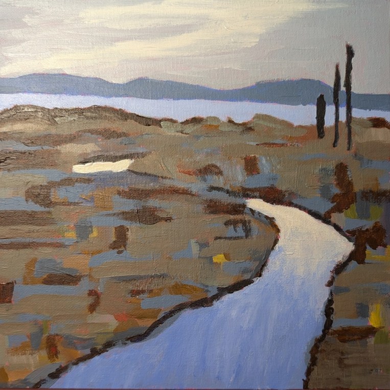
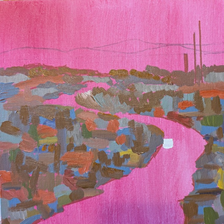
This 10×10 painting is one I’m doing as a paint-along effort from Acrylic University‘s “Bloom with Jed” paint-along video class.

The focus is on seeing the beauty in a gray, rainy day, of an ordinary (if not ugly, to my mind) marsh near a beach. But Jed points out ways to bring out the natural beauty via the painting — and of course, one way of doing it is using a magenta (PV19) background and letting bits of that tone shine through. We’ll see how it goes.