This painting was done on a 8×10 canvas, and the reference is one from an Ali Kay Fresh Paint class. I mostly followed the original photo (included in the class) rather than the revised reference or Ali Kay’s final painting.
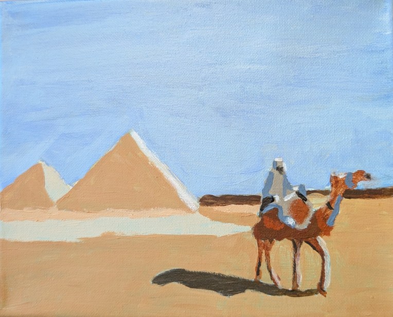

This painting was done on a 8×10 canvas, and the reference is one from an Ali Kay Fresh Paint class. I mostly followed the original photo (included in the class) rather than the revised reference or Ali Kay’s final painting.
I’m not entirely satisfied with this, which is based off a Fresh Paint lesson — I think my other autumn tree is better. Moving on…
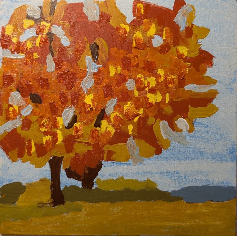
8×8 canvas panel
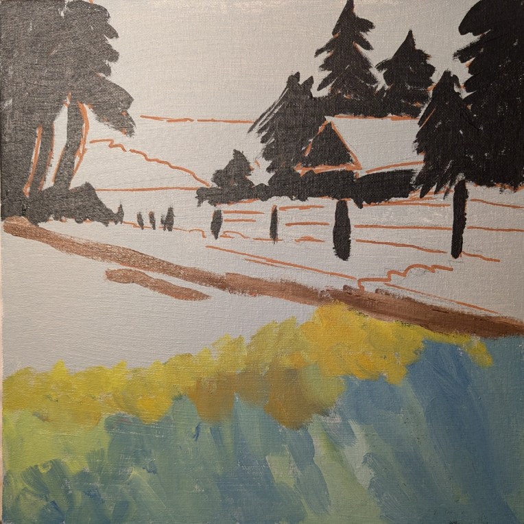
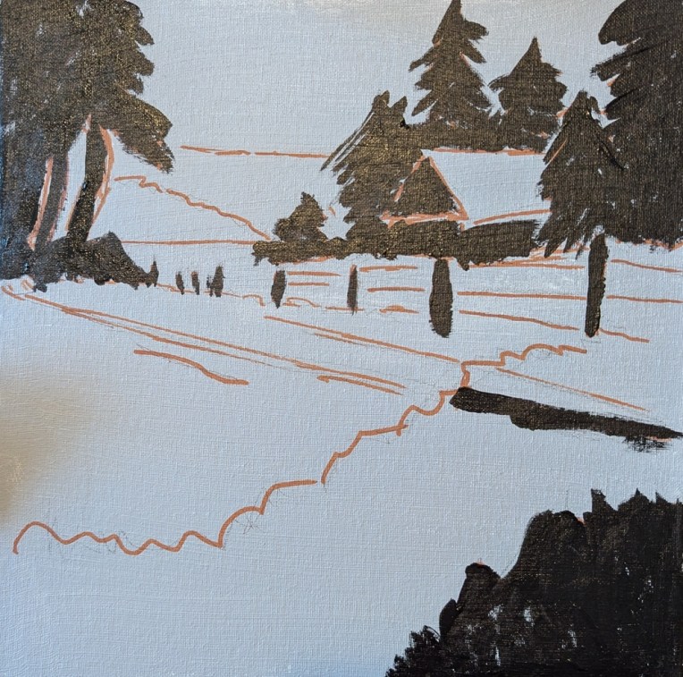
I actually finished this days ago, and then forgot to post to WordPress, so here is the finished work. (This was from the painting Jed Dorsey calls “Golden Fields & Rustic Barns” from his Jed Dorsey’s YouTube channel called “For the Love of Painting”.
12×12 canvas panel, freehand drawing, and doing my best to copy.
Now I’m going to do a few paintings based on my own photographs — “going solo” as it were. No leaning on online teachers!
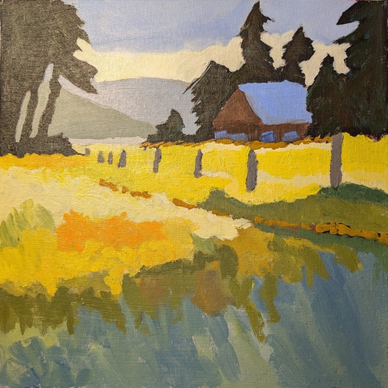
I recently came across a selection of videos at Jed Dorsey’s YouTube channel called “For the Love of Painting”, and fell in love with the painting Jed calls “Golden Fields & Rustic Barns“.
I’m working this on a 12×12 canvas, toned in neutral gray with a freehand drawing based off what I saw on the video. (This site is one in which you do NOT have to have a membership.)
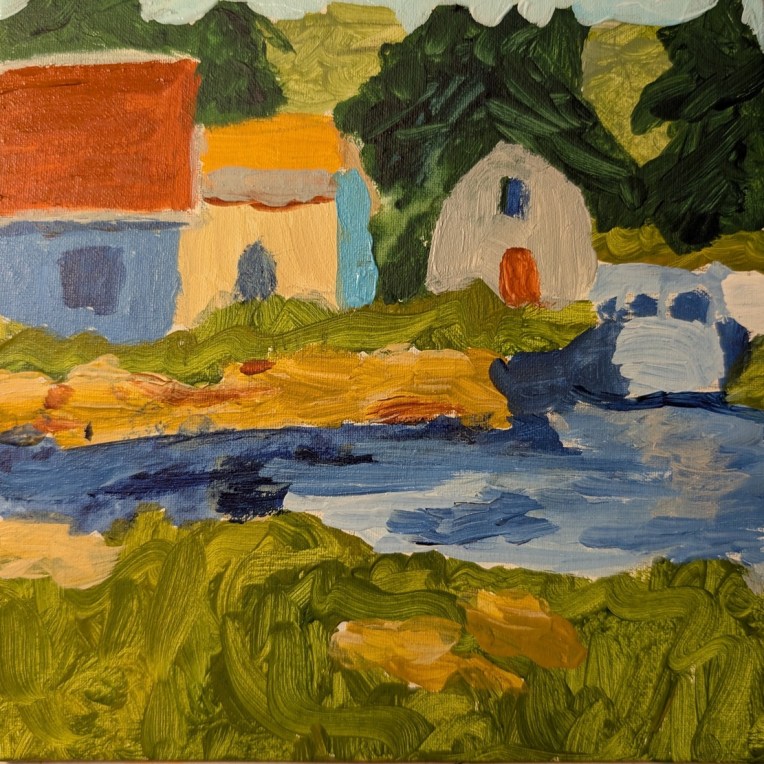
This is Week #7 (called “Boathouses”) of “Travels Near & Far” — a mini painting challenge at Acrylic University, and the artist is Dianna Shyne who also took the reference photo used. As with the week #1 work, the photo is of Prince Edward Island, Canada.
This was painted on a 6×6 canvas panel, and the swirly brushstrokes in green — meant to represent grass! — remind me of some of Van Gogh’s swirly painting (but not in good way, ha-ha!) To the right is supposed to be a boat, but since I painted it in the same colors as the water, it now appears “lost” or, rather, more like a bridge.
The thing is, I’m so focused on painting other things, I don’t care enough to paint it in, say, black and white so that it appears as a boat.
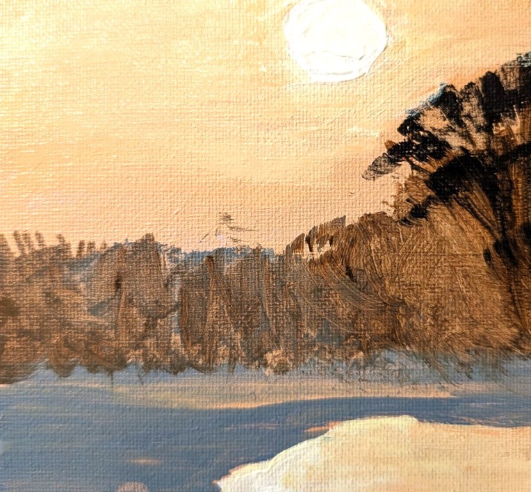
This painting was done on a 6×6 canvas panel, and is based on a photo I found on Pixabay. I’ve had this reference photo (significantly cropped from the original) for quite some time. I enjoyed painting it. However, my own photo of my painting is not that great, despite my fiddling with the properties. Around the white sun, I actually have more yellow blended into the orange of the sky. Ditto for the reflection at the bottom right.
Oh, and for the first time, I used my fan brush in painting the vegetation.
Based on an image by Larisa Koshkina from Pixabay
This is a redo of the week 12 painting for Jed Dorsey’s Mini Painting Challenge at Acrylic University, based on my observations of mistakes I made in the original painting. The idea was to get the proportions more accurate, the perspective/distance more accurate, and to convey a better sense of form (namely, that the trees were at the top of and behind a hill).
I painted it on a 5×5 canvas panel. For the sky I used Liquitex Soft Body Light Blue Permanent (PB15, PG7, PW6) and mixed the lower latitudes with more white. The pine trees were painted with Atelier’s Forest Green (PY74, PB15.3, PR101) mixed with Phthalo Green (Blue Shade) and Ultramarine Blue. The darker grass was a mix of Atelier’s Forest Green with Cad-free Yellow Medium by Liquitex, and the lighter grass was a mix of Winsor’s Sap Green (PY74, PG7, PBk7, PW6) and Cad-free Yellow Medium.
Here is a comparison between the original I two years ago, and the one I did today. The newer painting is far from perfect — the trees are still wonky, the paint is gloppy on the trees and I think the grass should be lighter in value — but at least you can tell the trees are on a hill, and the rocks no longer “float”.
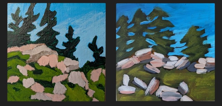
Here are some in-process photos of the redo:
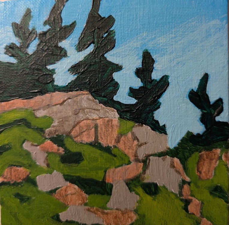
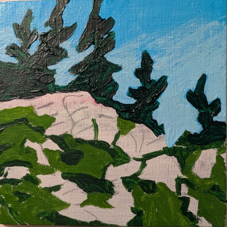
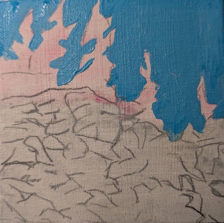
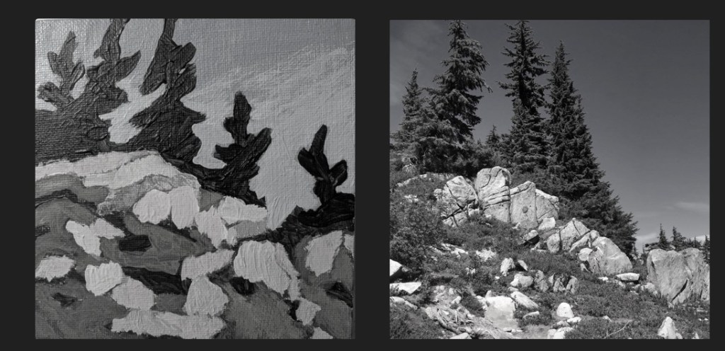
Here’s a value comparison between the reference photo [credit: Mark Hadland] and my painting.
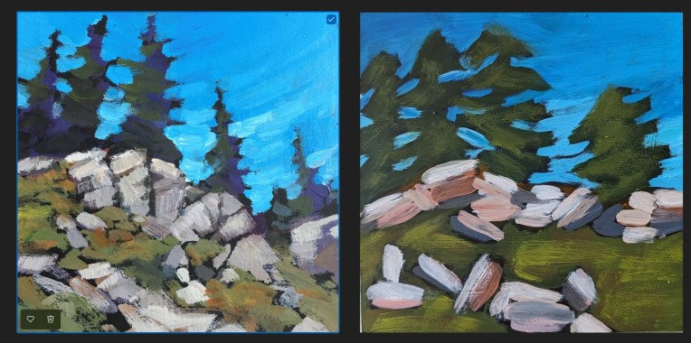
As with week 15 of Jed Dorsey’s Mini Painting Challenge at Acrylic University, many of the same flaws apply for the week 12 “Let’s Go Hiking” painting.
What I see is: 1) a lack of proportion which leads to 2) a lack of perspective. That tree at the right should obviously be smaller as it is farther away, for example. 3) Poor use of brush strokes in conveying form — for the rocks, they should have been vertical rather than horizontal which makes my rocks appear to be “floating” rather than grounded as boulders which comes across in Jed’s painting.
Positioning relative to the picture plane is not ideal in my painting, although in this one — compared to week 15 — my colors are not so saturated and, to my eye, are reasonably close to what Jed used. (Again, I don’t want to copy exactly, necessarily, and I DID go back and make a change to the values as indicated in this post. My first attempt at this painting is here.)
Finally, there is the difference in style between Jed’s and mine, which could just be related to my beginner status. But he has a preference for toning his canvases in black, which I did in this case — and I just can’t stand! I don’t have his painting ability so toning my canvas in black is discombobulating for me. In addition, Jed is gifted at painting the negative spaces, and that is NOT a skill I have at this point.
Also, in so many of these beginner lessons from various different painters I hear about using “big” brushes so that you don’t obsess over detail as many beginners do. I cannot argue with that, but I see in my paintings thus far TOO LITTLE attention to detail! It’s okay to use a smaller brush at times! 🙂
If I were to paint this again, I would stick with a white canvas or one toned a neutral gray, and I would probably trace key lines from his painting to get the proper sense of proportion as well as a sense of the boulders being rooted to the ground and forming the shape of the hill.
I’ve been browsing through the work I did in 2024, and it occurs to me that, for those times I was doing “master copies” of other artists’ work, I had two methods. One was just a straight copy when all I had to look at was the artist’s painting or drawing. The other was copying via the mini challenges at Acrylic University.
What I’ve realized now, in review, is that for the painting lessons, I would refer to the reference photo and the painting, watch the video, then do my own thing (more or less) so that my work is full of flaws. I would focus on the loose and expressive style, but I didn’t have the fundamentals down!
An example is below — from the week 15 painting for Jed Dorsey’s Mini Painting Challenge at Acrylic University.
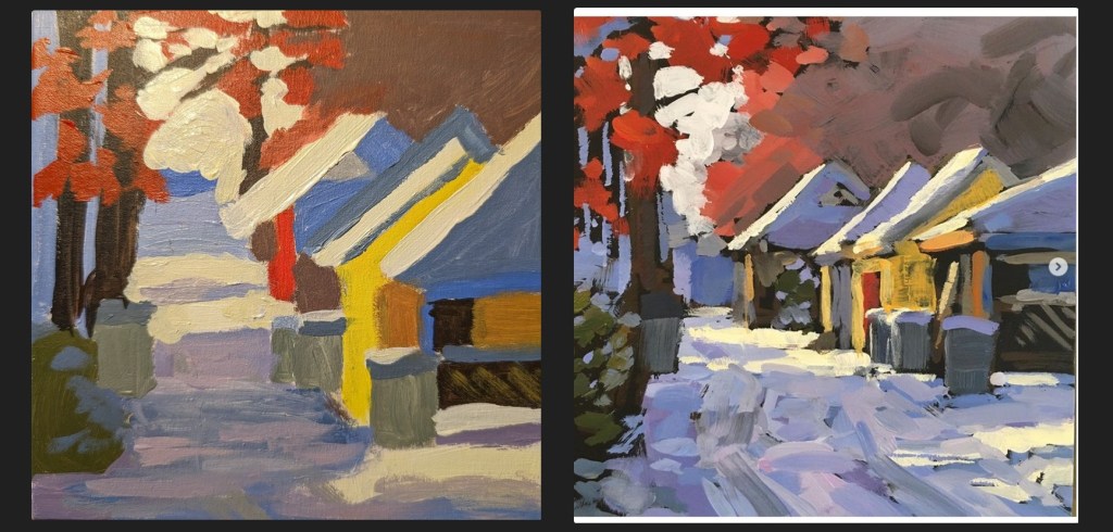
The first thing I see is I do a poor job of conveying form and perspective. Everything is flat and abstract in part because my colors are much too saturated and also because the proportions are all wrong, particularly of the houses.
My painting does not properly reflect perspective; Jed’s alley gets visually narrower in the distance, while mine does not. In addition, his brushstrokes for the alley are vertical relative to the picture plane, which helps move the eye to the end of the alley in the distance. My alley brushtrokes are horizontal which does nothing to convey perspective.
My buildings are out of proportion relative to each other and relative to their roofs, and they do not appear 3-dimensional. In addition, the trash bins near the yellow house appear to float.
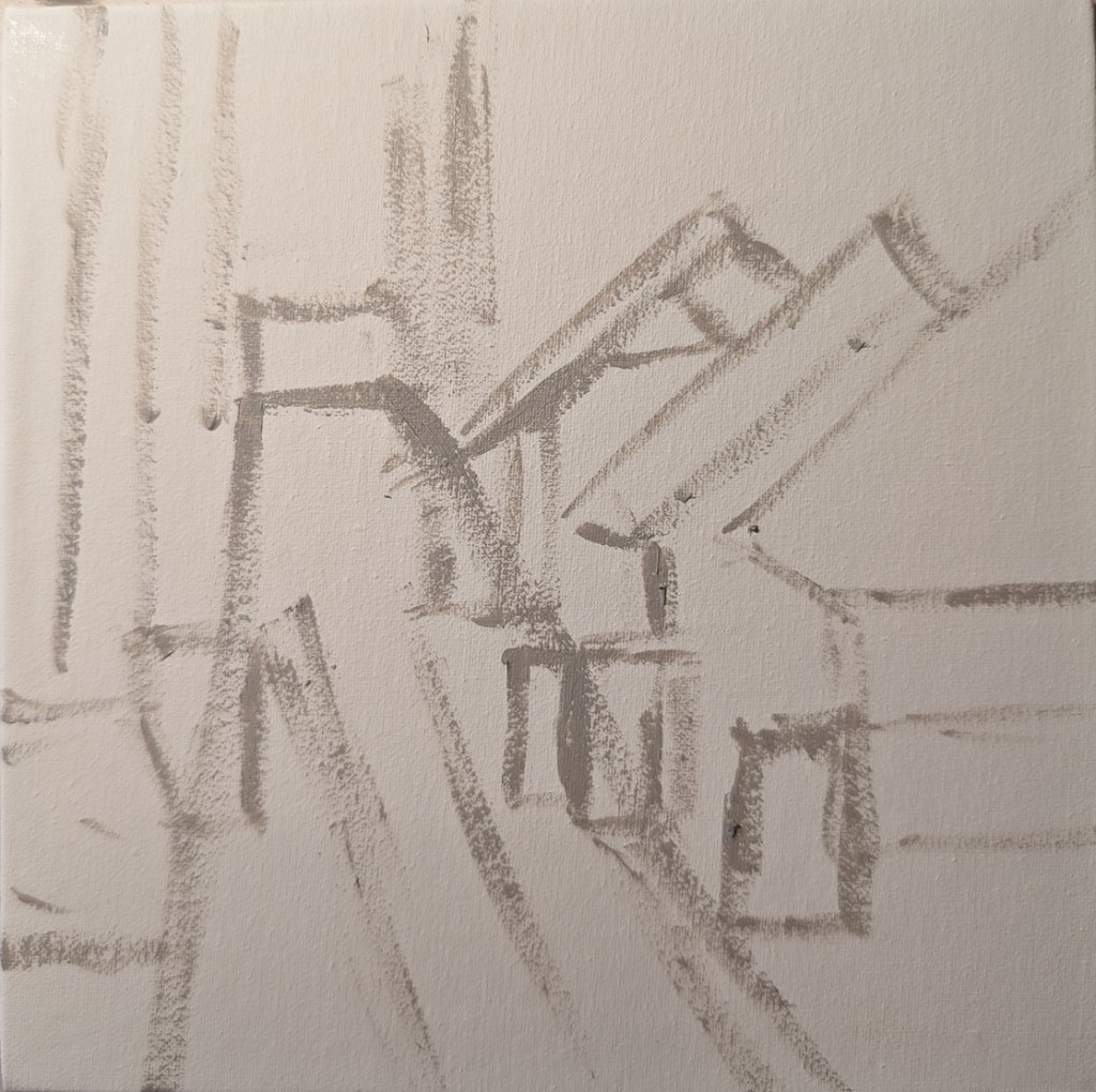
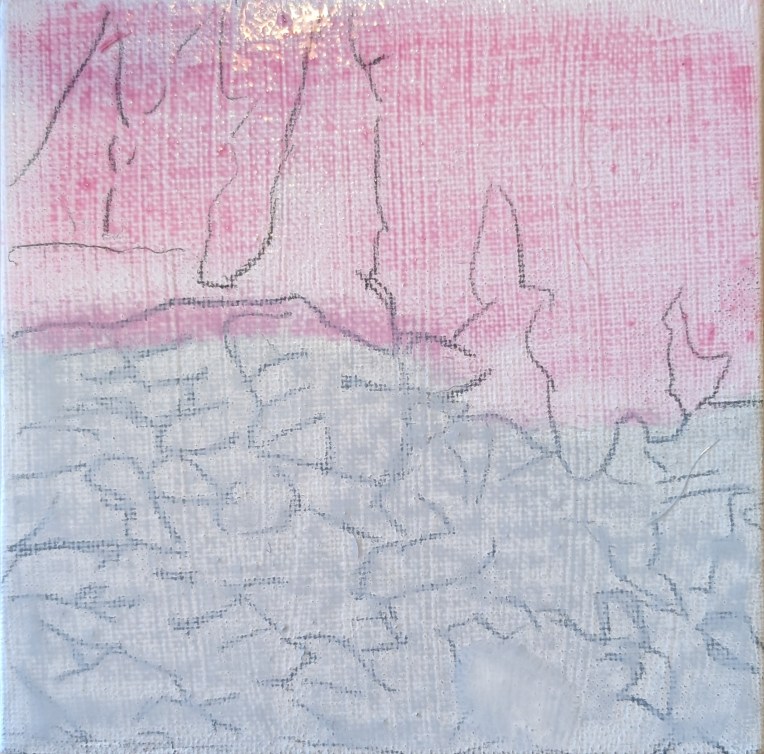
Ironically, in my initial sketch on canvas (below), I seemed to have a slightly better sense of proportion, but I didn’t think about using my brushstrokes to convey form and distance. If I were to do this painting again, I might consider tracing the large shapes of Jed’s painting first, just to get the placement right within the 6×6 panel.