Drawing Heads – Reilly Method

I recently purchased Nathan FowkesHow to Draw Portraits in Charcoal, and I also just signed up for his online course at Schoolism. It’s a 9-week course, and the idea in the first week is to get busy practicing drawing heads.

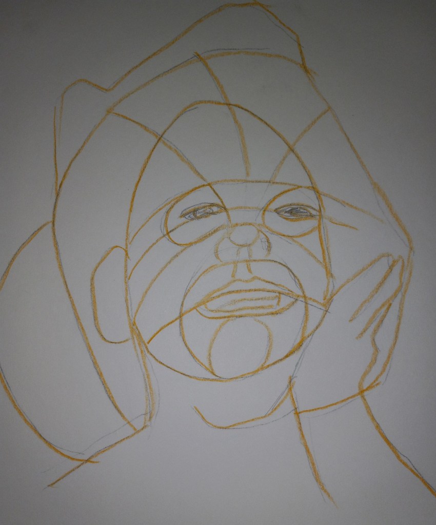
I had never heard of the Frank Reilly Method, but what I understand now is that it can assist you in thinking about the 3-dimensional form of the head, and how light and shadow can define the planes of the head.

An example is below — the light lands on the little girl’s face by her right eye in the photo, and in the Reilly drawing, the horizontal lines by the girl’s right eye indicate the planes of her face that would cause the light to land there, and not above or below.

Watercolor Color Wheels

I was playing with my new watercolor travel kit and made two color wheels — one Warm, one Cool. The Warm wheel was mixed from French Ultramarine, Cadmium Yellow and Cadmium Red (all Winsor-Newton). I love the orange, but the “purple” and “green” are unappealing. (This was done on 300 lb. paper.)

The Cool color wheel was made up of Winsor (Phthalo) Blue (Green Shade), Winsor Lemon and Alizarin Crimson. The “orange” is unappealing to me, but l love the vivid green. The purple is not too bad.

Trying out UART 400 Paper

Today I painted the same scene as yesterday, using the same pastels, but using UART 400 paper (again from my Jackson’s Art sampler set). This paper was easier to use, and I enjoyed it very much. The marks I made were much bolder — automatically — on the UART 400 paper.

Image by Evgeni Tcherkasski from Pixabay

And here are the two paintings side by side. The velour version appears much softer, almost as if the image is blurry.

Trying out Hahnemühle Velour Paper

Today I tried velour paper that I received in my sampler from Jackson Art. It was a very different texture; it feels to me the pastels just lay down on the top of the paper. And that the paper almost “resists” side strokes. It was fun to try, using Richeson, Blue Earth, Dick Blick and my one Terry Ludwig pastel, but I’m not certain I would buy this paper on a regular basis.

The reference image is by Evgeni Tcherkasski from Pixabay

The pastels I used

Random Underpainting… Autumn Trees

I had no idea what to paint today, so I just started randomly putting NuPastel on paper, and then I rubbed it in with a paper towel. Now I had an underpainting (of sorts) but didn’t know what to do with it — at first. Then I realized it reminded me of autumn trees.

My trees are cartoonish, but the whole picture is straight from my imagination, based on the colors and shapes of the random “underpainting”.

One More Try of the Reedy Lake

Yesterday’s sunset looked a bit like a fried egg, didn’t it? So I tried it one more time. This time I used Art Spectrum Colourfix paper, in the Terracotta shade.

While this painting is hardly a masterpiece, I feel most satisfied with it, and I finally got the reflection looking a bit more realistic than on my previous tries.

Reedy Lake: An Update

Today I did another study of the reedy lake (again on Canson Mi-Teintes Red Earth colored paper). I used a different pastel palette than I did before, and I did not do any underpainting.

This time, I think I did a better job of painting the sun’s reflection on the water.

Most of the pastels used were Richeson hand-rolled pastels, which seems to work for me on the Mi-Teintes paper, although it’s clear you can see a lot of the paper’s color coming through.