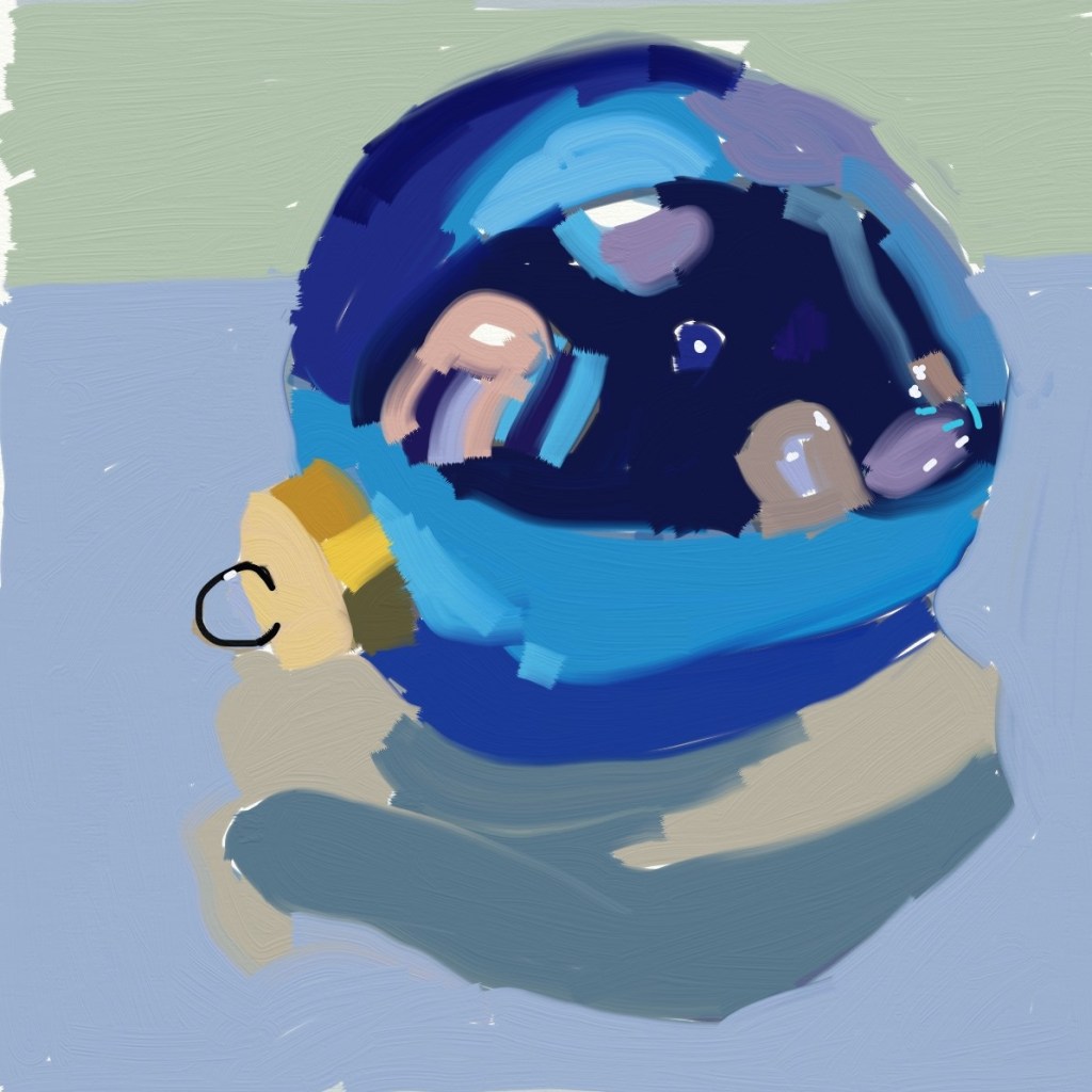
Today I tried painting a Christmas ornament in ArtRage Vitae, and I used as a reference a painting by Teddi Parker, which you can see here.
As with the sketch of Simba, I struggled a bit. In the Simba drawing, I used the felt pen tool; in this case I used the square flat brush, and widened the stroke.
It should be obvious that Teddi’s painting (master copy) is on the right.
The funny thing is, it actually felt like I was painting, despite using my finger tip! But I want to get back to the brush tomorrow.
I’ve never really considered digital painting before because I don’t have an iPad or an iPhone. Instead, I have an Android phone, and a Kindle Fire 10. However, one of my favorite artists on Instagram (Teddi Parker) has posted occasionally some work she’s done using ArtRage Vitae. So I decided to check it out — and to my surprise it’s available not only for Apple products, but Android and desktops (Windows, MacOS).
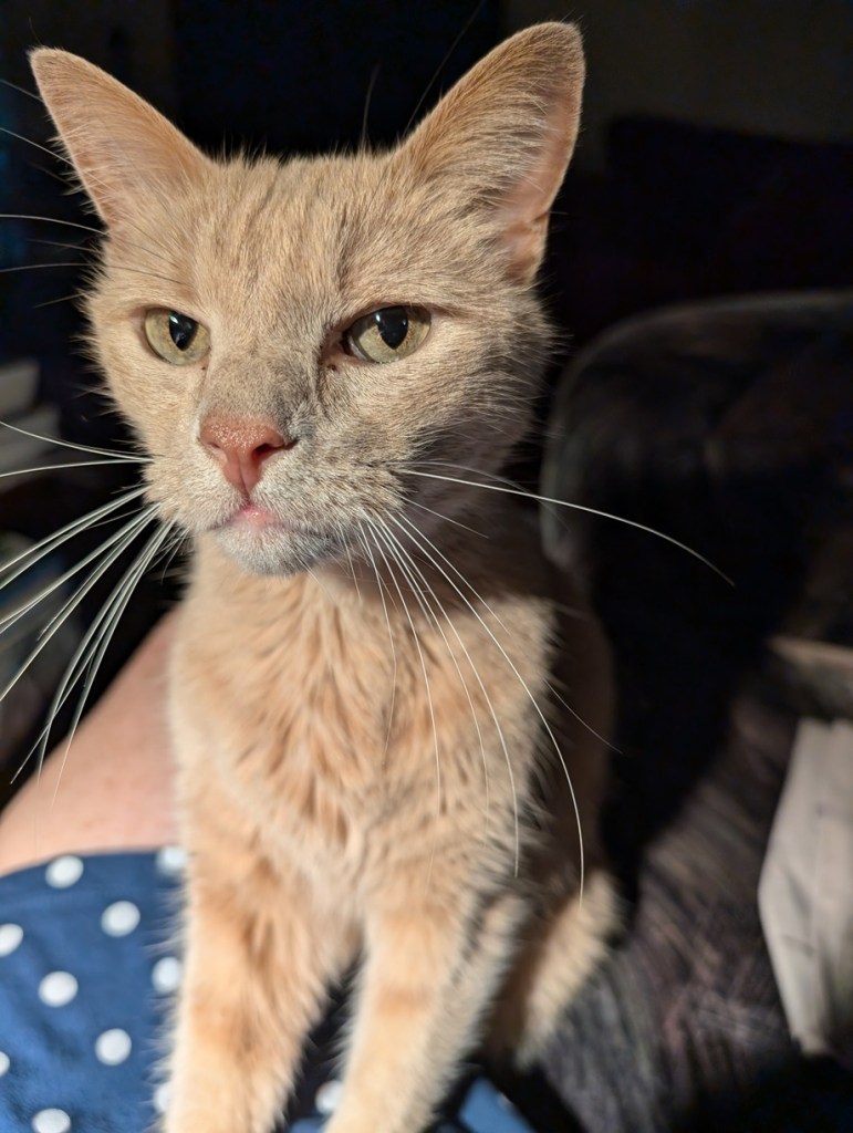
Okay, then. I bought it for $2.99 on Google Play and loaded it on both my phone (can’t see using it there, though!) and my tablet. Below is my first work.. a sketch of my cat, Simba, based on a photo I took of him some time back when he was on my lap. I saved it before I finished his long white whiskers (well, really I messed up with layering and had to start all over again.)
Not bad, for a first attempt. I used my finger, and am debating purchasing a stylus to see if that helps.
This monochrome work is the painted sketch on 300-lb. watercolor paper which I already posted about. I used Anthraquinone Blue (PB60) aka Indanthrone Blue. It’s semi-transparent, which works well for the technique I was using: treating my acrylics more like watercolors.
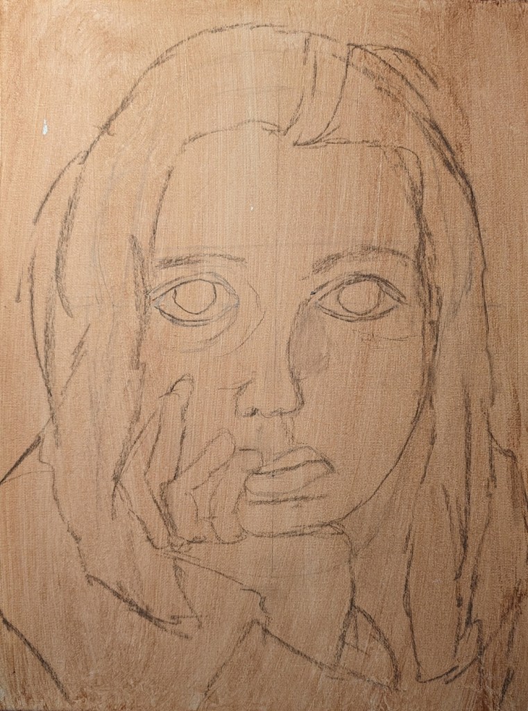
I have finished up 3 faces and am ready to paint them. The first one is on an 11×14 canvas, which I toned with burnt sienna, and then drew in part in pencil last June. Finally finished off the drawing part using willow charcoal. The image is from a Let’s Face It 2018 portrait art “class” (more like an online art experience) from KaraBullockArt.
The second one is on a 9×12 canvas, toned with yellow ochre and clear gesso. I drew this on by hand also earlier this month, using willow charcoal. I’m not sure now where the reference image came from.
Lastly, the third face is based on a photograph I took, and traced on to 300-lb. cold-pressed watercolor, and given a wash of acrylic glazing medium, pyrrole red, and cad-free yellow medium.
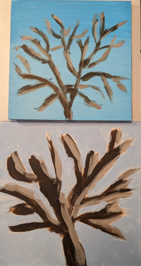
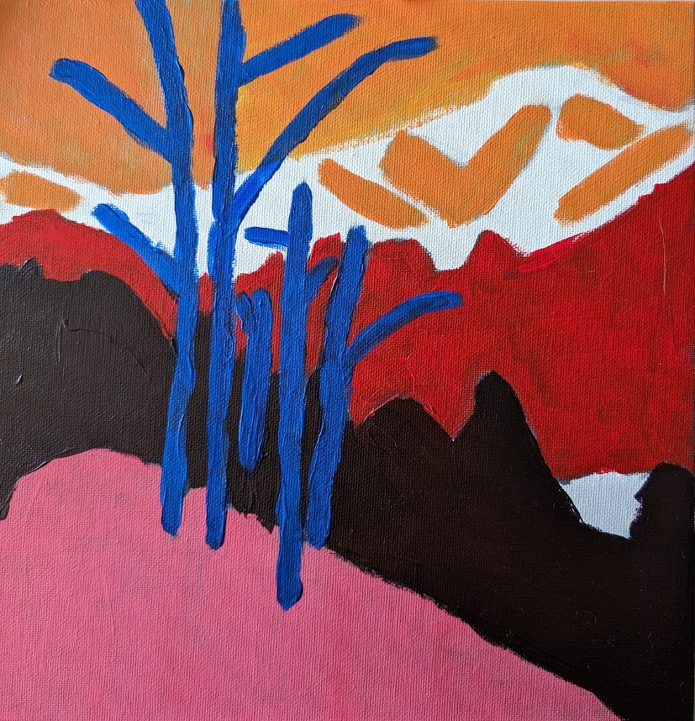
For this I used my own photo of the neighbor’s cottonwood tree as I view it from my backyard. I was struck by how white the tips of the branches were in the early morning sun.
At first I used Liquitex Light Blue Permanent (which is a 3-pigment mix, including Phthalo Green). At first it seemed a decent match for the sky — the lower half of the panel includes more Titanium White – but once dry it seemed too green.
I drew out the tree using willow charcoal, and then painted it using Raw Umber (Golden Acrylics) with some Matte Medium to keep it flowing, and then mixed with that color with white for the sunlit parts. The immediate painting looked awful — the greenish sky made the tree colors look wrong to me — but now that it’s dry it doesn’t look so bad.
In any case, that’s what prompted my second effort (on Soho canvas paper) in which I used cerulean blue (Utrecht Fluid) mixed with white, and painted the sky after painting the tree. The tree was done using the same paints as above.
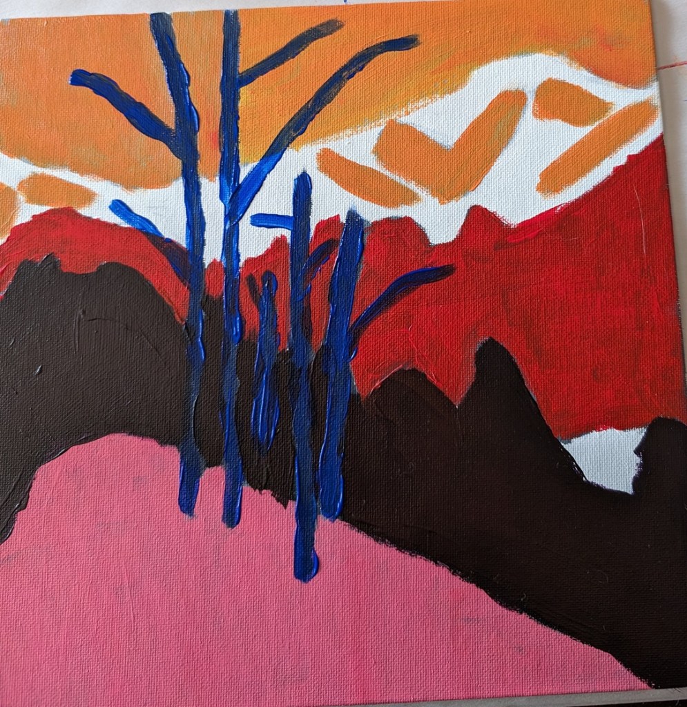
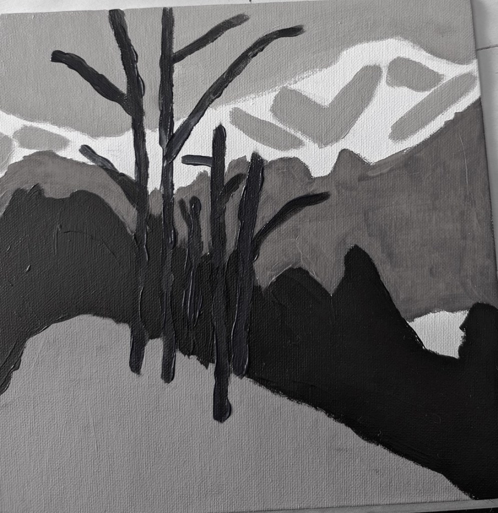
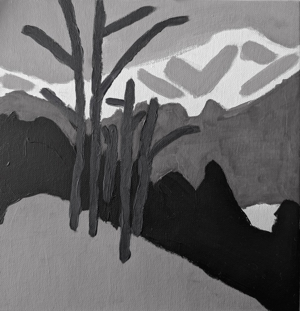
This is an exercise from one of the foundational courses (Acrylics 101) at Acrylic University wherein you do a value map of your painting using black, white and gray, and then applying color on top of the different value areas, using care to make sure your values — post-color — remain. It’s a more detailed version of the quickie free course I mentioned here.
Here’s my original painting done in grayscale, done as part of the Acrylics 101 online class, using their reference photo.
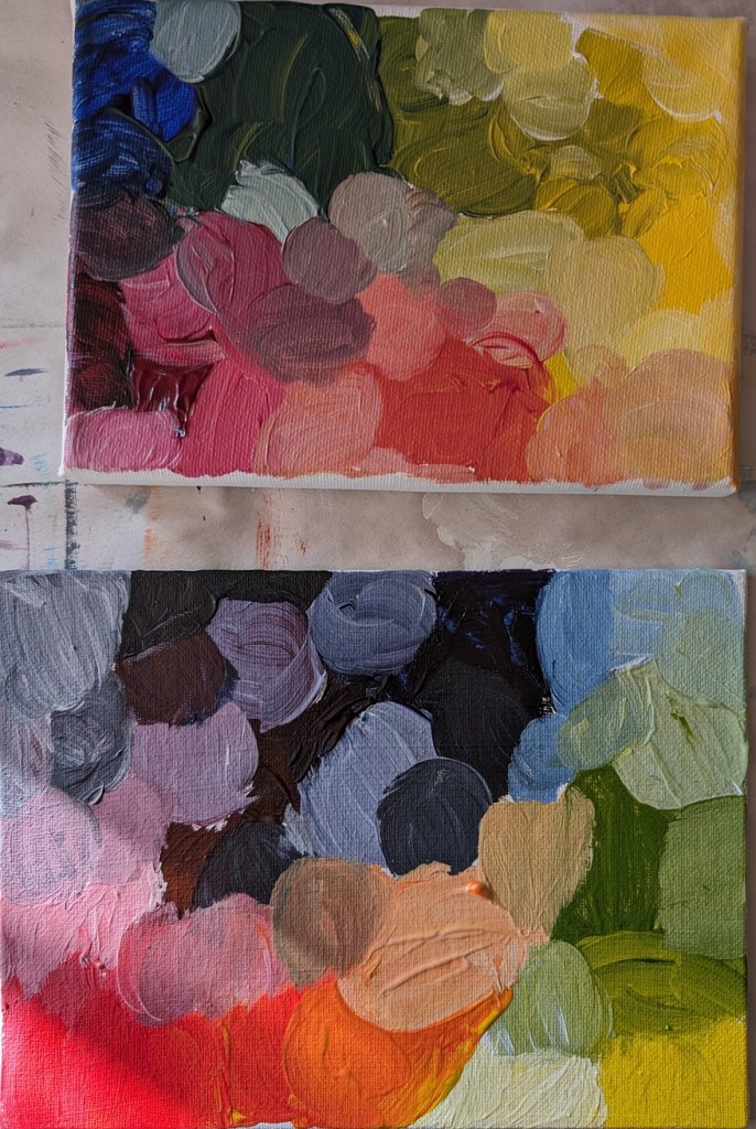
I did a value check on my primary colors and mixed secondaries.
The next task was to choose colors that aligned to the value map/painting I already did. This was my first effort. The abstract trees were a bit too dark, compared to my original (above), pretty much the same as the (abstract) forest.
But today I decided to use repurpose an old 12×12 canvas, and paint along with the video I watched last night. It was fun!
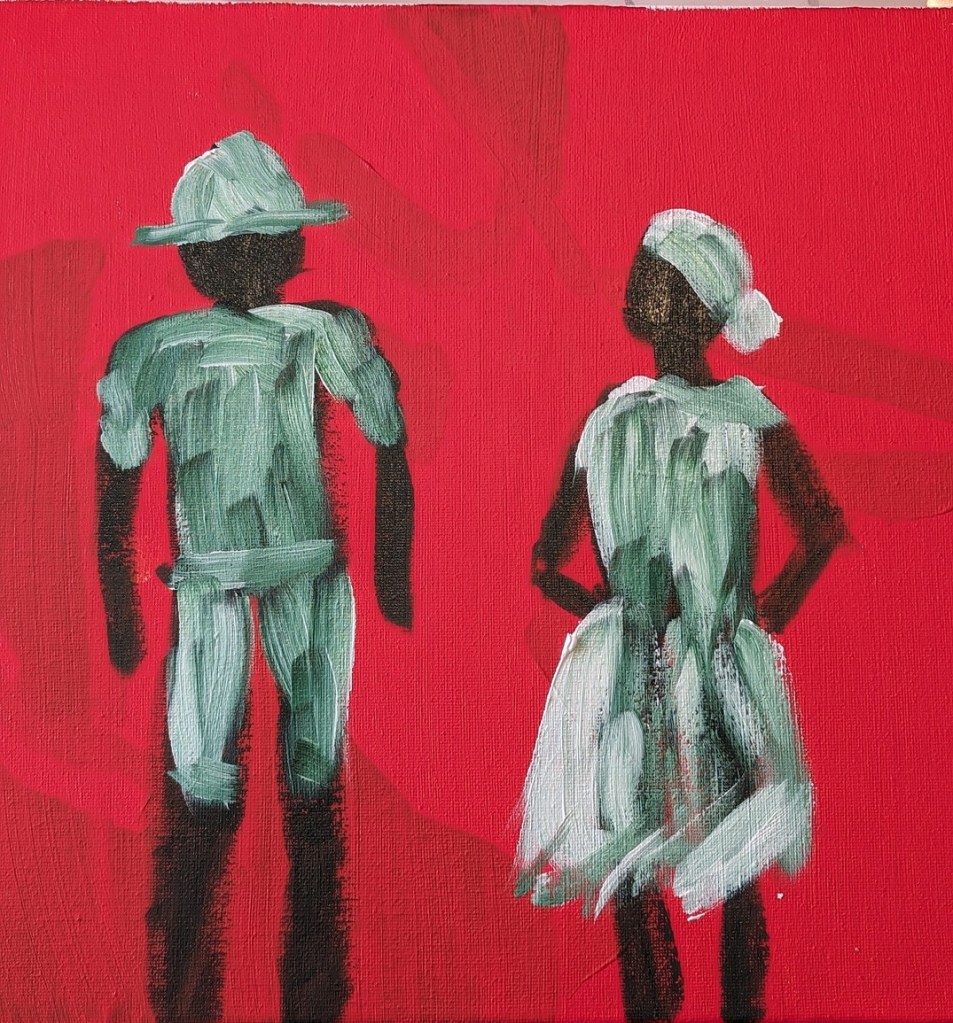
So, Slivka started out with an orangey underpainting, and then painted the forms in either Sap Green (which I used) or Hooker’s Green. For my background, I used Pyrrole Red (PR 254) mixed with Cadmium Yellow Hue (Liquitex Basics). (The blotchy look in the background is from my original unfinished painting.)
Then, while the figures were not yet dry, I followed along, painting their clothing in Titanium White, as Slivka did.
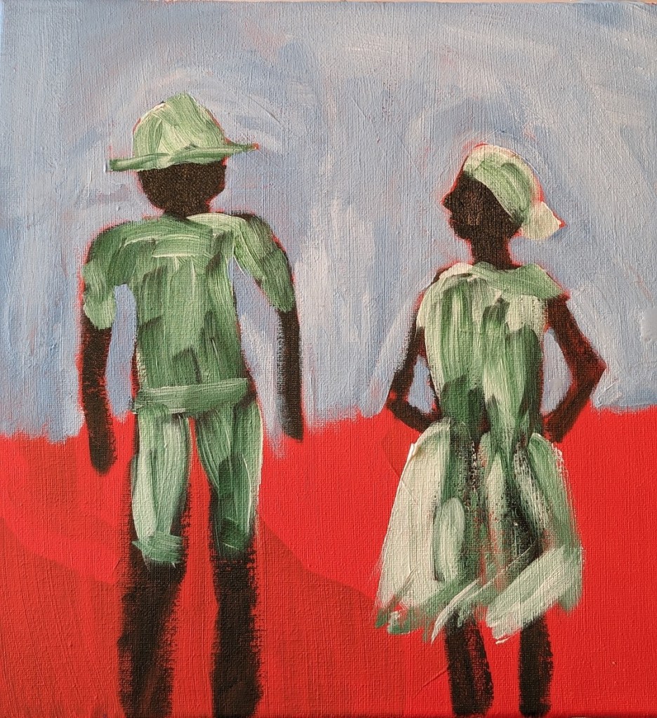
Painting the sky came next. I used Cerulean Blue (Utrecht Fluid brand) with some Titanium White.
Next was the ocean and the sand. Slivka uses some aqua green and Naples Yellow, respectively. I used Liquitex Basics Turquoise Green and created a kind of “Naples Yellow” by mixing Yellow Ochre with Titanium White. The sun-bright clothing was Titanium White softened with Cadmium Yellow Light Hue.
Slivka used Raw Sienna and Cadmium Red for the skin; I used Raw Sienna and Red Oxide. For the clothing shadows, Slivka used a violet with white. I used Liquitex Basics Gray Blue with some white.
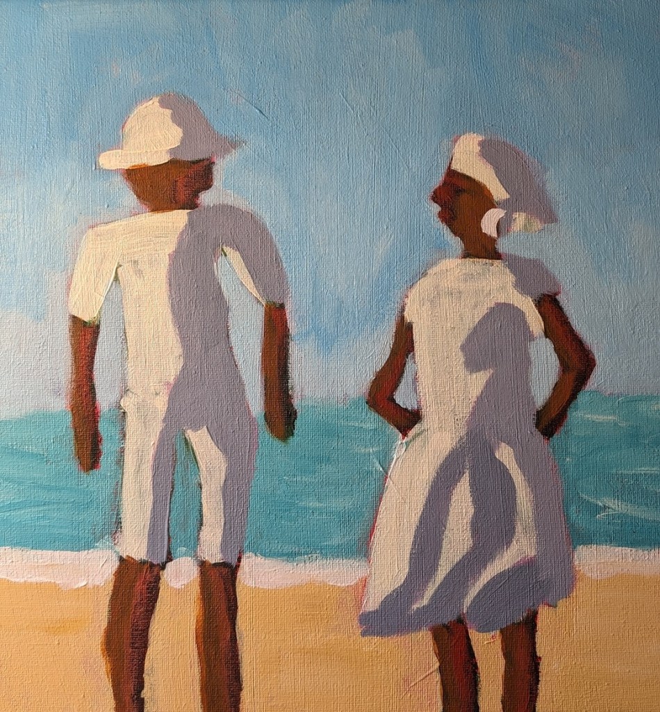
I repainted the sky from Cerulean to Light Blue Permanent (Liquitex brand) mixed with additional Titanium White. I may repaint the ocean, and get the horizon line straighter; regardless, this exercise was just a lot of fun!