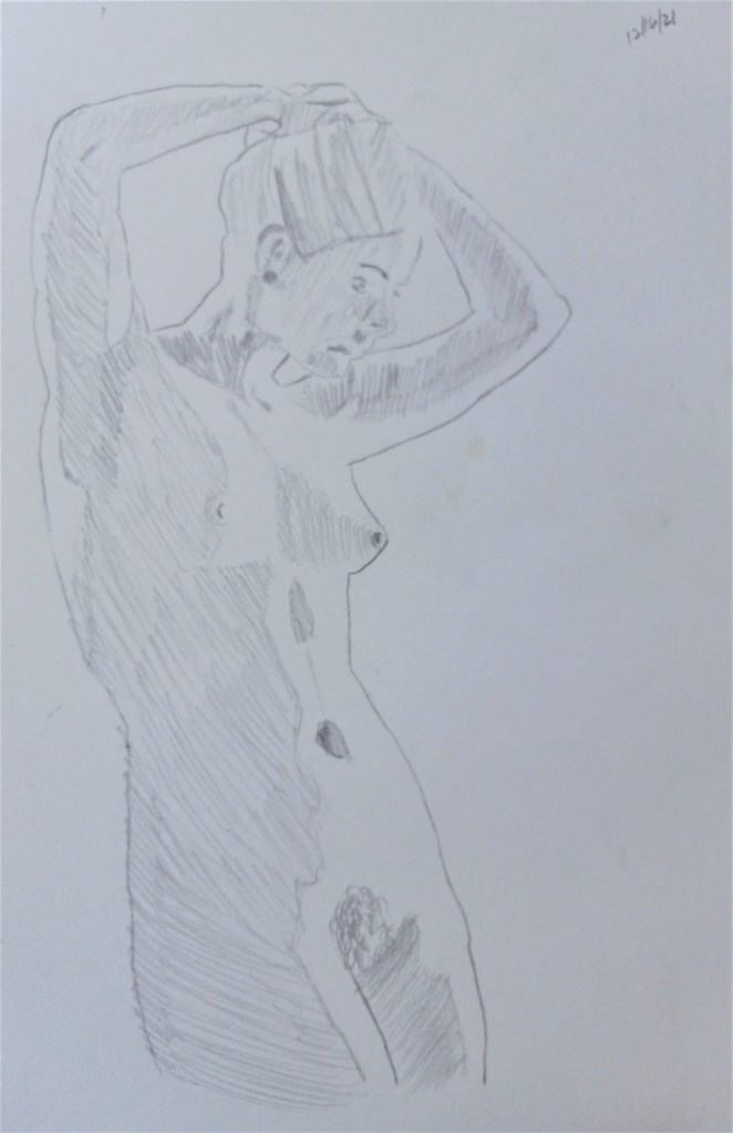
I was reading Mary Whyte’s book Painting Portraits and Figures in Watercolor (pub. 2011 by Watson-Guptill) and in it she talks about how imperative it is to watercolor painting to have good drawing skills, particularly if you are painting portraits or human figures. I suppose the same is true for other media, like pastel or oils. So, to that end, I did some drawing today.
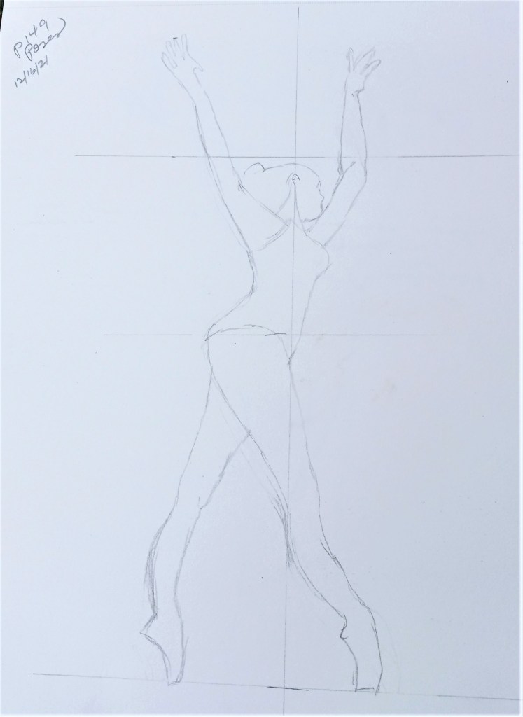
From The Complete Book of Poses, page 149Based on Pixabay photo by Roy Clarke Based on Pixabay photo by Sasin Tipchai
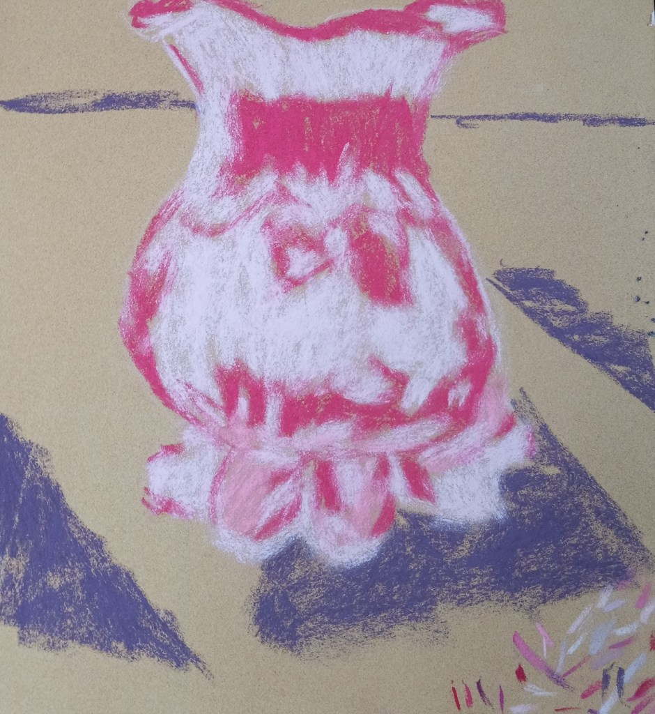
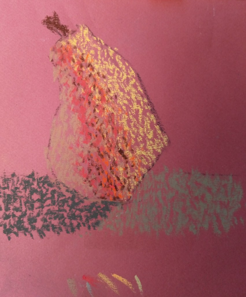
Finally got around to trying out some colors for my cranberry glass. I LOVED the paper — Sennelier Soft Pastel Card 360gsm — from my sampler set of sanded papers. I used Dick Blick Artist’s Soft pastels in 3 different rose colors, and they went down smooth as butter!
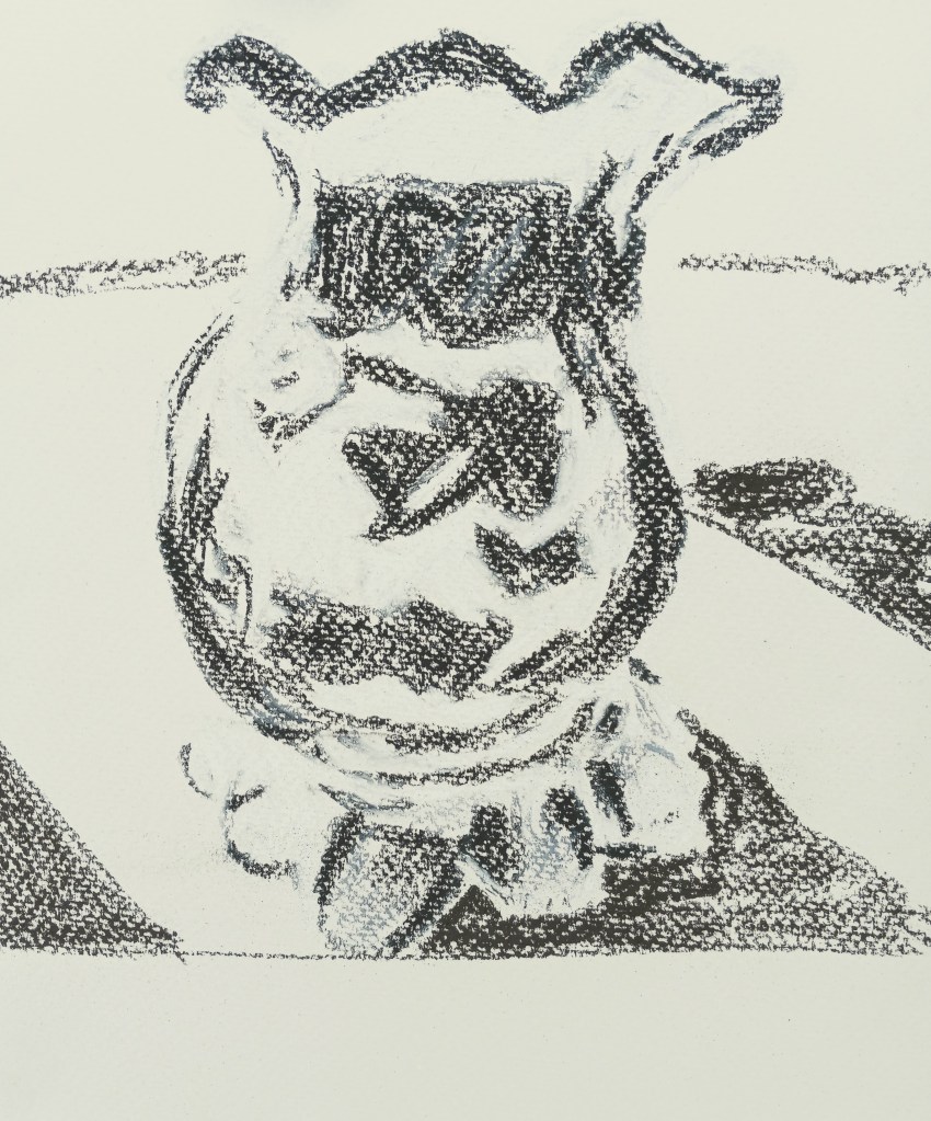
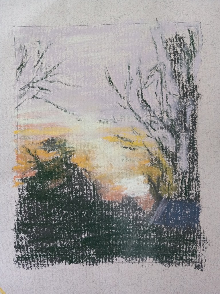
Comparing the two versions, I see i missed a few shadow spots. Oh well!
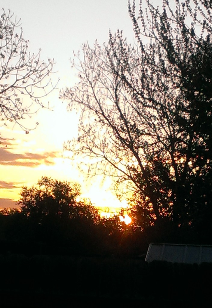
Today I did my own landscape painting based on a photo of a sunrise I took several years ago in our backyard.
I used Clairefontaine Ingres paper, which is unsanded, and not too bad. It was a pale tan color (and part of my unsanded paper sample I purchased from Jackson’s Art a year ago.) The initial drawing was done in vine charcoal. And I kept the size to 8×6.
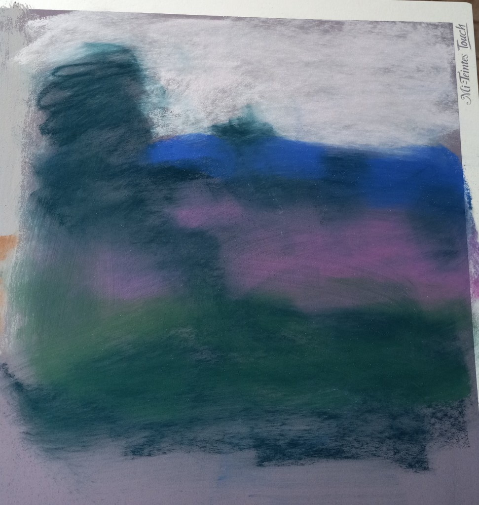
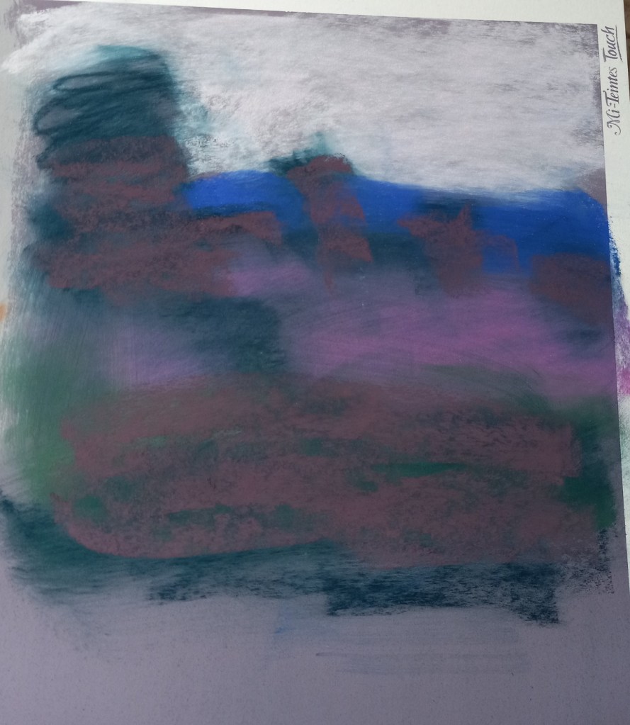
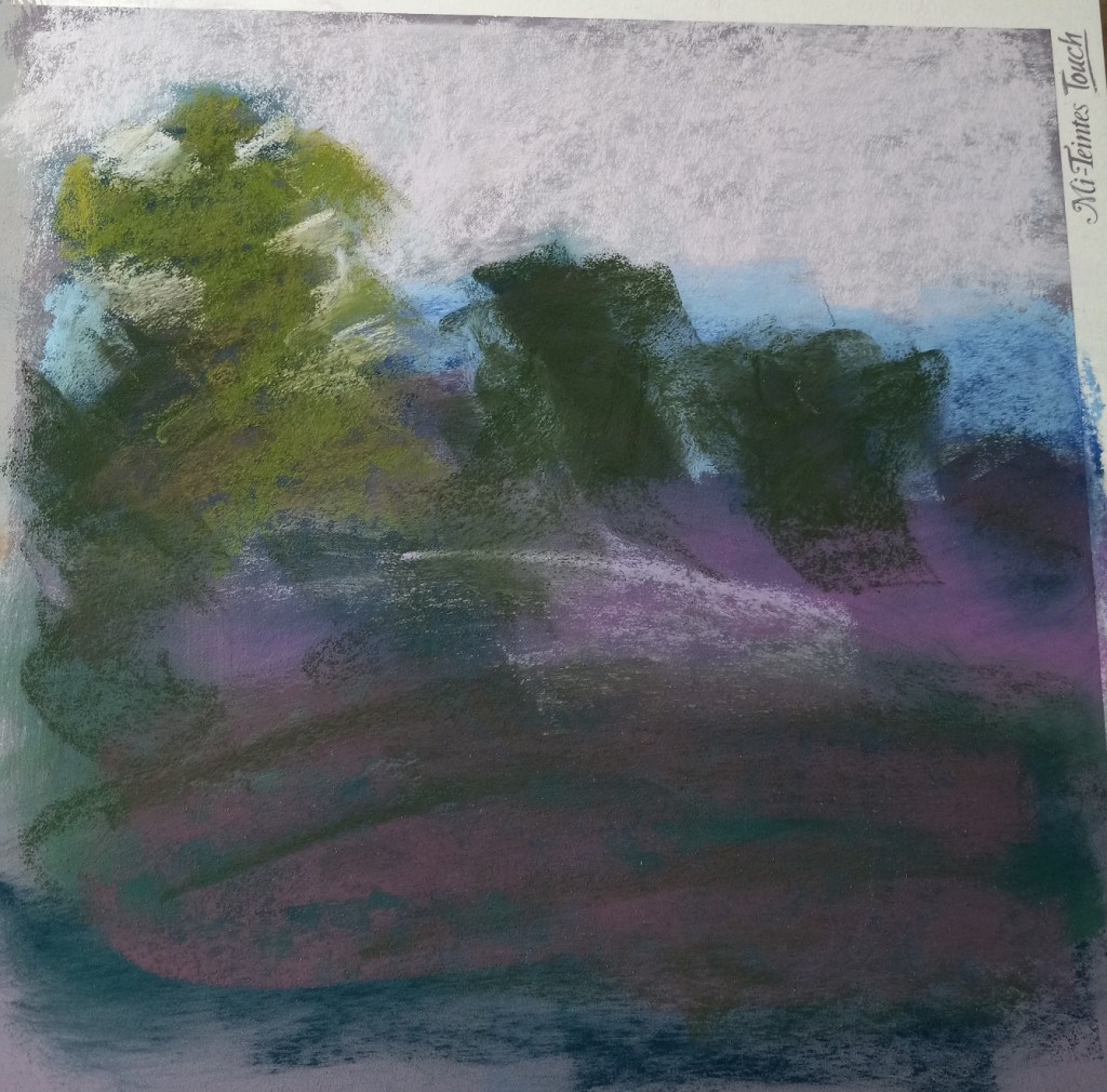
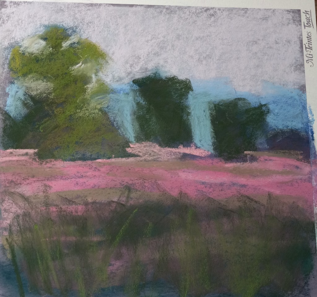
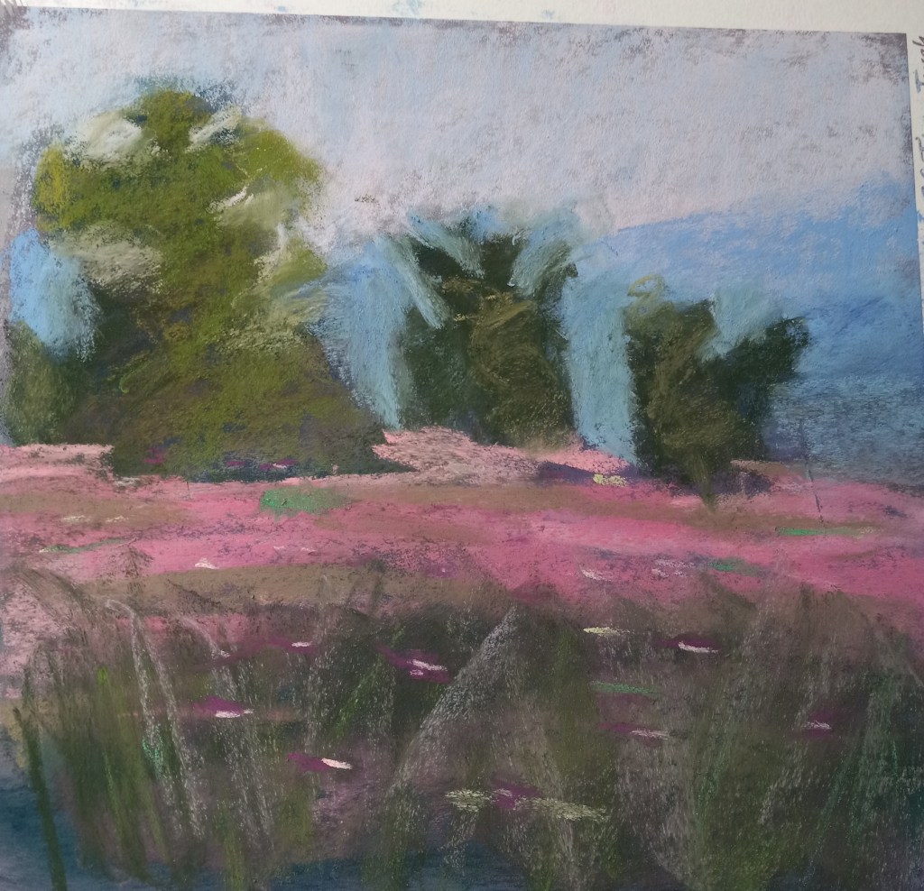
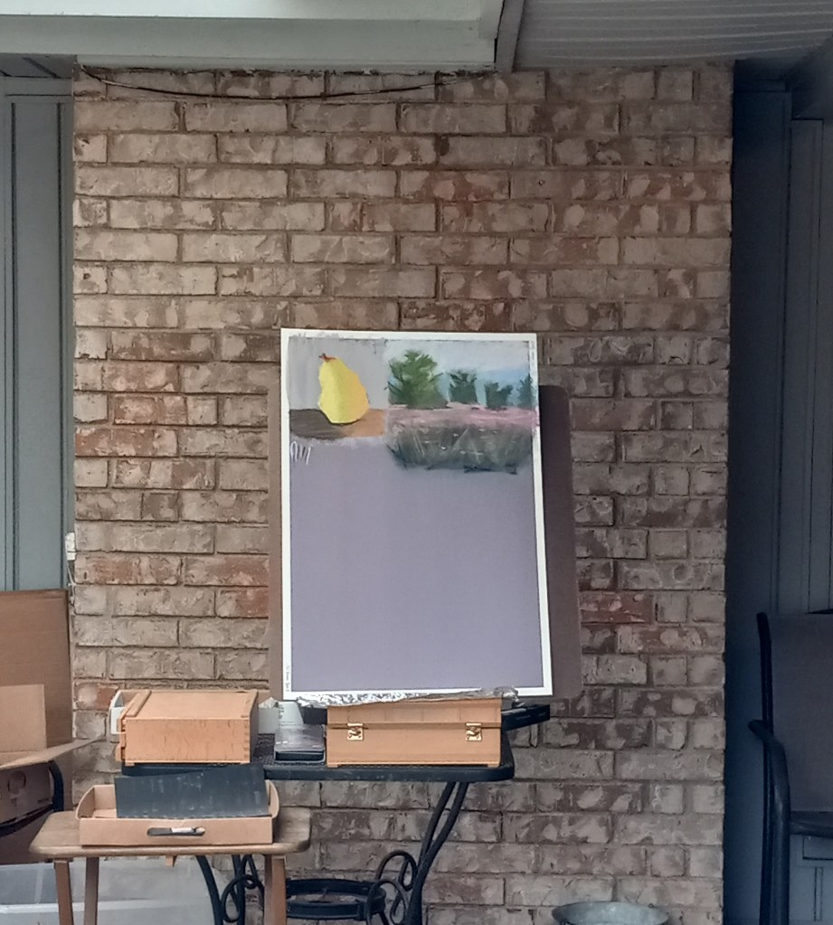
Today I watched a YouTube video (click here) by Karen Margulis about successful strategies for a daily painting habit. She demonstrated painting a landscape in pastel in 20 minutes and after I watched it once I decided to follow-along and try my hand at her style.
Below are step-by-step pictures of my attempt. I used a portion of my Canson Touch board in Twilight color. Karen’s painting is much superior to mine, but this was actually fun! It really did take 20 minutes. AND I feel ready to give a shot to doing a painting using one of my own photos.
The big tree really only looks like a tree from a distance, so I included a distant shot. I don’t yet have the skill Margulis has so I would want to draw out my trees a bit more. I can’t quite make the connection from abstract value shape to something I view as a tree after painting.
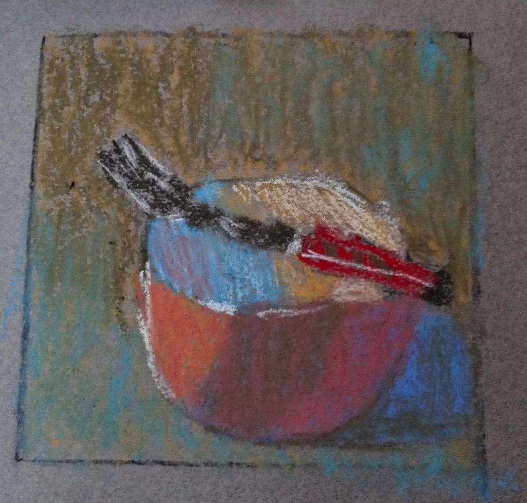
Gail Sibley has a video on YouTube wherein she uses white pastel paper, and a set of Terry Ludwig’s “Best Loved Basics” to paint a red-orange bowl with a fork balanced on it.
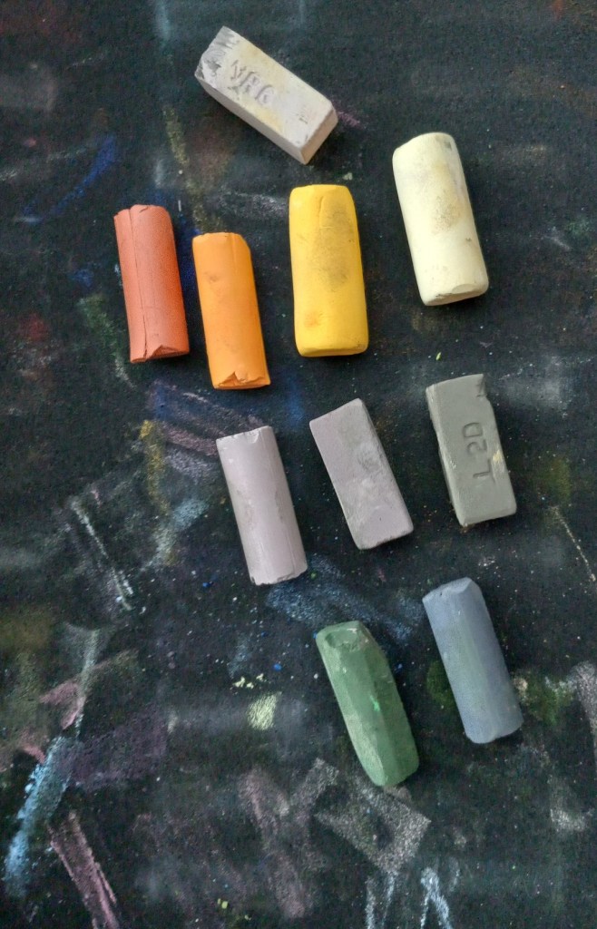
I decided to try my own hand at painting the red bowl. The paper I used was a gray-toned Canson Mi Teintes, and, since I don’t have Terry Ludwig pastels, I used a random set of 8 pastels (only 7 shown), making my best guess as to a close match to what Gail was using. I used vine charcoal to sketch the bowl on the pastel paper, and 2B charcoal pencil in the preliminary planning sketch.
I also created a grayscale version of the photo of the bowl, and the values are skewed. The background should not be darker than the cast shadow. Ditto for the shadow in the middle of the bowl, appearing like a gray stripe. It should not have been darker than the cast shadow.
I may tweak this painting tomorrow, if the paper can hold any more pastel.
Today I used some of my pieces of Canson Mi-Teintes paper, after reading some of Karen Margulis’ blog posts about loving the paper.
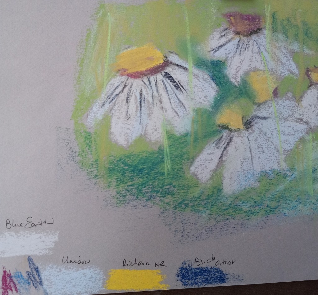
Since I’m still focused on pears and different mark-making styles, I decided to use stippling on a sheet of Terracotta tinted Mi-Teintes paper.
Then, after admiring the way Margulis makes her daisies, I attempted to copy her style (also on a piece of Mi-Teintes). I took Margulis’ advice to use a light touch, but I also did not do too much layering.
My experiment was largely to see which pastels work best on this paper. I noted the results at the bottom — Blue Earth and Richeson Hand-Rolled covered the paper much better than Unison or Blick Artists’ Soft Pastels. (Of course, that may also be the function of my skill level.)
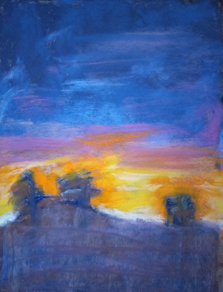
Today’s painting is my own version of a “Desert Glow” sunset after I followed along in Assignment #1 of Marla Baggetta’s “Sunsets in Pastel” online workshop. (I’ve now signed up for 3 of her workshops — and then, with the Black Friday sales still on until this Friday, also signed up for a subscription to her monthly pastel workshops).
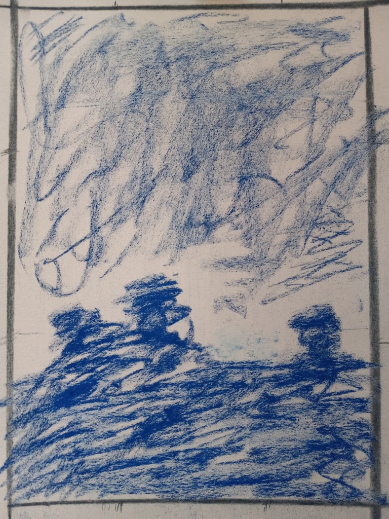
The first thing I did was to draw some thumbnails, using my Vincent Van Gogh brand of hard pastels, and vine charcoal. I decided to go with the vertical thumbnail on the bottom left as the reference for the sunset picture.
The next step was to proportionately size up the thumbnail sketch to the paper being used (Pastel Premier in Clay) and do the value sketch/underpainting. My thumbnail was, luckily, 2-1/2″ x 3-1/2″ so my picture was sized up to 7-1/2″ x 10-1/2″. I used Indigo Blue NuPastel for this part.
Next step was the fun part — choosing the colors!!
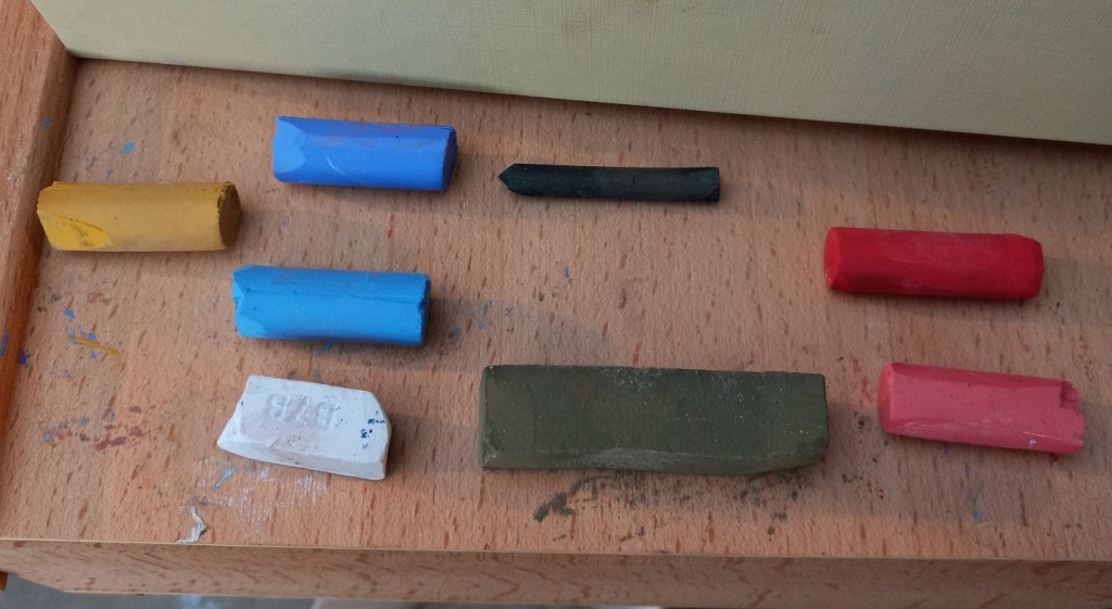
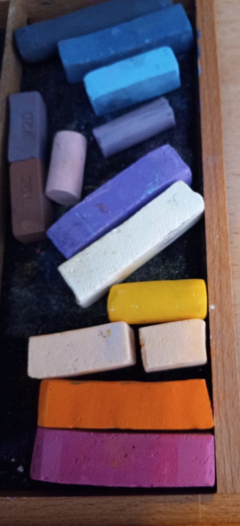
Gorgeous colors! These are almost all Great American, with some Blue Earth, a Terry Ludwig (light blue), and Mount Vision (darkest blue), and Dick Blick Artists’ Soft Pastels. The yellow is one of my Richeson Hand-Rolled yellows.
Here’s the completed study.
The first thing I have to say is that the photo — taken from my Samsung phone — does not sufficiently pick up the magenta, which is a bummer. It also picks up too much blue from the ground, which may (?) be due to the indigo blue underpainting (and of course the use of some darker blues in the ground area.)
Self-critiquing — I could go on and on. Marla Baggetta has a whole list of questions for us to ask ourselves, the first one being “Were you the director? Or did the piece direct you?” I got carried away laying down color, that’s for sure. It was a blast to use all those bright colors! I completely forgot about my thumbnail, and the idea of putting in a striated sky. And I got “lost” in the ground area, not having planned anything out (a structure like a house? Some telephone poles? Some greenery?) So the foreground is a poorly-thought-out mess.
What was good about this? I loved, loved, loved this paper texture! Totally fun to work with. AND I loved all the pastels I used.
For next time:
better planning for the foreground
More sky, less earth.
Underpainting — use the NuPastels again. but experiment with different colors.