3 Times a Hot Mess… But at least I’ve Learned something!

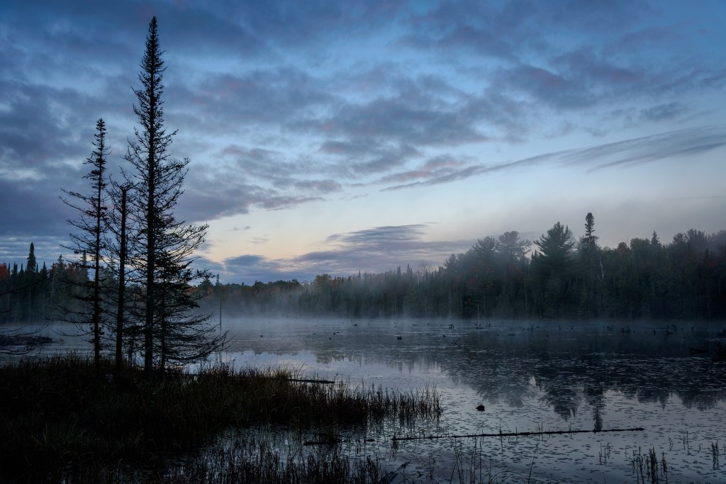
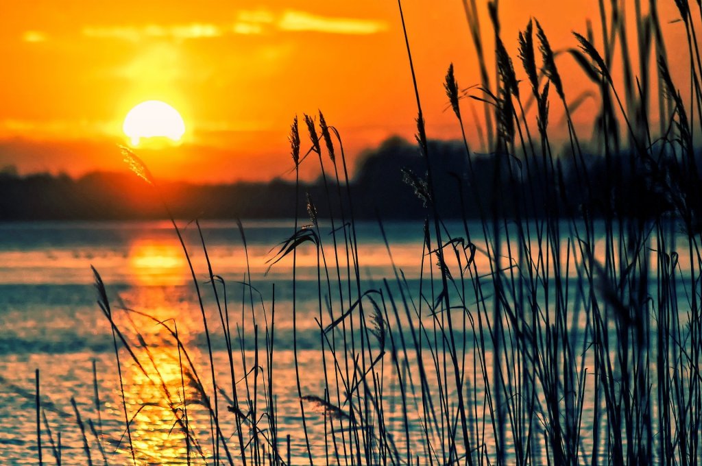
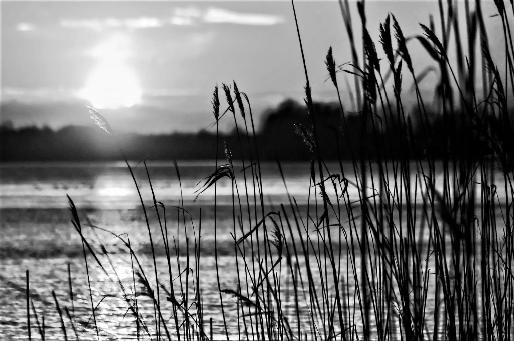
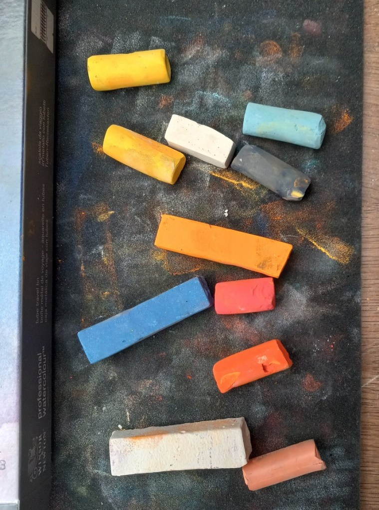
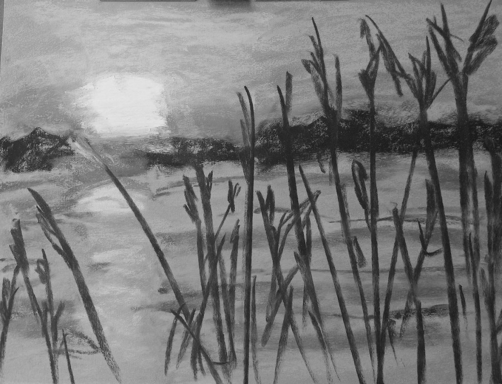
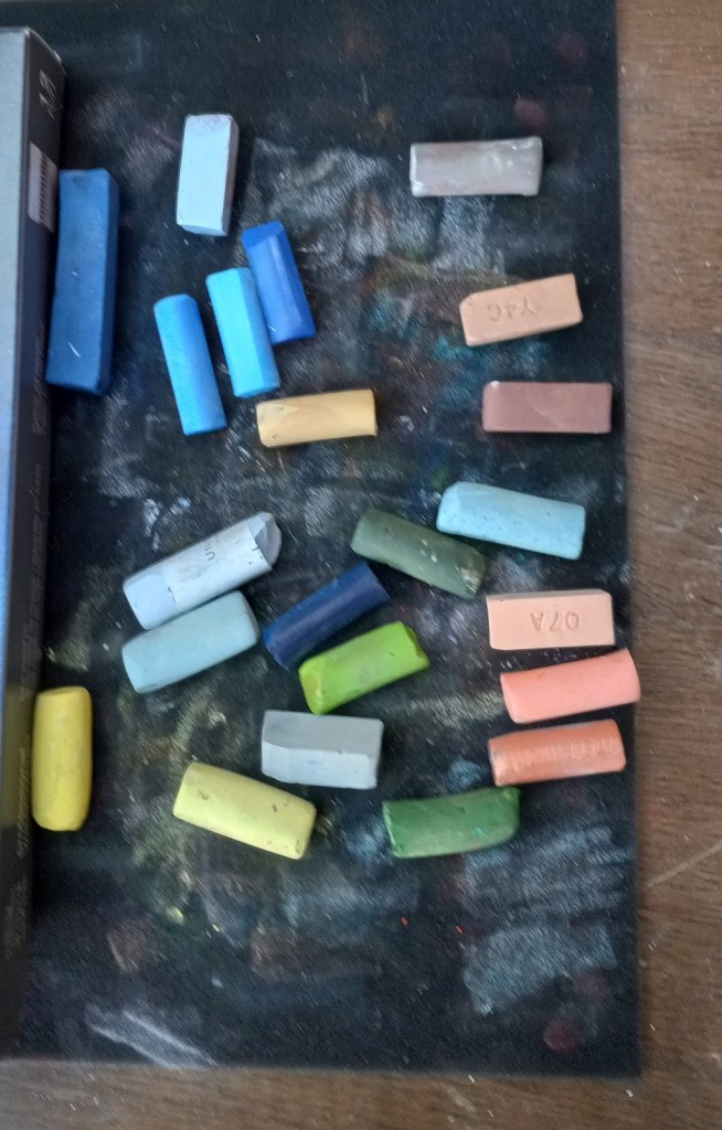
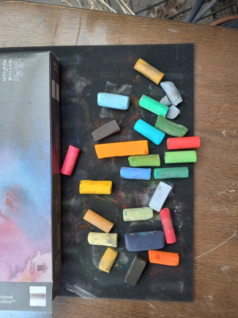
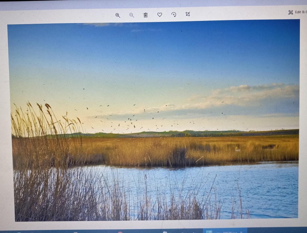
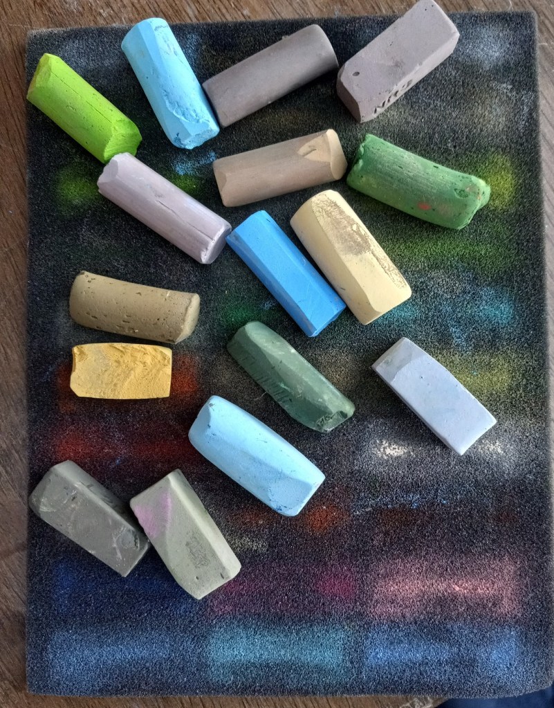
This project was based on an image by MustangJoe from Pixabay. I used Colourfix Smooth in Blue Haze all three times, as well as using the same palette.

All three efforts were failures, but at least I learned a few things.
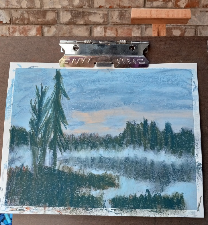
Attempt #1

First time around, I did an underpainting (of the dark areas only) using a Blue Violet NuPastel. Using this color was a BAD idea! Why? Because I would later add a dark gray-green, and a reddish brown on top of that blue violet, which made mud. Ugh!

First time around, I also used too heavy a hand, in effect scribbling with the pastels trying to cover the paper. Bad idea — too heavy a hand can ALSO create mud.

First time around, the pine trees were cartoonish. But I was so frustrated with the mud mess I didn’t care at that point!
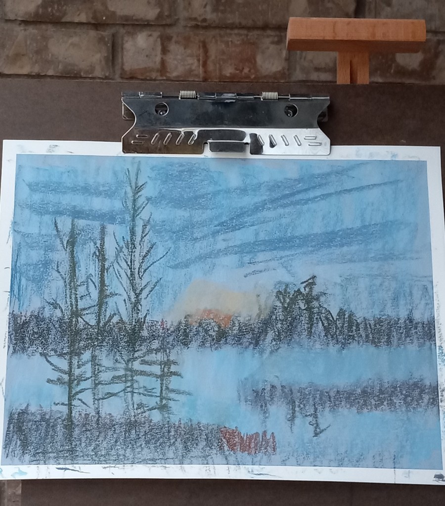
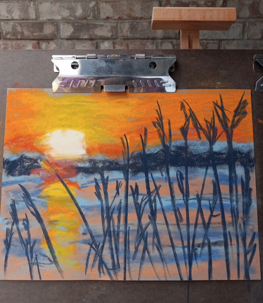
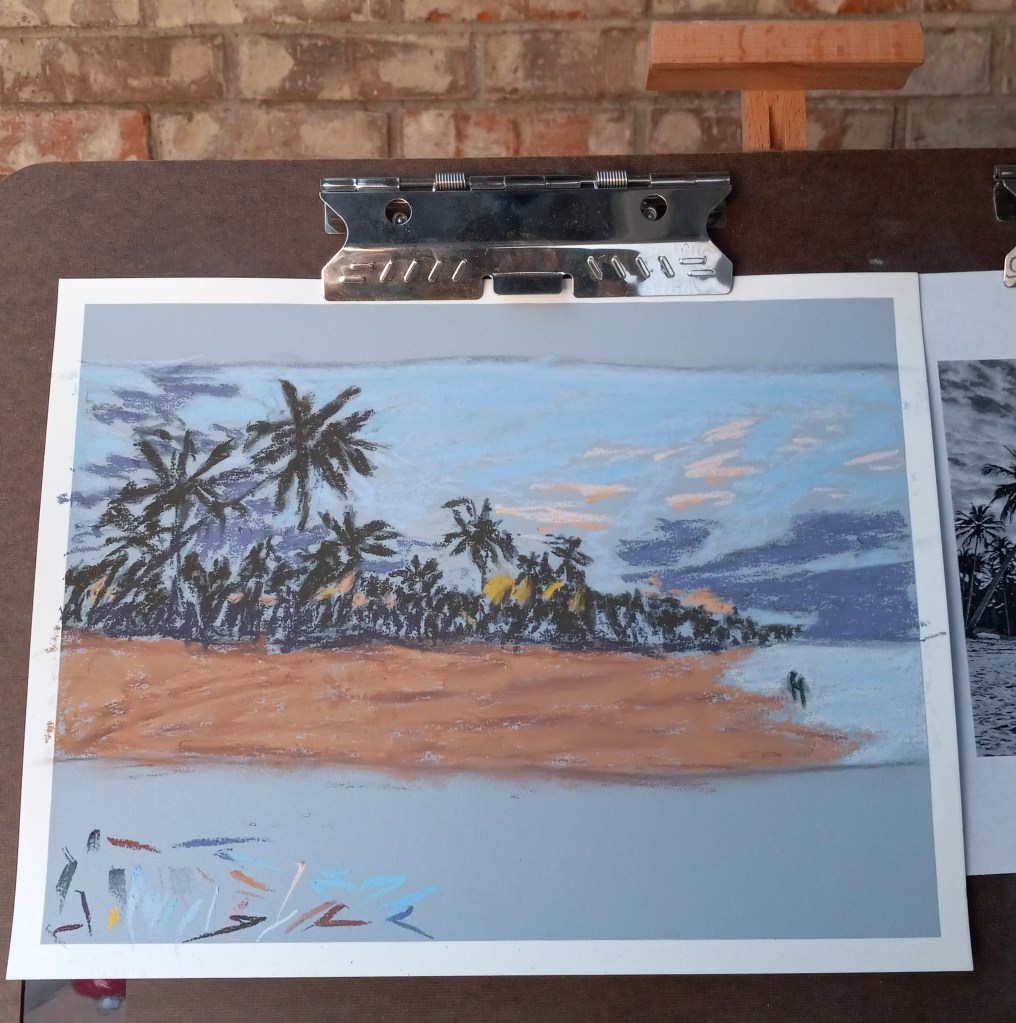
Attempt #2

  • My second attempt was successful in that I maintained a much lighter touch. But I still had mud because I still did the Blue Violet underpainting before using the dark green and the reddish brown.
  • The pine trees were rendered a little bit more like the photo, which pleased me.
  • I struggled with laying down color with certain pastel sticks. I ended up mostly with broad strokes done vertically, which doesn’t really work for the sky.
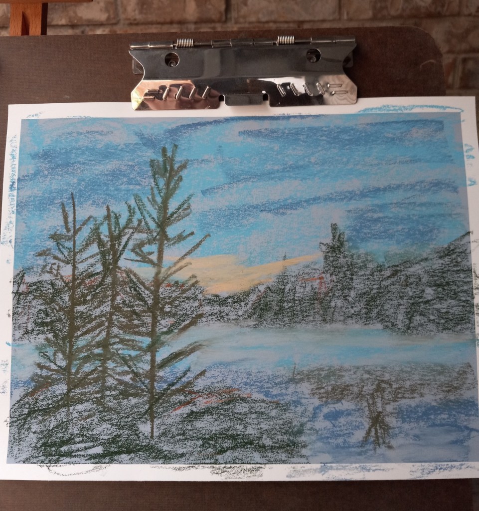
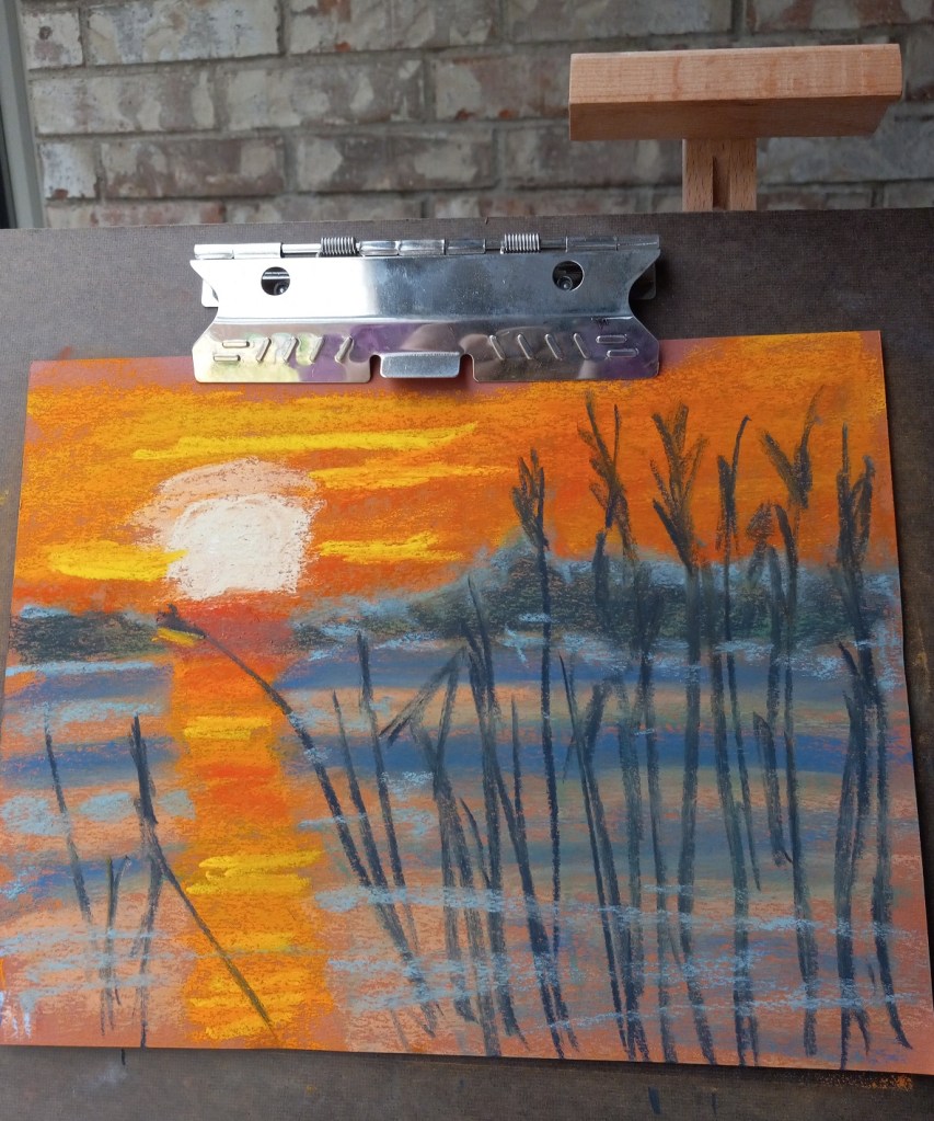
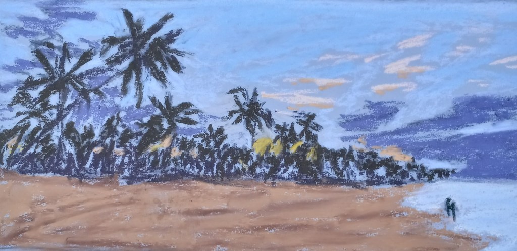
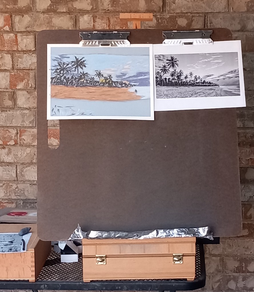
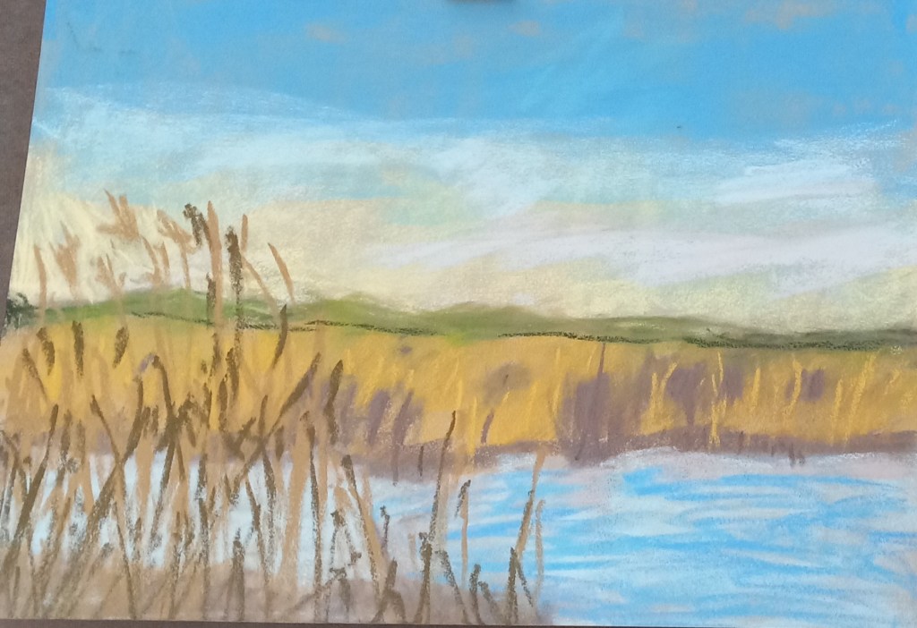
Attempt #3

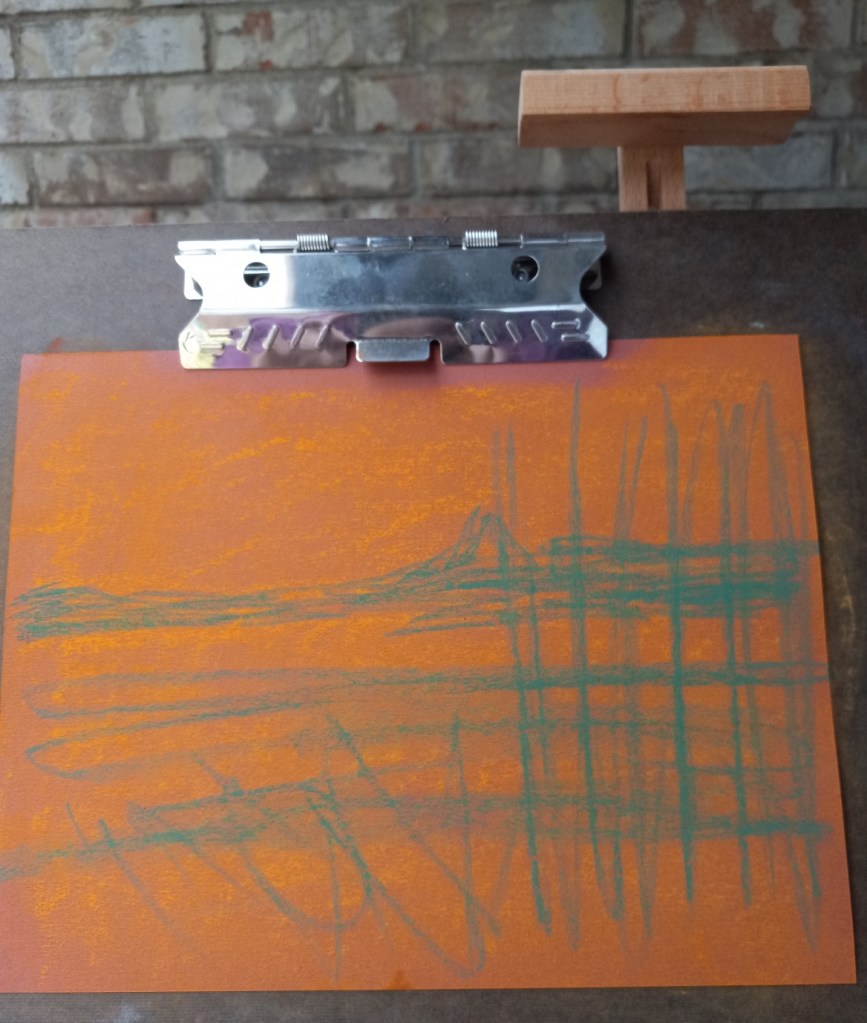
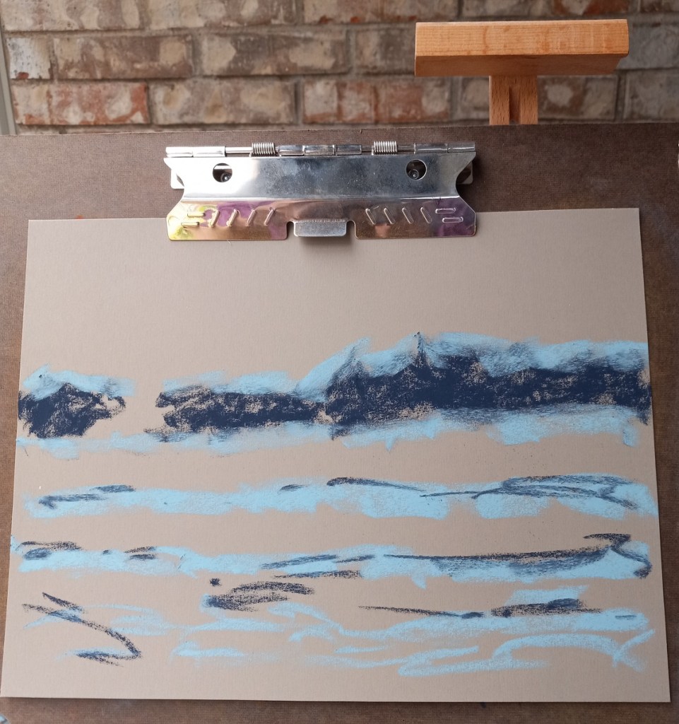
  • This time I skipped the underpainting — whew! Still had mud because the gray-green and the orangey-brown are NOT a good pairing!
  • Had better luck with making marks for the sky, but the colors are not quite right to my mind. In analyzing the source image, I realize there is more of a lavender hint to the darks rather than green brown.

I need to try colors with more purple and less green and brown. I may need to experiment with papers which have more grit.

Reference photo
Sticks used
Violet Blue NuPastel

Attempt #1
Attempt #2
Attempt #3

Two Landscape Studies: Different Papers

Today I did two landscapes using the same reference photo, and the same pastels, but two different papers and underpainting.

The reference photo was from an image by Tomasz Marciniak from Pixabay. I made it grayscale to verify there was sufficient difference in values.

The pastels I used were Great American, Blick Artists’ Soft Pastels, Richeson Hand-rolled, and Blue Earth.

Pastels for sunset at the lake

The first painting was done on Canson Mi-Teintes (smooth side) in the Red Earth tint. I did an underpainting with NuPastels (212 – Deep Orange, and 378 – Erin Green).

The second painting was done without any kind of underpainting, and using Pastel Premier paper in Italian Clay, a 320 grit sanded paper.

Here are the 3 pictures in grayscale: the original photo, the pastel on Canson paper, and the pastel on Pastel Premier.

Here are the three images in color (same order):

Christmas Ornaments: my own version

I used a Hahnemühle non-sanded pastel paper from my sampler set to draw the pair of ornaments taken from my fireplace decorations.

I took a photo of the entire easel scene; you can see the reference objects on the left. I also took a photo of the ornaments, and the color palette I used.

I was painting from life rather than the photo reference; the photo looks somewhat bluer and I was standing at a slightly different position taking the photo than when I was actually pasteling.

Christmas ornaments: Follow-along with Marla Baggetta

I watched Marla Baggetta’s YouTube video from December 2019 in which she did a pastel painting of Christmas tree ornaments. I then attempted to copy her work to get a feel for how she laid colors for each ornament.

My copied work was done on Canson Mi-Teintes (the Red Earth shade) on the “honeycomb” textured side because I messed up the initial drawing on the smooth side. The initial drawing was done using vine charcoal, and then I used the sticks shown below for color. It looks best from far away!

Next up is trying a painting using some of my own ornaments.