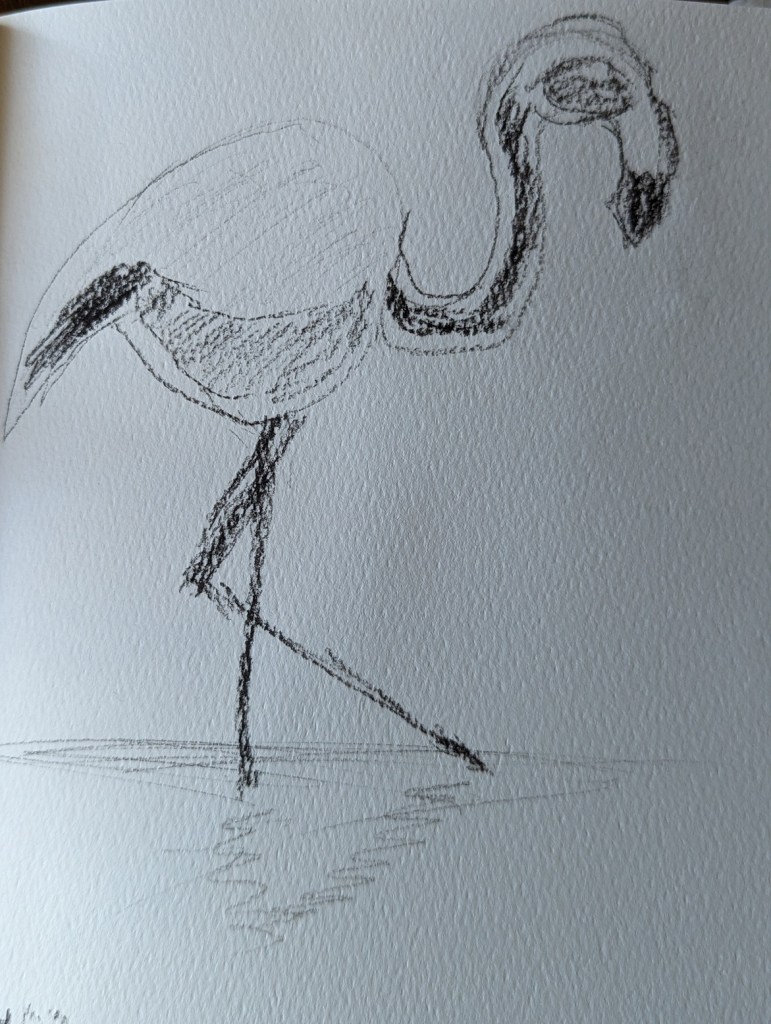
This charcoal pencil sketch is based on an image by sarahbernier3140 from Pixabay, which I intend to paint at some point soon.


This charcoal pencil sketch is based on an image by sarahbernier3140 from Pixabay, which I intend to paint at some point soon.
I did this charcoal pencil sketch of a flamingo in my Arteza sketchbook. My intention is to paint it at some point.
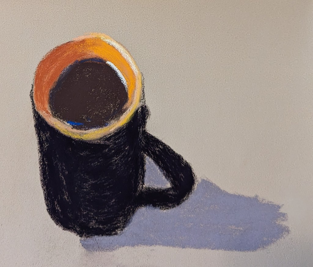
These pastel paintings were done based off an image by นิธิ วีระสันติ from Pixabay.
I used the same pastel palette for both (mostly) — Blick, Richeson, and Terry Ludwig sticks.
The paper on the left is Art Spectrum Colourfix, and the paper on the right — which I found easier to work with — is Clairefontaine Pastelmat.

This pastel work, done on an approx. 12×10 scrap of white Pastelmat, was based in part off an image by Somchai Sumnow from Pixabay, but also off of some of my own reference photos of Hawaiian beaches.
Mostly I was interested in the different shades of blue and also how different brands of pastel lay down on the paper. There are some weird diagonal lines, probably creases from the original 19×25 size of the Pastelmat sheet,
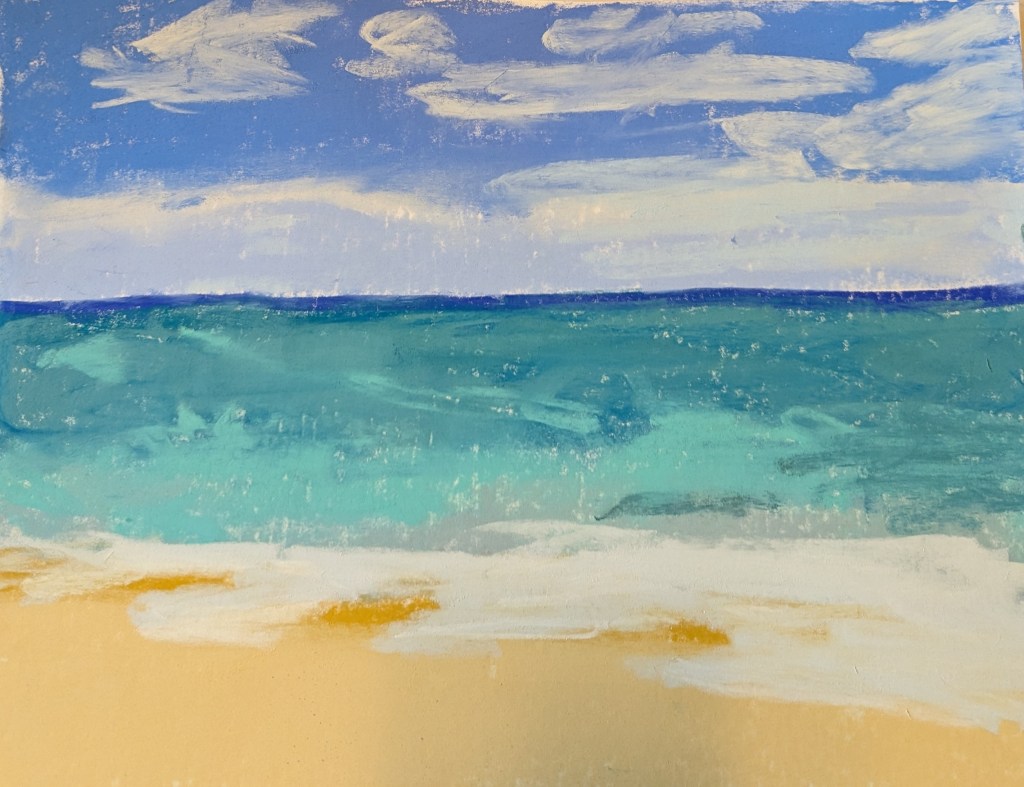
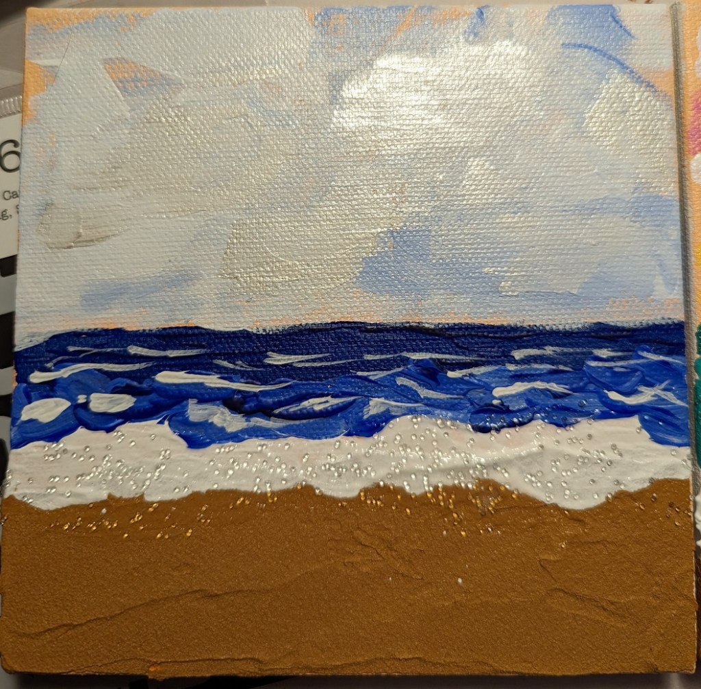
And, just for fun, comparing the above pastel piece with another beach piece I did 3 or 4 months ago with acrylics, sand texture, glass beads, and iridescent paint.
After painting the sunflowers in my two previous posts — as much as fun as it was — I wanted to make my flowers more artistic and less symbolic. I was reading blog posts from Karen Margulis, a pastel painter, and was inspired to up my game.
This was done in pastel on a terracotta-colored 6×8 Pastel Premier 4-ply board.

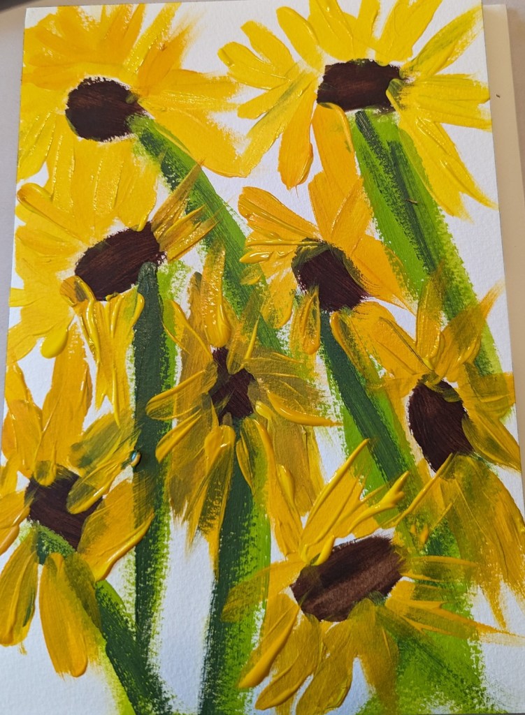
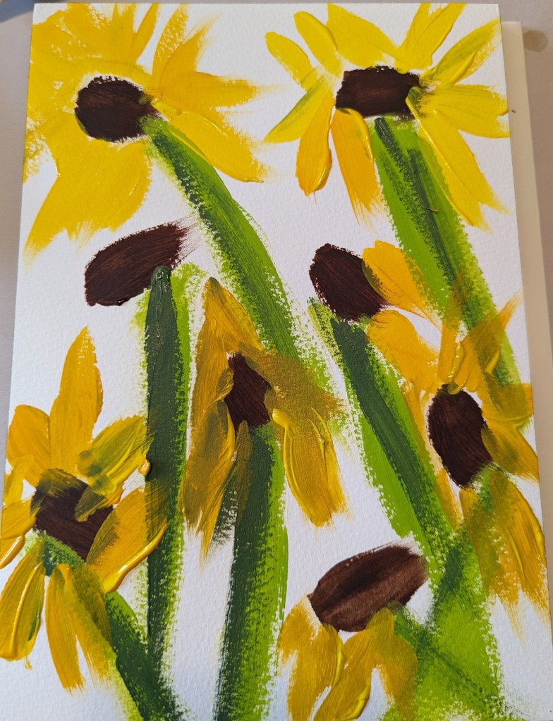
After doing a quickie version in pastels, I decided to a similar scene in acrylics. This was done on 7×10 300-lb. cold-pressed watercolor paper.
Here’s the work-in-progress (right) and the finished version (left).
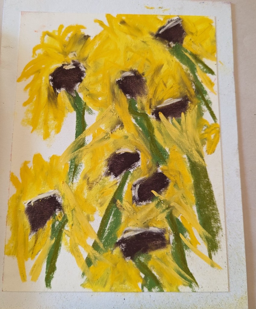
This was just a quickie because I didn’t have a lot of time, yet I wanted to paint something. It was done on a 6×8 white Pastel Premier 4-ply board (from a sampler set I got at Dakota Pastels a few years back).
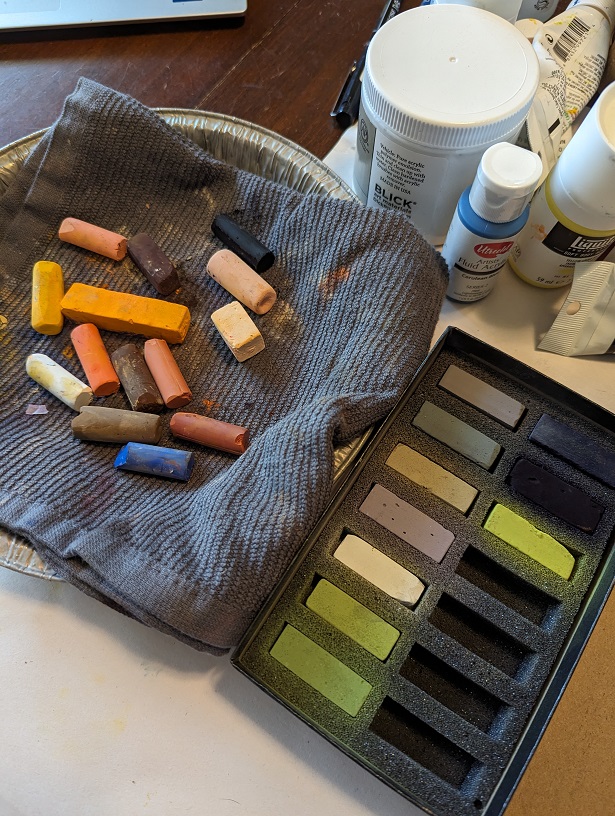
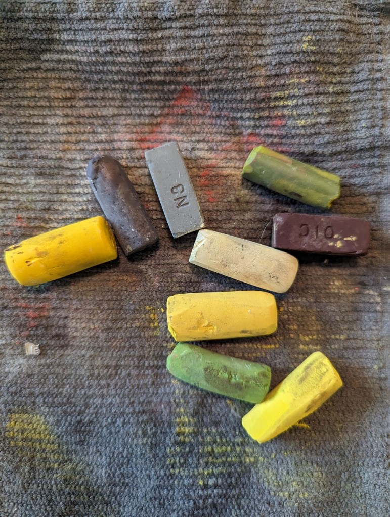
I didn’t even use all the pastel sticks shown below — but one thing I would do differently would be to paint the centers last so as not to smear the yellow shades with the darker brown.
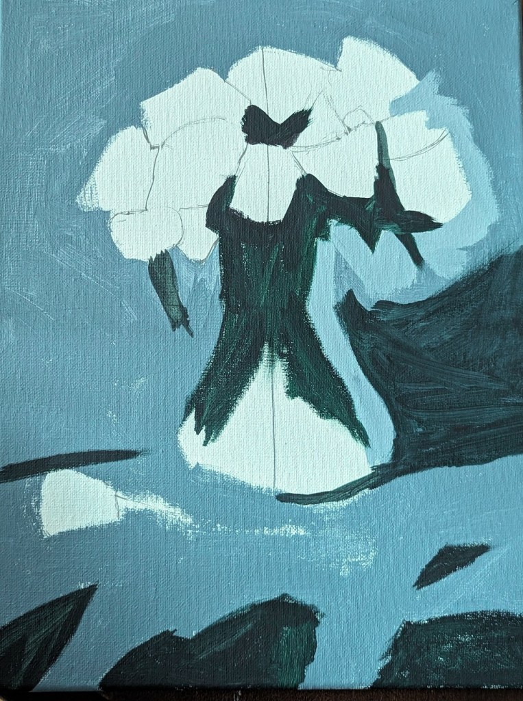
I’m trying roses now, using a reference photo from PaintCoach’s Patreon site. This is the background done, on a 11×14 canvas.
Wow! I’ve actually made 100 paintings. This one was my first from life rather than a photo. And, man, these sunflowers are in bad shape! I bought them specifically to paint them, but I’ve been drawing rather than painting for the last week or so. (I did take some photos of them right when I bought them, though, so I can try again.)
I decide to use my new Green Earth paint for the stems and leaves (mixed with my go-to Chromium Oxide Green. I used Diarylide Yellow for the petals, and a mix of Burnt Umber Light w/ Carbon Black for the faces of the flowers.

 BetterLateThanNeverArt