I’ve been away from drawing and painting for a few weeks now… must be the summer heat. Finally picked up my Aquarelle pencils and sketch book to do this quickie face.
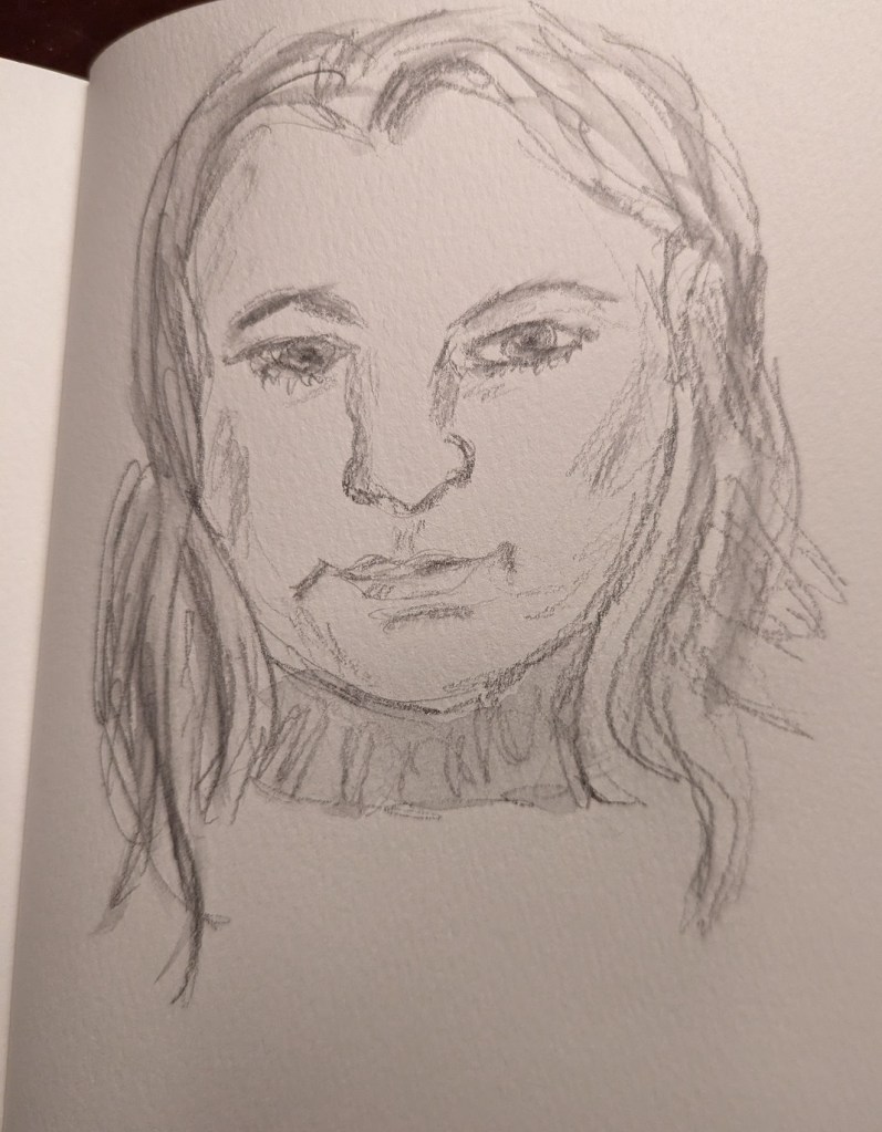

I’ve been away from drawing and painting for a few weeks now… must be the summer heat. Finally picked up my Aquarelle pencils and sketch book to do this quickie face.
As I mentioned in this post, I’m taking the online course by Peggi Kroll-Roberts, and the assignment is to do 2-value and then 3-value studies painting the figure. In this effort, I am using the figure I sketched out in charcoal here, as prep for a future painting.
I drew out the figure first, using a 6×8 piece of 300-lb watercolor paper. For comparison’s sake, I’ve included the charcoal figure.
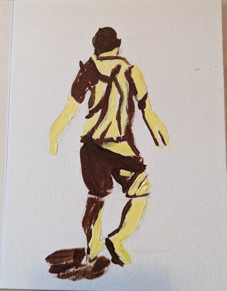

Based on an image by sarahbernier3140 from Pixabay
I wasn’t particularly satisfied with my pink and white roses in the vase a few posts back so I tried winging this one (on 6×8 watercolor paper). I like the colors, but this is a pretty abstract “symbolic” rose.

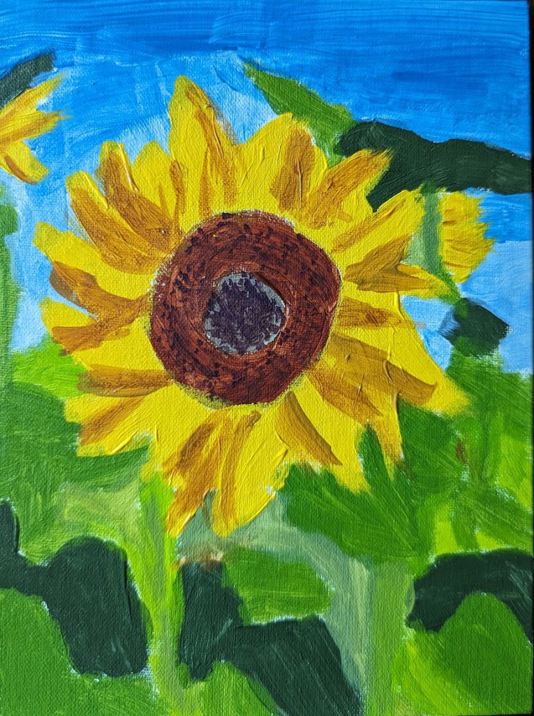
I’m still fired up about sunflowers, and trying to improve. This work was based off the image by Nadine Doerlé from Pixabay.
I did the background is dioxazine purple, a complementary of the yellow. (I think I’m better at drawing out the sunflower than painting it!)
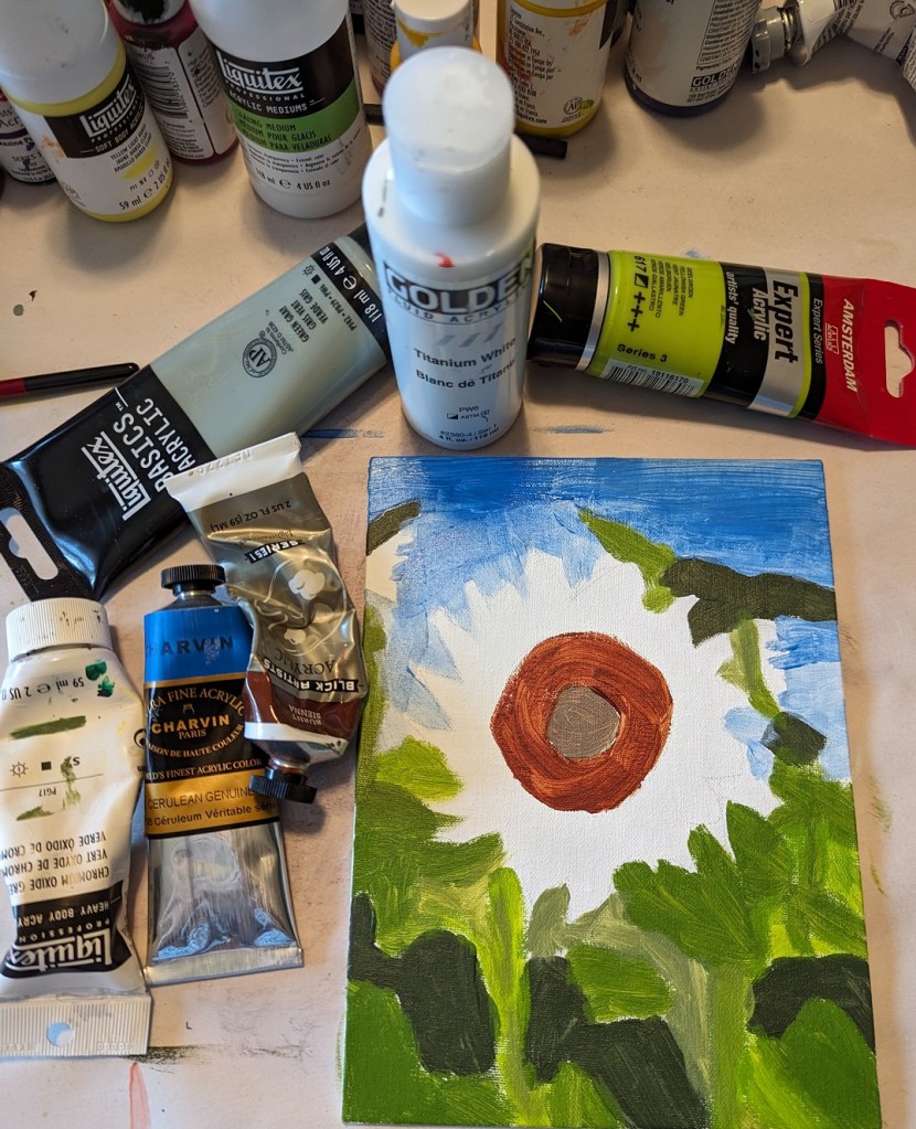
Step 1 – draw out the flower; Step 2 – paint the background

Then I painted the flower petals and the center.
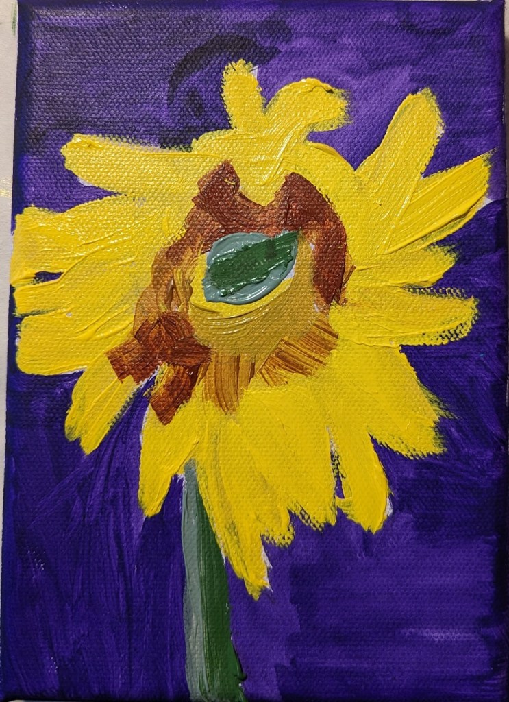
And, last steps.

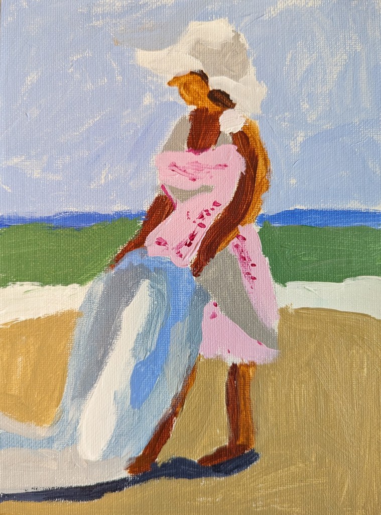
I’m taking an online class (more precisely, watching streaming demos online) by Peggi Kroll-Roberts who is particularly known for her beach photos of human figures. The class is about value structures to show the form of the human figure: the lights and darks.
Effectively, this is a notan. You start with 2 values and then move to 2 darks, 1 light or 2 lights, 1 dark. And then you move to color.
My next step here would be to paint in black and white, then to move to 3 values, and finally to color — using colors mapped to the values.
In fact, Laurel Hart, in her 2007 book Putting People in your Paintings (on p. 23) even suggests you even go ahead and paint over your penciled-in shadows if you prefer. You can erase the pencil later.

I recently purchased the June 2019 of Leisure Painter which had an article by Steve Strode about the basics of acrylics. He suggests you model good painters, and gives an example in the magazine of his painting based off of Peggi Kroll-Roberts‘ style.
This is the first figure I’ve ever painted, and my goal was 1) just to do one, and 2) was trying to focus on using minimal brush strokes — just to boldly attempt it, in other words.

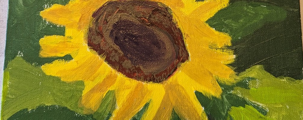
This 6×8 painting of a sunflower is based off the image used for Episode 29 of Artists Network Drawing Together series. What I did differently from the others I’ve painted was that for the shadowed part of the leaves, I mixed my yellow with a touch of Dioxazine Purple to desaturate it (rather than using Yellow Ochre). Ditto for the center of the flower; there’s a lot of the purple mixed in with yellow (although I also used Burnt Sienna and Burnt Umber).
Here’s the work-in-progress.

And here’s the finished piece.

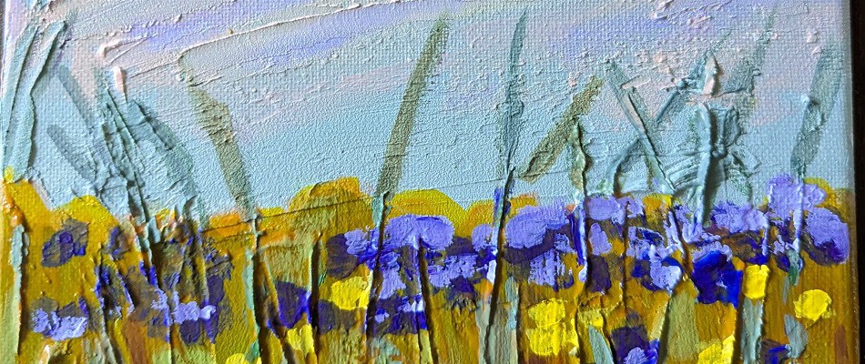
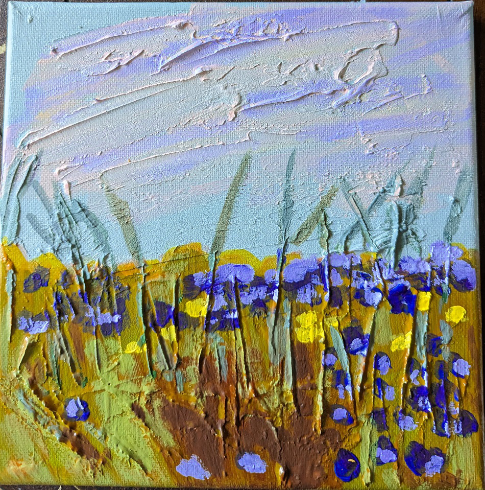
This painting was based off an image by RÜŞTÜ BOZKUŞ from Pixabay, and an article I found on the UK site Painters Online. I used an 8×8 canvas for this work, and took photos of each step I took.
Step One was to apply the modeling paste. The horizontal “goop” was to signify clouds; the vertical lines was to signify weeds and plant stalks.
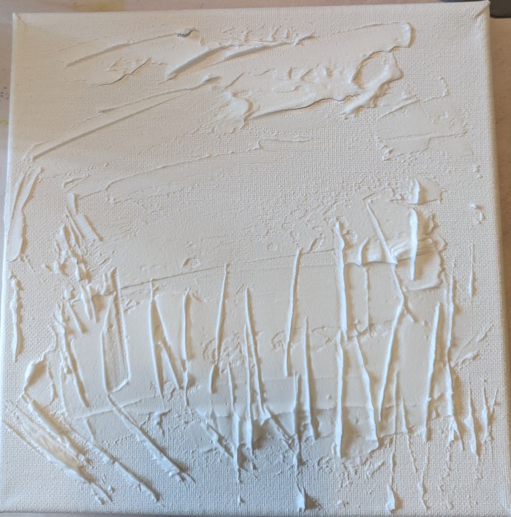
After applying the modeling paste and letting it thoroughly dry, I went in my own direction rather than following the Painters Online demo.
I used a gray green mixed with a yellow green for the grasses, and a gray blue for the sky area.
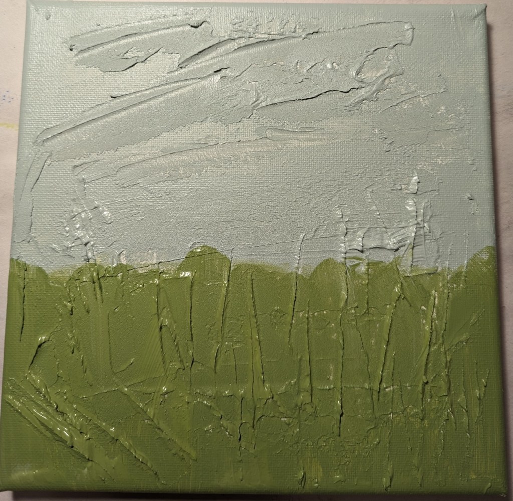
Green is reportedly not a good color to use alone when doing landscapes and meadows. So, my next step was to apply a transparent orange glaze (using Liquitex Gloss Glazing Medium over the green paint, and let that dry thoroughly.
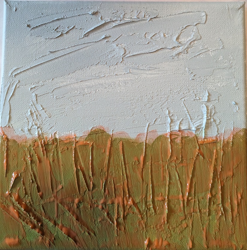
After the glaze dried, I added a darker value in the center bottom (to match with the reference photo) as well as adding a glaze of Cadmium Red Medium Hue for the clouds.

Next I painted the flowers, using Dioxazine Purple with some Titanium White, some yellow flowers, and highlighted the stems with Gray Green, yellow, and Burnt Sienna. I retouched the grassy area with some green. Then I added some of the Dioxazine Purple mixture to the clouds in the sky, and called it a day.
(The photo here doesn’t fully reflect the periwinkle/purple color of the flowers; they look too blue.)