I’m trying roses now, using a reference photo from PaintCoach’s Patreon site. This is the background done, on a 11×14 canvas.
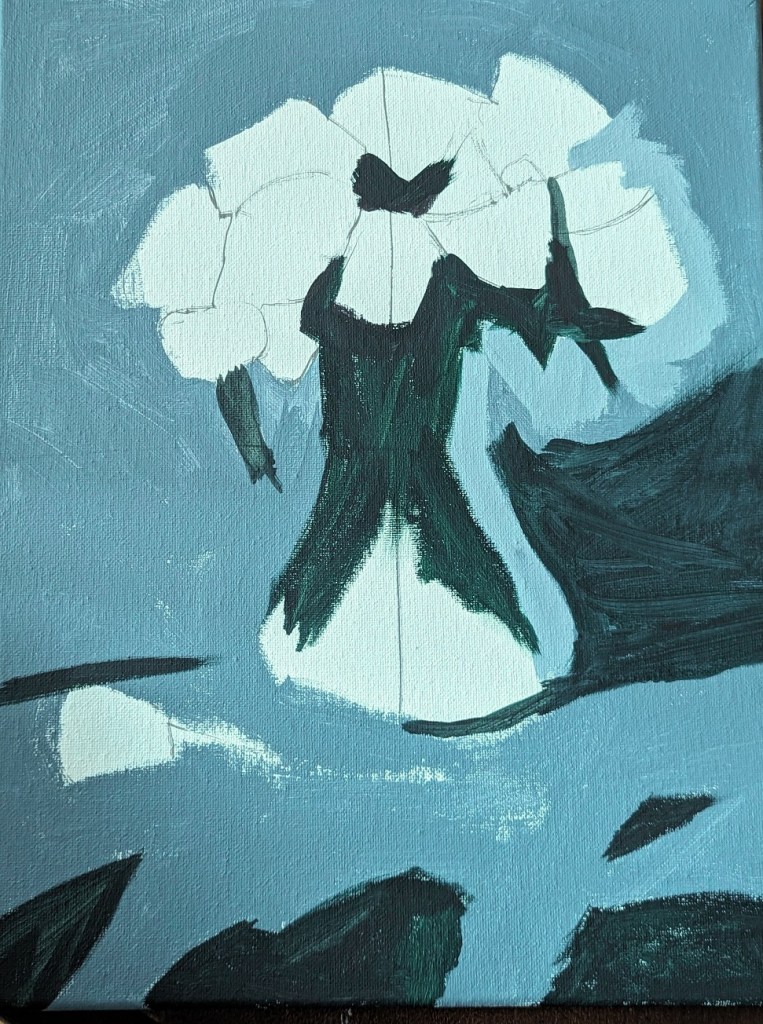

I’m trying roses now, using a reference photo from PaintCoach’s Patreon site. This is the background done, on a 11×14 canvas.
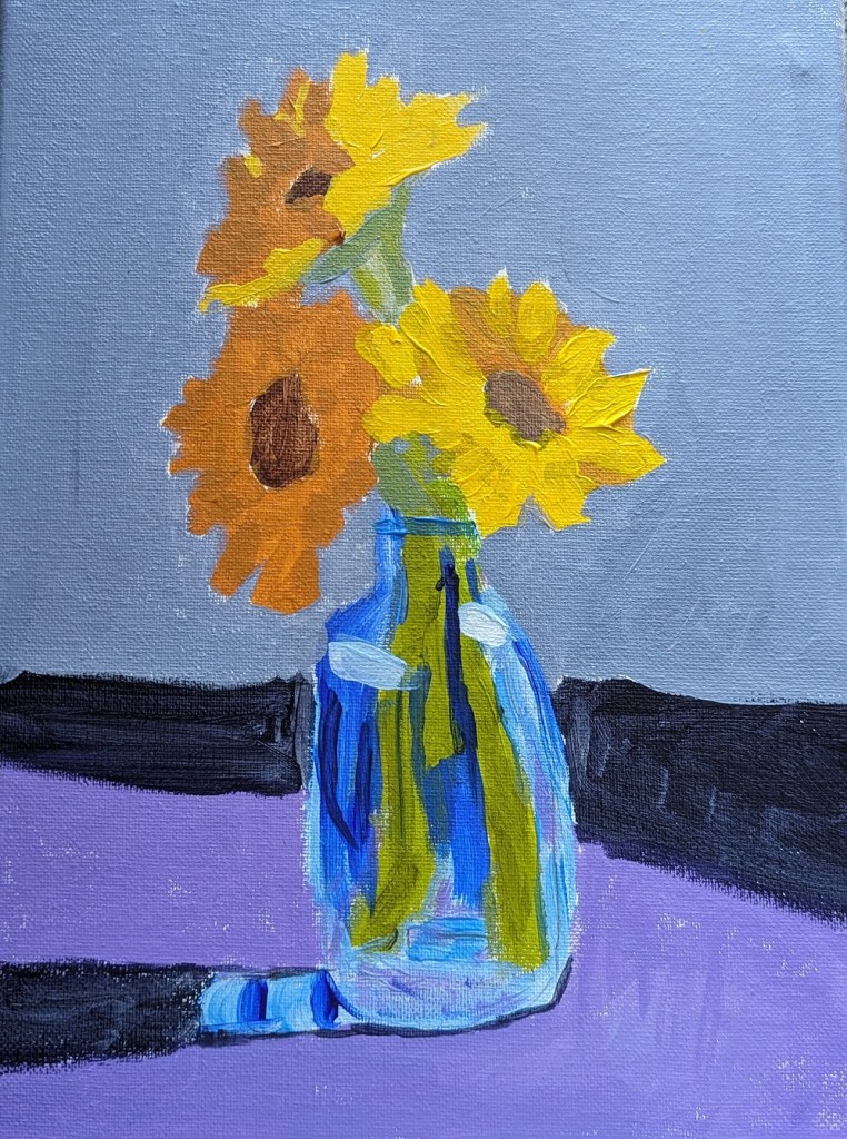
This 9×12 painting of a vase of sunflowers is from one of the PaintCoach Patreon lessons. I’m on a sunflower roll…
For the stems, I used my Liquitex BASICS Green Gray, my new Green Earth, and Phthalo Green (Yellow Shade) with Liquitex Cad-Free Yellow.
For the petals, I used Cad-Free Yellow, Yellow Ochre, and Cad-Free Orange desaturated with Ultramarine Blue.
The vase was done with Ultramarine Blue, Cerulean Blue and Titanium White.
Wow! I’ve actually made 100 paintings. This one was my first from life rather than a photo. And, man, these sunflowers are in bad shape! I bought them specifically to paint them, but I’ve been drawing rather than painting for the last week or so. (I did take some photos of them right when I bought them, though, so I can try again.)
I decide to use my new Green Earth paint for the stems and leaves (mixed with my go-to Chromium Oxide Green. I used Diarylide Yellow for the petals, and a mix of Burnt Umber Light w/ Carbon Black for the faces of the flowers.

The other day I bought some new acrylic paints from brands I haven’t used before. I needed some more yellow azo medium, so I tried Matisse Flow. I am perfectly happy with the color and the paint itself, but a negative for me is this brand has a foil covering once you take off the cap. I couldn’t pull it off by hand; had to use a knife — and found the whole thing unnecessary.
I got Green Earth and Payne’s Gray made by Old Holland. I like both colors — in particular the Payne’s Gray which would be great for a night sky. It surprised me that the Green Earth was so transparent. It would be good in a floral still life or a landscape.
The Cerulean Blue is made by Charvin. I think it’s a single pigment color. And I love the color!

I did this quick study from memory and on a 6×6 canvas panel based on one of my own photos. I had previously underpainted the panel in an Ultramarine Blue-Titanium White mix, which seriously affected the magenta paint.

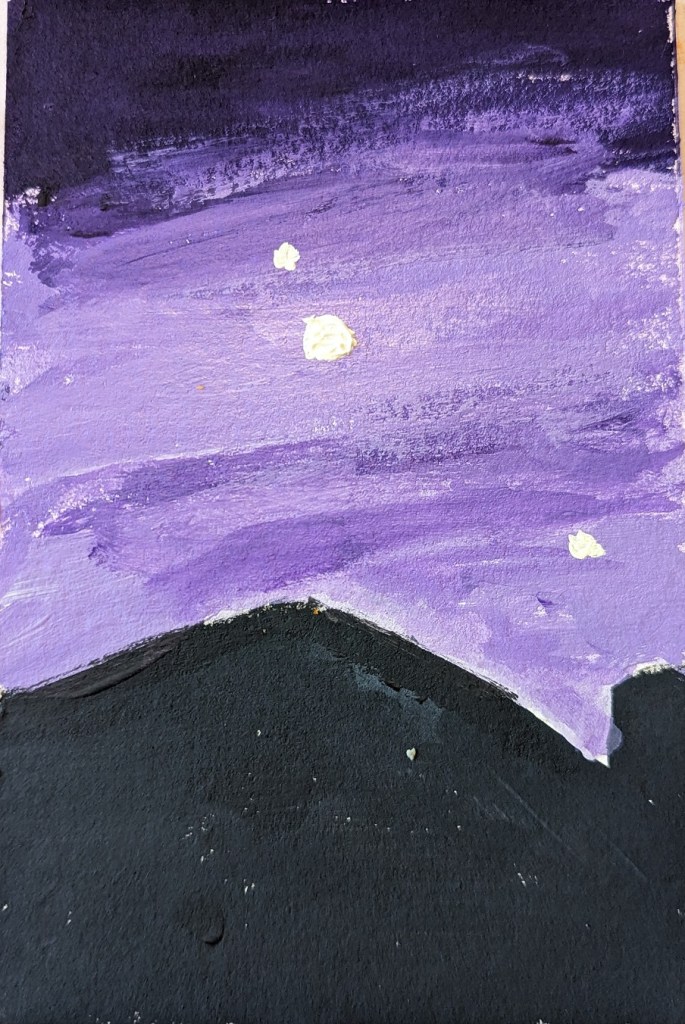
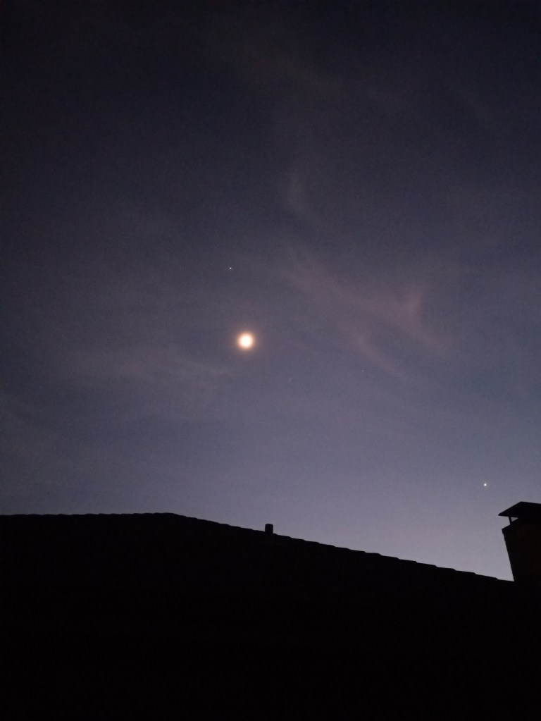
For this study, I used another of my own photos — this one taken one evening in early December of 2021 from my backyard. The Moon was actually a crescent at the time, but I had a cheap smartphone at the time with a lousy camera, so it looks full, and I carried on with that in my painting. Jupiter is shining above the Moon, and Venus is near the silhouette of the chimney.
This was done on a 4×6 piece of 300 lb. cold-pressed watercolor paper. The house silhouette is blue-black, and the sky was painted in tints of dioxazine purple. The Moon, Jupiter and Venus are painted in a yellow-white mix.
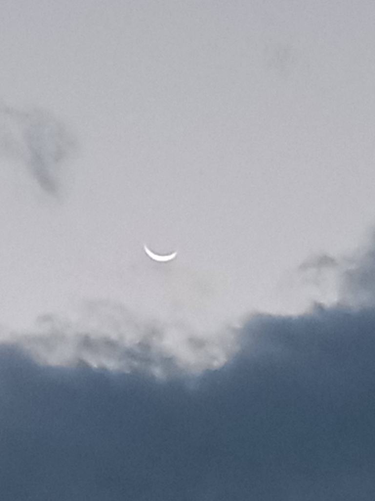
This painting was done in acrylic on a 4×6 piece of 300 lb. cold-pressed watercolor paper. It’s based off of a photo I took of the waning crescent Moon one morning back in November 2021.
I felt the original image of the sky was too gray and blue, so I changed it up at bit. The sky was painted with Liquitex BASICS blue gray; the pink is Cadmium Red Medium Hue from Golden, and the Moon is Titanium White mixed with Hansa Yellow Light (PY 73).

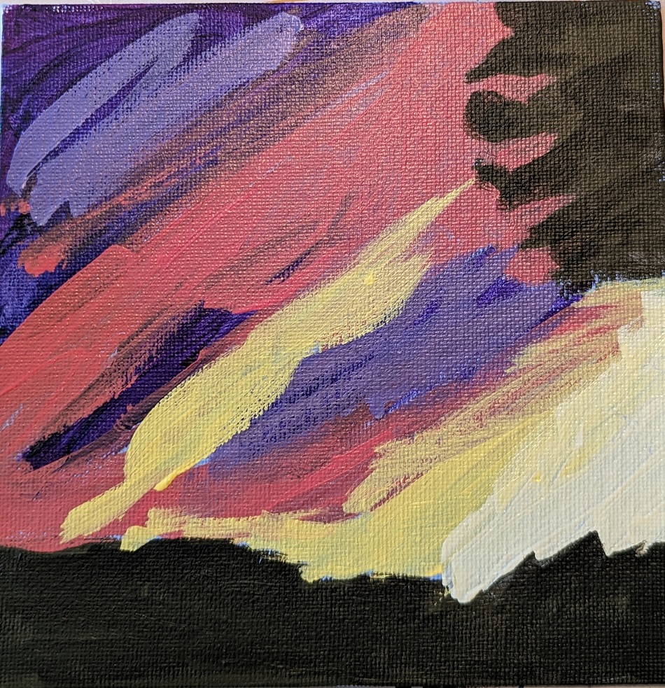
This 4×6 painting in acrylic on 300 lb. cold-pressed watercolor paper is based off a photo I took in Dec 2021 near sunset.
Colors used for the tree and roof silhouette: Chromium Oxide Green, Alizarin Crimson, and a touch of Cerulean Blue
Colors used for the sky: Cerulean Blue, Phthalo Blue, Cad-free Orange, Cad-free Yellow, Titanium White, Blue Gray

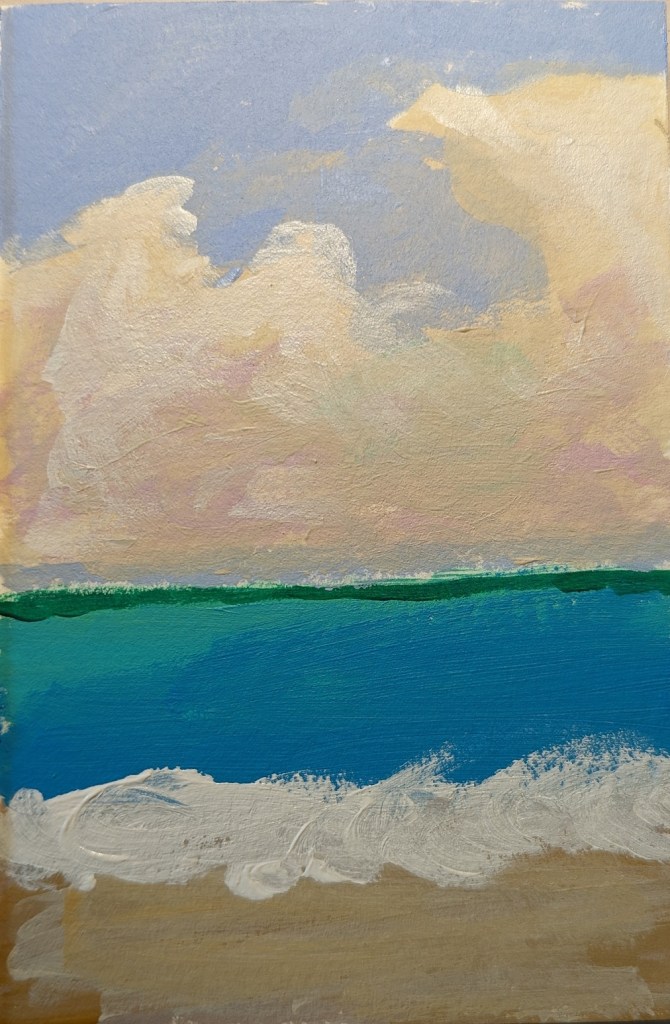
This painting was a quickie, from imagination, after having browsed through images — photos and paintings — of the sea and sky.
My primary focus was the clouds.
This is 4×6 done on 300 lb. cold-pressed watercolor paper, so I could wet my acrylics a bit.