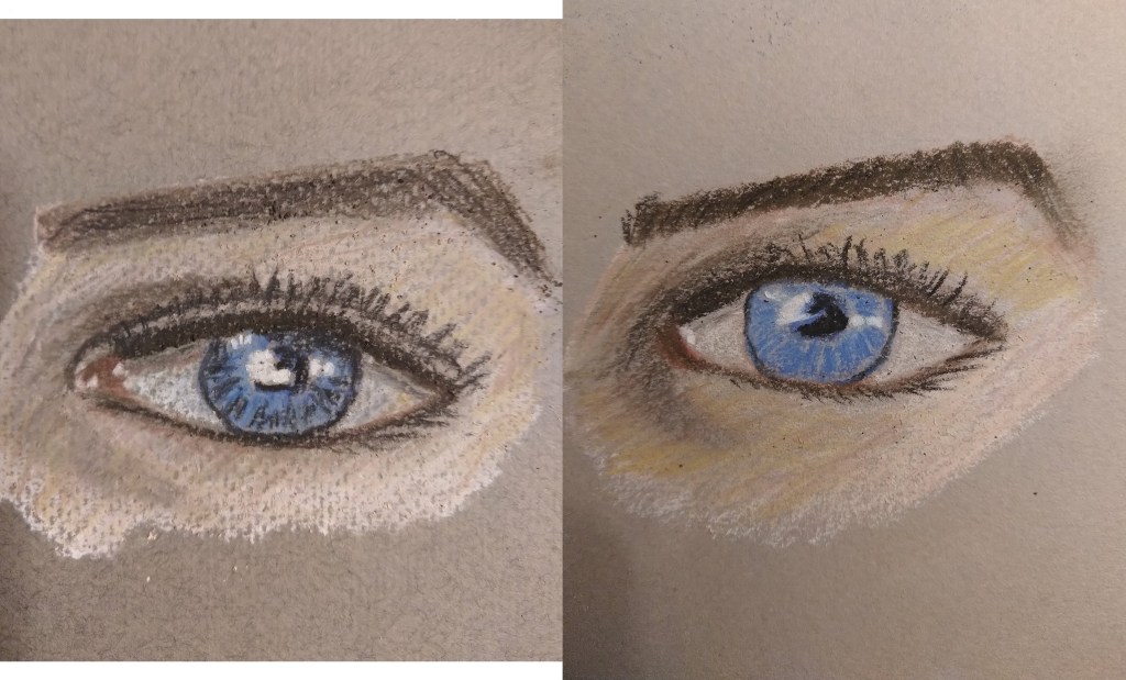
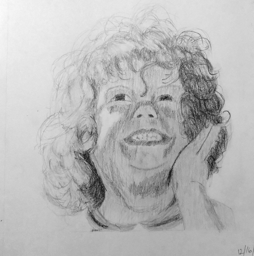
Eye Study

I have a set of Derwent pastel pencils (36-count tin), and am taking Phil Davies’ “Portraits in Pastel Pencil” class on arttutor.com. I was less interested in exactly matching the reference photo than I was in determining the best 10 colors to use. (We’re limited to a palette of ten, per the instructor, and he uses Faber-Castell Pitt pastel pencils.)

The first drawing was done on Rembrandt Talens pastel paper, and I dislike the look of the honeycomb hatched paper. Utterly ruins the drawing for me! The other paper used was Canson Mi-Tientes (smooth side). In both cases, a tinted gray paper was used.

Working with Pastels and Charcoal

I’ve been taking Rebecca de Mondenca’s pastel classes on arttutor.com, and this is some of my initial work from her class “A Beginner’s Guide to Pastels”.

I find I don’t care for the pastel paper that has the honeycomb look, although it can hold more pastel layering, given the “tooth” of the paper.

Most of these are from using the Dick Blick Artist’s Pastels (60 set), but the (finger) blended blues are Sennelier Landscape (30 set) pastels.