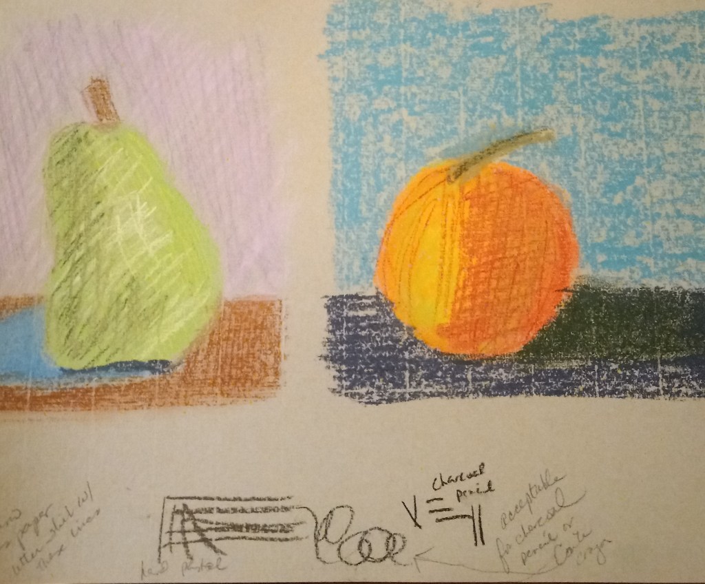
This fruit study was my take on an exercise from Marla Baggetta’s “Making Your Mark” online workshop.
I used Fabriano Ingres pastel paper — one of the papers in the sampler I bought from Jackson’s Art — and am dissatisfied with the vertical lines in the paper.
What I like is my color choices: I think they closely resemble the cup in “life”. I’m especially happy with the crema color(s). I’m somewhat pleased with the actual drawing of the cup. I am least pleased with my mark-making, especially with regard to the crema. Perhaps I would be better off using NuPastels or even pastel pencils to render the detail more finely.
Or, be more impressionistic in my painting, and use blurry strokes instead of trying to match the reference so closely.
I don’t recall what pastel paper I used; the pastels here are mostly Blick Artist’s Soft Pastels (half sticks) that are, obviously, brand-new. I had a lot of difficulty laying down color in the way I wanted!
Afterwards, on one of Marla Baggetta’s YouTube demos in which she uses Rembrandt pastels, she mentions that the pastels are new, and she gently abraded them against the sanded paper she was using.
I have some Rembrandt half-stick pastels as well as Blick Artists pastels; they seem similar in look and feel to me. So, I used some scraps of fine sandpaper to abrade some of my Blick pastels. I hope that will help in my next painting!
Today I signed up for Marla Baggetta’s “Pastels for the Serious Beginner” online, work-at-your-own-pace class. I’m definitely a beginner, and I’m serious to finally get busy using some of the pastels I have, in addition to my daily drawing.
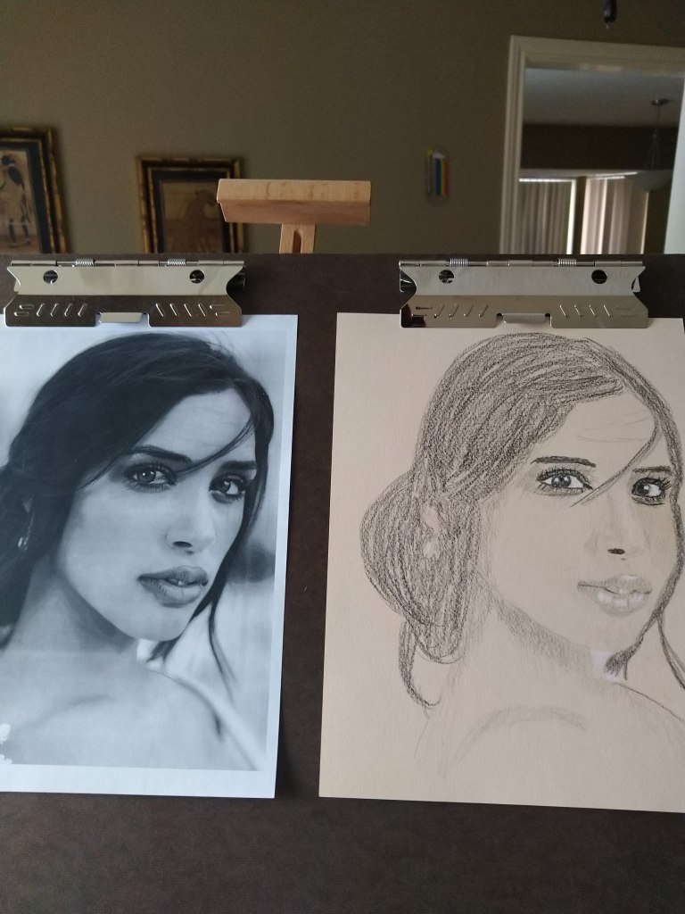
While my ultimate goal is to paint portraits and human figures, I like Marla’s work, and have watched a few of her demos on YouTube.
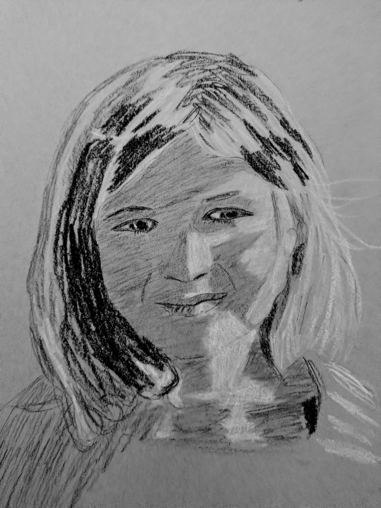
Here’s another portrait study from an Unsplash photo. Again, shading is a major issue. I also don’t have the shape of the subject’s chin and cheeks quite correct. The mouth is fairly decent, but not shaded dark enough.
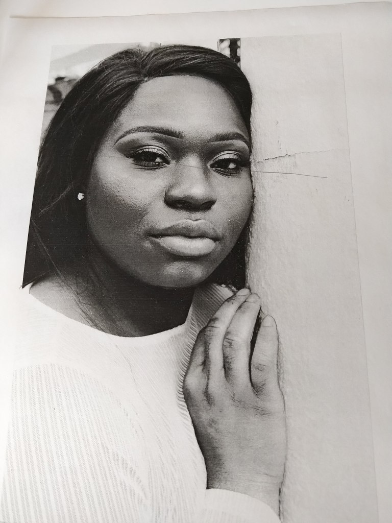
Here’s my attempt at another portrait. I need much more experience in properly toning and shading darker skin. While I did some shading on the subject’s neck, the shading on her right and left cheeks is entirely absent, and around the bridge of her nose is much lighter than the reference.