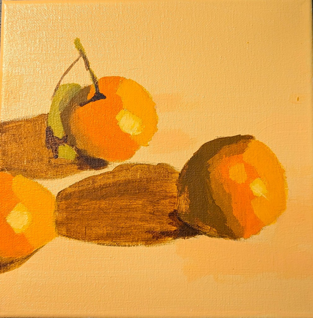
Here’s the finished painting, based on Will Kemp’s still life e-book. I posted the work-in-progress here.
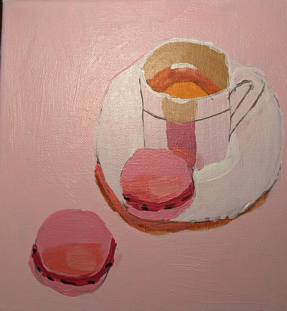

Here’s the finished painting, based on Will Kemp’s still life e-book. I posted the work-in-progress here.
I am working on one of the still life projects in the E-book I bought at Will Kemp’s Art School online. This particular painting is focused on an analogue color scheme of red (pink) and purple.
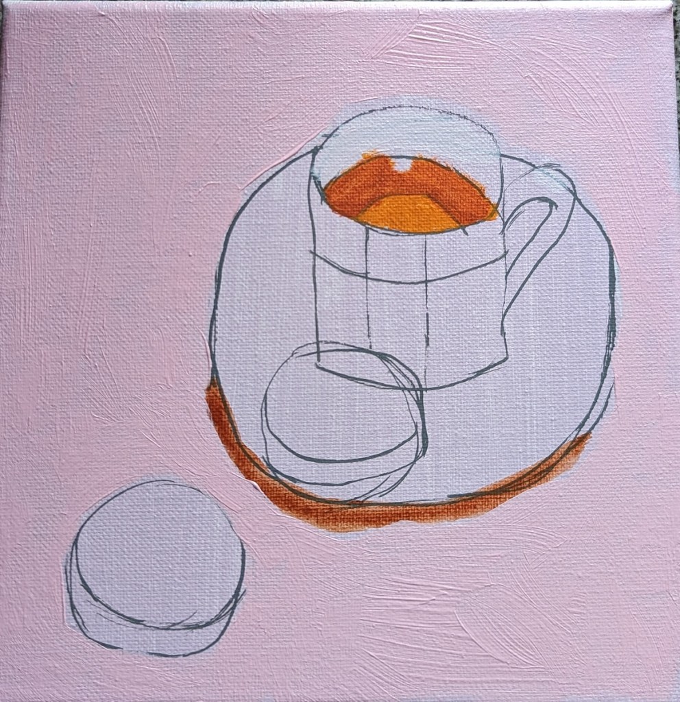
Work-in-progress. I am trying out “drybrushing” in this quick study.
Another artist I found and follow on YouTube and his personal site is Will Kemp, from the UK. He is classically trained, and began with painting in oils, later switching to acrylics because he was working in an area not properly ventilated for the paint thinners and solvents he had been using.
Will Kemp has multiple YouTube videos, online tutorials on his website, online classes for sale (and downloading) in acrylics, and I am finding his style as a useful enhancement to what I’m learning from Paint Coach.
I bought Kemp’s Still Life Acrylic Project E-Book, and am working through it. First up was a project that involved painting a group of clementines. Much of the focus is on setting up your colors by color mixing, which is something I need to learn about.
This was painted on an 8×8 canvas.
This is an 8×8 painting of a watermelon slice, and the palette I used.


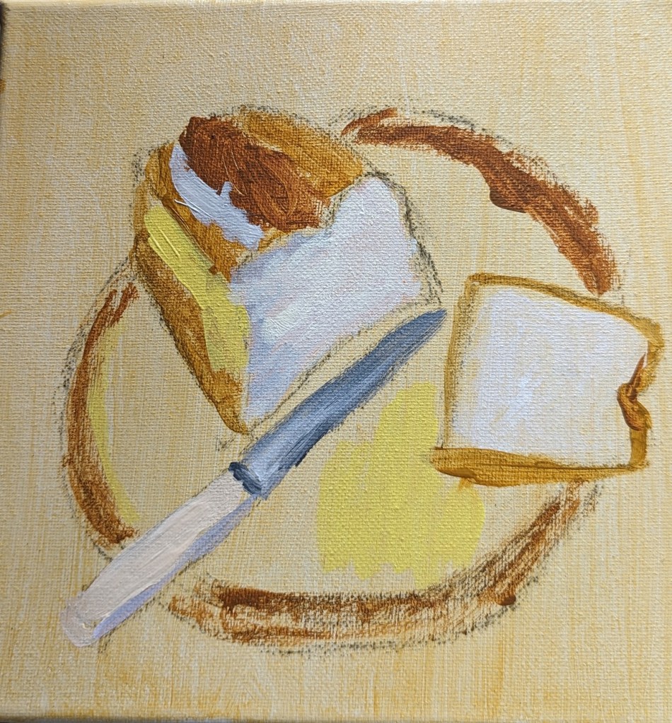
This is a still life from one of the Beginner “Painting Paths” offered on Patreon by the Paint Coach. The idea is to block out your darks and lights first, and use that as a value “road map” in completing the painting, gradually adding more detail.
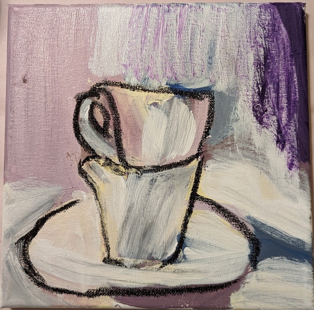
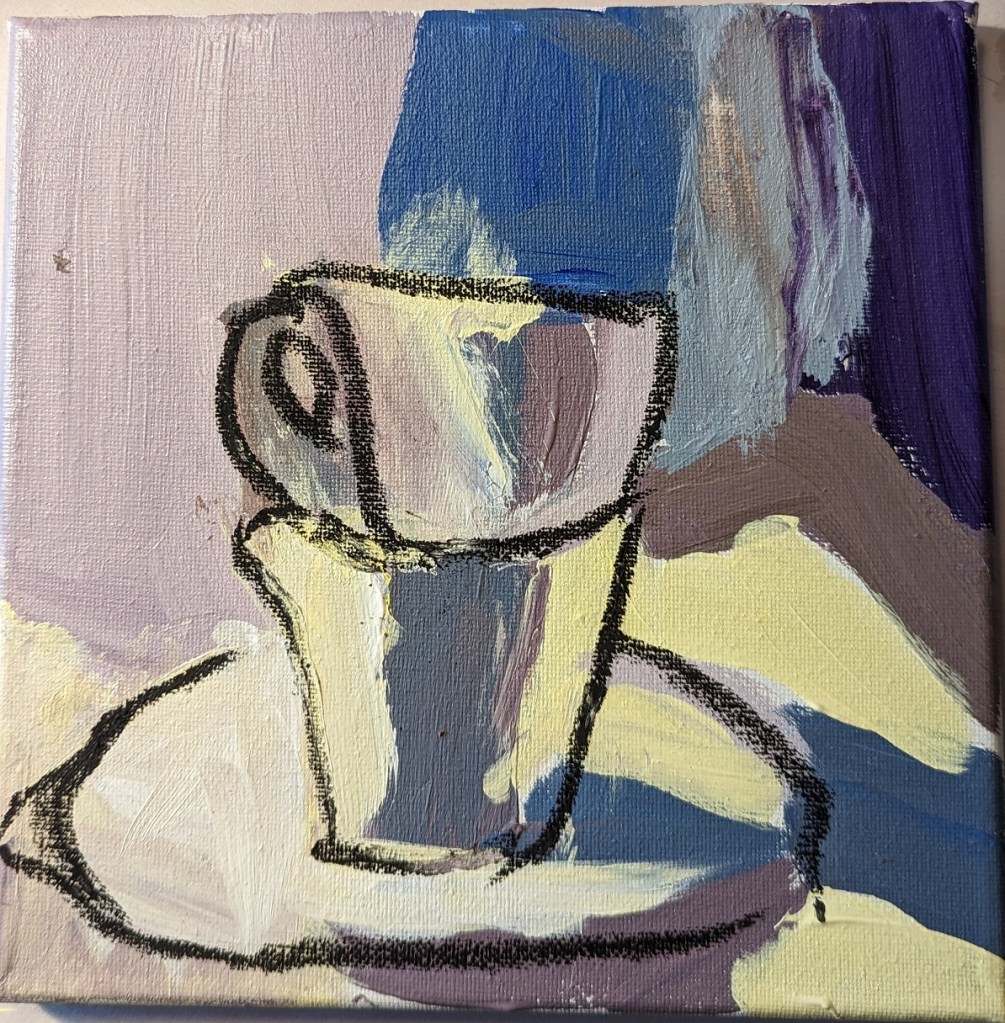
I love the idea of painting white objects because I know you’re not supposed to use, say, Titanium White to indicate snow, sand, white dishware, white linen, white flowers, clouds, etc. Instead that “white” will have greyed blues, greyed lavenders (light purple), perhaps some yellows and/or oranges.
So, when I saw the reprint of “White Cups” in How to Paint Fast, Loose and Bold: Simple Techniques for Expressive Painting, I thought I would give it a try. Can I come close to matching these colors?
When I look at the reprint of Mollica’s work, I see light shades of yellow, shades of yellow ochre, lavender, greyed purple, maroon, an olive green, a desaturated orange, a dark purple “black” that might be a mix of ultramarine blue and burnt sienna or a Payne’s gray. I see greyed blue, and even a rich brown that might be burnt umber or might be a mix of red, blue and yellow. At best, there might be two small highlights of a pure white on the lip of each cup.
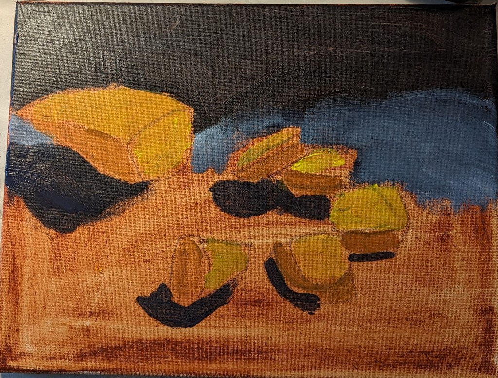
Sounds good, but I failed at color mixing. Ugh. I drew over the dried big splotches of paint (see right)with compressed charcoal because it wasn’t even obvious what the object was! Then I ended up deciding to heck with it, I’ll use a glaze of titanium white — and glazes, I’m told, are not successful with opaque pigments like titanium white.
Since the painting was a fail anyway, I went ahead and did the glaze, careful to keep my compressed charcoal lines. (left most photo)
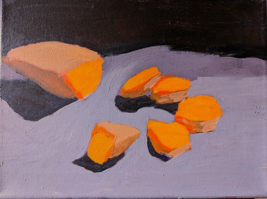
Afterwards, I used a color picker app to get a sense of the colors in the photo, which all tend toward brown. I suspect that is partly an artifact of the photo, which is quite probably not an accurate reproduction as far as the colors are concerned.


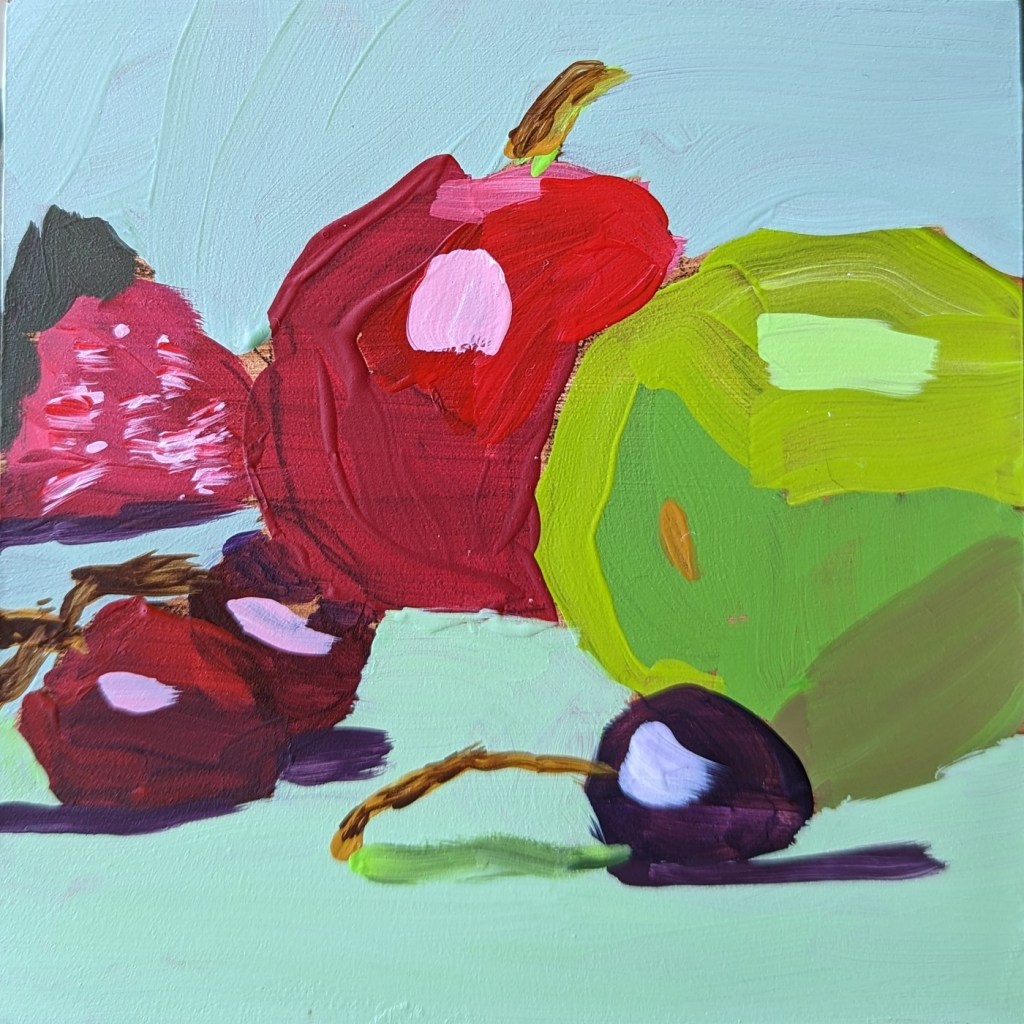
The still life of fruit is yet another study from Patti Mollica’s book How to Paint Fast, Loose and Bold: Simple Techniques for Expressive Painting.
As far as my efforts in copying still life demonstrations from various painting teachers, this is one of my better ones in my opinion. I’m most pleased with the dark red (purple) cherry.
That said, all the stems I painted are sloppy — I need to practice painting thin lines. And the brushwork on the red apple is awful. The paint choices as well could be improved — the red is so transparent you can see through to the raw sienna underpainting, and my charcoal pencil outline. Sigh.
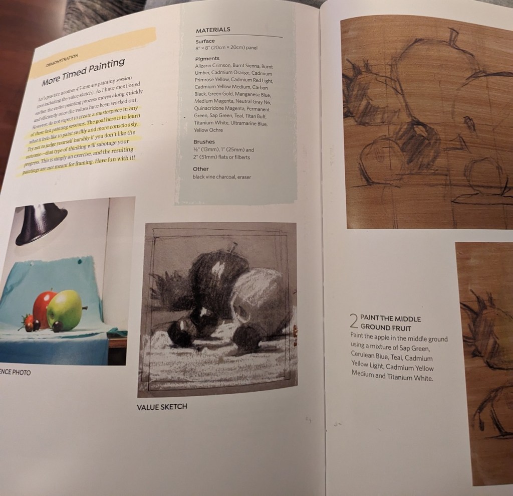
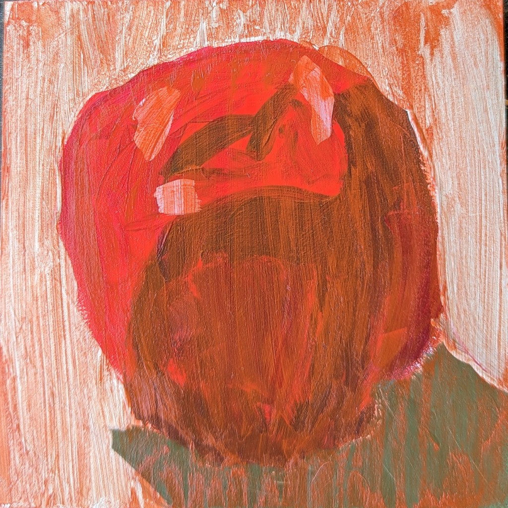
I wish I had taken a photo of this red apple before I applied a glaze of Naphthol Red (PR112) and Satin Glazing medium, but I didn’t. It was inspired by Patti Mollica’s How to Paint Fast, Loose and Bold: Simple Techniques for Expressive Painting (also mentioned in yesterday’s post).
This was painted on 5×5″ gesso board.