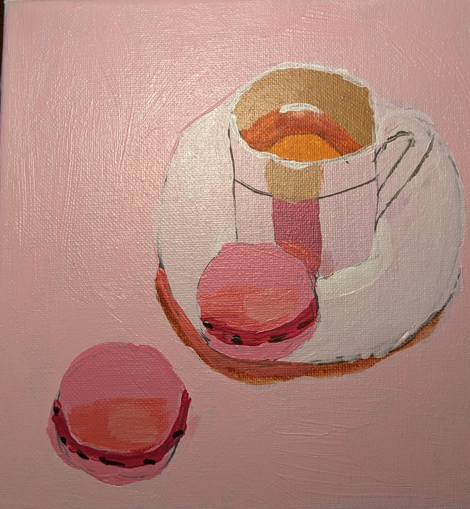
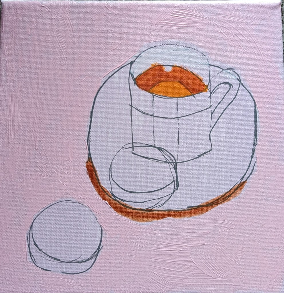
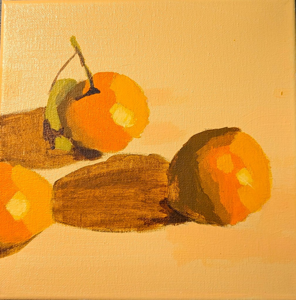
I love the idea of painting white objects because I know you’re not supposed to use, say, Titanium White to indicate snow, sand, white dishware, white linen, white flowers, clouds, etc. Instead that “white” will have greyed blues, greyed lavenders (light purple), perhaps some yellows and/or oranges.
So, when I saw the reprint of “White Cups” in How to Paint Fast, Loose and Bold: Simple Techniques for Expressive Painting, I thought I would give it a try. Can I come close to matching these colors?
When I look at the reprint of Mollica’s work, I see light shades of yellow, shades of yellow ochre, lavender, greyed purple, maroon, an olive green, a desaturated orange, a dark purple “black” that might be a mix of ultramarine blue and burnt sienna or a Payne’s gray. I see greyed blue, and even a rich brown that might be burnt umber or might be a mix of red, blue and yellow. At best, there might be two small highlights of a pure white on the lip of each cup.
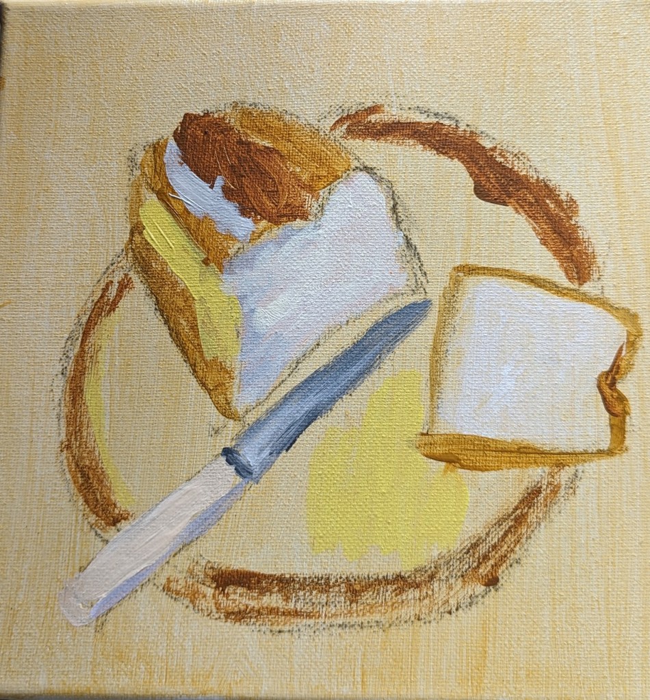
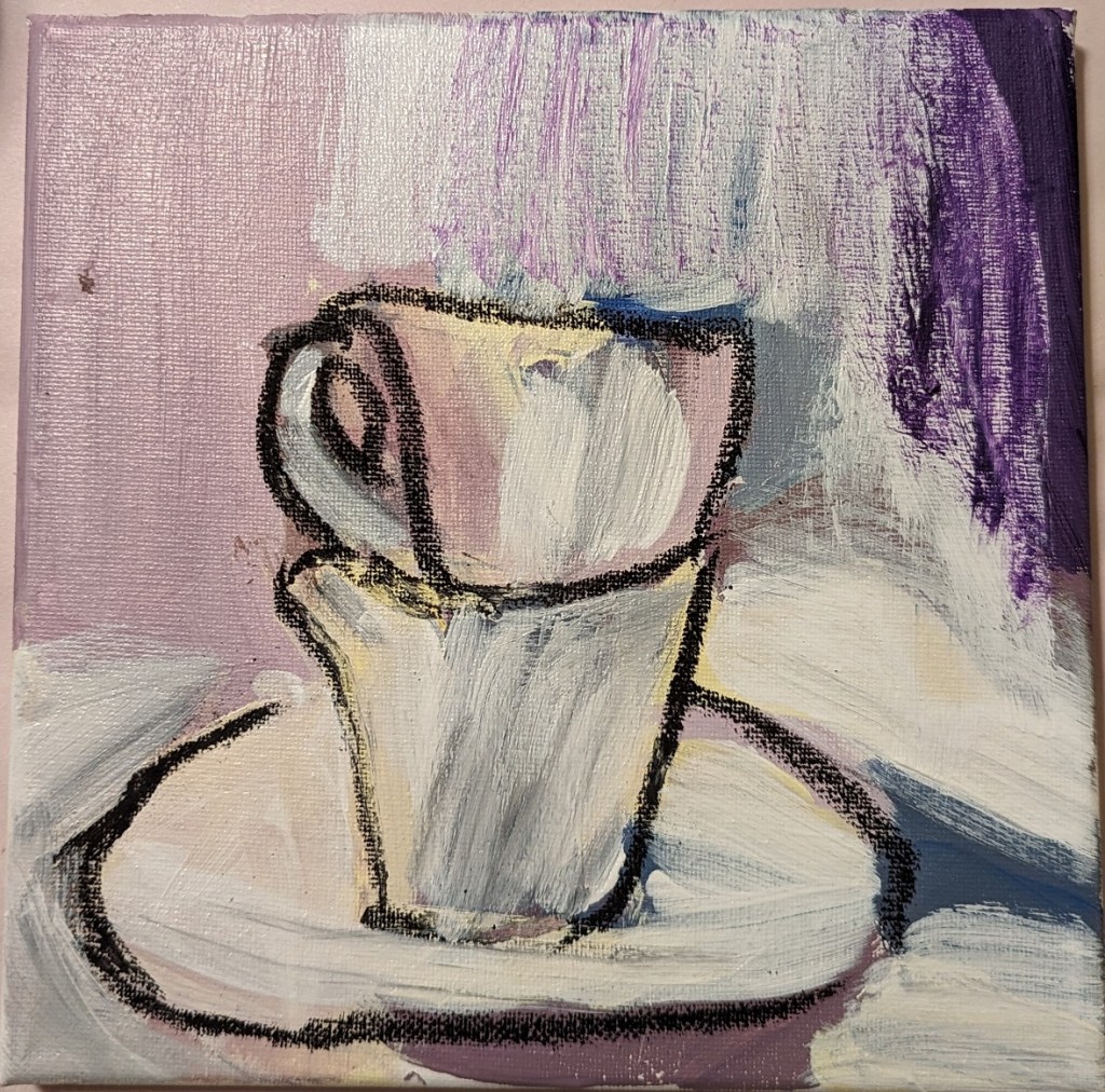
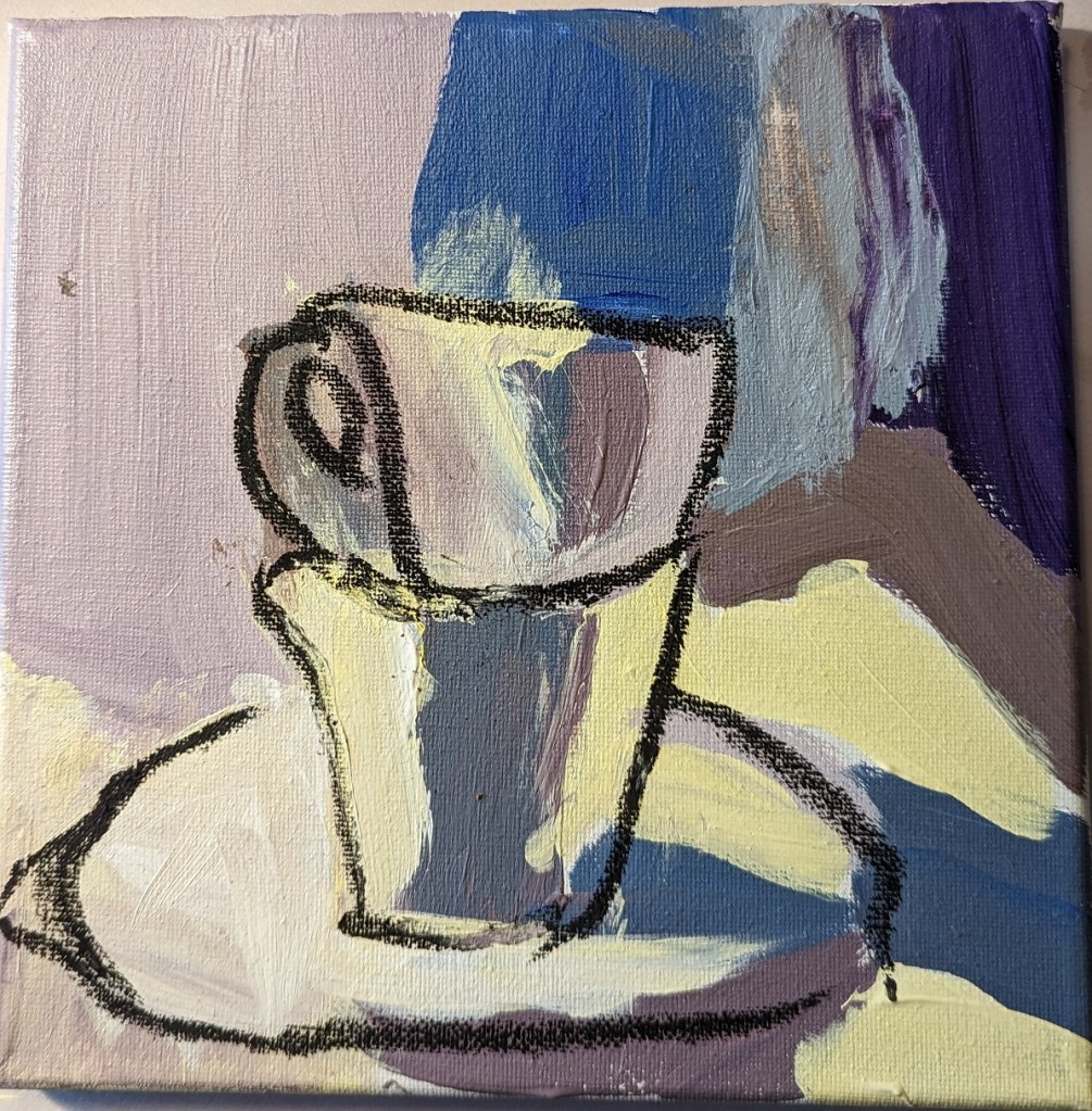
Sounds good, but I failed at color mixing. Ugh. I drew over the dried big splotches of paint (see right)with compressed charcoal because it wasn’t even obvious what the object was! Then I ended up deciding to heck with it, I’ll use a glaze of titanium white — and glazes, I’m told, are not successful with opaque pigments like titanium white.
Since the painting was a fail anyway, I went ahead and did the glaze, careful to keep my compressed charcoal lines. (left most photo)
Afterwards, I used a color picker app to get a sense of the colors in the photo, which all tend toward brown. I suspect that is partly an artifact of the photo, which is quite probably not an accurate reproduction as far as the colors are concerned.