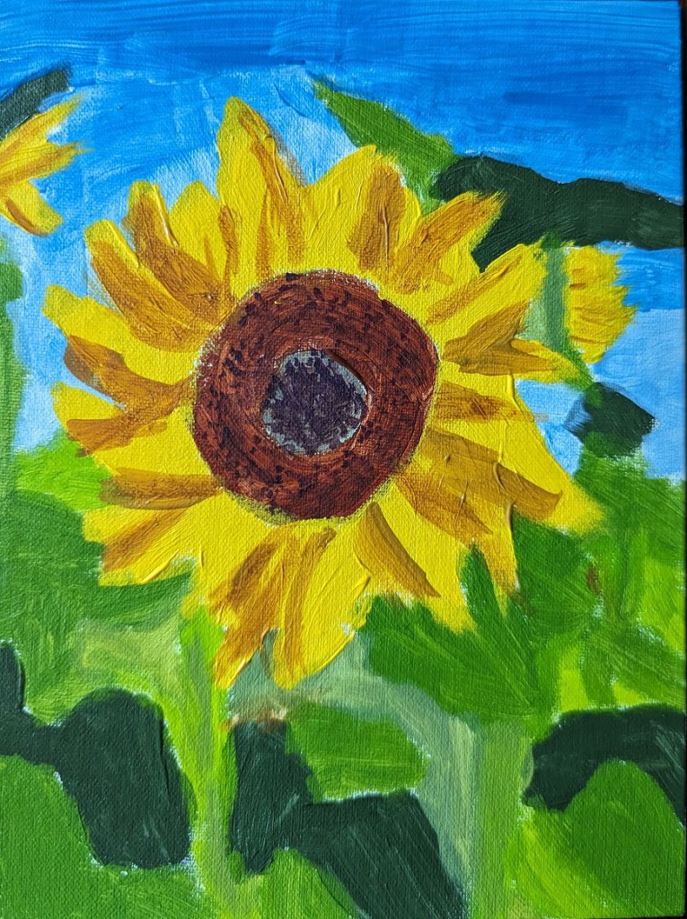
This 6×8 painting of a sunflower is based off the image used for Episode 29 of Artists Network Drawing Together series. What I did differently from the others I’ve painted was that for the shadowed part of the leaves, I mixed my yellow with a touch of Dioxazine Purple to desaturate it (rather than using Yellow Ochre). Ditto for the center of the flower; there’s a lot of the purple mixed in with yellow (although I also used Burnt Sienna and Burnt Umber).
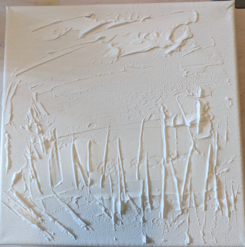
This painting was based off an image by RÜŞTÜ BOZKUŞ from Pixabay, and an article I found on the UK site Painters Online. I used an 8×8 canvas for this work, and took photos of each step I took.
Step One was to apply the modeling paste. The horizontal “goop” was to signify clouds; the vertical lines was to signify weeds and plant stalks.
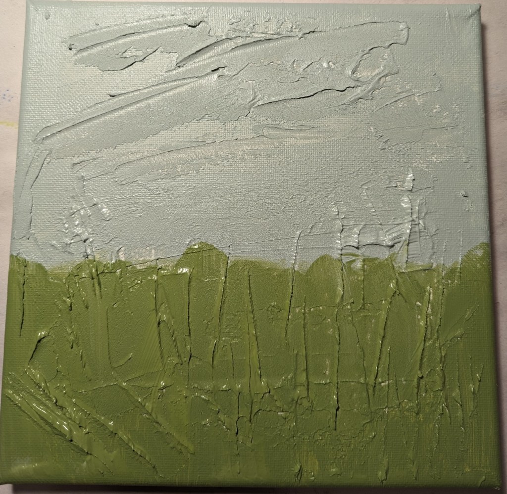
After applying the modeling paste and letting it thoroughly dry, I went in my own direction rather than following the Painters Online demo.
I used a gray green mixed with a yellow green for the grasses, and a gray blue for the sky area.
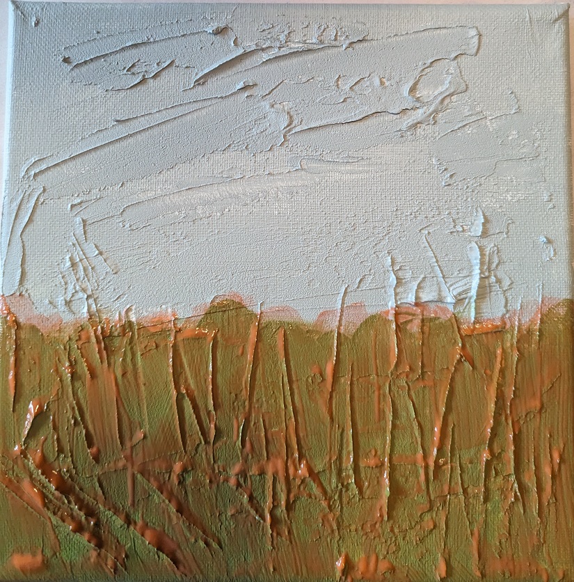
Green is reportedly not a good color to use alone when doing landscapes and meadows. So, my next step was to apply a transparent orange glaze (using Liquitex Gloss Glazing Medium over the green paint, and let that dry thoroughly.
After the glaze dried, I added a darker value in the center bottom (to match with the reference photo) as well as adding a glaze of Cadmium Red Medium Hue for the clouds.
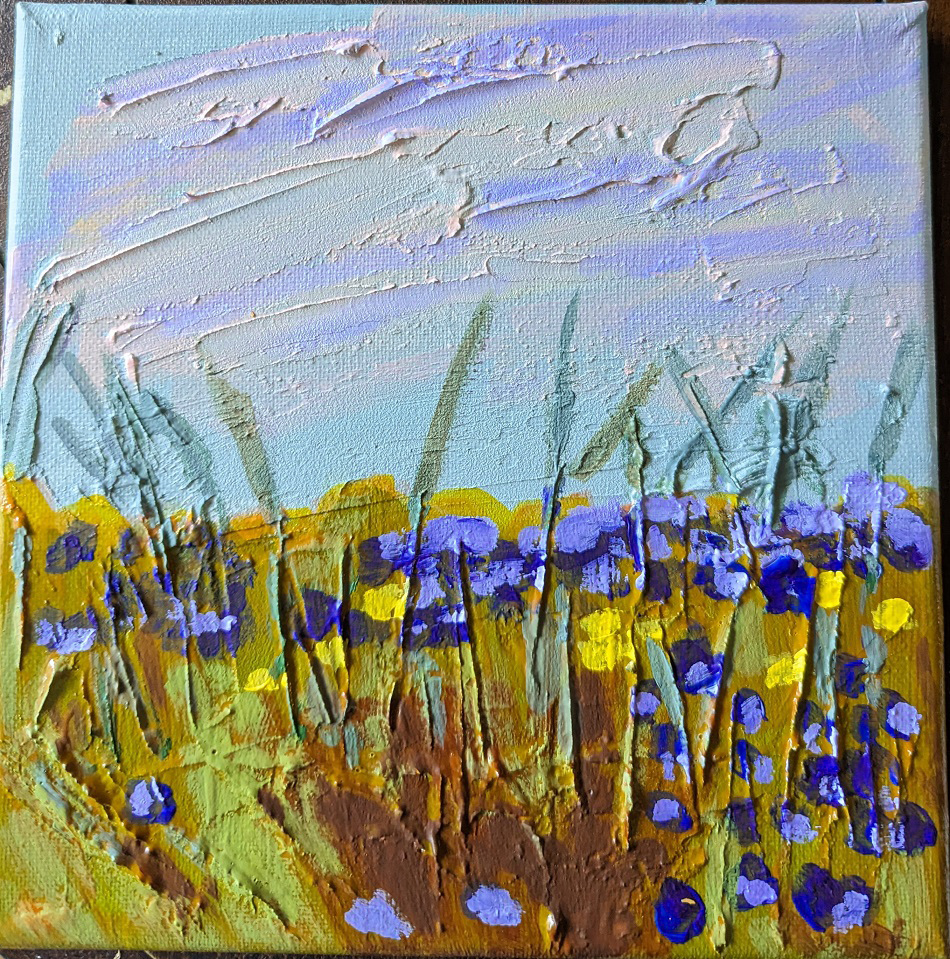
Next I painted the flowers, using Dioxazine Purple with some Titanium White, some yellow flowers, and highlighted the stems with Gray Green, yellow, and Burnt Sienna. I retouched the grassy area with some green. Then I added some of the Dioxazine Purple mixture to the clouds in the sky, and called it a day.
(The photo here doesn’t fully reflect the periwinkle/purple color of the flowers; they look too blue.)
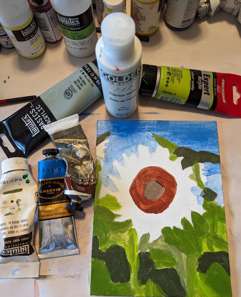
This acrylic painting on a 6×8 canvas is inspired by an image by Dioptrius from Pixabay. I’ve included a work-in-progress photo of the work surrounded by the paint colors I used.
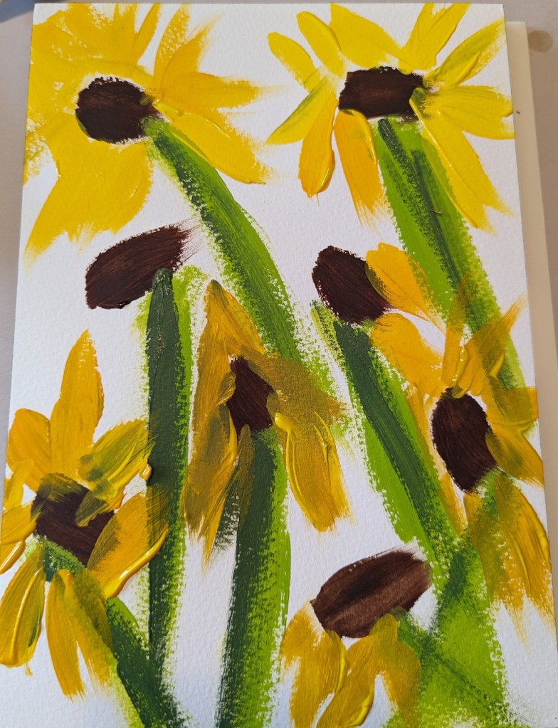
After painting the sunflowers in my two previous posts — as much as fun as it was — I wanted to make my flowers more artistic and less symbolic. I was reading blog posts from Karen Margulis, a pastel painter, and was inspired to up my game.
This was done in pastel on a terracotta-colored 6×8 Pastel Premier 4-ply board.
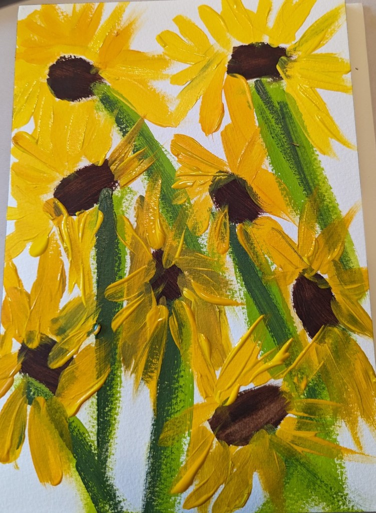
This was just a quickie because I didn’t have a lot of time, yet I wanted to paint something. It was done on a 6×8 white Pastel Premier 4-ply board (from a sampler set I got at Dakota Pastels a few years back).
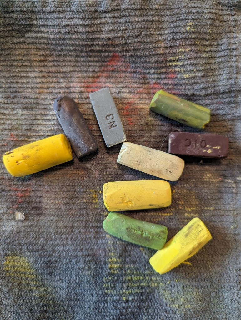
I didn’t even use all the pastel sticks shown below — but one thing I would do differently would be to paint the centers last so as not to smear the yellow shades with the darker brown.
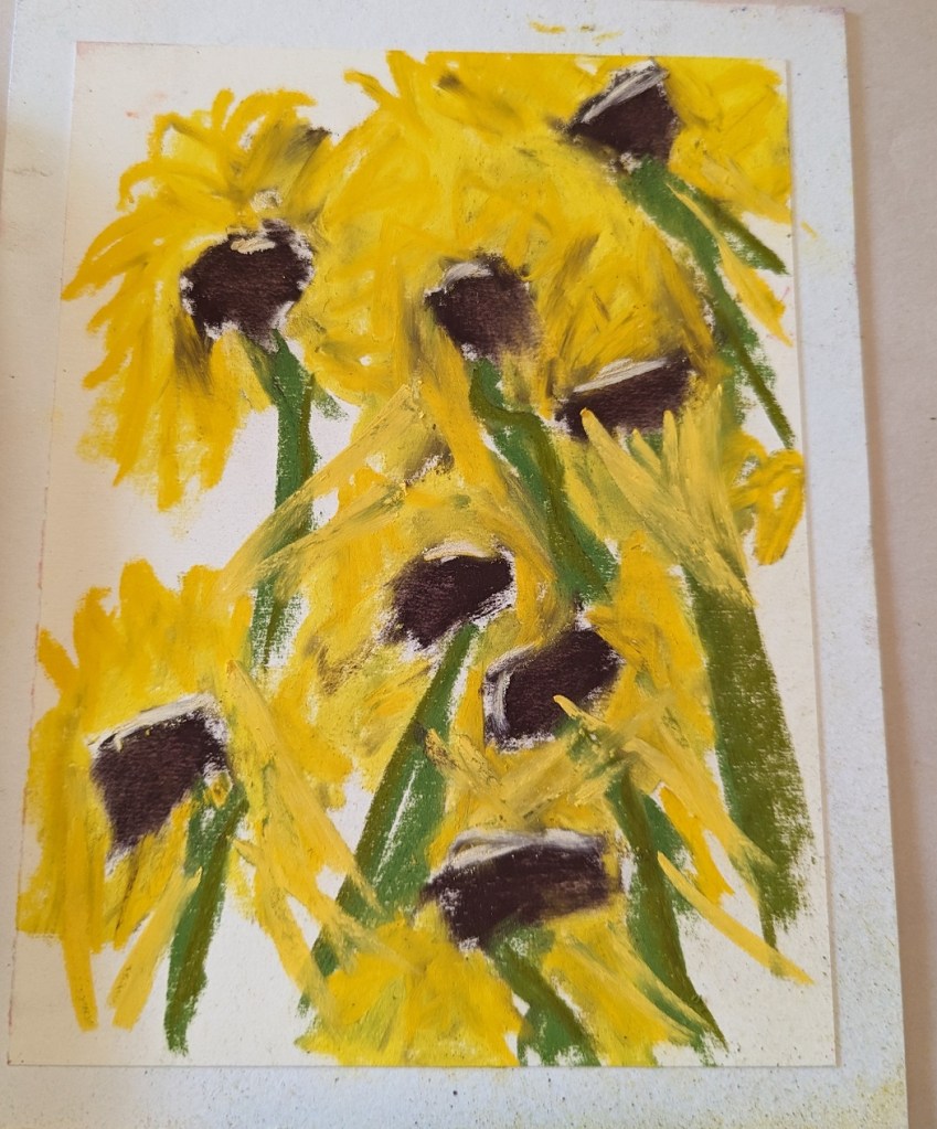
I did this painting in soft pastel based on an Image by Chil Vera from Pixabay.
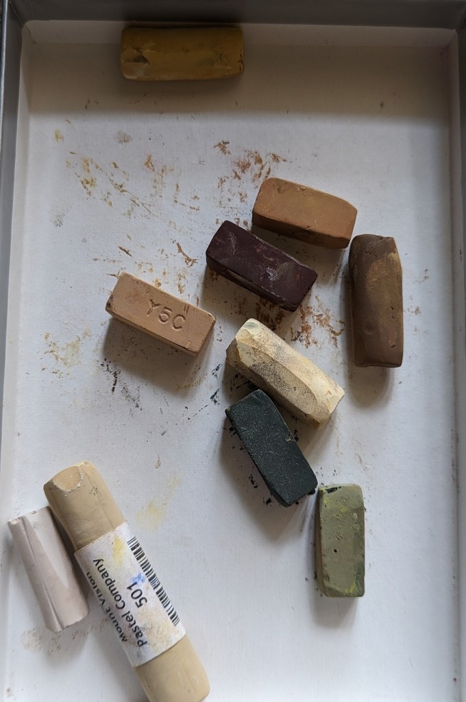
It’s on a “Slate” colored 6×8 4-ply Pastel Premier board that I bought some time ago when I trying out soft pastels. (So far, I’m still favoring acrylic paints, but this was fun to do!) The pastels I used are shown at right.