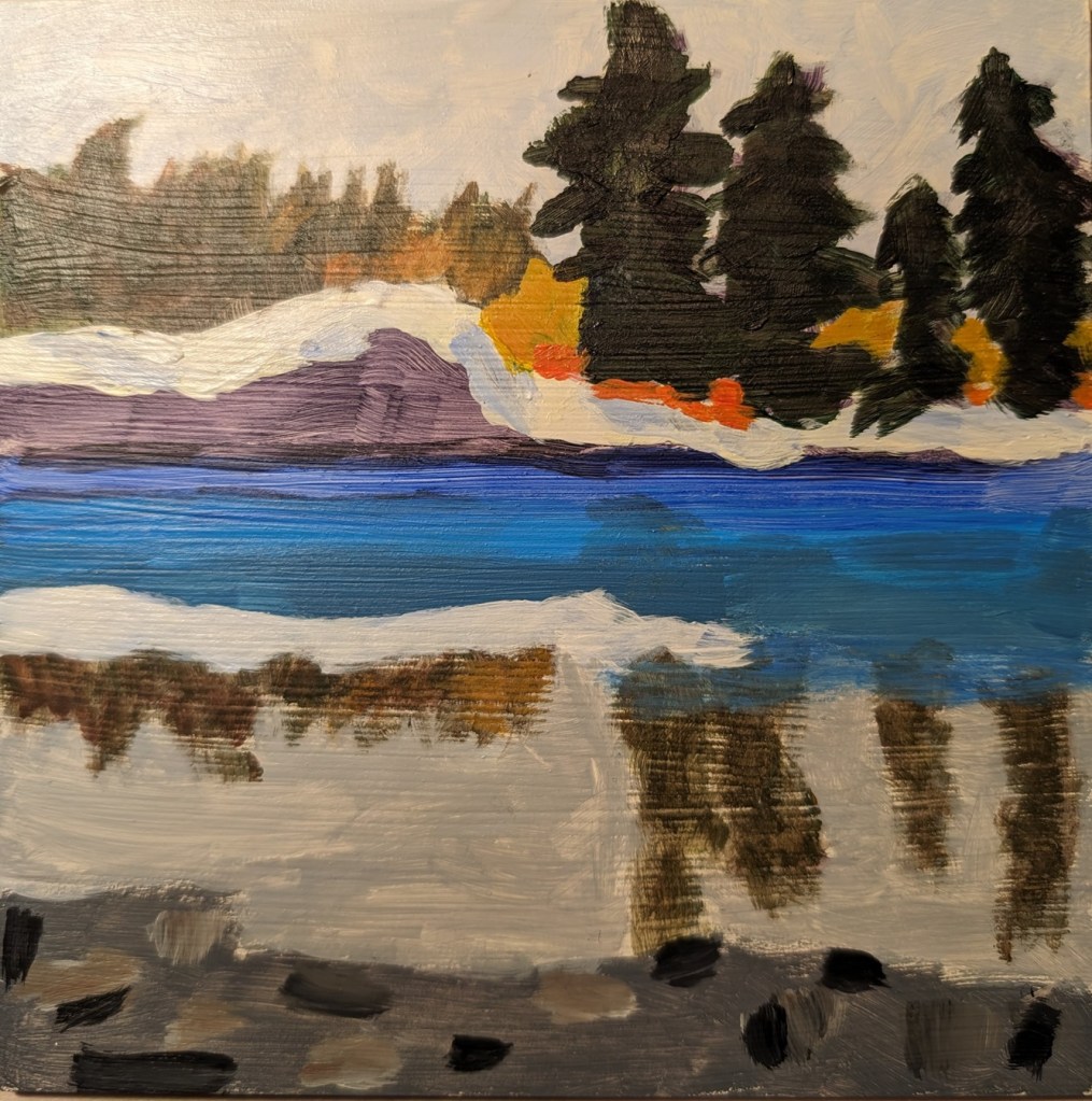
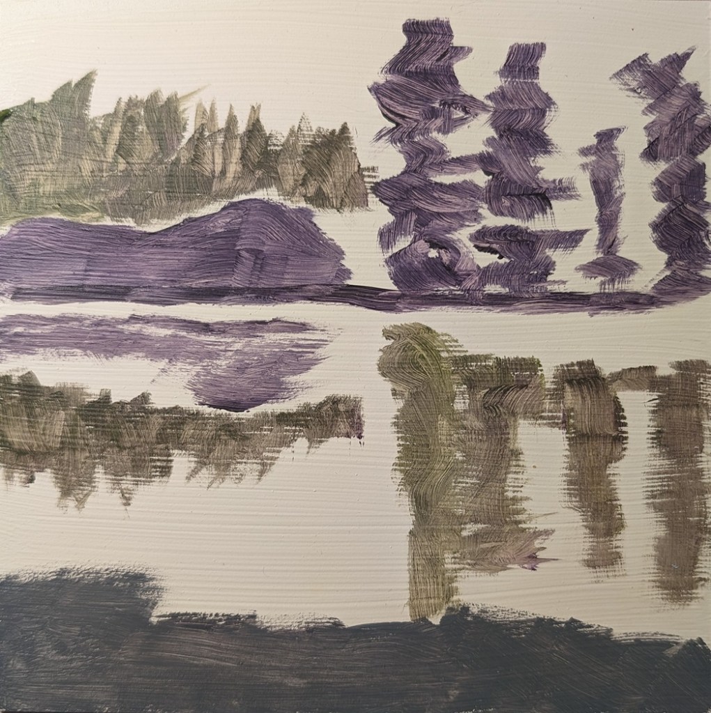
I used an old Ampersand Gessobord panel which I re-gessoed numerous times to reduce the slickness. Unfortunately, that left brushstroke grooves, which are particularly obvious in the reflection of the trees.
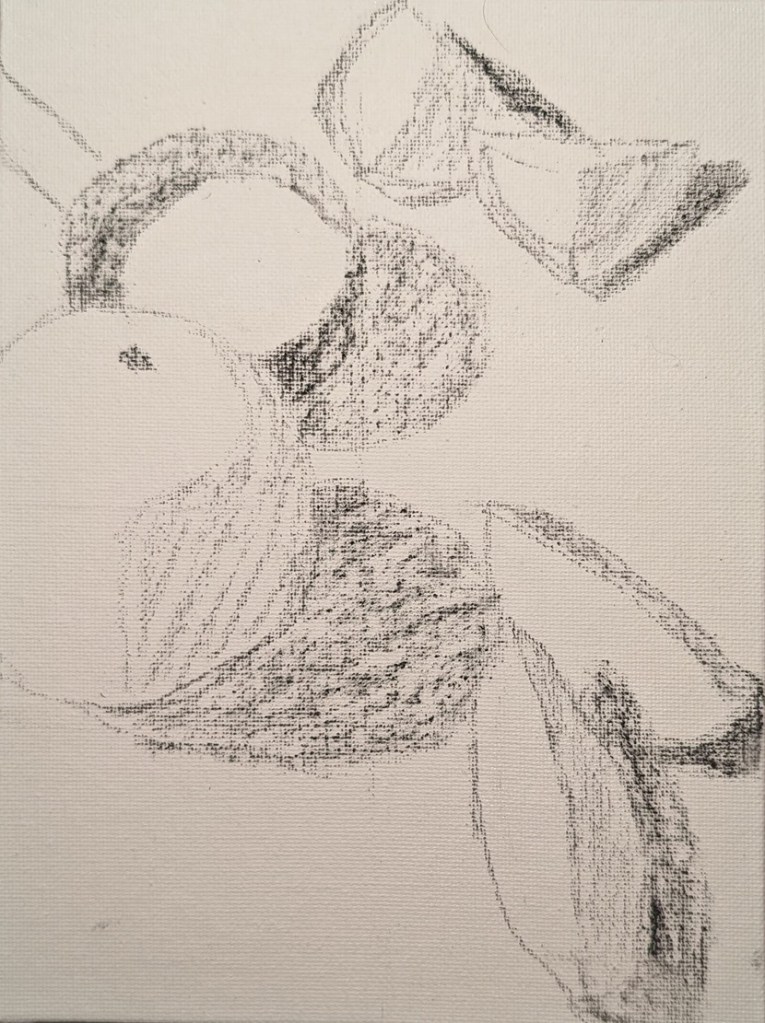
A few weeks ago, Paint Coach posted a new grayscale exercise on Patreon for his subscribers. This is my effort, after viewing his video. Done on a 6×8 canvas panel in acrylic, initially drawn out with willow charcoal.
This is an exercise from one of the foundational courses (Acrylics 101) at Acrylic University wherein you do a value map of your painting using black, white and gray, and then applying color on top of the different value areas, using care to make sure your values — post-color — remain. It’s a more detailed version of the quickie free course I mentioned here.
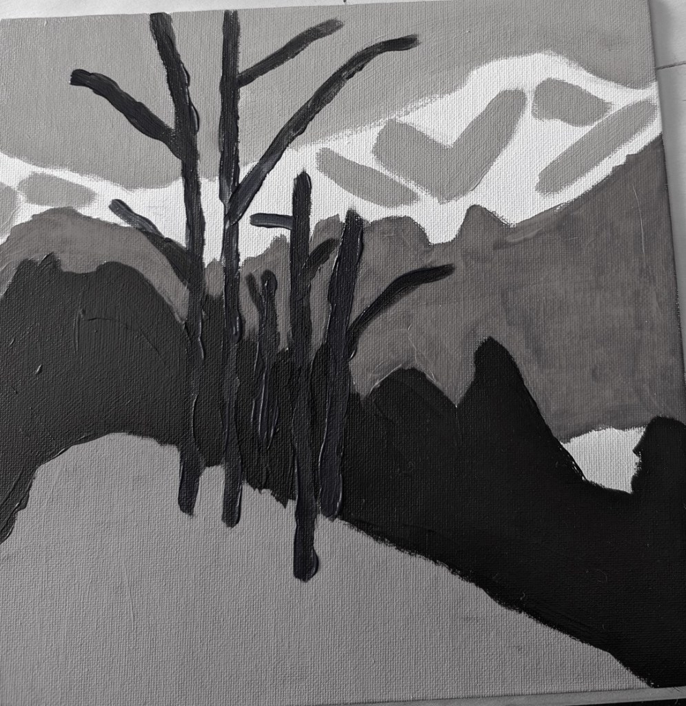
Here’s my original painting done in grayscale, done as part of the Acrylics 101 online class, using their reference photo.
I did a value check on my primary colors and mixed secondaries.
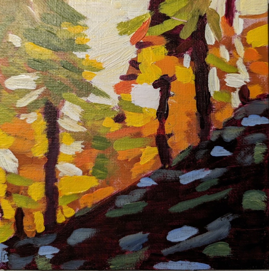
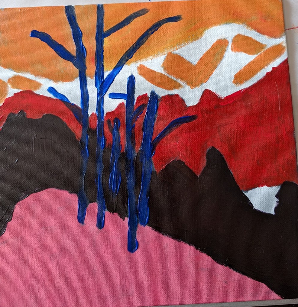
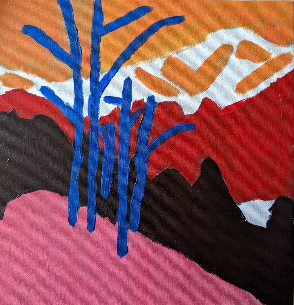
The next task was to choose colors that aligned to the value map/painting I already did. This was my first effort. The abstract trees were a bit too dark, compared to my original (above), pretty much the same as the (abstract) forest.
The class covers basic suggested supplies, brushstrokes, values, the grayscale, color mixing, and 3 small paintings.
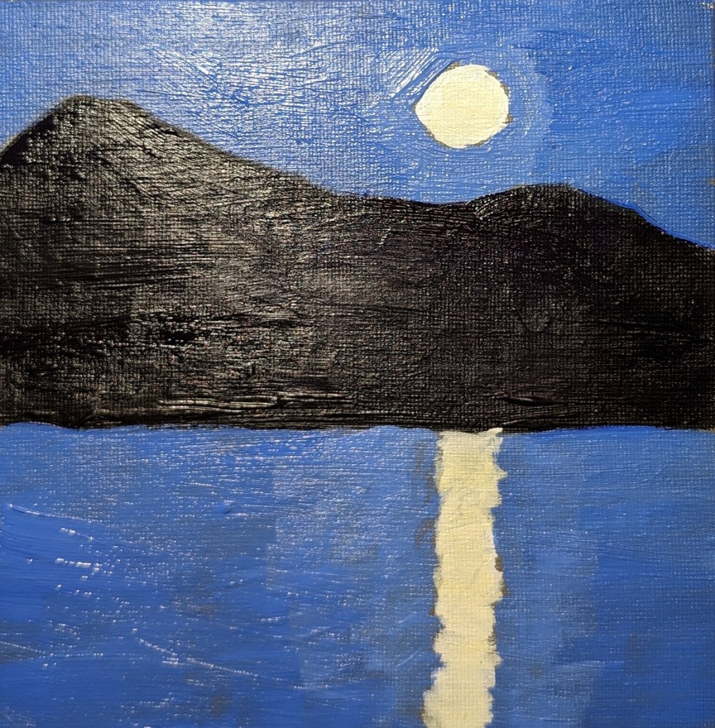
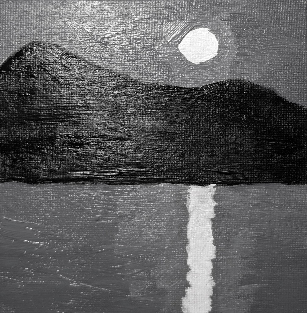
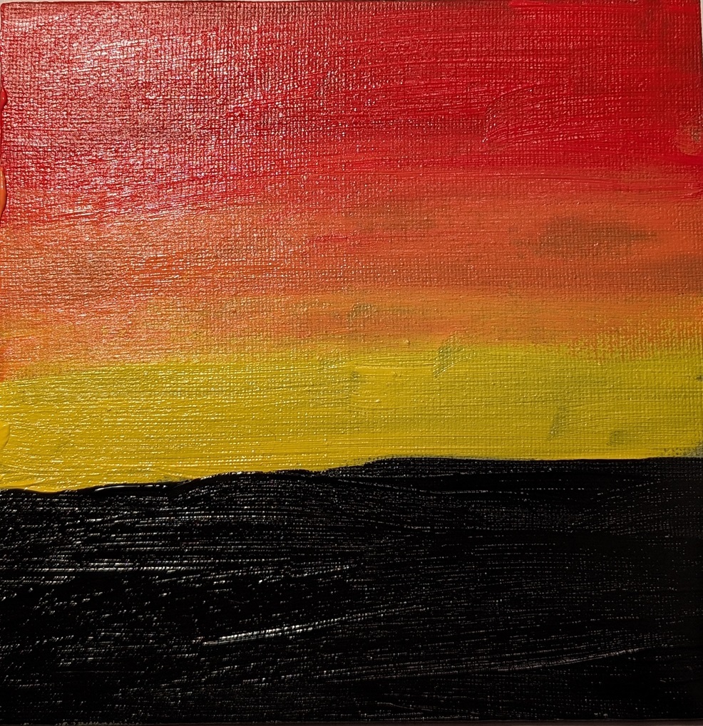
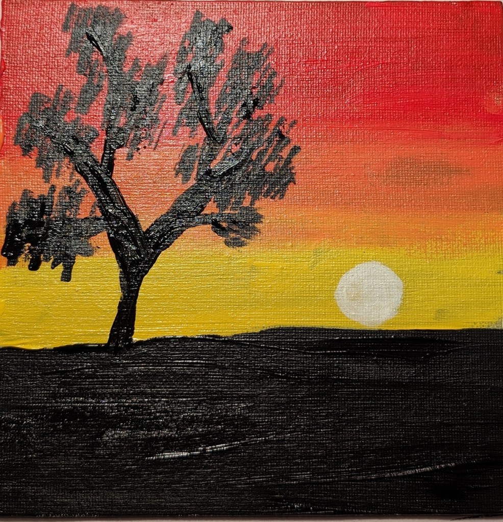
The first two paintings from the class are below. You paint the moon scene in grayscale first, and then paint color over it, keeping with the value map. The last photo is of the color painting, but in black & white to validate the value map.
The second set of paintings is a sunset, and the last one (not yet completed) will be roses.
The other day I was on Instagram, and something came up in my feed about Acrylic University, an art site I wasn’t aware of until that moment. I checked it out and signed up for an 8-week “Cloud Challenge” class taught by Dianna Shyne. This painting was done today in that class.
I had fun!
Clouds are more difficult to paint than they seem.
I really do not like phthalo blue as a color — it’s much too intense, and much too much of a greenish blue.
The “black” in this painting is a chromatic black — ultramarine blue, phthalo blue, Anthraquinone Red (marketed as alizarin crimson) and the merest touch of cad yellow hue.
Overall, I like the colors, but this looks more like a stained-glass abstract than puffy clouds.
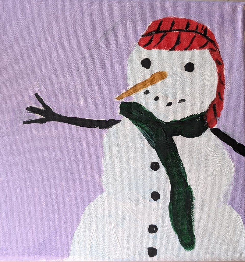
This snowman (painted on an 8×8 canvas) was inspired in part by snowmen done in pastel by Karen Margulis. It’s been warmer than normal here for December, but we might actually have a freeze tomorrow. No sign of snow, though. (Sigh.) So I thought painting a snowman would put me in a winter mood.
I’m not sure if you can tell, but the (viewer’s) right side of the snowman is a gray-white, while the (viewer’s) left side of the snowman is a sky blue-white mix.
The other colors are Pyrrole Red (straight from the tube), Yellow Ochre (mixed with the red for the carrot stick nose), Sap Green and Mars Black (straight from the tube) and the lavender background is a dash of Dioxazine Purple with Titanium White.