This drawing — done in graphite, compressed charcoal, and white Conte crayon — was based on a photograph from Pixabay, which I cropped and changed to grayscale.
Original image by Jill Wellington from Pixabay

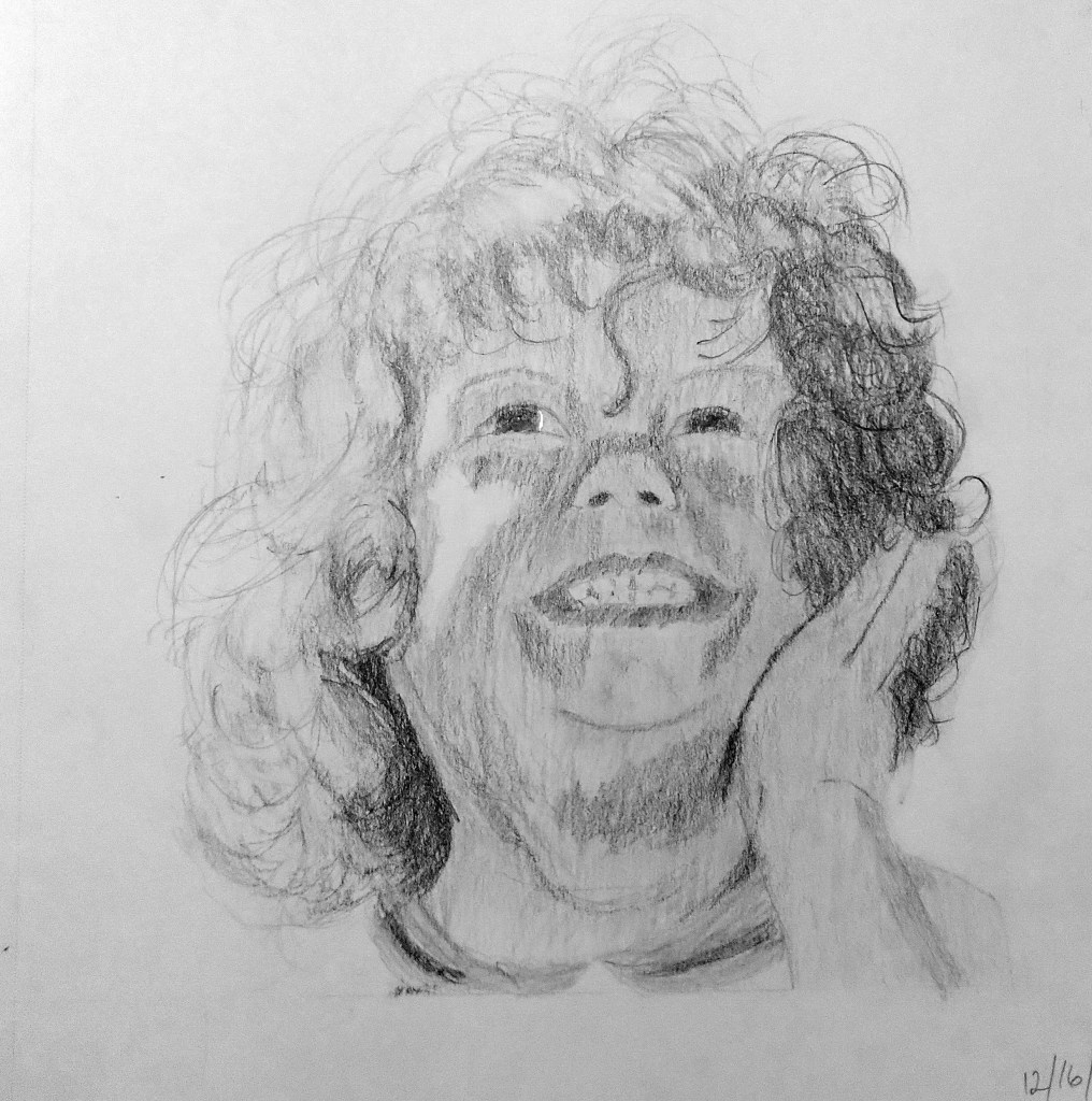
This drawing — done in graphite, compressed charcoal, and white Conte crayon — was based on a photograph from Pixabay, which I cropped and changed to grayscale.
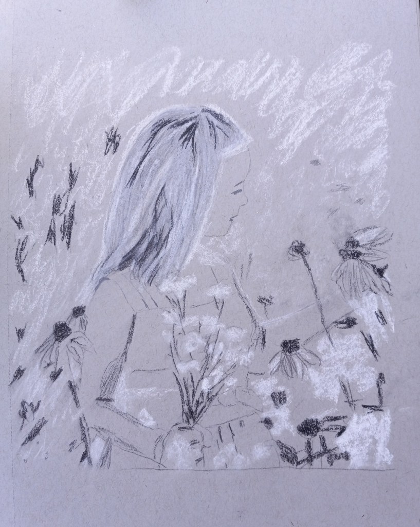

Original image by Jill Wellington from Pixabay
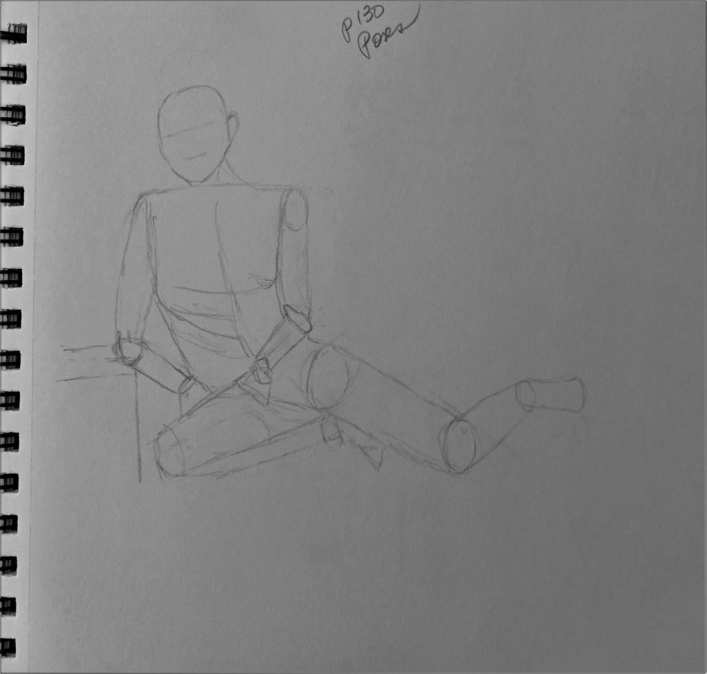
Still focused on regular daily drawing since it is the foundation for so much.
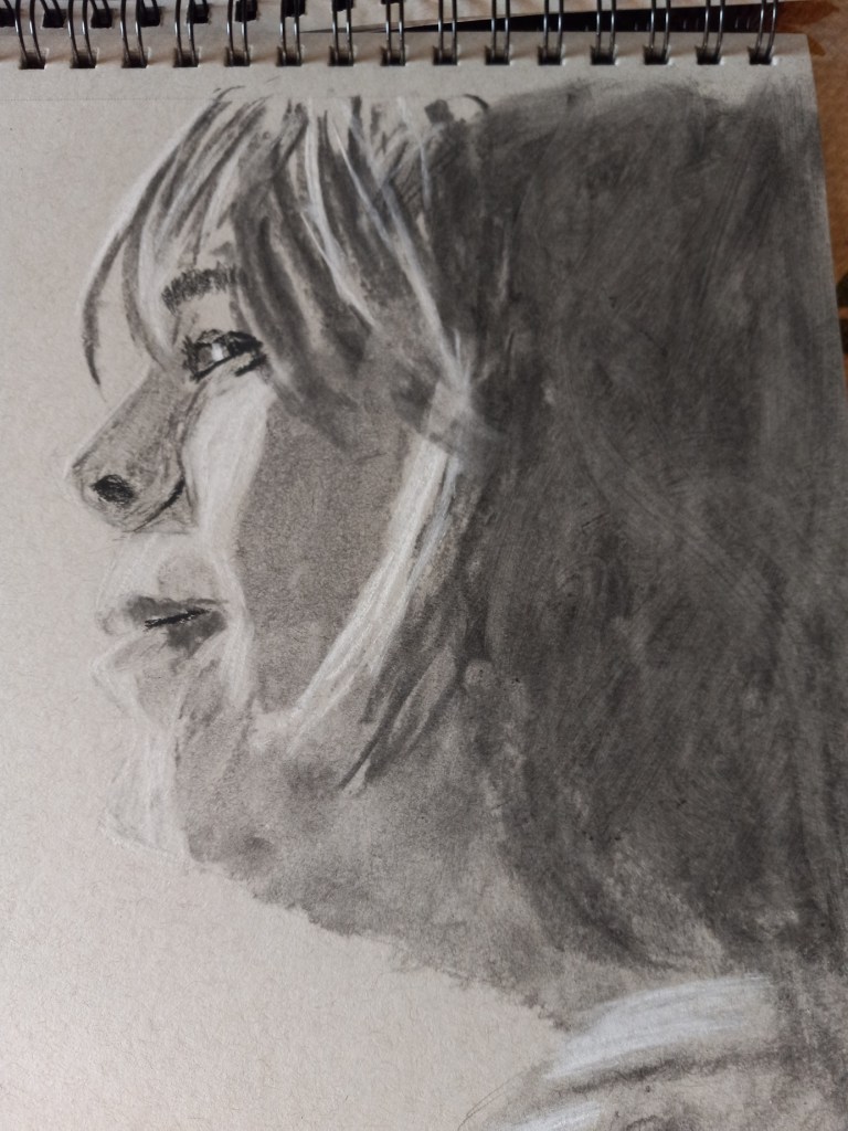
This portrait is based on a photo I downloaded from Pixabay. I used soft vine charcoal for the large shaded areas, For the more detailed areas, I used charcoal pencils 2B and 6B, in addition to Conte crayon in light gray, with mere touches of Conte in white. The rendering was done on Strathmore 400 gray toned sketch paper.
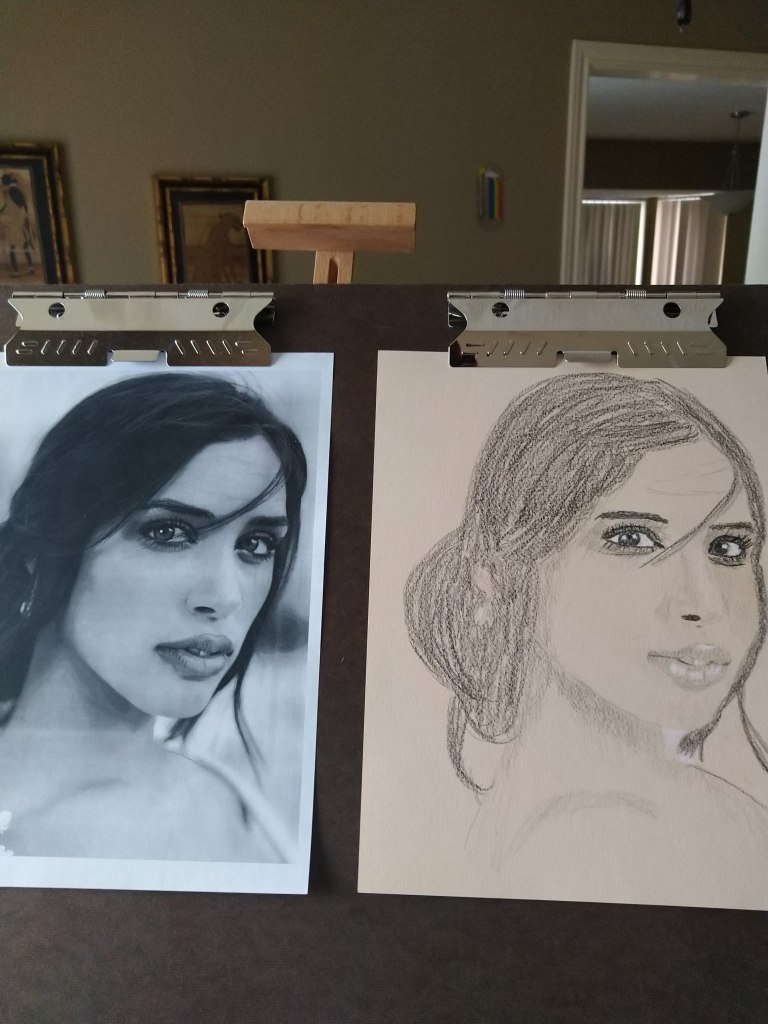
Here’s another portrait study from an Unsplash photo. Again, shading is a major issue. I also don’t have the shape of the subject’s chin and cheeks quite correct. The mouth is fairly decent, but not shaded dark enough.
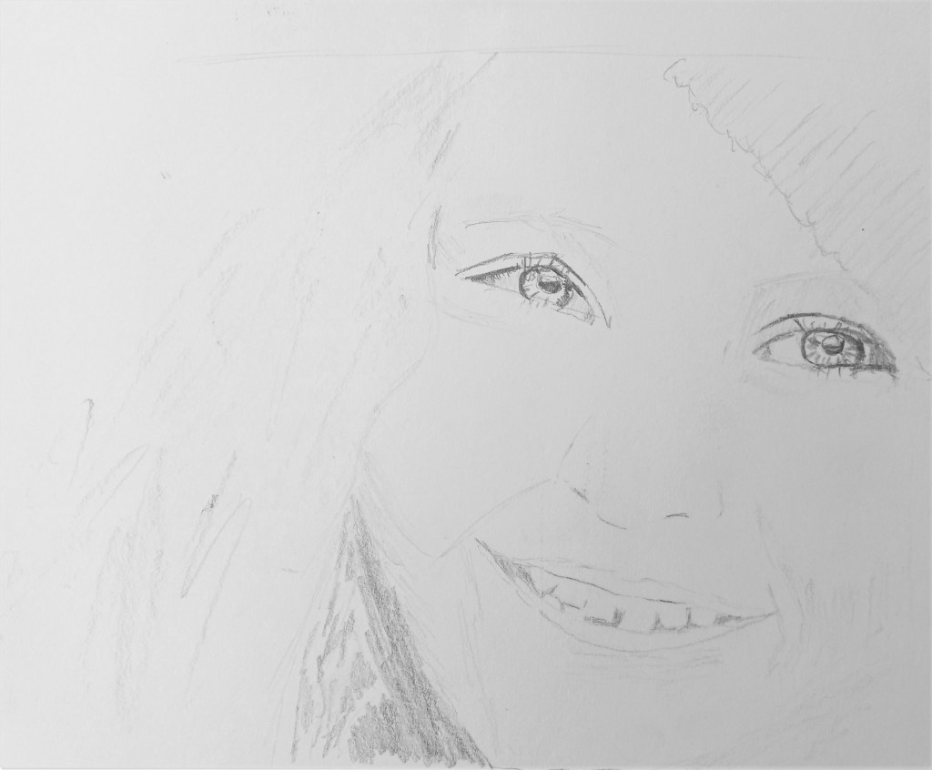
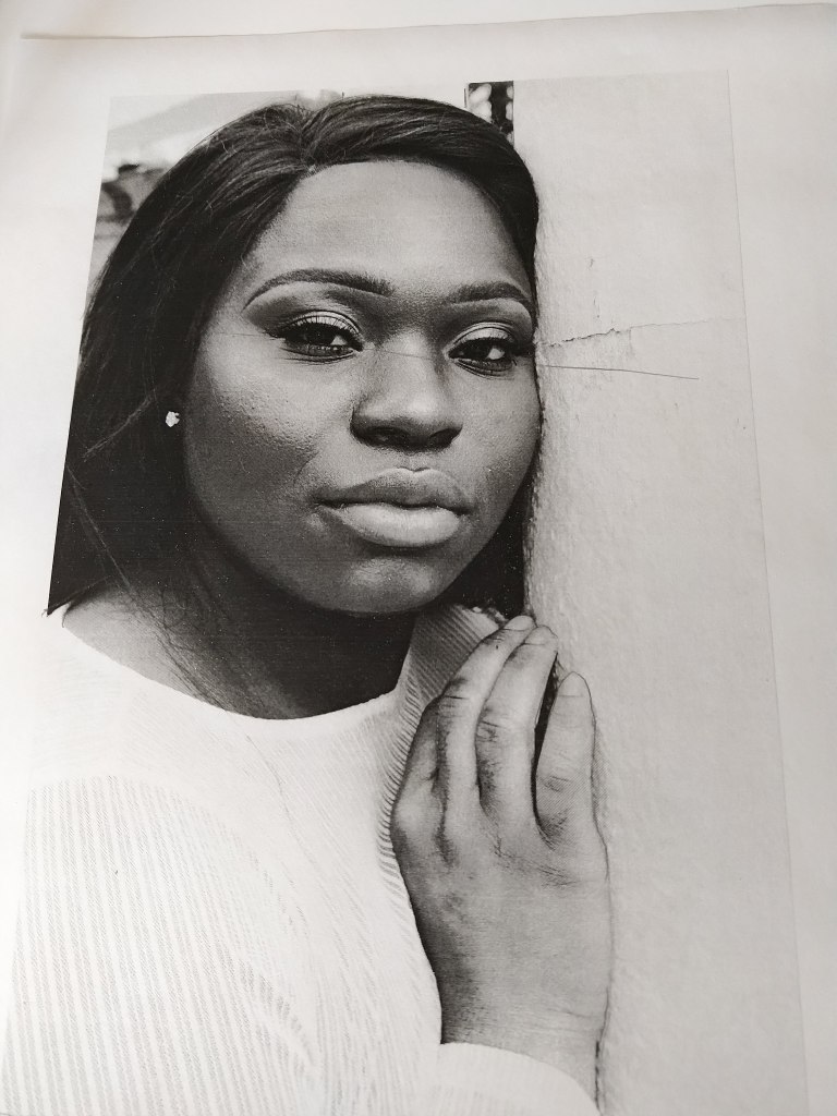
Here’s my attempt at another portrait. I need much more experience in properly toning and shading darker skin. While I did some shading on the subject’s neck, the shading on her right and left cheeks is entirely absent, and around the bridge of her nose is much lighter than the reference.
I could say the same regarding the white shirt.

Based on a photo from Clarke Sanders on Unsplash.
Practicing drawing curly hair using a tutorial on Youtube from Kirsty Partridge, and trying to find a good blend for light red hair. Prismacolor colored pencils are used here.
For the lighter strand, I used Burnt Ochre, Goldenrod, Yellow Ochre, Sand and Cream. For the darker strand, I used Terracotta, Yellow Ochre, Mineral Orange and Beige.
I am not overly satisfied with either.


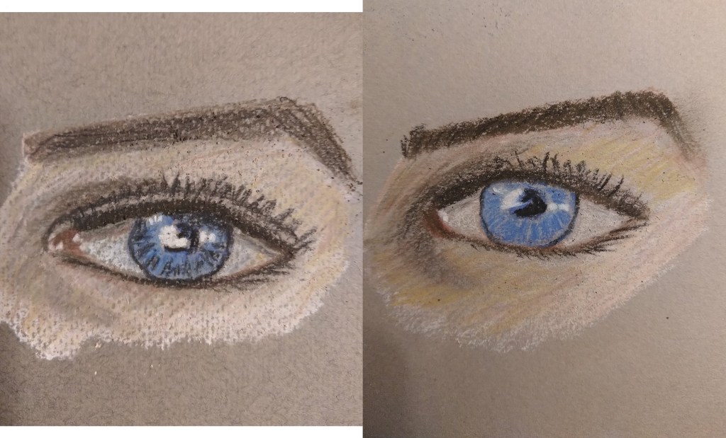
I have a set of Derwent pastel pencils (36-count tin), and am taking Phil Davies’ “Portraits in Pastel Pencil” class on arttutor.com. I was less interested in exactly matching the reference photo than I was in determining the best 10 colors to use. (We’re limited to a palette of ten, per the instructor, and he uses Faber-Castell Pitt pastel pencils.)
The first drawing was done on Rembrandt Talens pastel paper, and I dislike the look of the honeycomb hatched paper. Utterly ruins the drawing for me! The other paper used was Canson Mi-Tientes (smooth side). In both cases, a tinted gray paper was used.
Using a reference photo of myself at aged 3.
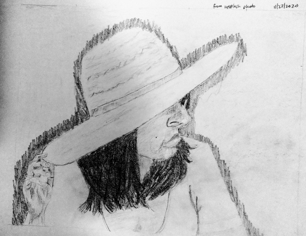
This drawing is based off a photo I found on Unsplash. I need to learn how to draw hair!