Lessons Learned

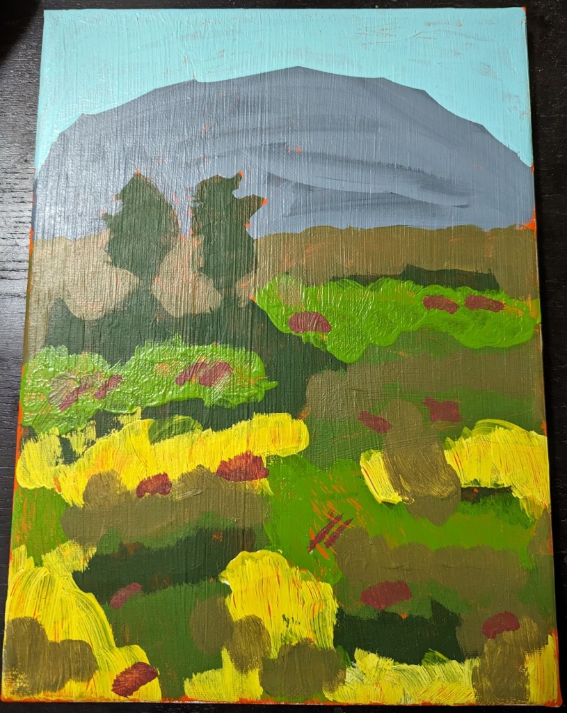
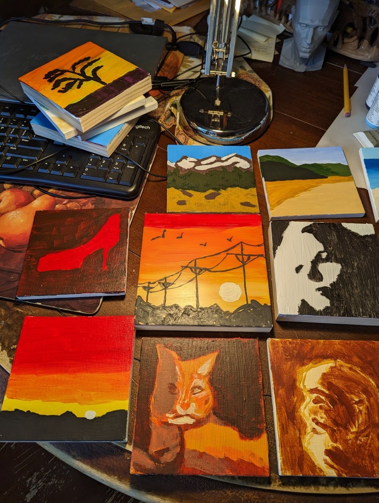
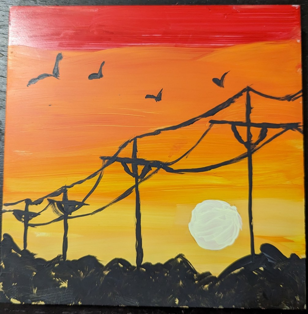
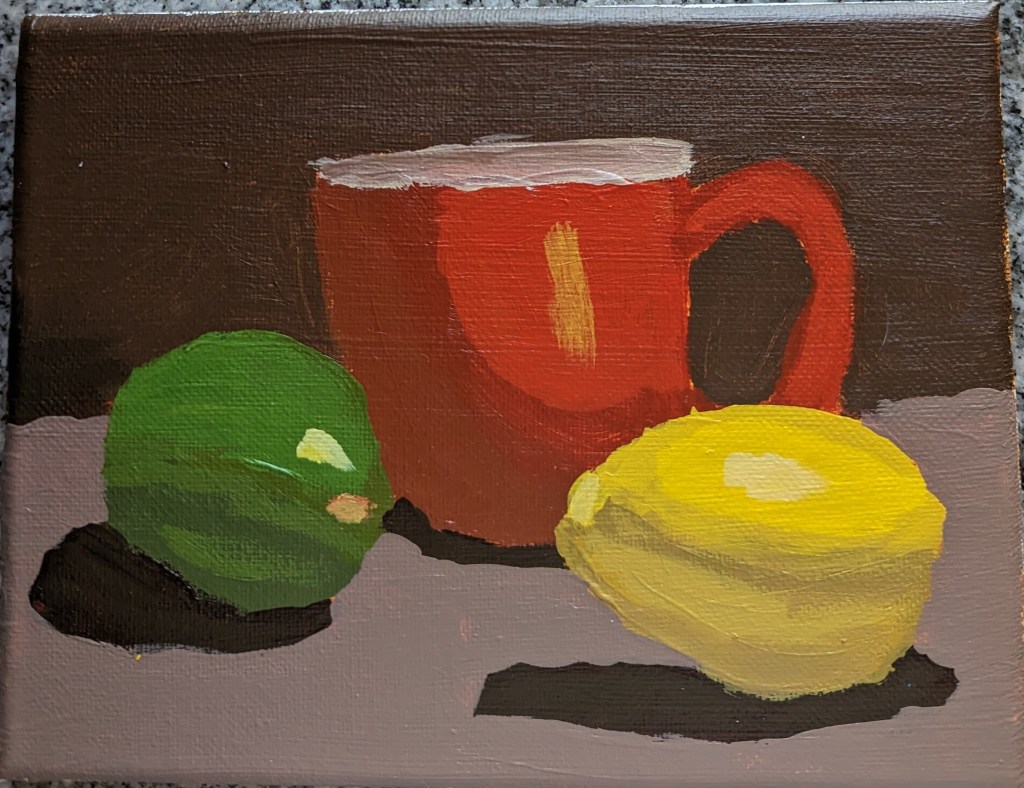
Using a demo project in Mixed Media Color Studio by Kellee Wynne Conrad, I attempted a landscape scene. And unfortunately I used a vivid fluorescent orange paint as background. This was a huge mistake!

The entire landscape became, for me, an exercise in trying to paint over the vivid orange, so I got very sloppy. I also discovered that my yellow paint was entirely too transparent — and that I need to pay attention to how transparent or opaque the paint I’m using is.

I also broke basic landscape rules around atmospheric perspective, in that the more distant the shapes (mountains, trees, etc.) are, the bluer they should be.

Cherry Tree Dropping Blossoms

I got the idea for this cherry tree painting from the Feeling Nifty website. I didn’t care for the example of the black/gray background, or the black tree — it looked too much like Halloween to me. (Halloween is a great holiday, but it doesn’t mix with blossoming cherry trees!) Also, I didn’t have Q-tips, nor did I want to use them — it would’ve been too close to copying the artist. I wanted to do things my way.

This was done on a 5×7 canvas; the background is ultramarine blue with black (“Payne’s Gray”). The predominant color of the blossoms is Quinacridone Magenta (pigment color PR 122) dark and tinted with Titanium White, with some Cadmium Red Hue (PR 112).

Notans — Based on Pixabay & Unsplash

I downloaded a few photos of women’s faces from Pixabay and Unsplash, set them to grayscale, applied the gaussian blur filter, and then posterized the image down to 2 values: black and white.

I used these notans to paint.

The top-most picture was done on wood covered with gesso painted with an old brush (hence, the ridges.) Some folks say to sand your gesso application, but I didn’t want to hassle with that. Below is a comparison between the actual notan (posterized photo) on the computer screen, and my painted image on the right. Close but not exact.

“50 small Paintings” in Acrylic

In early February, I found “Learn to Paint in Acrylics in 50 Small Paintings” by Mark Nelson on Amazon, and purchased it. I consider it a mixed bag — you can check out the reviews on Amazon, if you’re interested, about its negative points — all I will say publicly on a blog is that it’s the book that got me to pick up a paintbrush and actually PAINT! (I did NOT do all 50 paintings, but I rolled along on a dozen or so, some of which are shown below.)

The black, white and gray moonlight painting is the first one I did, following along in the book. As a nocturne of sorts, it is either highly stylized or something only a novice would do. Titanium White and Mars Black are heavily used in almost every painting, something that the typical art teacher suggests you avoid. But, again, this artist may be deliberately stylistic.

Still Life from #PAINTCOACH Patreon

I recently discovered @paintcoach on YouTube, and signed up for his Patreon page after viewing about a dozen of his videos.

One of the first paintings I did was a still life. (I still need to learn how to photograph my work; the glare is from my desk lamp — my “studio” is the same dining room table where I worked my job during the Covid lockdown.)

I like the cup the most — except for the messed-up lip (way too light!). I think I did a better job mixing colors for the lime, but the lemon is completely messed up. I kept fiddling with it, and made it worse.

Bottom line, I’m satisfied with my drawing (though why on earth did I choose Red Oxide as my color?). The downside of drawing, though, is my tendency to paint within the lines, which is part of why my value transitions are so darned harsh.

Color mixing is also difficult when I’m using white freezer paper (an old roll hanging around from years ago) as my palette paper vs. painting on a toned canvas. Just when I thought the color mix looked right (on the “palette”), it looked awful on the canvas. Ugh.

Brushwork is also a challenge.

Painting of the Day: Glass Vase in Gray Scale

Today’s pastel painting was done on Rembrandt pastel paper, using 3 NuPastels: Warm Deep Gray, Warm Very Light Gray, and touches of Warm Medium Gray. This was a value study in preparation of a color piece which I’ll be doing on a sample scrap of Sennelier Pastel Card (bought last year as a part of a sampler from Jackson’s Art).

The original picture in color is below. I also downloaded the Android app Color Grab, and played a bit with color choices. While that was fun, I quickly became overwhelmed at the thought of using so many colors for the vase!

I decided to simplify to an extreme by editing my photo to be grayscale, and then using Adobe Photoshop Elements to posterize the grayscale photo to get the two extremes of values. The posterized version was the reference for my pastel.

I am underwhelmed by the texture of the Rembrandt pastel paper; I do not care for the honeycomb look at all.