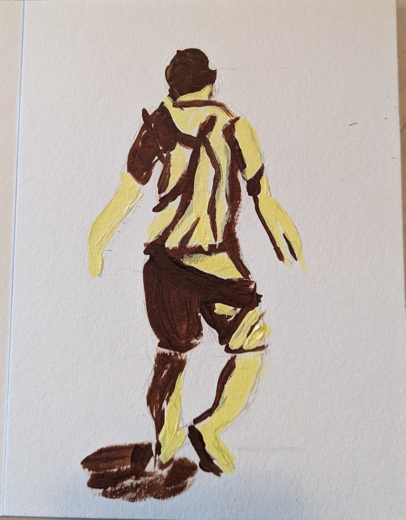
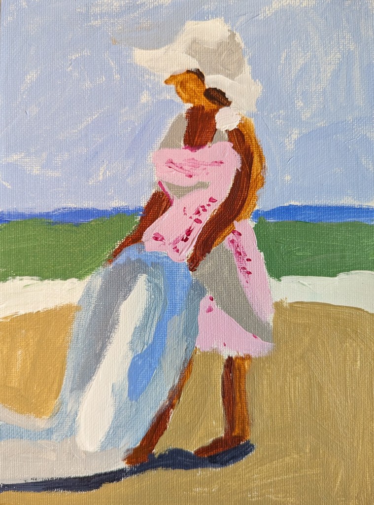
As I mentioned in this post, I’m taking the online course by Peggi Kroll-Roberts, and the assignment is to do 2-value and then 3-value studies painting the figure. In this effort, I am using the figure I sketched out in charcoal here, as prep for a future painting.
I drew out the figure first, using a 6×8 piece of 300-lb watercolor paper. For comparison’s sake, I’ve included the charcoal figure.
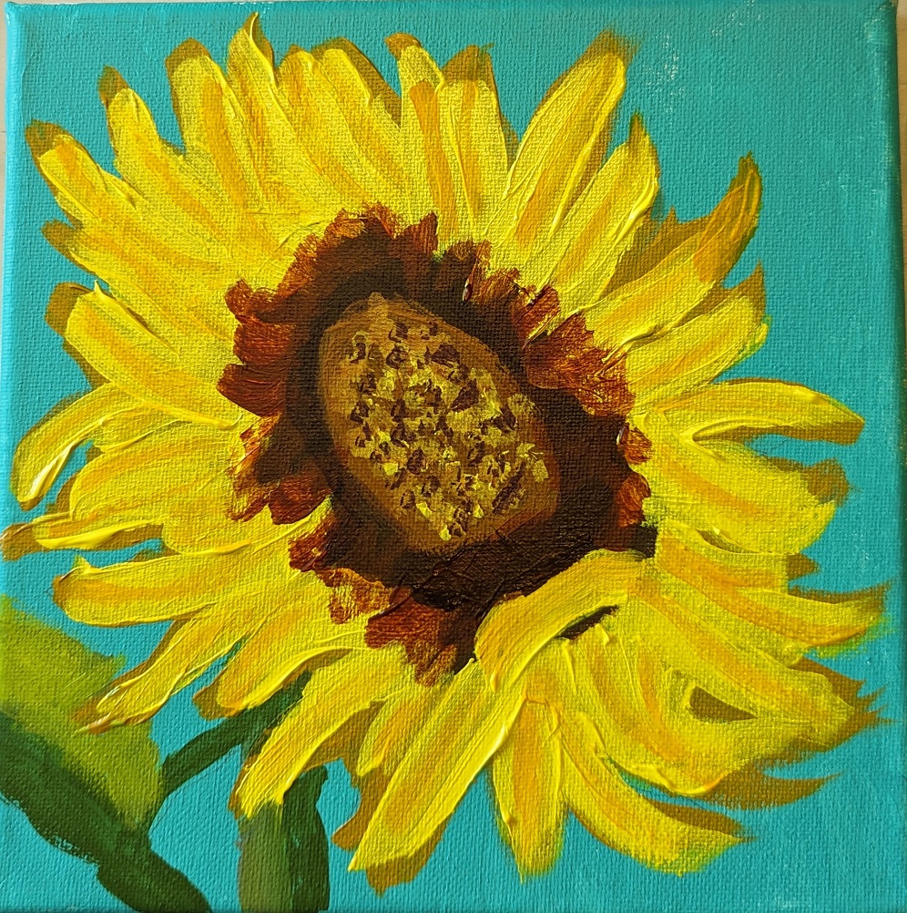
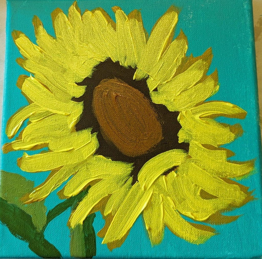
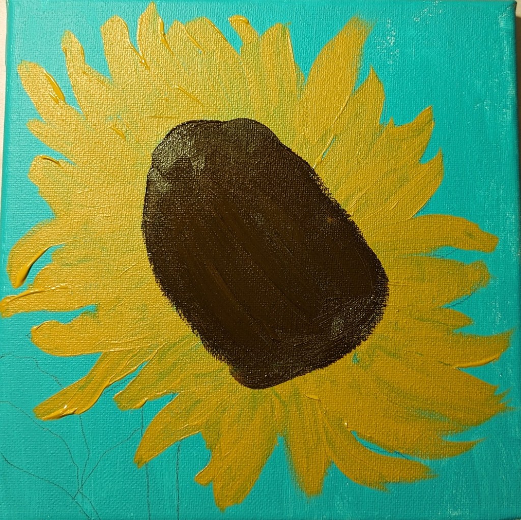
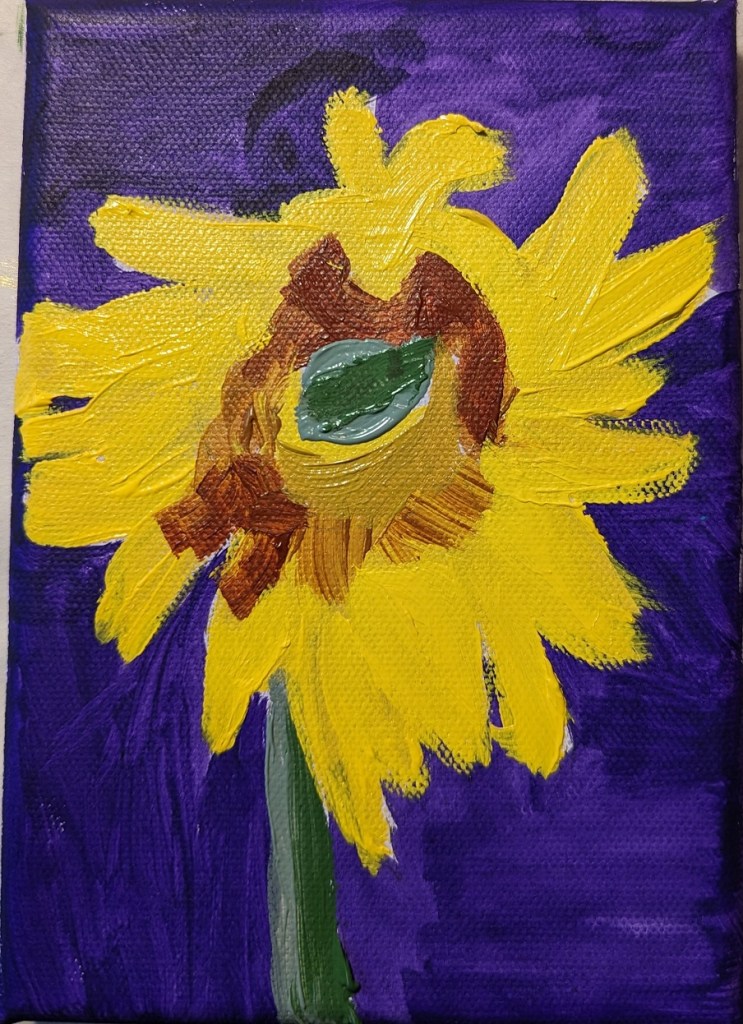
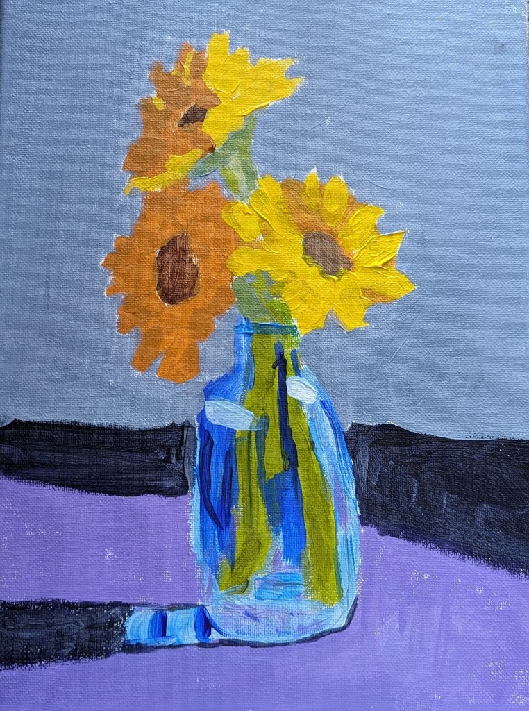
I’ve been unsatisfied with my sunflower painting so the other day I googled “how to paint sunflowers in acrylics”. The search results were a bounty of different YouTube videos. Well, naturally, some sunflower paintings appealed to me more than others so I watched about half a dozen.
What I found was, naturally, everyone has their own way of painting sunflowers. Some start with the background, some start with the dark center of the flower. However, the colors they chose for painting the flower were largely in sync across the board — and with my own paintings: yellow, yellow ochre, burnt sienna, burnt umber, etc. etc.
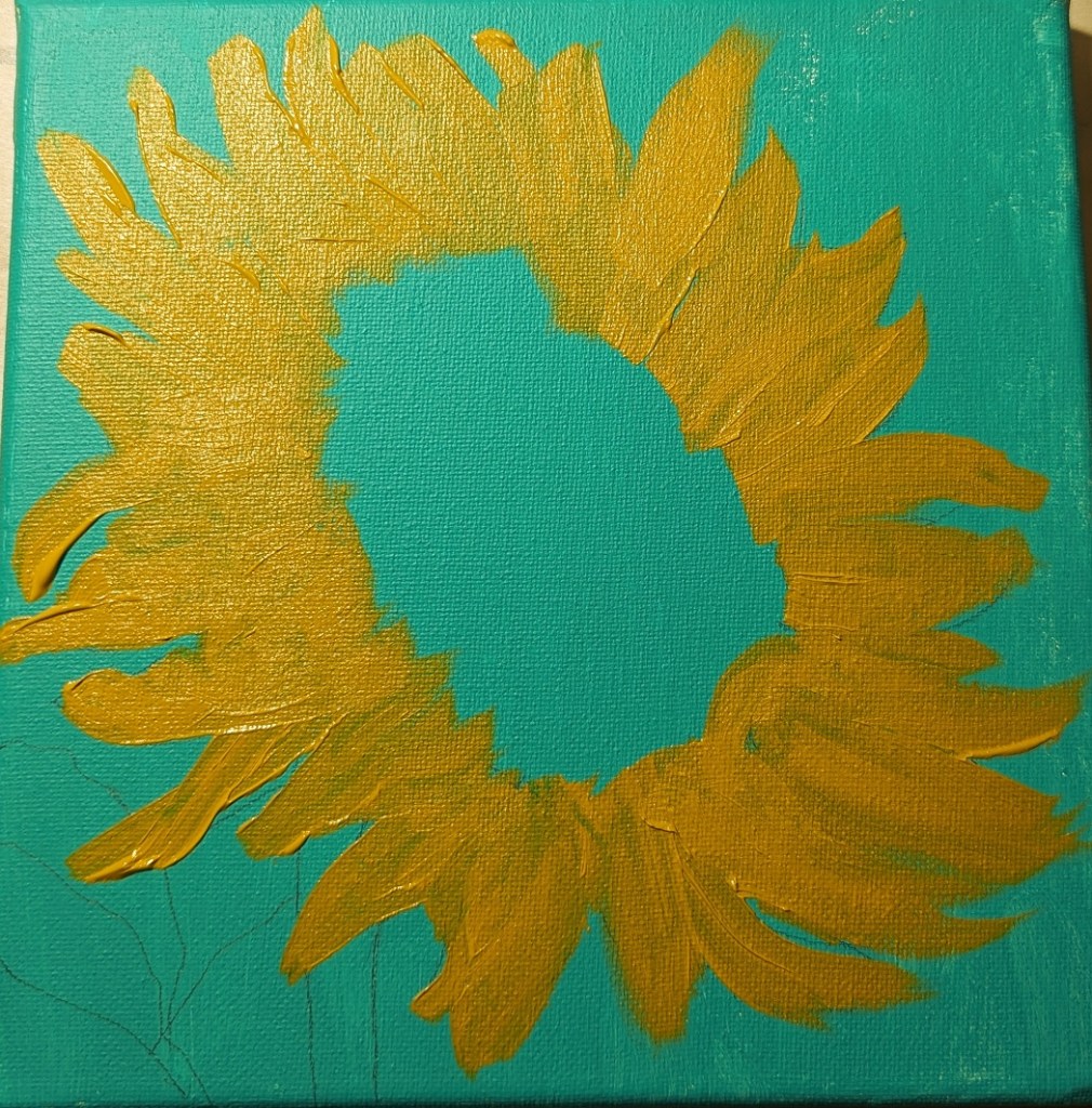
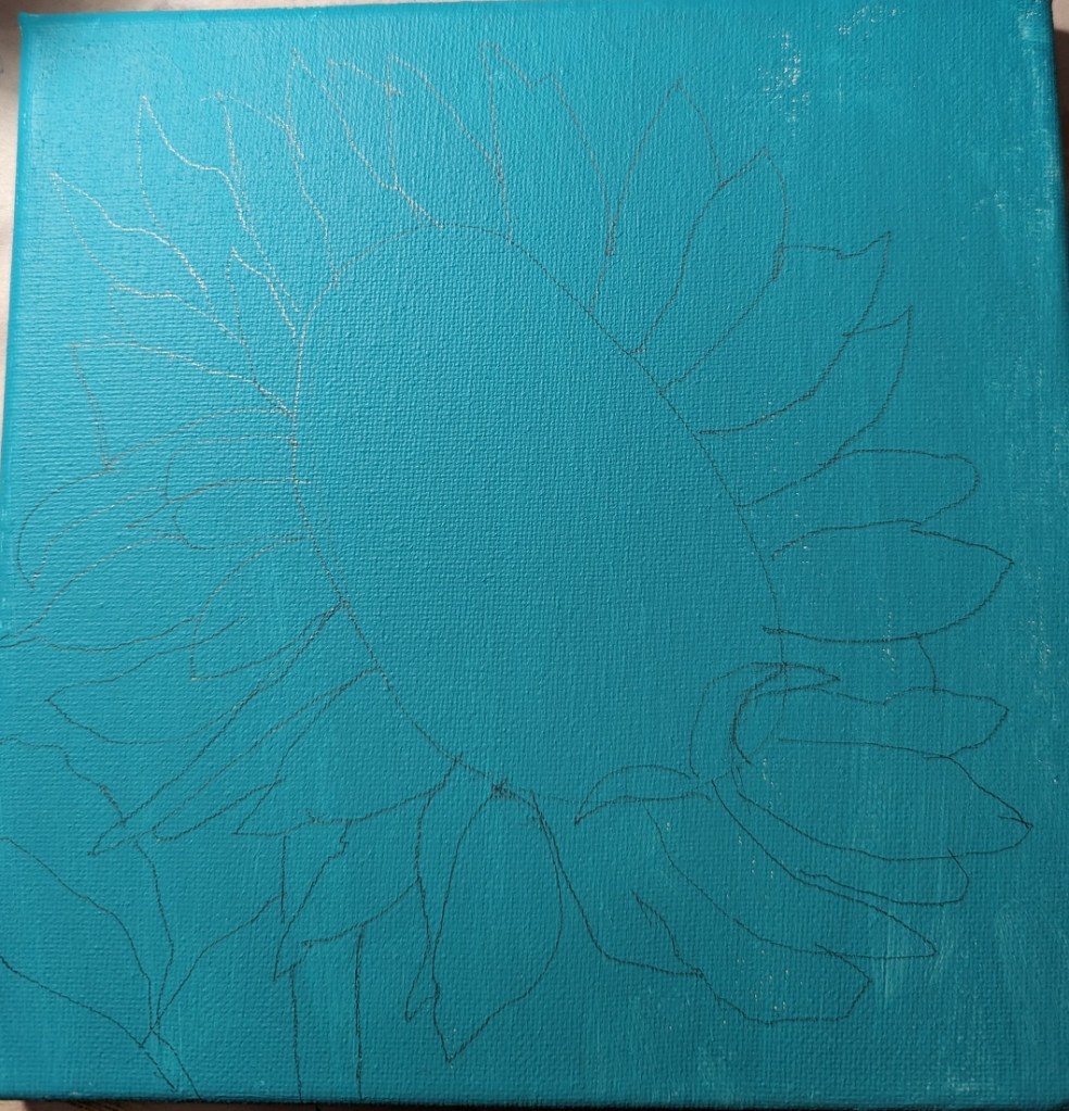
One process I decided to try, though, was to do more layering of the petals, and start with a round of yellow ochre first, applying the brighter yellow afterwards. This painting on an 8×8 canvas was just from my imagination, and the mix of all the sunflower pictures I’ve been looking at lately.
I recently purchased the June 2019 of Leisure Painter which had an article by Steve Strode about the basics of acrylics. He suggests you model good painters, and gives an example in the magazine of his painting based off of Peggi Kroll-Roberts‘ style.
This is the first figure I’ve ever painted, and my goal was 1) just to do one, and 2) was trying to focus on using minimal brush strokes — just to boldly attempt it, in other words.
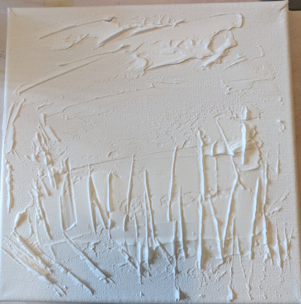
This painting was based off an image by RÜŞTÜ BOZKUŞ from Pixabay, and an article I found on the UK site Painters Online. I used an 8×8 canvas for this work, and took photos of each step I took.
Step One was to apply the modeling paste. The horizontal “goop” was to signify clouds; the vertical lines was to signify weeds and plant stalks.
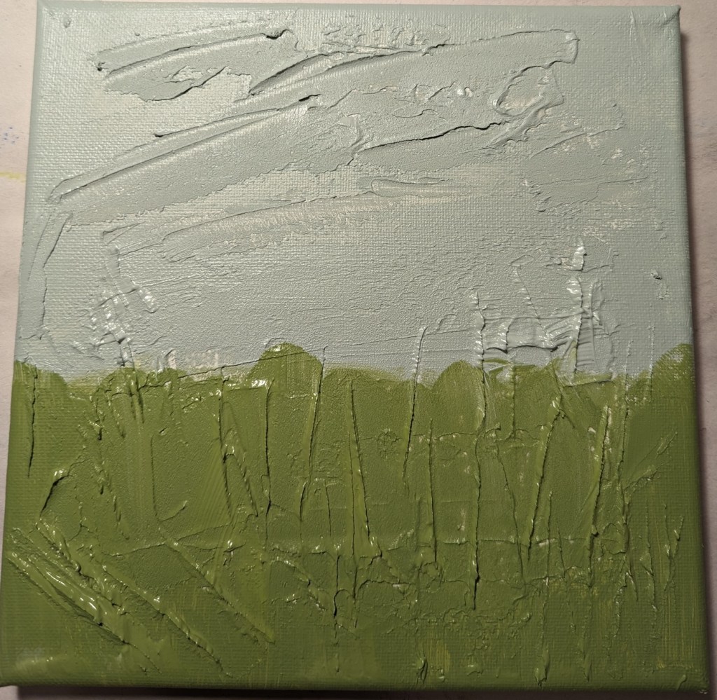
After applying the modeling paste and letting it thoroughly dry, I went in my own direction rather than following the Painters Online demo.
I used a gray green mixed with a yellow green for the grasses, and a gray blue for the sky area.
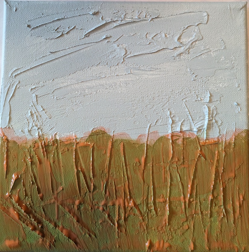
Green is reportedly not a good color to use alone when doing landscapes and meadows. So, my next step was to apply a transparent orange glaze (using Liquitex Gloss Glazing Medium over the green paint, and let that dry thoroughly.
After the glaze dried, I added a darker value in the center bottom (to match with the reference photo) as well as adding a glaze of Cadmium Red Medium Hue for the clouds.
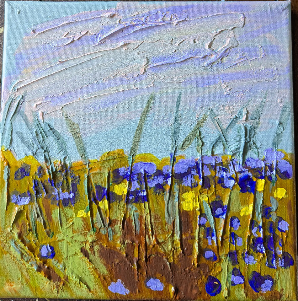
Next I painted the flowers, using Dioxazine Purple with some Titanium White, some yellow flowers, and highlighted the stems with Gray Green, yellow, and Burnt Sienna. I retouched the grassy area with some green. Then I added some of the Dioxazine Purple mixture to the clouds in the sky, and called it a day.
(The photo here doesn’t fully reflect the periwinkle/purple color of the flowers; they look too blue.)
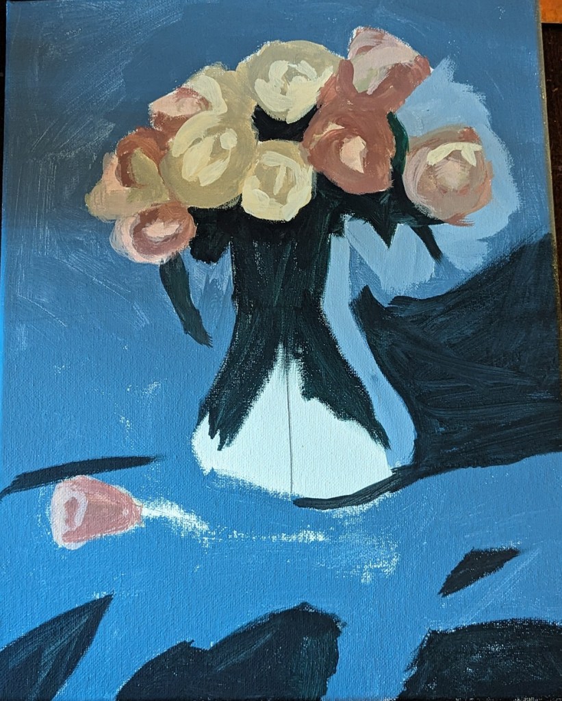
We had a baseball game to go to in the afternoon (for Independence Day) so I wasn’t able to get more done on this painting. However, I have the base colors in for the roses.
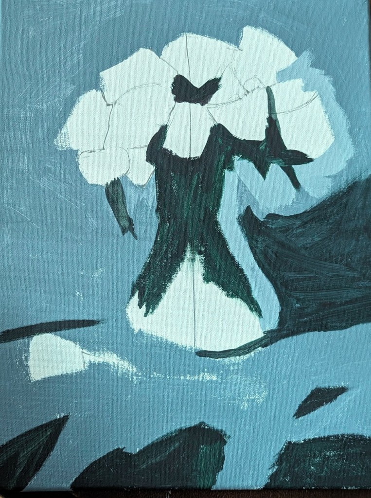
I need to watch the PaintCoach‘s YouTube to understand what he did for the flower stalks, and the finishing touches.