This work, Girl in a White Dress, is yet another online tutorial on the PaintCoach Patreon page. It’s 9×12, toned in pale umber, and drawn out in willow charcoal.
Right now, I’m mapping out the big shapes of the water, with the colors to be adjusted later.
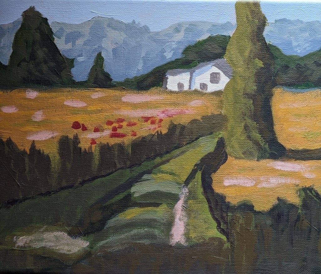
Finally had time to paint again after watching so much baseball — This is the finished work from the Patreon lesson.
(The photo of the completed painting was taken in a different room with only natural light coming in from southern windows; the other one was taken in my “studio” (dining room table) under the bright light of a work lamp.)
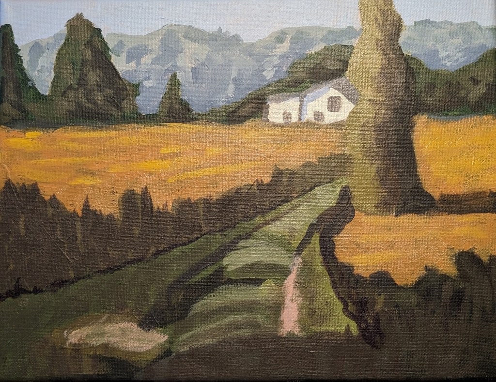
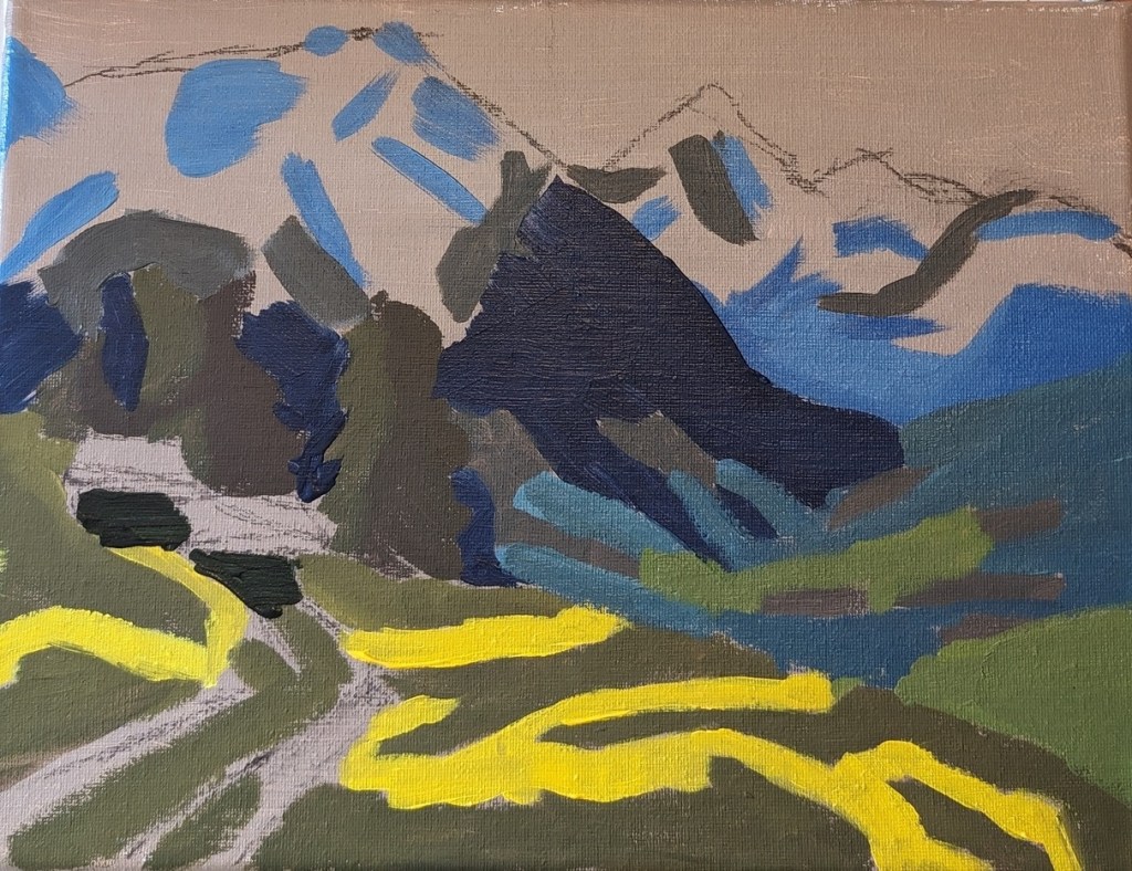
I’m continuing to work on this landscape. I painted over the first take of the yellow ochre to make it more golden, and I think the lighter green up front is too saturated/yellow, and I need to darken it.
What is left to do is the leaves on the tree, the flowers in the meadow, and the grassy definition of the path to the house.
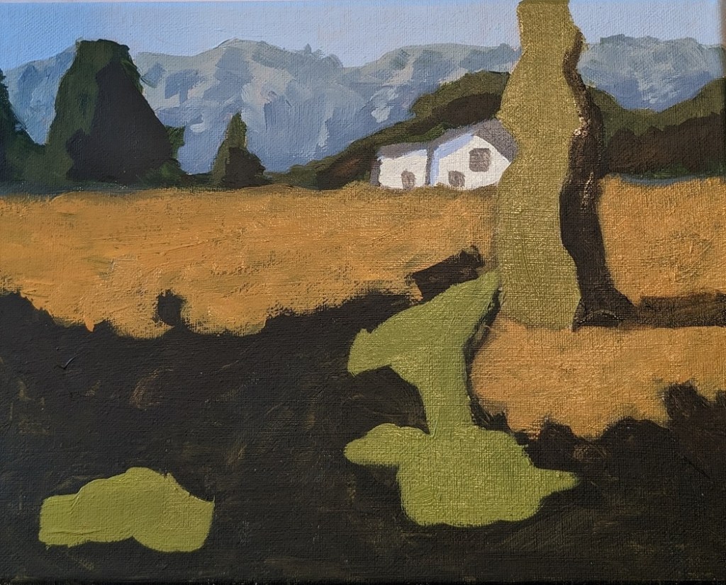
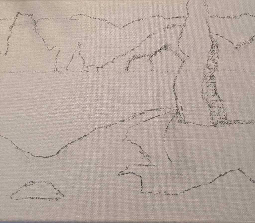
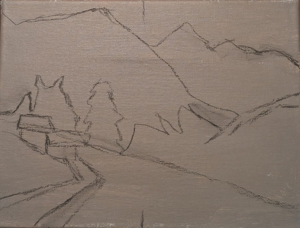
Now that Halloween is over, I’m working on a landscape from PaintCoach’s Patreon site. This is in advance of his Paint Week (free!) that starts on November 6 (link to sign up is in his YouTube notes).
This one is on a 9×12 canvas, toned in Pale Umber, and sketched out in charcoal — rather than painted, because I’ve been watching the World Series, lol.
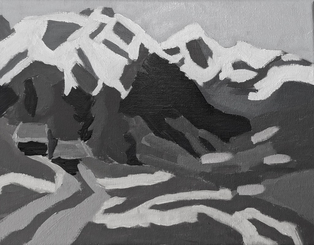
I completed the mountain valley abstract. The green grass in the front is not as de-saturated in real life as in the photo. I’m also including the source photo, as well as a black and white version for value comparison.
This is another exercise from PaintCoach Patreon’s page. The idea is that, if your solid shapes of values works, your painting will work once the detail is filled in. And it’s also to help beginners like me think in terms of shapes rather than things.
I used a raw umber and white tone on a 9×12 canvas, and sketched out in charcoal (a few days ago) — again, because I was also watching postseason baseball.
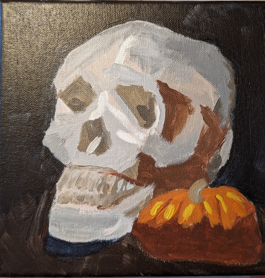
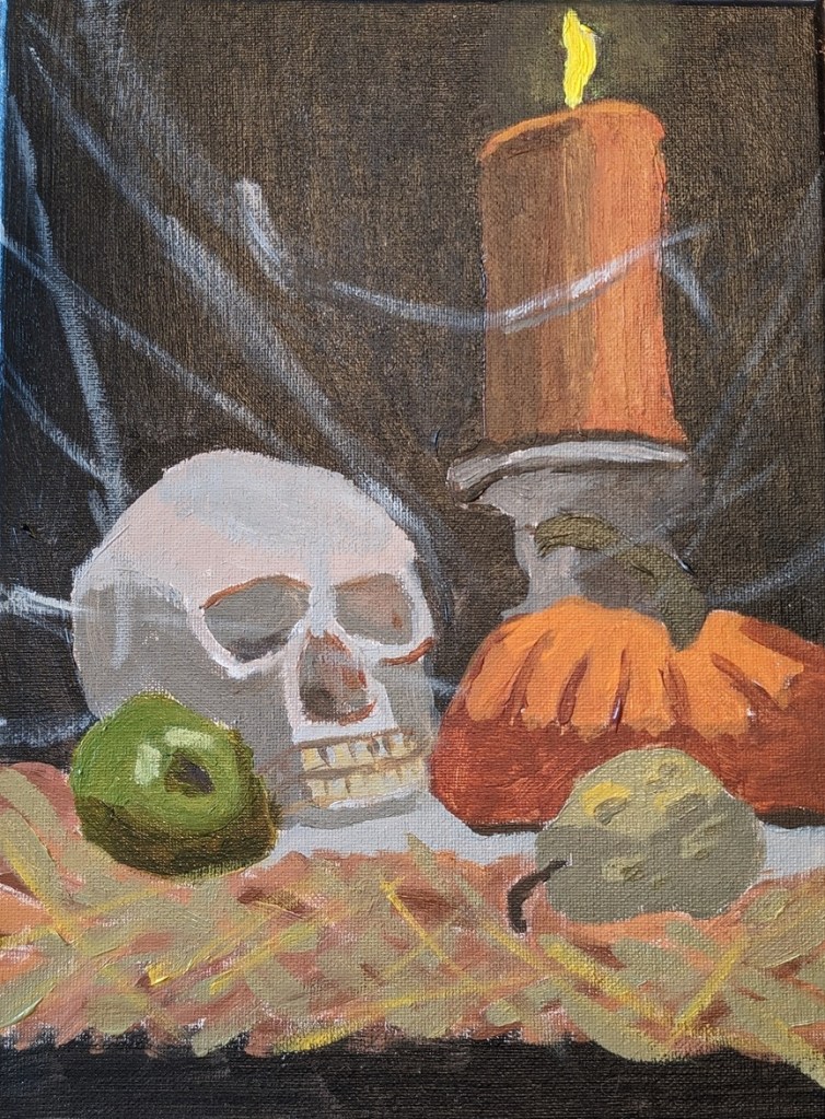
This is based on a new Halloween-themed Patreon post from PaintCoach. I’m using a 9×12 canvas, and I did a tone of Pale Umber (Winsor & Newton Galeria) thinned out with water. As with the skull and pumpkin painting in my previous post, I sketched it out with willow charcoal. The background in this case is Ivory Black rather than a chromatic black of Burnt Sienna and Indanthrene Blue. Near the bottom, I’m using Raw Umber.
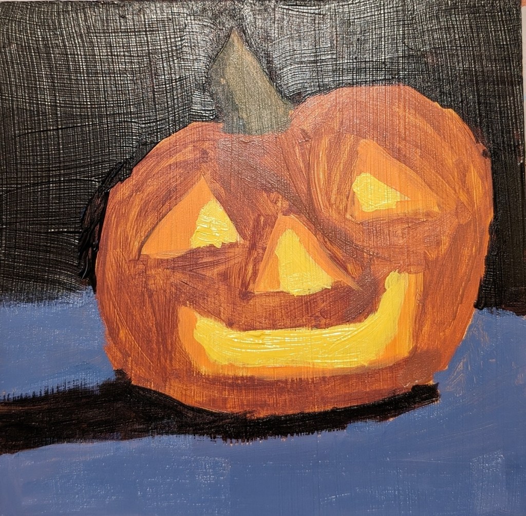
I mentioned in yesterday’s post that I realized that I needed to use a color closer to Burnt Sienna as my desaturated orange; my desaturated “orange” was simply too brown and yellow.
In any case, while it was fresh on my mind, I decided to do a quickie painting of another jack o’lantern, skipping the smaller one and just focusing on getting the colors correct. I used a 6×6 Ampersand Gessoboard that I had toned with yellow ochre several months ago.
The color of the surface the pumpkin sits on is actually a bit more lavender than blue; the photo lighting is a bit off. And I really dislike the slippery Gessoboard!