As I indicated in an earlier post, I’m working on “Winter Cabin” in a follow-along from a PaintCoach post on Patreon.


As I indicated in an earlier post, I’m working on “Winter Cabin” in a follow-along from a PaintCoach post on Patreon.
I’m working on another lesson from PaintCoach’s Patreon pages. This one is called “Winter Cabin”. I’m using an 8×10 canvas, which I toned with Windsor & Newton Galeria’s Pale Umber. I sketched out the basic shapes with a Liquitex acrylic paint pen in Burnt Umber.

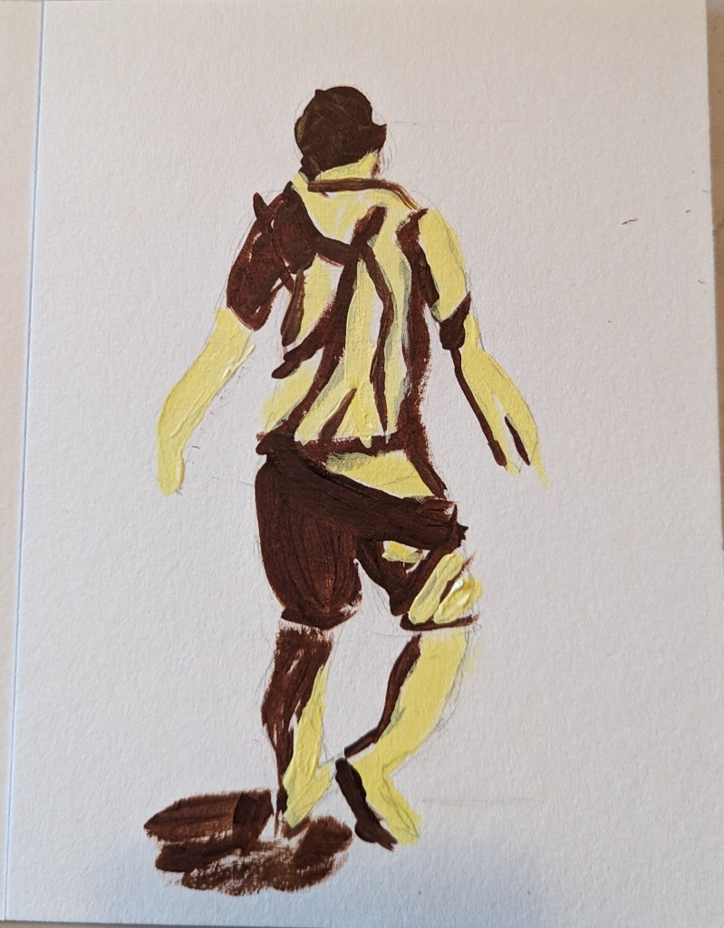
As I mentioned in this post, I’m taking the online course by Peggi Kroll-Roberts, and the assignment is to do 2-value and then 3-value studies painting the figure. In this effort, I am using the figure I sketched out in charcoal here, as prep for a future painting.
I drew out the figure first, using a 6×8 piece of 300-lb watercolor paper. For comparison’s sake, I’ve included the charcoal figure.

Based on an image by sarahbernier3140 from Pixabay
I decided the background was too gloomy with that gray blue, so painted over it with Golden’s Neutral Gray 7.
I used the blurred reference photo from the PaintCoach Patreon site, and listened here and there to the video, but ultimately I decided to go with my interpretation of the colors rather than trying to copy color for color the instructor’s work.

We had a baseball game to go to in the afternoon (for Independence Day) so I wasn’t able to get more done on this painting. However, I have the base colors in for the roses.
I need to watch the PaintCoach‘s YouTube to understand what he did for the flower stalks, and the finishing touches.
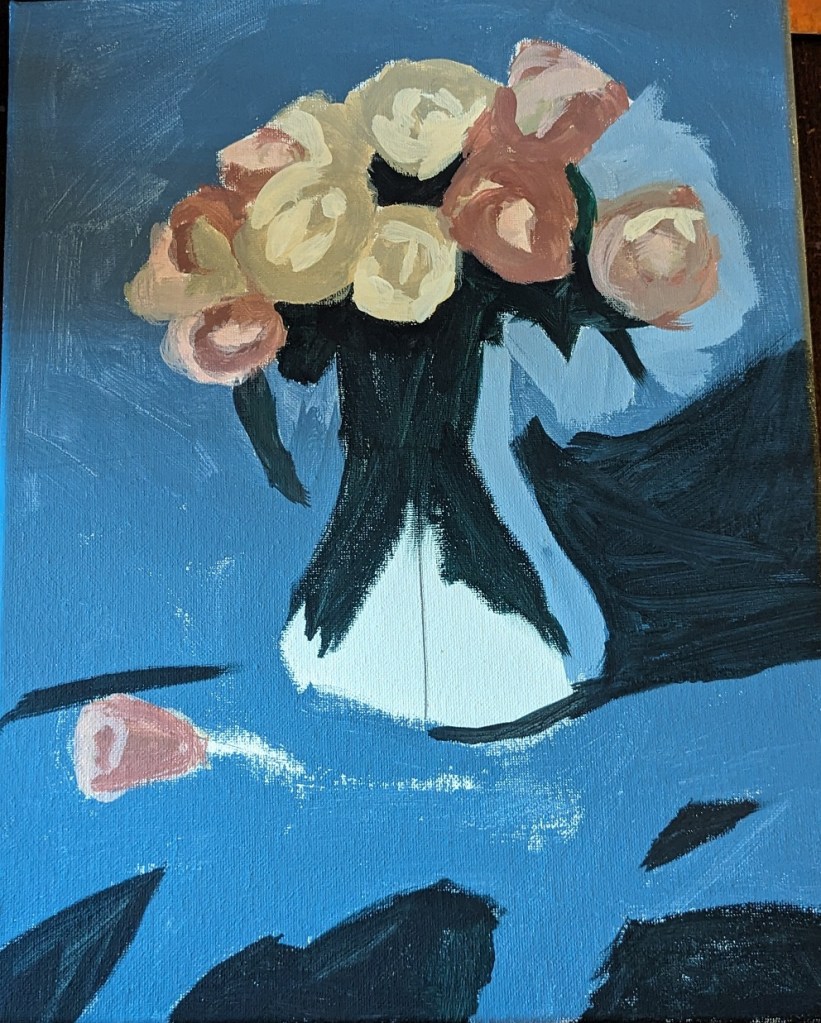
I’m trying roses now, using a reference photo from PaintCoach’s Patreon site. This is the background done, on a 11×14 canvas.
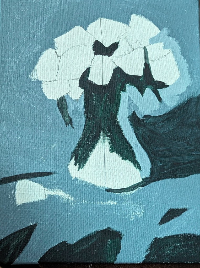
Here is the completed work. The orange I left untouched from the initial wash of color, adding alizarin crimson and yellow for the brighter and darker parts of the leaves.
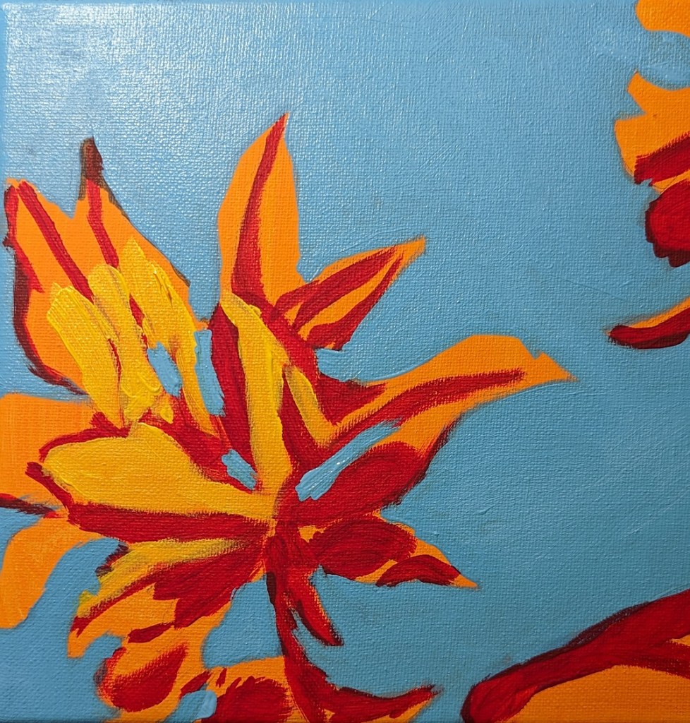
One more study I’ve done in the Adventures in Acrylic class. I did not do the fluorescent orange spray paint, and this time, instead of using my Perinone Orange (a close substitute), I went with Liquitex’s Cad-Free Orange paint, more soothing to my eyes.
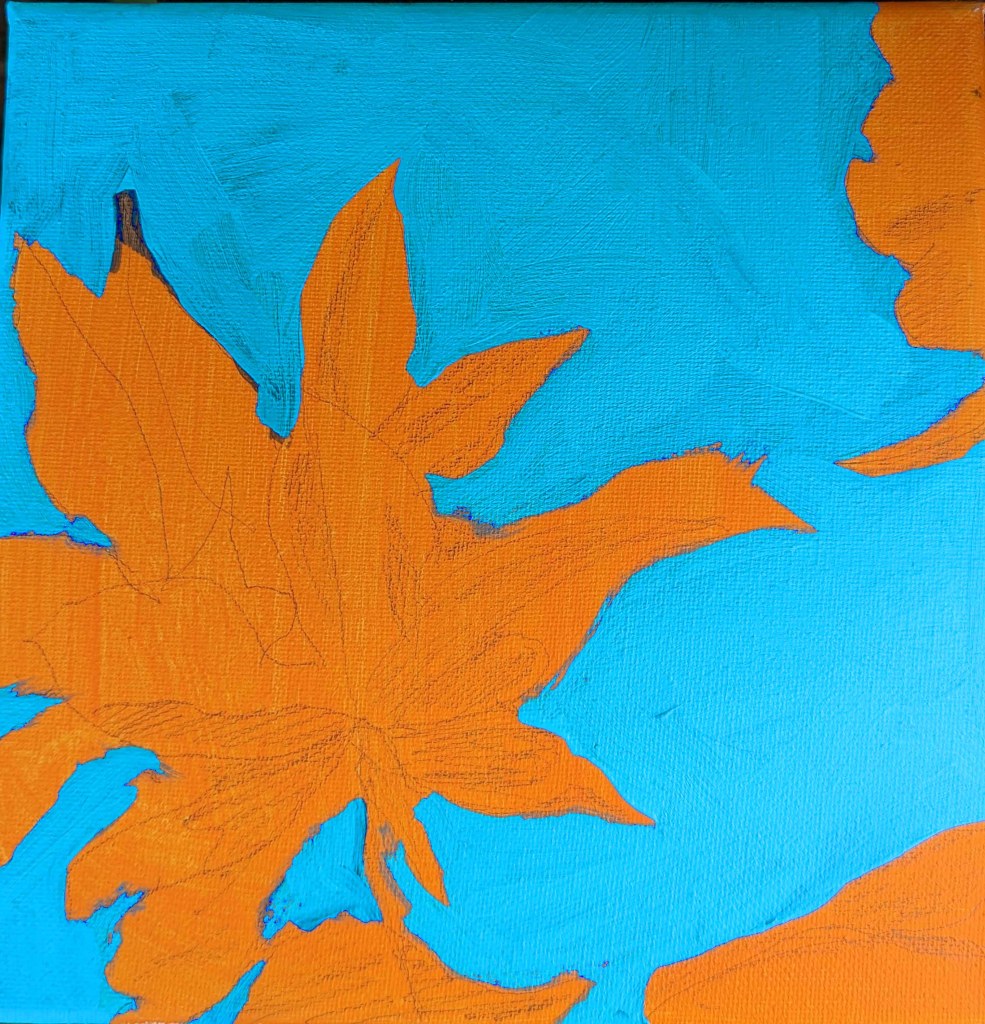
Then I did a free-hand drawing in pencil of some of the orange leaves from the reference photo provided in the class, and did some light shading of the shadow areas as I saw them.
My blue was a mix of Utrecht’s cerulean blue (fluid) and Liquitex’s soft-body Light Blue Permanent (I think it is). I used a long-handled small bright brush to paint in the negative spaces.
This is really an in-progress painting, but I’m tempted to leave it as it is and go on to something else. We’ll see!
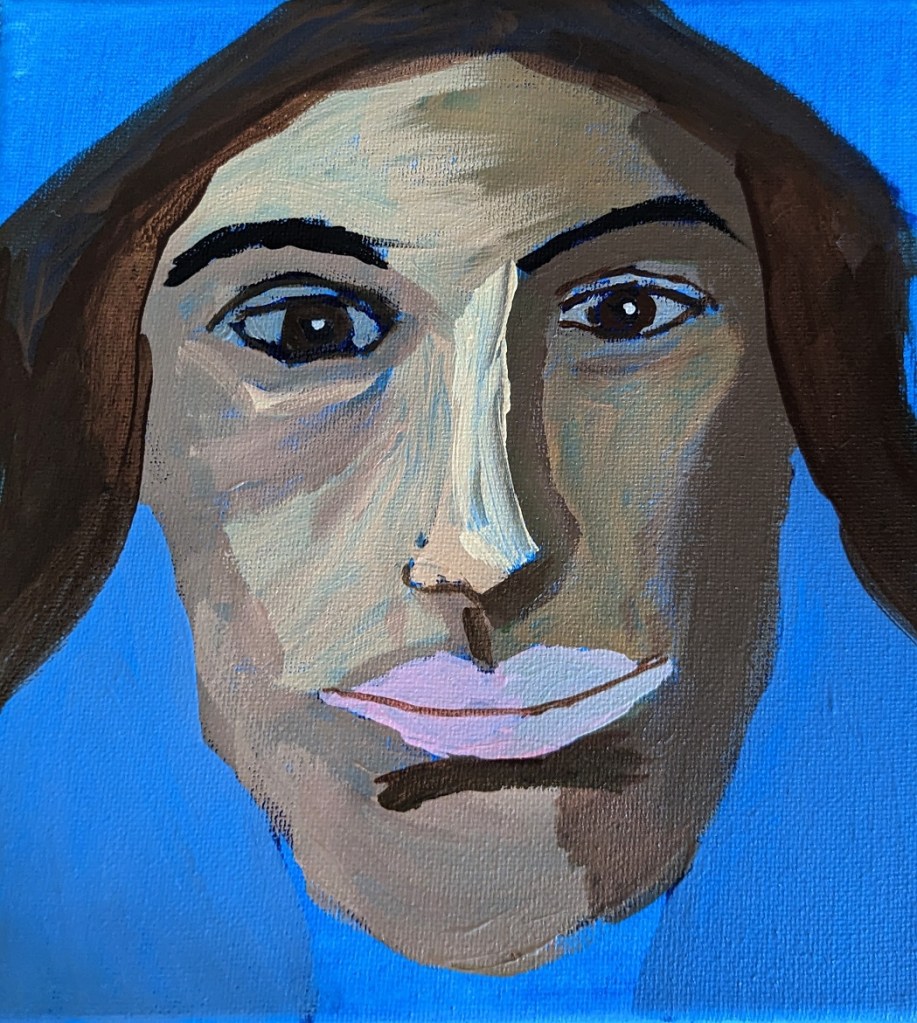
This is another work from Marla Baggetta’s Adventures in Acrylic class I’m taking. I have to say I’m NOT a big fan of phthalo blue, at least as a background. Especially a portrait background! That blue just shines through in an aggravating fashion! And, obviously, it affects the look of the other paint colors used. All in all, she looks greener than I had wanted her to be. Until I get portraits down well, I don’t see the purpose of using wacky colors. 🙂
Anyway, painting a portrait — though this was supposed to be “expressive” and “fun” not an absolute likeness — is one thing, drawing is another. I fiddled with the proportional divider I bought for sketching, and the drawing was pretty decent. But once I started painting over my pencil lines, the drawing went out the window. Ugh!
I AM reasonably satisfied with the facial planes and the shadows — for a first attempt.
Oh well. Tomorrow’s another day!