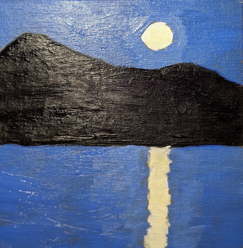
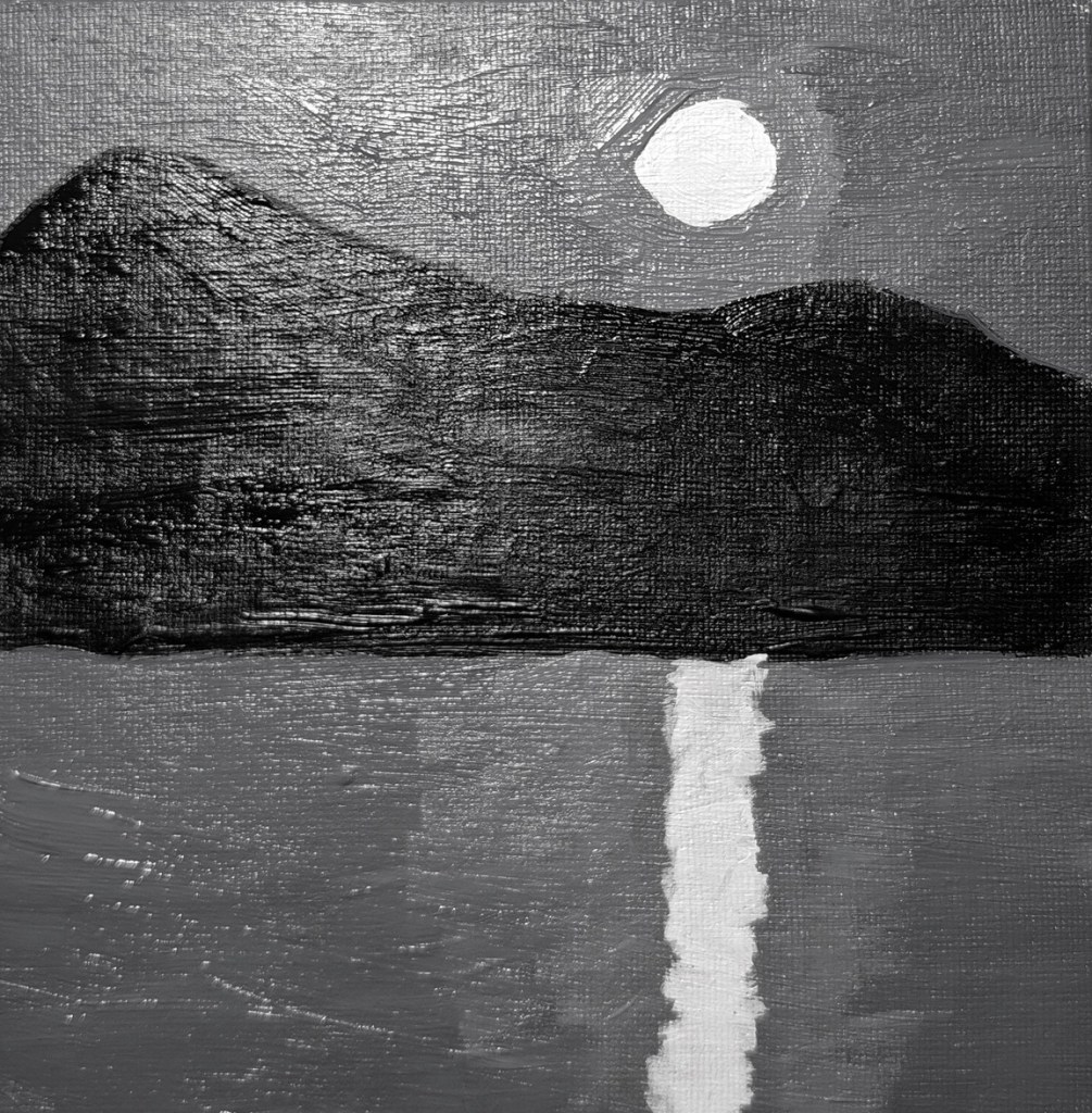
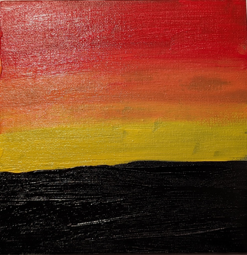
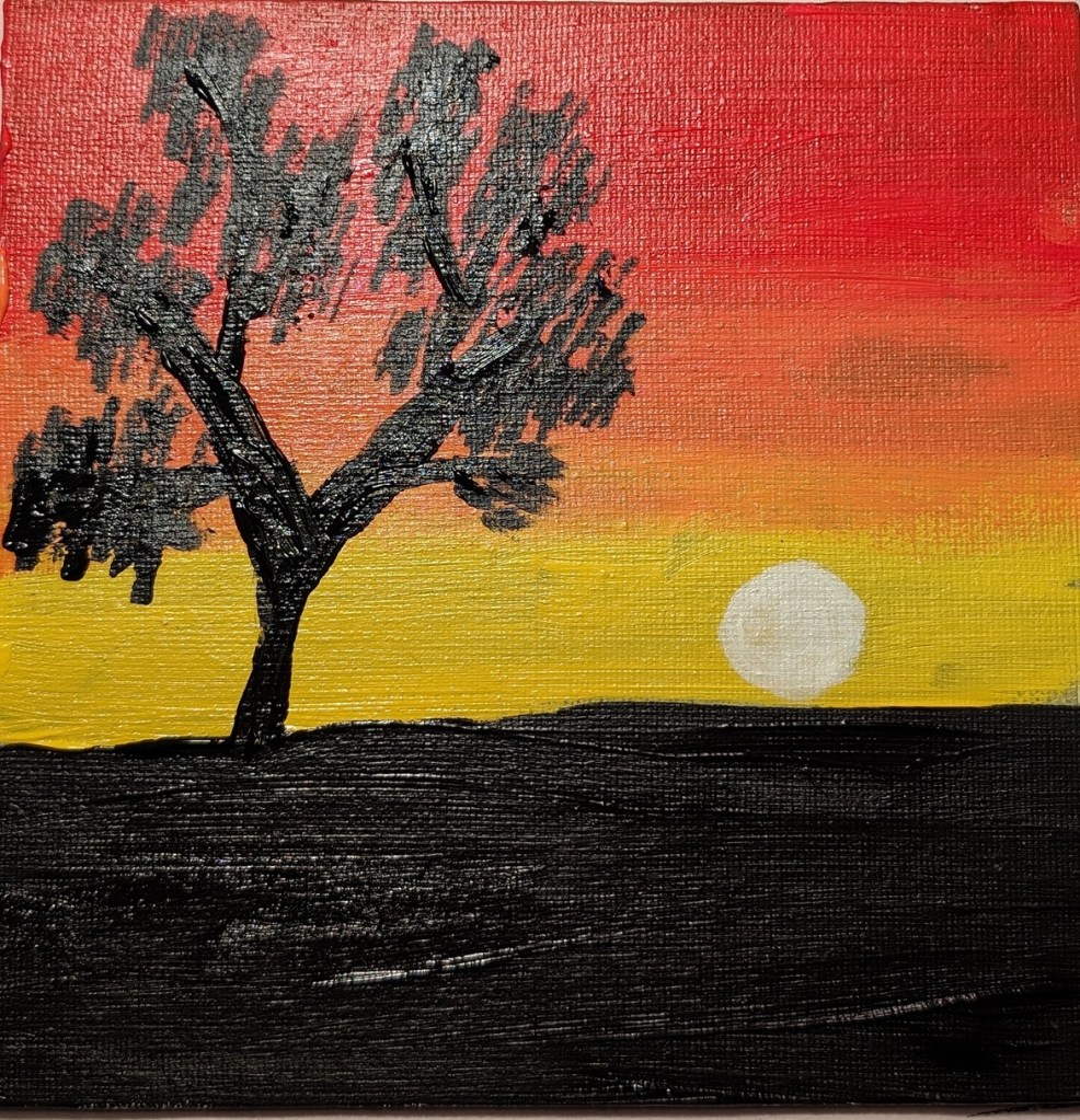
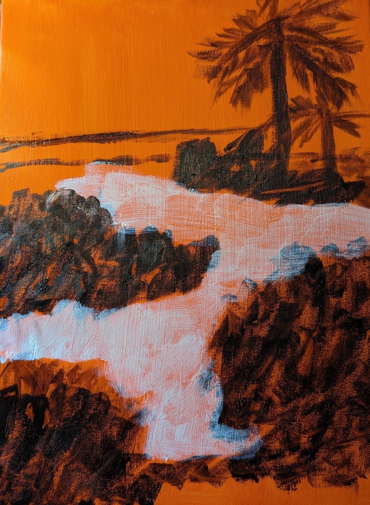
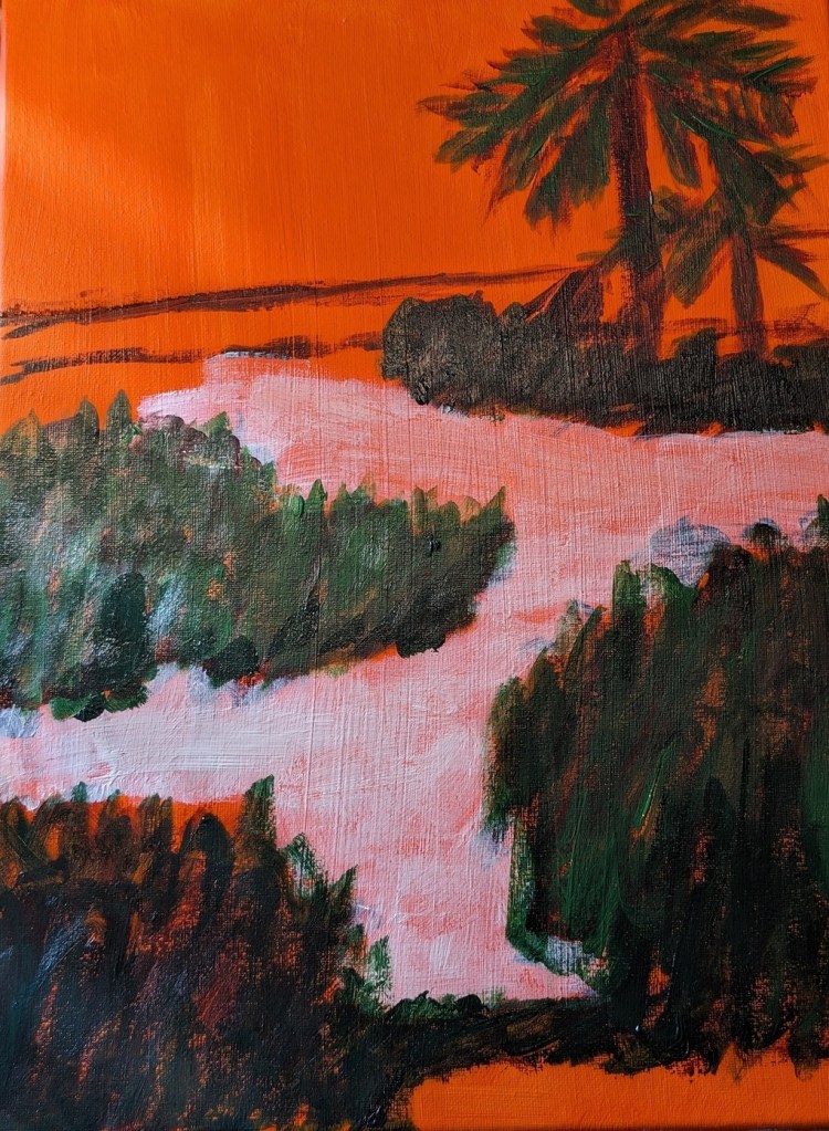
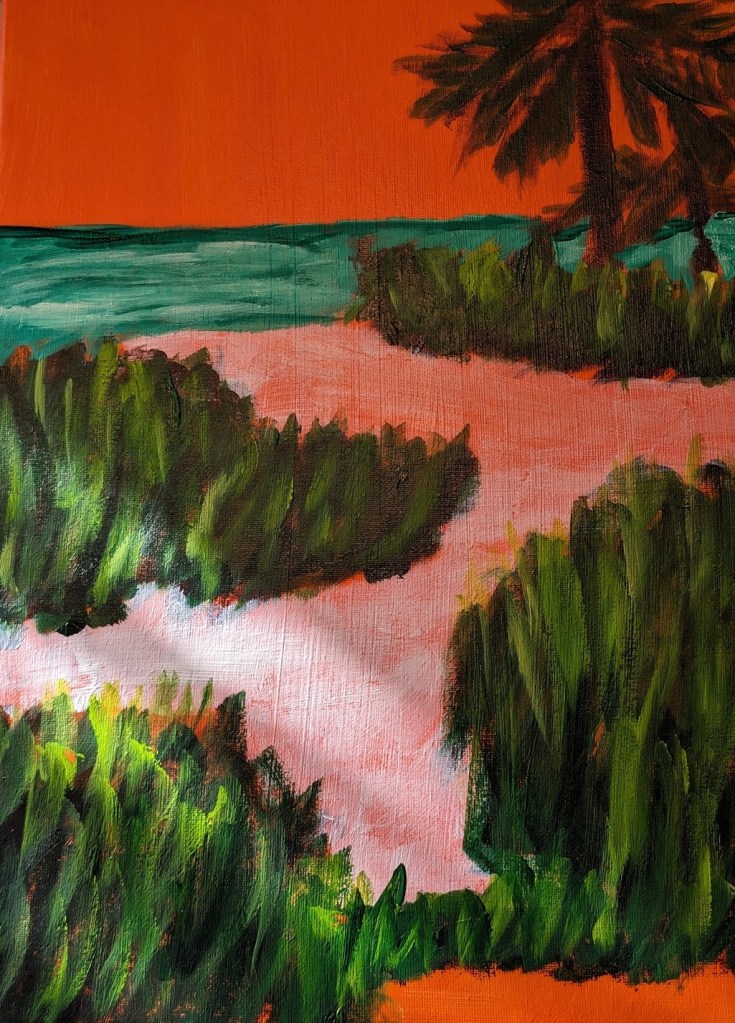
This is an exercise from one of the foundational courses (Acrylics 101) at Acrylic University wherein you do a value map of your painting using black, white and gray, and then applying color on top of the different value areas, using care to make sure your values — post-color — remain. It’s a more detailed version of the quickie free course I mentioned here.
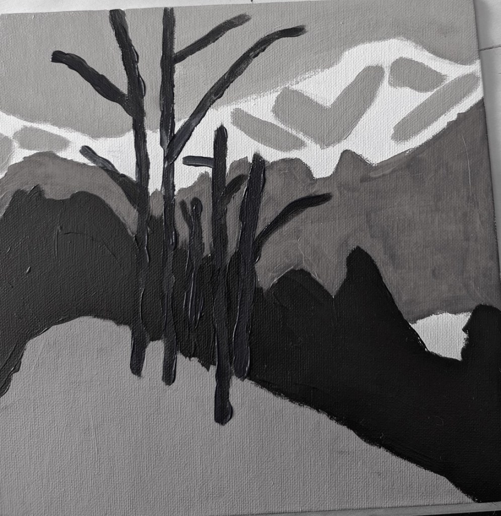
Here’s my original painting done in grayscale, done as part of the Acrylics 101 online class, using their reference photo.
I did a value check on my primary colors and mixed secondaries.
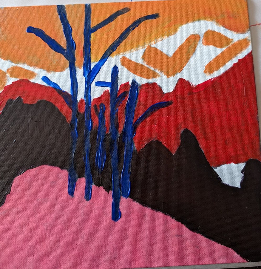
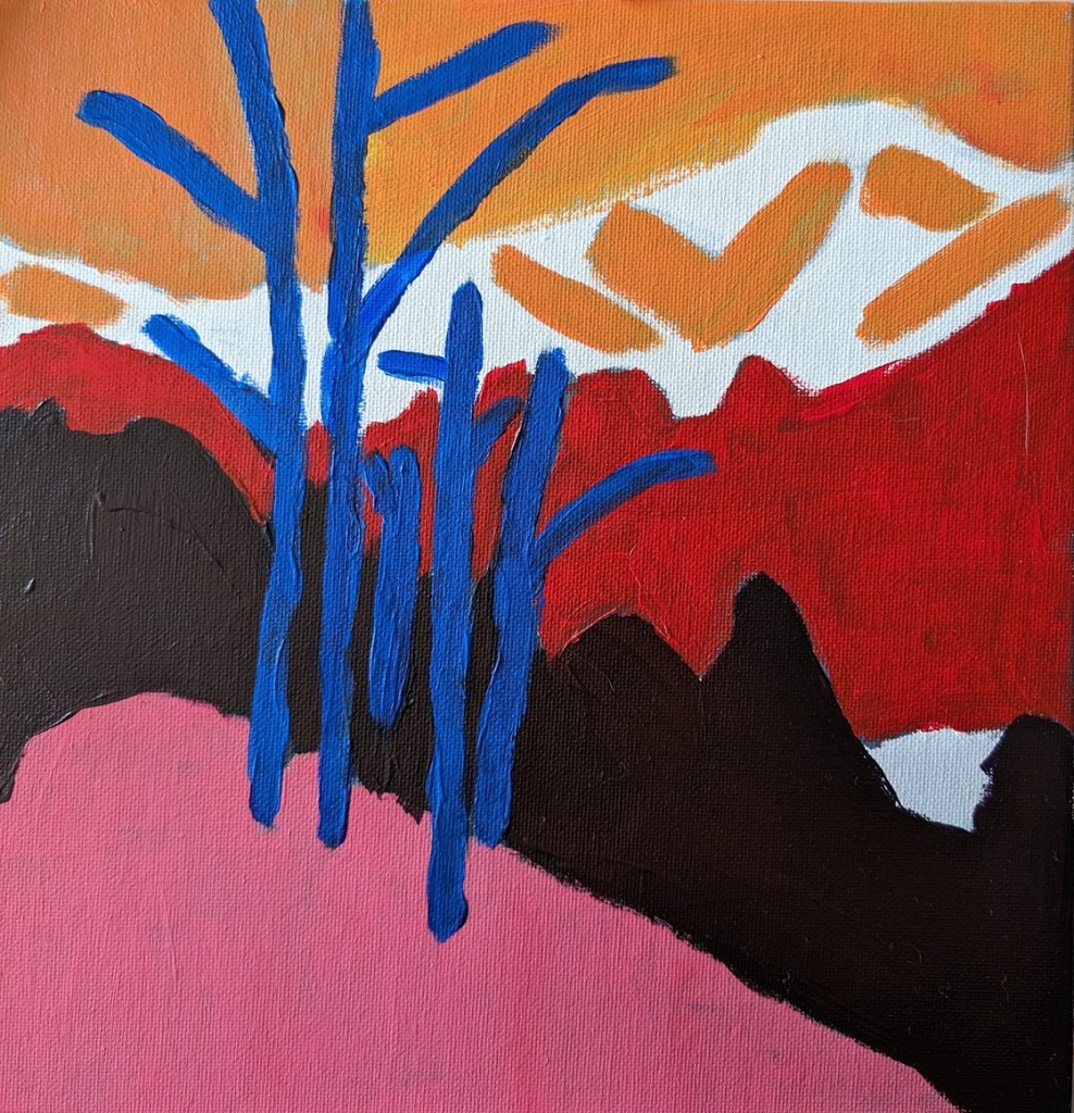
The next task was to choose colors that aligned to the value map/painting I already did. This was my first effort. The abstract trees were a bit too dark, compared to my original (above), pretty much the same as the (abstract) forest.
The class covers basic suggested supplies, brushstrokes, values, the grayscale, color mixing, and 3 small paintings.
The first two paintings from the class are below. You paint the moon scene in grayscale first, and then paint color over it, keeping with the value map. The last photo is of the color painting, but in black & white to validate the value map.
The second set of paintings is a sunset, and the last one (not yet completed) will be roses.
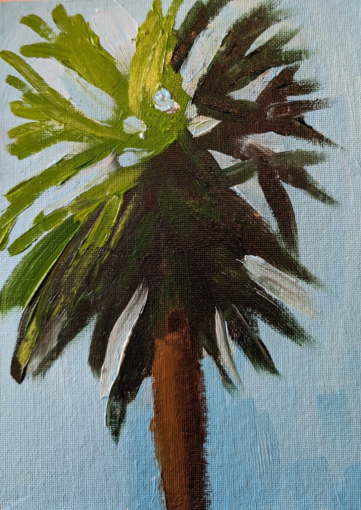
I used Transparent Orange (PO 73) by Chroma Atelier as a background, then Sap Green mixed with Carmine (Amsterdam Acrylic) for blocking out the greenery. For the grasses, I used the Amsterdam’s Sap Green and Yellow Green, as well as Winsor Galeria’s Sap Green (much lighter than Amsterdam’s Sap Green). The sky is Light Blue Permanent by Liquitex Basic; the ocean is Phthalo Green mixed with Titanium White.
The sand has been blocked out with transparent Zinc White. I still need to paint the sand and its shadow colors, and add some color (sunlight and shadows) to the bark of the palm trees.
The other day I was on Instagram, and something came up in my feed about Acrylic University, an art site I wasn’t aware of until that moment. I checked it out and signed up for an 8-week “Cloud Challenge” class taught by Dianna Shyne. This painting was done today in that class.
I had fun!
Clouds are more difficult to paint than they seem.
I really do not like phthalo blue as a color — it’s much too intense, and much too much of a greenish blue.
The “black” in this painting is a chromatic black — ultramarine blue, phthalo blue, Anthraquinone Red (marketed as alizarin crimson) and the merest touch of cad yellow hue.
Overall, I like the colors, but this looks more like a stained-glass abstract than puffy clouds.
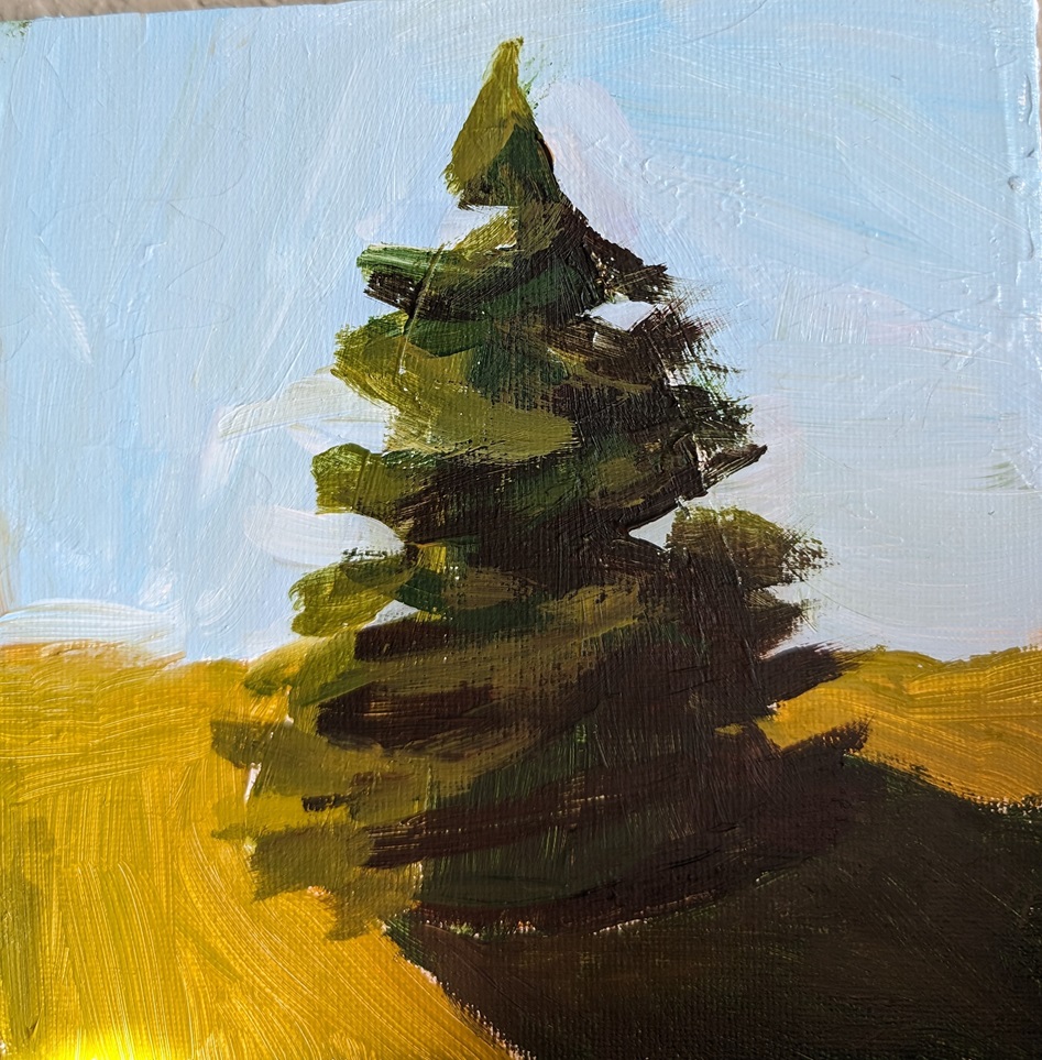
I ‘m working on painting pine trees, so I can make some Christmas cards on a Christmas tree theme. The tree on the left was painted on a 6×6 canvas panel, and is based on Kim’s class (a follow-along).
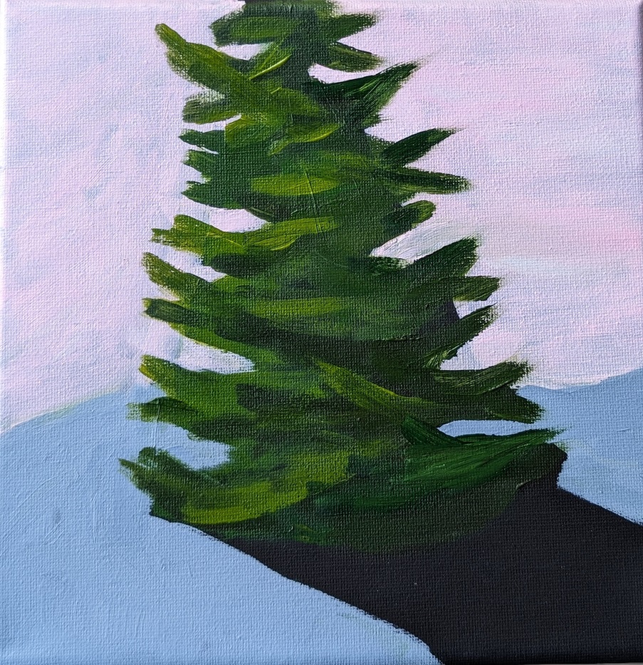
The tree on the right was painted on a 8×8 black stretched canvas. The shadow of the tree is unpainted; I’m just using the black of the canvas.