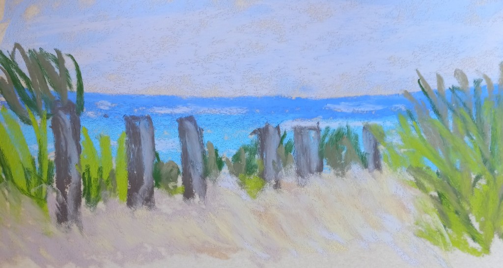
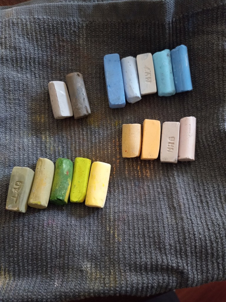
This work is based off a photo by Pexels from Pixabay. I did it on a 9×12 piece of Pastelmat in sand color. I did an alcohol wash underpainting, using NuPastels in orange, rust and deep dark blue. Most of my pastels were Blue Earths and Richeson Hand-rolled, the latter quickly becoming my go-to pastel sticks.
Today I painted the same scene as yesterday, using the same pastels, but using UART 400 paper (again from my Jackson’s Art sampler set). This paper was easier to use, and I enjoyed it very much. The marks I made were much bolder — automatically — on the UART 400 paper.
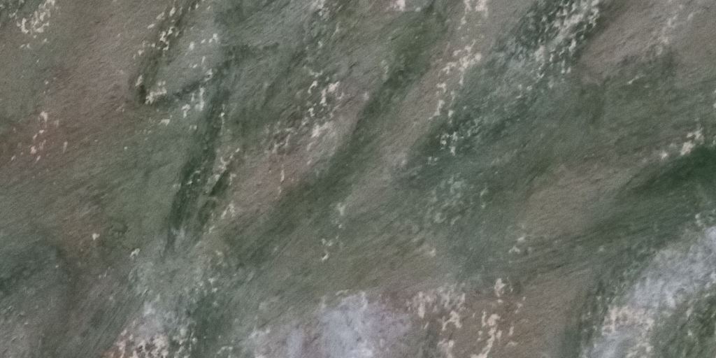
Today I tried velour paper that I received in my sampler from Jackson Art. It was a very different texture; it feels to me the pastels just lay down on the top of the paper. And that the paper almost “resists” side strokes. It was fun to try, using Richeson, Blue Earth, Dick Blick and my one Terry Ludwig pastel, but I’m not certain I would buy this paper on a regular basis.
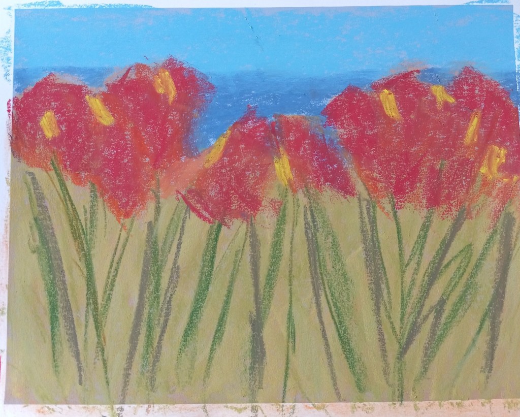
I decided to skip including the mountains around Lake Louise, and focus in on the poppies. The result is that what is actually the lake looks like sky. But maybe that’s okay. This study was done on Colourfix Smooth in Blue Haze.
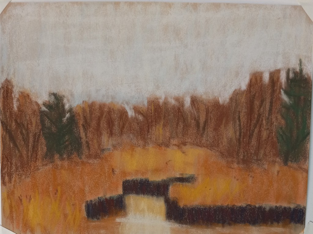
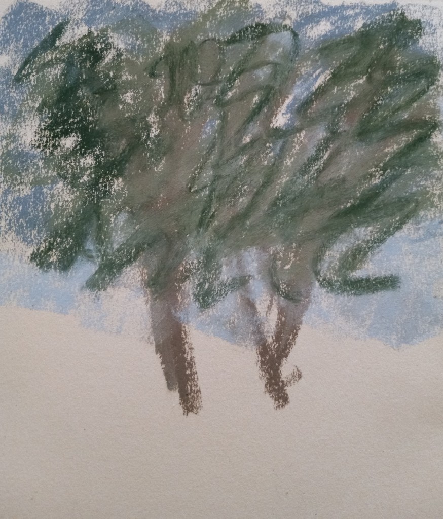
I had no idea what to paint today, so I just started randomly putting NuPastel on paper, and then I rubbed it in with a paper towel. Now I had an underpainting (of sorts) but didn’t know what to do with it — at first. Then I realized it reminded me of autumn trees.
My trees are cartoonish, but the whole picture is straight from my imagination, based on the colors and shapes of the random “underpainting”.
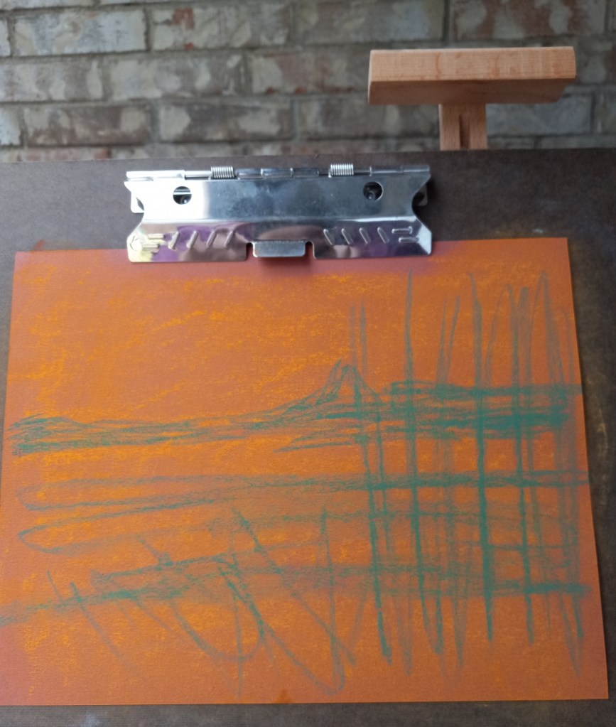
Yesterday’s sunset looked a bit like a fried egg, didn’t it? So I tried it one more time. This time I used Art Spectrum Colourfix paper, in the Terracotta shade.
While this painting is hardly a masterpiece, I feel most satisfied with it, and I finally got the reflection looking a bit more realistic than on my previous tries.
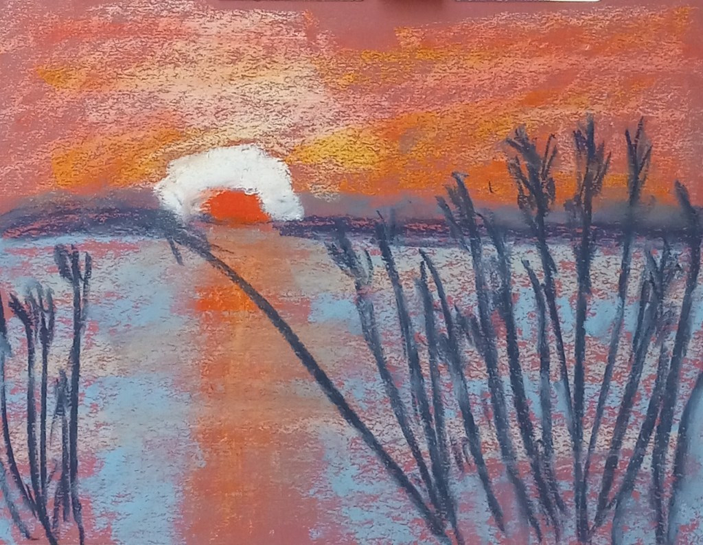
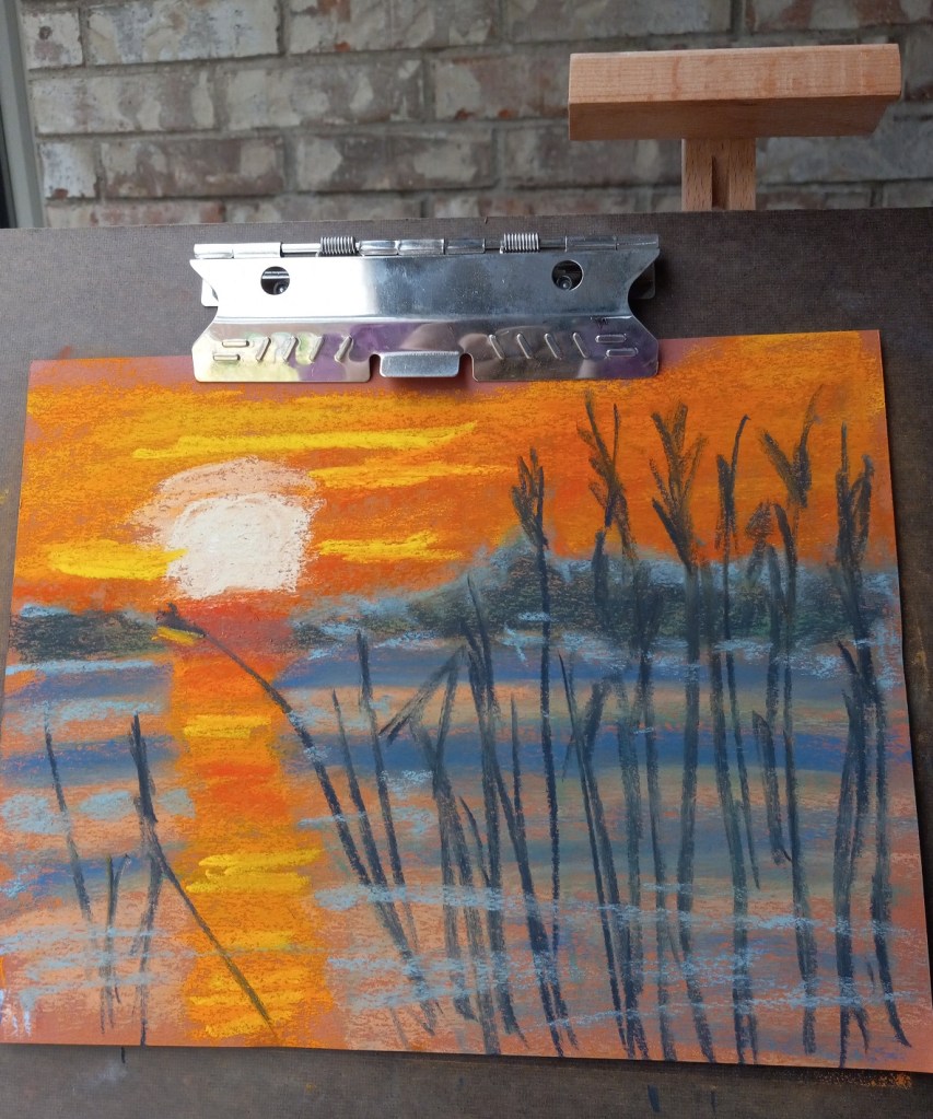
Today I did another study of the reedy lake (again on Canson Mi-Teintes Red Earth colored paper). I used a different pastel palette than I did before, and I did not do any underpainting.
This time, I think I did a better job of painting the sun’s reflection on the water.
Most of the pastels used were Richeson hand-rolled pastels, which seems to work for me on the Mi-Teintes paper, although it’s clear you can see a lot of the paper’s color coming through.
Early on while I was working on the “500 scenes”, it was a warm blustery day and it seemed to me the tree was energetic so I was using the pastel sticks energetically myself. And completely forgetting I was using Canson Mi-Teintes paper, which cannot take a lot of layers of pastels! When I added the dark green — or tried to – the stick just skittered off. Nothing was really taking, and the appearance was reminiscent of mud. I did NOT want the dark green to look like scribbles! Oh well.
Yes, I had heard of that occurring once the tooth of the pastel paper (any pastel paper!) is filled, but really, experience is the best teacher. Now that I’ve filled the tooth of the paper myself, and experienced the skipping and the muddy look, I totally get it.
There are so many things wrong with this picture — where do I begin?
underpainting on Canson
finished painting on Canson
First of all, were I to do this again — IF I did the NuPastel underpainting — I would blend it in to the paper more effectively. I think I’d stick with the orange, but am undecided about the blue. I might try a medium green since green complements the red of the paper, and would blend in with the orange NuPastel and with the dark blue reeds.
The second, more obvious, item is the sun’s reflection on the water. That should have been a vertical line straight down the paper using the side of my pastel stick. And the water should have been painted in smoother, broader strokes. In fact, it might be better, compositionally, to assume still quiet water rather than the rippling water seen in the reference image.
I will have to redo this work and see what develops — hopefully, a better picture!