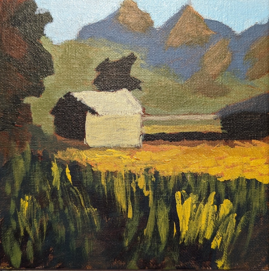
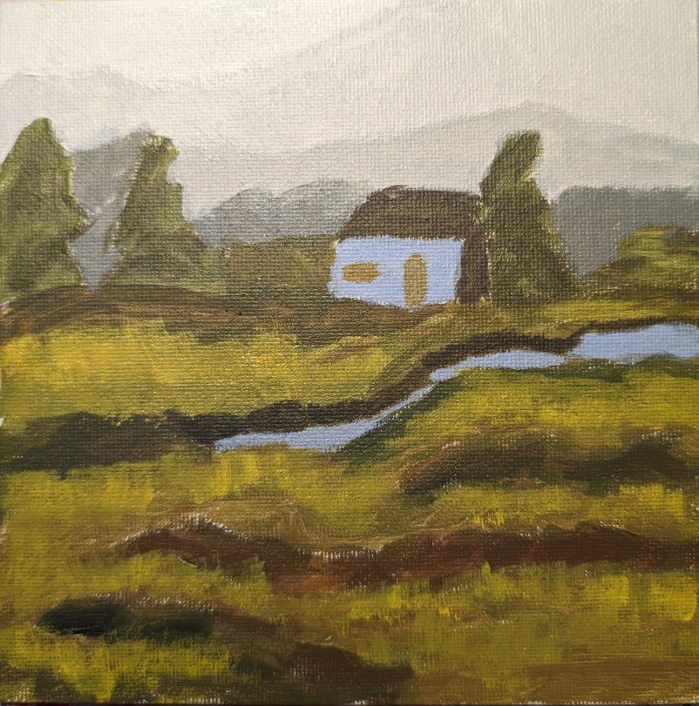
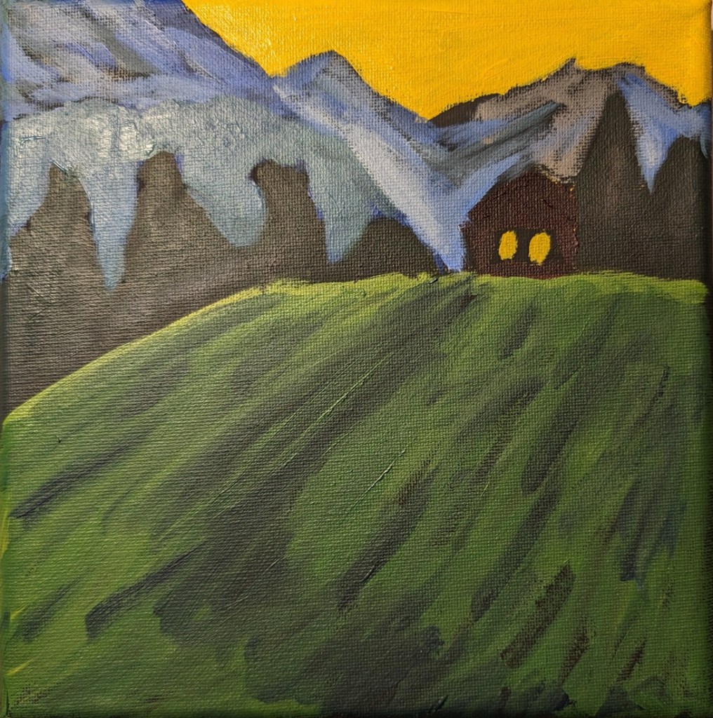
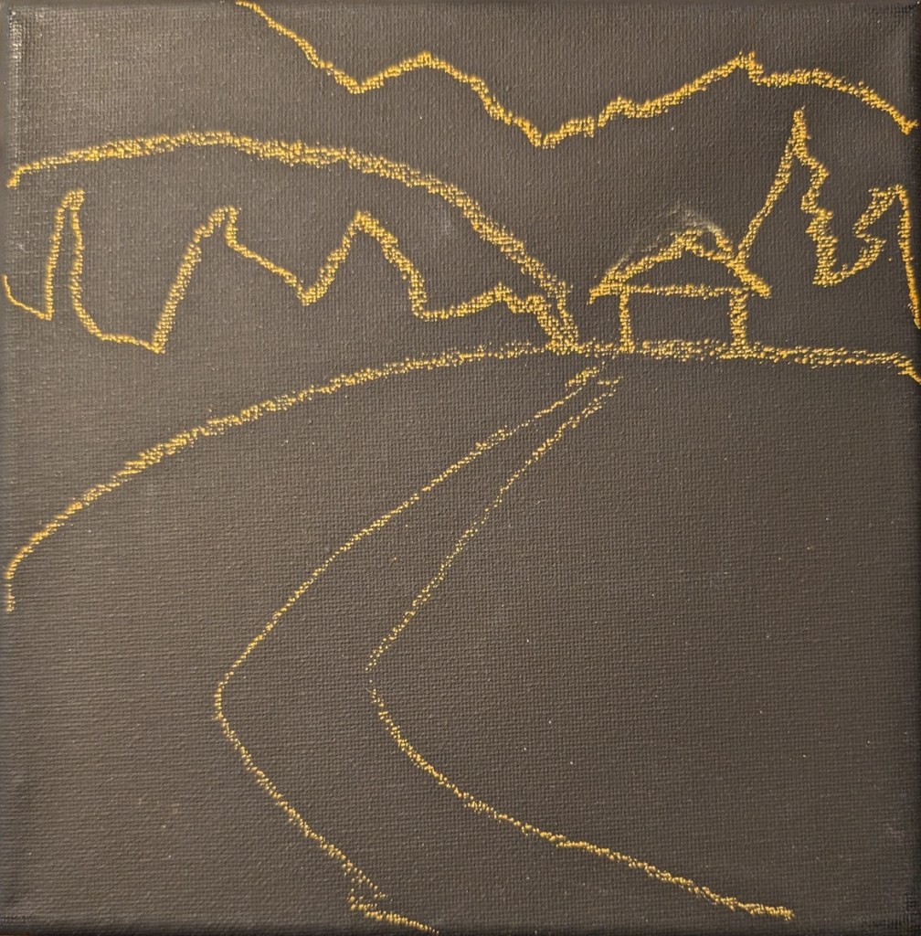
(Acrylic University) Acrylics 101: Mini Practice Paintings #1

So I’m going through the Foundations classes in the library of Acrylic University — basically the reason I paid for a year’s subscription. In Acrylics 101 we cover the basic tools (brushes, easels, types of acrylic paint), the importance of thumbnail sketches, values, color (opaque vs. transparent, color mixing, etc.) and then finally we do some practice paintings. Three are minis (6×6) and three are larger sized (up to 16×20).

Jed Dorsey, our instructor, says that he has found that beginners do better — and gain confidence more quickly — when they attempt to copy a painting rather than work with a reference photo (or plein air) primarily, I assume, because the artistic decisions have already been made. He demos painting a copy of his own painting, explaining why he did what he did.

So, with that lead-in, here’s my painting of his painting. I used Diarylide Yellow as my toning color, and painted on 6×6 canvas paper using only a #8 flat brush.

(Acrylic University) Primary Palette 101: Exercise

These paintings are from Part 1 of an color-study exercise I’m doing on the Acrylic University site. The class is taught by Jed Dorsey; it is his reference photo and his follow-along painting vids I am using for my own studies below.

Part 1 focuses on a warm yellow (I used Liquitex Cad-Free Yellow Medium), a cool blue (Phthalo) and a warm red (I used Pyrrole Red). 

Part 2 will feature different versions of the primary hues; I’ll be using Liquitex Cad-Free Yellow Light (cool), Ultramarine Blue (warm), and Anthraquinone Red (cool).

Exercise: Colors as Values

This is an exercise from one of the foundational courses (Acrylics 101) at Acrylic University wherein you do a value map of your painting using black, white and gray, and then applying color on top of the different value areas, using care to make sure your values — post-color — remain. It’s a more detailed version of the quickie free course I mentioned here.

Here’s my original painting done in grayscale, done as part of the Acrylics 101 online class, using their reference photo.

I did a value check on my primary colors and mixed secondaries.

The next task was to choose colors that aligned to the value map/painting I already did. This was my first effort. The abstract trees were a bit too dark, compared to my original (above), pretty much the same as the (abstract) forest.

This was my next attempt, which I think is better. Also I turned on the grid function on my Pixel camera; it makes a real difference!

Online Class “Terrific Trees” : Pine tree

Over Black Friday, I bought access to a handful of online classes at Kara Bullock Art. One was the “Terrific Trees” class by Kim VanDerHoek.

I ‘m working on painting pine trees, so I can make some Christmas cards on a Christmas tree theme. The tree on the left was painted on a 6×6 canvas panel, and is based on Kim’s class (a follow-along).

The tree on the right was painted on a 8×8 black stretched canvas. The shadow of the tree is unpainted; I’m just using the black of the canvas.

Paint Week Nov 2023 — Landscape

Paint Week 2023 is going on this week, and the subject to paint is a kayaker on a river lined by mangroves. Although I’m working on a portrait tutorial by the same teacher, I took some time out to paint the landscape on a 9×12 canvas.

The subject didn’t particularly excite me; that’s probably apparent in my results. I find the value map helpful as a concept, but painting-wise, the burnt sienna underpainting shows through too much, which I don’t like. Maybe if I were using oils it would work better?

New England Landscape.. Continued

I’m continuing to work on this landscape. I painted over the first take of the yellow ochre to make it more golden, and I think the lighter green up front is too saturated/yellow, and I need to darken it.

What is left to do is the leaves on the tree, the flowers in the meadow, and the grassy definition of the path to the house.