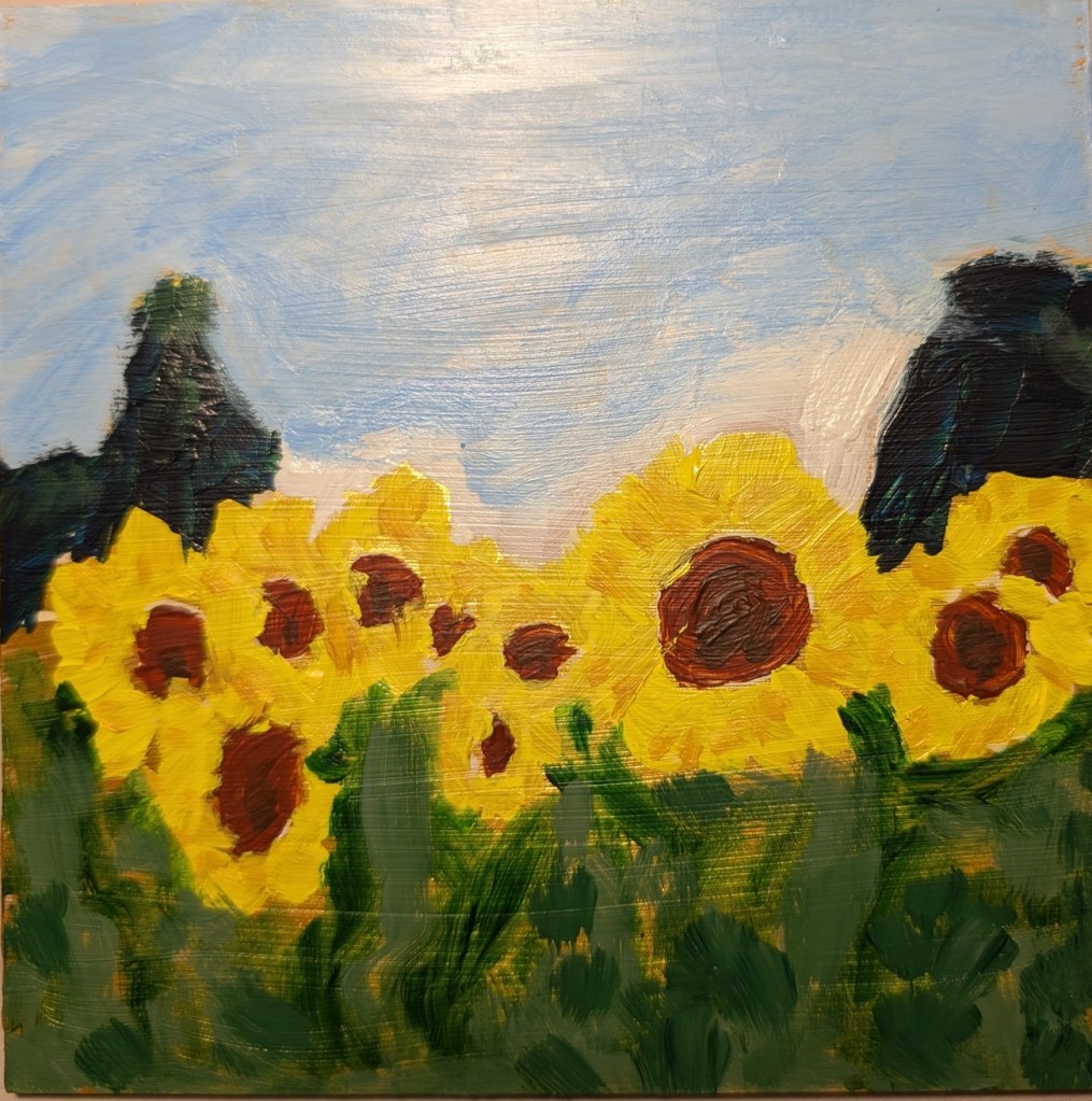
52 Mini Paintings Challenge: Week #16

This is the week 16 painting for Jed Dorsey’s Mini Painting Challenge at Acrylic University. It’s called “Canyon Shadows” and is based on a reference photo by Jacob Jolibois, supposedly somewhere in the Grand Canyon area. 6×6 canvas panel.

Surprisingly straightforward, although when I looked at the reference and my painting in gray scale, I had to adjust my values for the cliff at the left, and the sky just above it. As well as the distant canyon walls.

Cherry Tree… After Dianna Shyne

Last week, the instructor Dianna Shyne led a workshop on the “Colors of Spring”, which included her painting four small studies of flowering trees and spring flowers. I was struck most by her field of daffodils, and this flowering tree. (I’m guessing it’s a cherry tree.) I did my own version of the reference photo, and here is my result. (I took a photo at a distance, because in some ways, the painting looks better from afar.) 8×10 stretched canvas.

Colors used: Titanium White, Quinacridone Magenta (PR122), Naphthol Red (PR112), Cad-Free Yellow Medium, Ultramarine Blue and Raw Umber. I toned the canvas a few months ago with Raw Umber and Titanium White.

Field of Daffodils… After Dianna Shyne

One of the perks of Acrylic University membership is weekly classes/workshops livestreamed on YouTube. Last Friday, the instructor Dianna Shyne led a workshop on the “Colors of Spring”, which included her painting four small studies of flowering trees and spring flowers. One was of a field of daffodils, and since daffs are my favorite flower, I tried my own version of the reference photo she used.

This was done on an 8×10 stretched canvas, and the yellow used is (mostly) Liquitex Cad-Free Yellow Light (Lemon), with some Cad-Free Yellow Medium in the foreground. All the various shades of green were mixed from Cad-Free Yellow Light and Mars Black.

52 Mini Paintings Challenge: Week #12 – Value Adjustment

After I completed the week 12 painting for Jed Dorsey’s Mini Painting Challenge at Acrylic University, and compared it to a grayscale of the reference image, I realized the values were off. So I’ve lightened the trees and the grass.

Here’s the value comparison between the reference image and the original painting, and then the reference and this updated version. The updated pic is, obviously, on the left. My trees and my grass were much too dark in my first attempt.

52 Mini Paintings Challenge: Week #12

This is the week 12 painting for Jed Dorsey’s Mini Painting Challenge at Acrylic University. The reference photo [from Mark Hadland] is from somewhere in the Colorado Rockies, I believe, and the painting is called “Let’s Take a Hike”. It’s painted on a 6×6 Claybord panel, toned in black first. I liked the Claybord better than Gessobord; what I read online is folks beefing that is shows the brushstrokes. Which, yeah, it does. But, in my case, so what? I’m just practicing, not doing commissioned work.

One thing, though — I need to do the trees and sky “my way”. (Which is — do the sky FIRST and then paint in the trees.) Doing it Jed’s way is fine for him, but for me it just looks like c–p.

52 Mini Paintings Challenge: Week #10

This is the week 10 painting for Jed Dorsey’s Mini Painting Challenge at Acrylic University. The name is “Golden Vineyard”. I’m not sure where Dorsey got the photo, but he did his painting on a black canvas. I looked at the reference photo, and it seemed more golden to me, so I went with a yellow ochre background.

This is on a 6×6 canvas panel, a brand I haven’t used before (Yes! All Media cotton). I bought it at my local Jerry’s Artarama, and found it to be extraordinarily smooth, more similar to Ampersand’s Gessobord than the typical cotton panel. I’m undecided about it, as I certainly didn’t like Gessobord when I tried it last year. We’ll see.. I have 5 more panels to use.