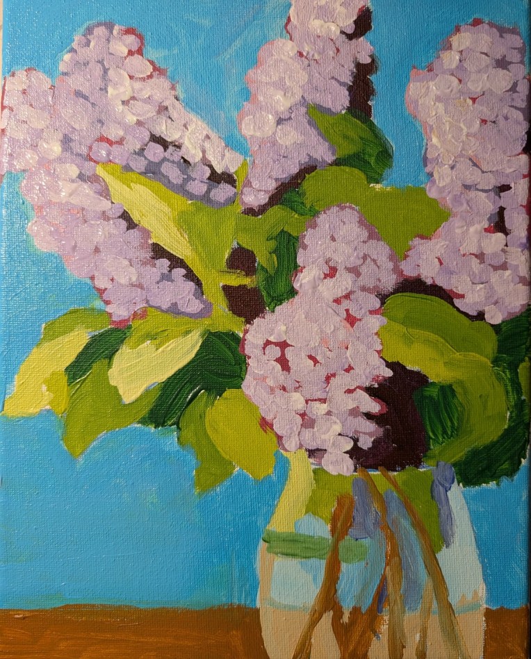
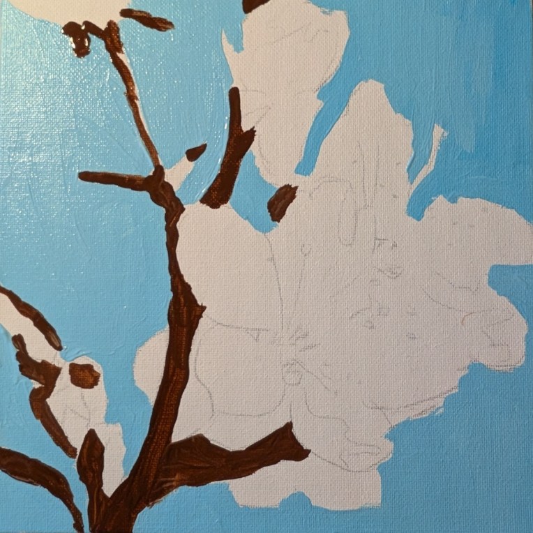
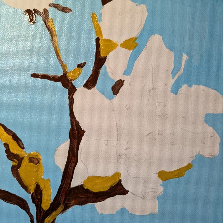
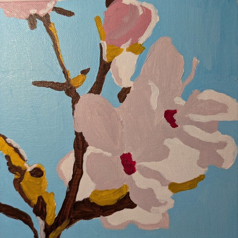
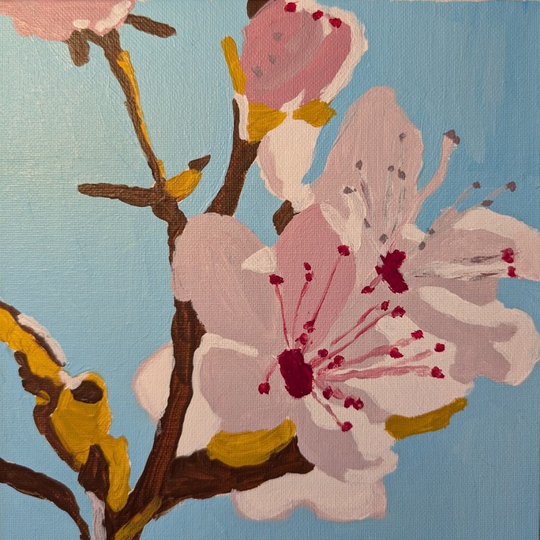
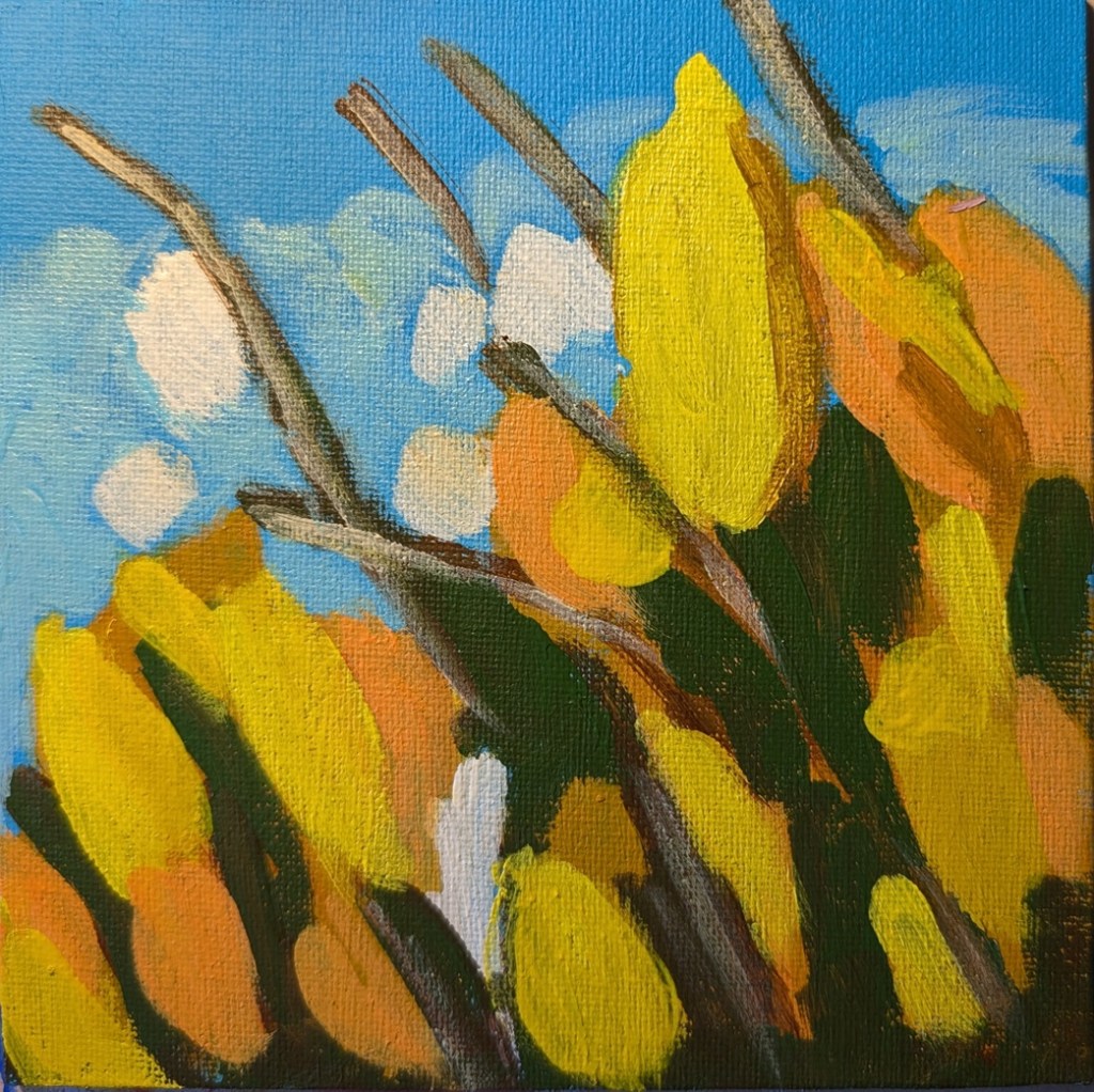
I outlined these lilacs on an 8×10 canvas over a year ago (based on a template found on Ali Kay‘s Fresh Paint site.) Finally got around to painting it — using the reference photo Ali Kay provided, and NOT copying her style at all.
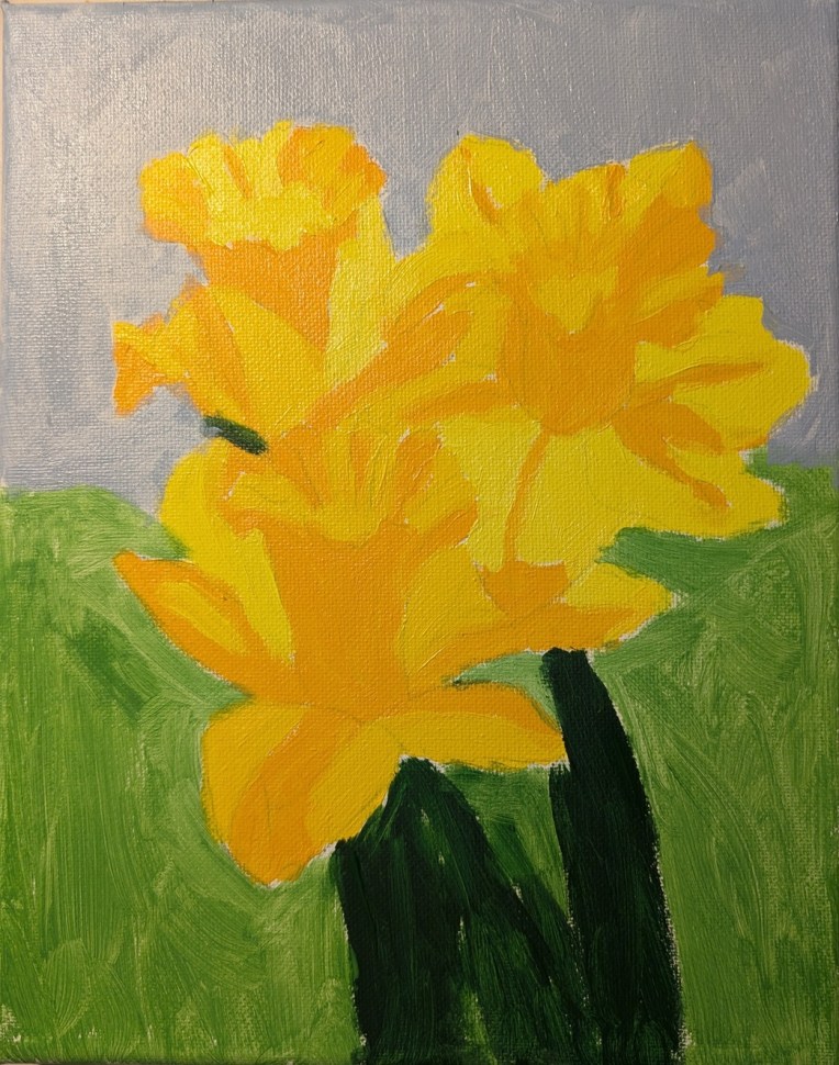
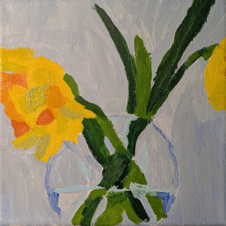
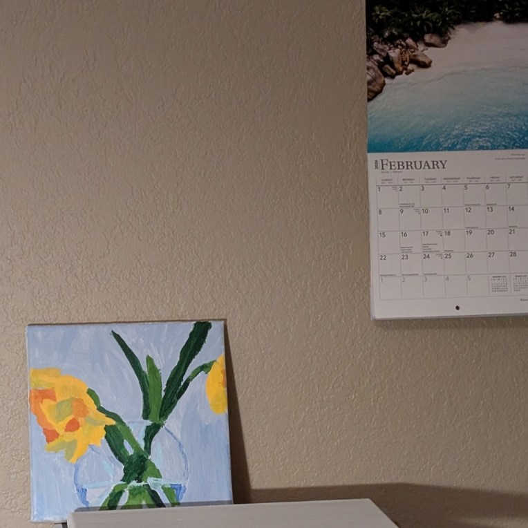
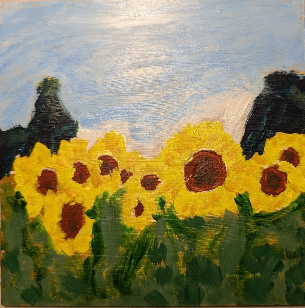
Overall, I’m more satisfied with the lilacs — which put me in mind of spring in New England during my college years — than with the daffodils in the vase I did a while back.