Cherry Tree Dropping Blossoms

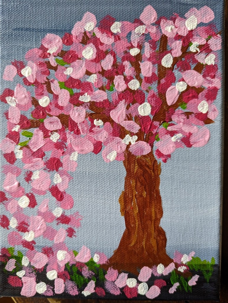
I got the idea for this cherry tree painting from the Feeling Nifty website. I didn’t care for the example of the black/gray background, or the black tree — it looked too much like Halloween to me. (Halloween is a great holiday, but it doesn’t mix with blossoming cherry trees!) Also, I didn’t have Q-tips, nor did I want to use them — it would’ve been too close to copying the artist. I wanted to do things my way.

This was done on a 5×7 canvas; the background is ultramarine blue with black (“Payne’s Gray”). The predominant color of the blossoms is Quinacridone Magenta (pigment color PR 122) dark and tinted with Titanium White, with some Cadmium Red Hue (PR 112).

Notans — Based on Pixabay & Unsplash

I downloaded a few photos of women’s faces from Pixabay and Unsplash, set them to grayscale, applied the gaussian blur filter, and then posterized the image down to 2 values: black and white.

I used these notans to paint.

The top-most picture was done on wood covered with gesso painted with an old brush (hence, the ridges.) Some folks say to sand your gesso application, but I didn’t want to hassle with that. Below is a comparison between the actual notan (posterized photo) on the computer screen, and my painted image on the right. Close but not exact.

Still Life from #PAINTCOACH Patreon

I recently discovered @paintcoach on YouTube, and signed up for his Patreon page after viewing about a dozen of his videos.

One of the first paintings I did was a still life. (I still need to learn how to photograph my work; the glare is from my desk lamp — my “studio” is the same dining room table where I worked my job during the Covid lockdown.)

I like the cup the most — except for the messed-up lip (way too light!). I think I did a better job mixing colors for the lime, but the lemon is completely messed up. I kept fiddling with it, and made it worse.

Bottom line, I’m satisfied with my drawing (though why on earth did I choose Red Oxide as my color?). The downside of drawing, though, is my tendency to paint within the lines, which is part of why my value transitions are so darned harsh.

Color mixing is also difficult when I’m using white freezer paper (an old roll hanging around from years ago) as my palette paper vs. painting on a toned canvas. Just when I thought the color mix looked right (on the “palette”), it looked awful on the canvas. Ugh.

Brushwork is also a challenge.