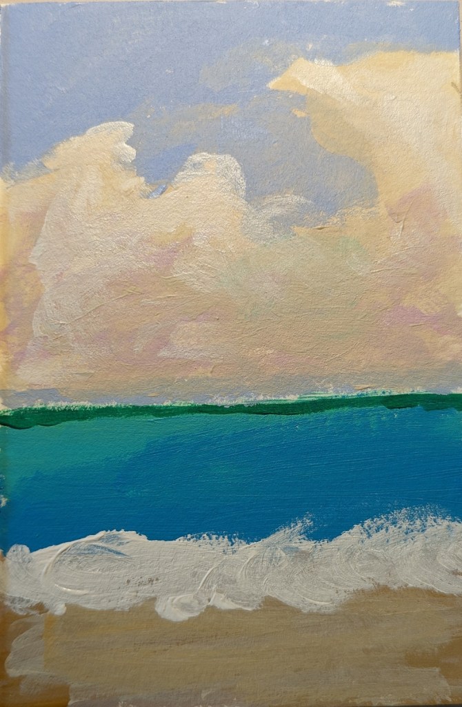
Another 5×5 Mini Landscape

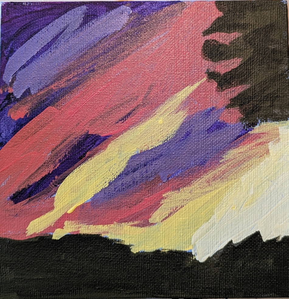
Although I wasn’t too crazy about Mark D Nelson’s “Learn to Paint in Acrylics with 50 Small Paintings”, it DID get me painting. So, I picked up Volume 2, and decided to do my own version of one of his small landscape works.

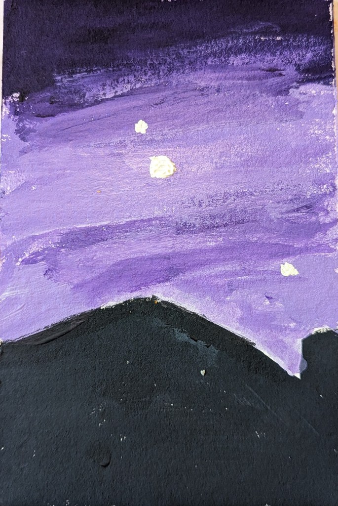
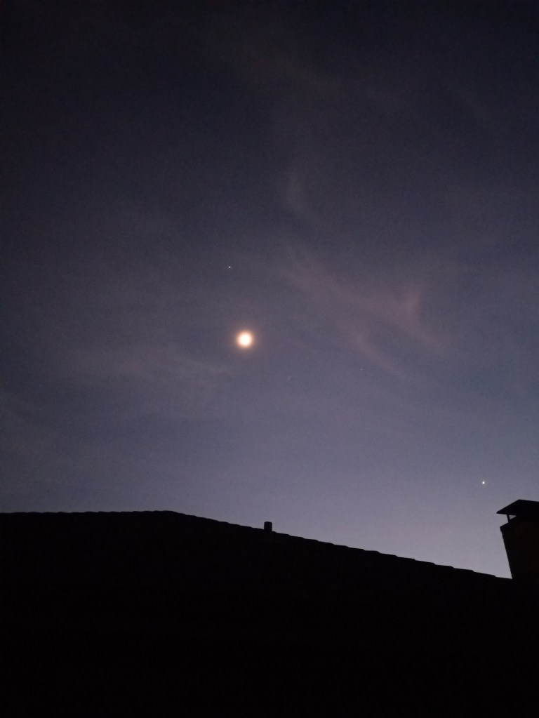
Mine is painted on a 6×6 canvas, and riffs on Daniel’s effort (also shown).

“Small Landscape — Big Brush” from Patreon

This 6×8 painting is from a tutorial by Paint Coach on Patreon. The idea is that you use a decently large brush (say, 1/2″) so that you are focused on the basic shapes as opposed to detail.

The 6×8 canvas size felt too small to me for all the different landscape “objects” — trees near and far, a stream, a path, mountains, etc. Whew!

Worse, my photo doesn’t adequately capture the colors I see in my own painting; the path is both grayer and more purple than what is shown, even though I fiddled with tint/saturation/brightness, etc. in the Photos app.

Oh well, time to get painting the next thing.

Got Some Oils & some “OPEN” Acrylics

I’m still wanting to try oil paints, but am spooked by how thick they are — and the need to thin them without solvents. Ugh! But the colors are gorgeous! That violet is luscious; however, it took nearly a week to be touch dry.

That said, acrylics can dry so fast, so I’d also like to try Golden’s Open Acrylics to increase the working time.

Simple Landscape : Barn & Mountains (#PAINTCOACH Patreon)

This 6″ x 8″ landscape — from PaintCoach Patreon — was a challenge, as far as getting the right colors. I got exasperated, and left the barn unpainted for several weeks, before finally just finishing it in a “I’m winging it” effort. (I figure, because it’s acrylic, that I can go back later and repaint the side of barn so that it’s not so gray as it appears.) But for now I am moving on.

I never did finish the foreground area; it should not be just a solid yellowish green. But, again, maybe later!

White Cups – A Study

I love the idea of painting white objects because I know you’re not supposed to use, say, Titanium White to indicate snow, sand, white dishware, white linen, white flowers, clouds, etc. Instead that “white” will have greyed blues, greyed lavenders (light purple), perhaps some yellows and/or oranges.

So, when I saw the reprint of “White Cups” in How to Paint Fast, Loose and Bold: Simple Techniques for Expressive Painting, I thought I would give it a try. Can I come close to matching these colors?

When I look at the reprint of Mollica’s work, I see light shades of yellow, shades of yellow ochre, lavender, greyed purple, maroon, an olive green, a desaturated orange, a dark purple “black” that might be a mix of ultramarine blue and burnt sienna or a Payne’s gray. I see greyed blue, and even a rich brown that might be burnt umber or might be a mix of red, blue and yellow. At best, there might be two small highlights of a pure white on the lip of each cup.

Sounds good, but I failed at color mixing. Ugh. I drew over the dried big splotches of paint (see right)with compressed charcoal because it wasn’t even obvious what the object was! Then I ended up deciding to heck with it, I’ll use a glaze of titanium white — and glazes, I’m told, are not successful with opaque pigments like titanium white.

Since the painting was a fail anyway, I went ahead and did the glaze, careful to keep my compressed charcoal lines. (left most photo)

Afterwards, I used a color picker app to get a sense of the colors in the photo, which all tend toward brown. I suspect that is partly an artifact of the photo, which is quite probably not an accurate reproduction as far as the colors are concerned.

Still Life — Another Study

The still life of fruit is yet another study from Patti Mollica’s book How to Paint Fast, Loose and Bold: Simple Techniques for Expressive Painting.

As far as my efforts in copying still life demonstrations from various painting teachers, this is one of my better ones in my opinion. I’m most pleased with the dark red (purple) cherry.

That said, all the stems I painted are sloppy — I need to practice painting thin lines. And the brushwork on the red apple is awful. The paint choices as well could be improved — the red is so transparent you can see through to the raw sienna underpainting, and my charcoal pencil outline. Sigh.