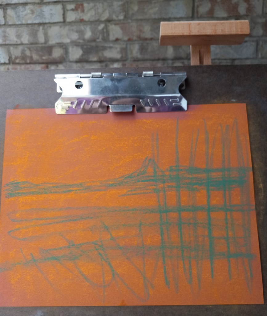
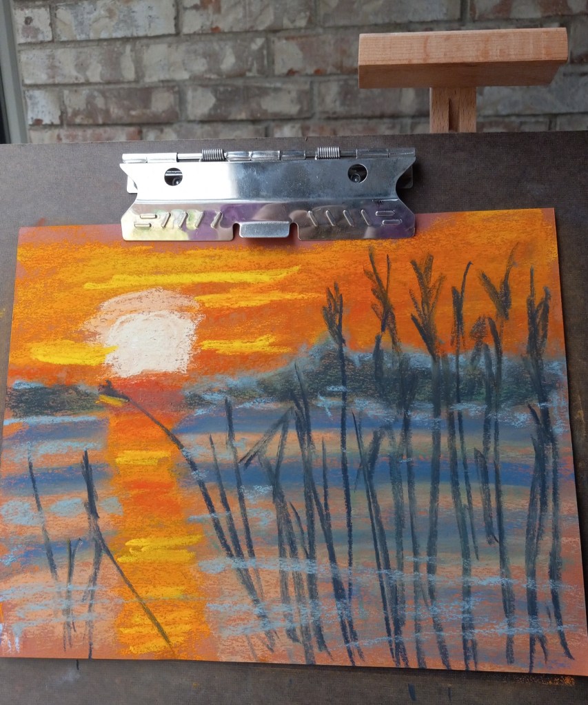
There are so many things wrong with this picture — where do I begin?


First of all, were I to do this again — IF I did the NuPastel underpainting — I would blend it in to the paper more effectively. I think I’d stick with the orange, but am undecided about the blue. I might try a medium green since green complements the red of the paper, and would blend in with the orange NuPastel and with the dark blue reeds.
The second, more obvious, item is the sun’s reflection on the water. That should have been a vertical line straight down the paper using the side of my pastel stick. And the water should have been painted in smoother, broader strokes. In fact, it might be better, compositionally, to assume still quiet water rather than the rippling water seen in the reference image.
I will have to redo this work and see what develops — hopefully, a better picture!
