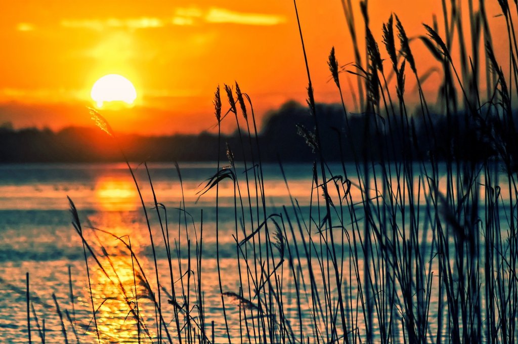
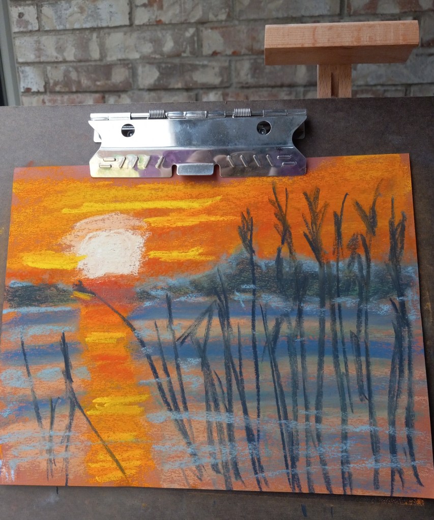
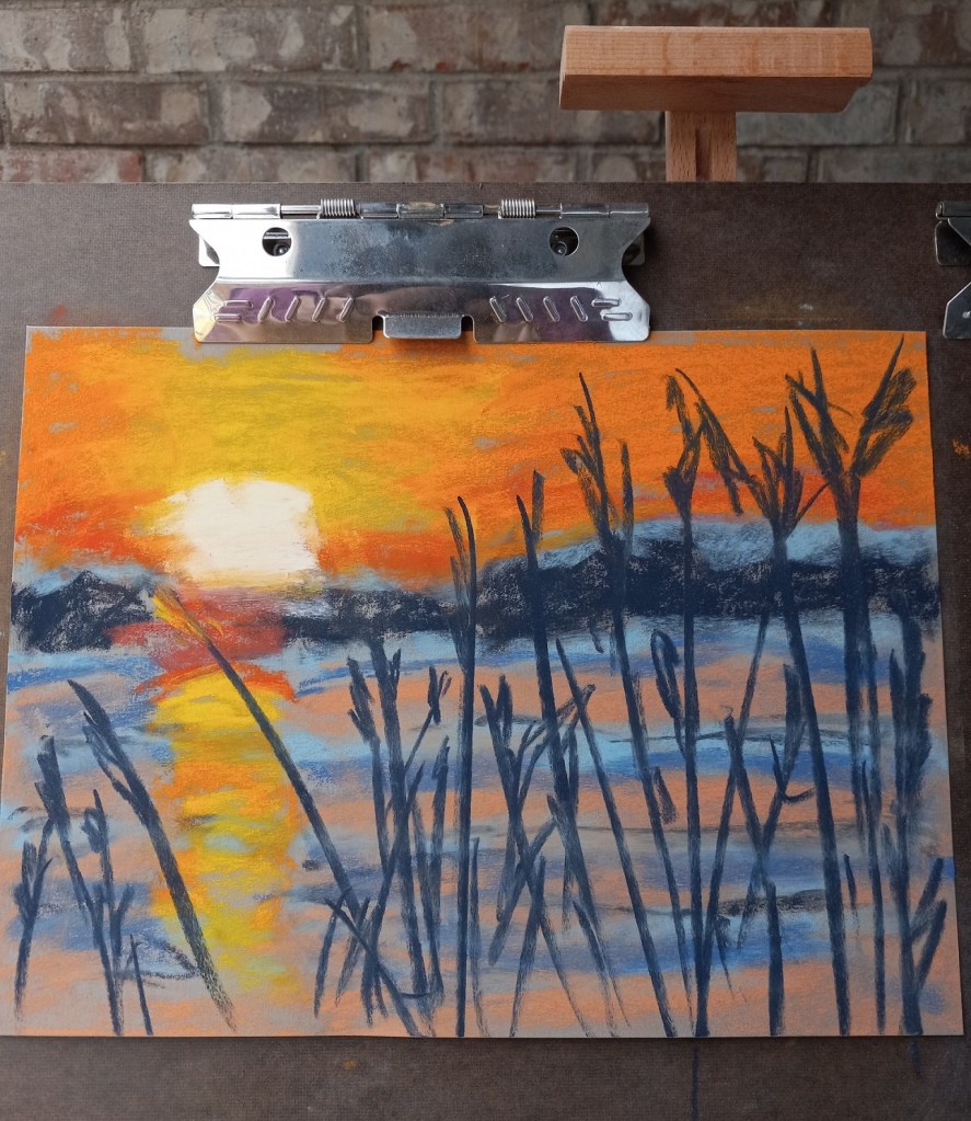
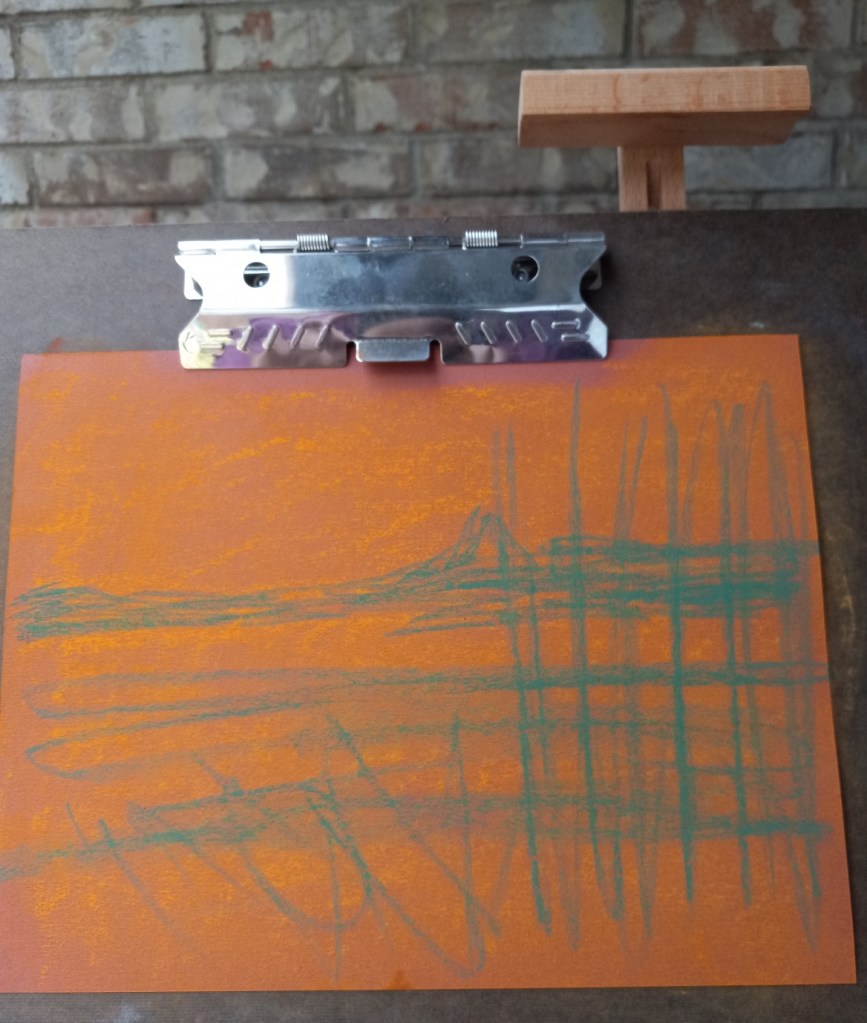
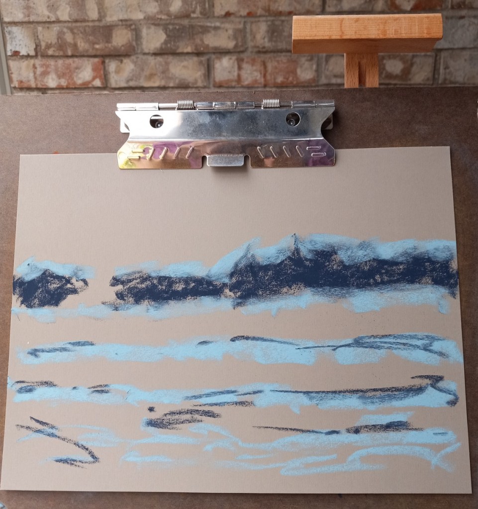
Today I did two landscapes using the same reference photo, and the same pastels, but two different papers and underpainting.
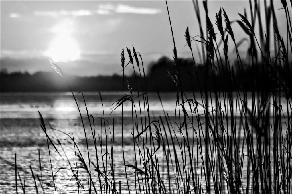
The reference photo was from an image by Tomasz Marciniak from Pixabay. I made it grayscale to verify there was sufficient difference in values.
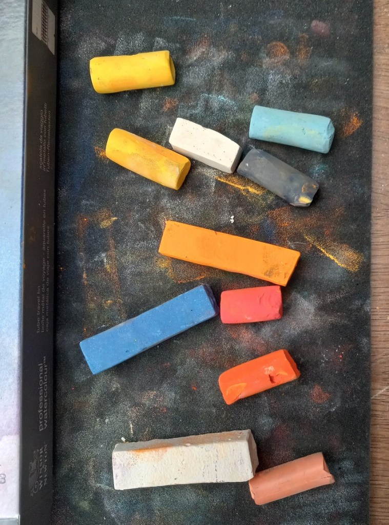
The pastels I used were Great American, Blick Artists’ Soft Pastels, Richeson Hand-rolled, and Blue Earth.
The first painting was done on Canson Mi-Teintes (smooth side) in the Red Earth tint. I did an underpainting with NuPastels (212 – Deep Orange, and 378 – Erin Green).
The second painting was done without any kind of underpainting, and using Pastel Premier paper in Italian Clay, a 320 grit sanded paper.
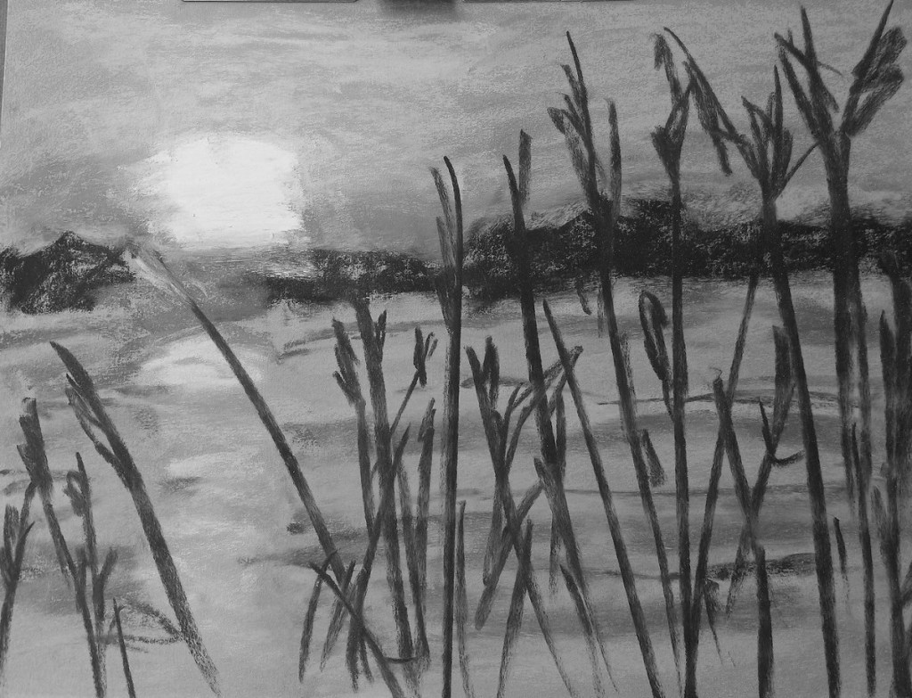
Here are the 3 pictures in grayscale: the original photo, the pastel on Canson paper, and the pastel on Pastel Premier.

Here are the three images in color (same order):