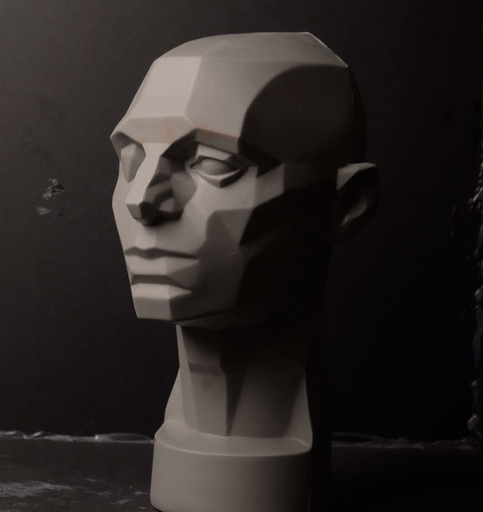
This is my first-ever “portrait”. I did not draw out the head using pencil or charcoal or marker; I just drew “roughly” the so-called Loomis head. This was also an exercise in seeing values.
I will be doing more practice on these heads.

This is my first-ever “portrait”. I did not draw out the head using pencil or charcoal or marker; I just drew “roughly” the so-called Loomis head. This was also an exercise in seeing values.
I will be doing more practice on these heads.

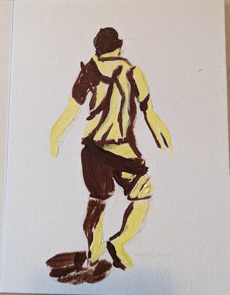
As I mentioned in this post, I’m taking the online course by Peggi Kroll-Roberts, and the assignment is to do 2-value and then 3-value studies painting the figure. In this effort, I am using the figure I sketched out in charcoal here, as prep for a future painting.
I drew out the figure first, using a 6×8 piece of 300-lb watercolor paper. For comparison’s sake, I’ve included the charcoal figure.

Based on an image by sarahbernier3140 from Pixabay
I’m taking an online class (more precisely, watching streaming demos online) by Peggi Kroll-Roberts who is particularly known for her beach photos of human figures. The class is about value structures to show the form of the human figure: the lights and darks.
Effectively, this is a notan. You start with 2 values and then move to 2 darks, 1 light or 2 lights, 1 dark. And then you move to color.
My next step here would be to paint in black and white, then to move to 3 values, and finally to color — using colors mapped to the values.
In fact, Laurel Hart, in her 2007 book Putting People in your Paintings (on p. 23) even suggests you even go ahead and paint over your penciled-in shadows if you prefer. You can erase the pencil later.

I just got The Landscape Painter’s Workbook: Essential Studies in Shape, Composition, and Color by Mitchell Albala. I really don’t know much about painting, although I’ve wanted to do it most all my life. I figured I had to learn how to draw before I painted. (Turns out, maybe, maybe not.)
In any case, the first chapter is about shape interpretation, and the first exercise is to “simplify and differentiate with limited values”. Albala has you do a painting in black and white, using 5 values (so the 3 mid-values are grays). He has you to choose a photo, and then put it in grayscale, squint and determine the no more than 5 values (to simplify). So, I used his photo example first without turning the page to see his proposed value study.
Here is my attempt, and then below it is my copy of how he did the 5 values from his photo in the book. The first thing I realized, after looking at his examples and his comments, is that i totally focus on trying to match the photo. The sky in the example photo is fairly overcast and looks like a “2” value (on a scale of 1 to 5, with 1 being the brightest), whereas the ground at the bottom of the photo looks brightest. But in reality the sky should be the lightest brightest value, so you have to adjust the proposed painting and not necessarily match the photo!
This realization also enforces another idea — there’s a reason landscape painters do paintings “en plein air”. If I were outside doing a value study (or painting) from life, it would be obvious that the sky is the lightest value and you don’t want the ground “fighting” the sky! This can be a downside of photographs.
Below that example, I used my own photo — taken in Sonoma County at a winery (I forget which one) — and my attempt at the 5 values the way I would paint it.
I used NuPastels on toned drawing paper.
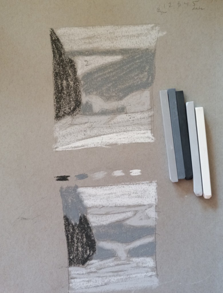
Below is my photo and my idea of a value study.


Today, on Karen Margulis‘ Patreon page, she challenged us to do a painting using only hard pastels like NuPastels, Rembrandts, Cretacolor, etc. Well, my Dick Blick Artist’s Soft Pastels are roughly the hardness of Rembrandts, so I chose to use those.
Then I decided to do a value study for a snowscape based off a Pixabay image by Alain Audet from Pixabay. I may end up using this as an underpainting for that snowscape, but I suppose it could stand alone. I did this on Sand-colored Pastelmat, 9×12.
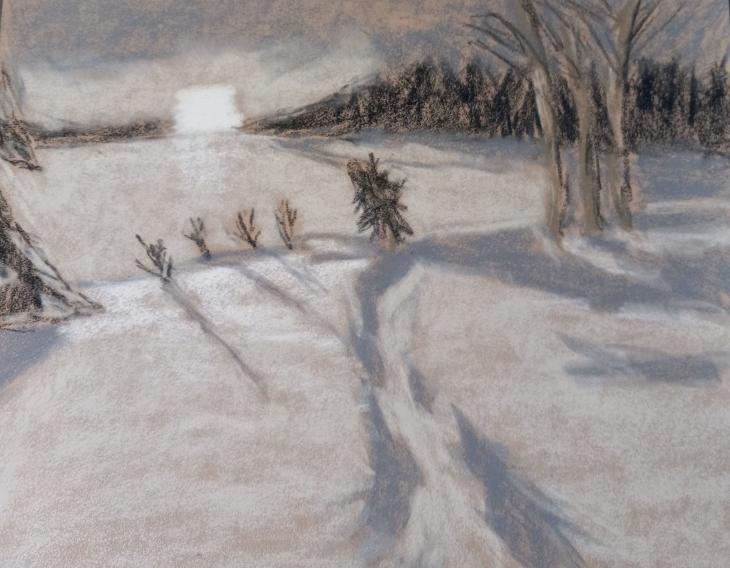
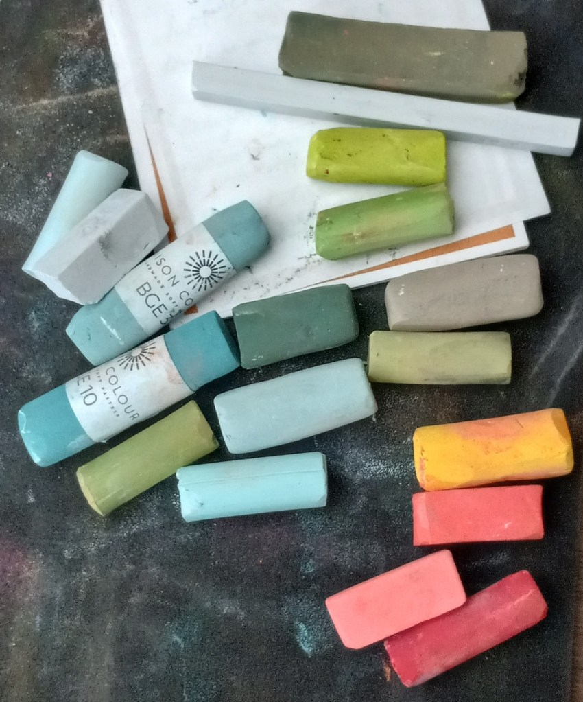
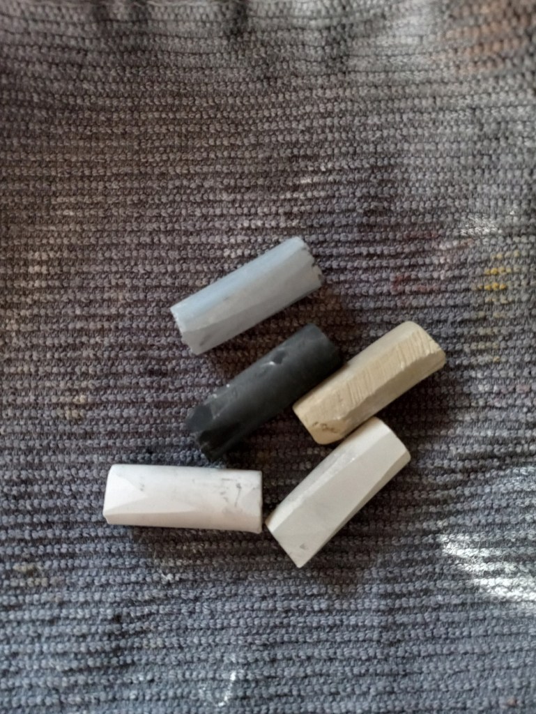
And these are the sticks I used.
In 1989 I visited Lake Louise, and the reason I took this photo was due to the vivid poppies against the teal blue lake. I would like to paint the poppies and the lake, but I need to do a value study and a color study.
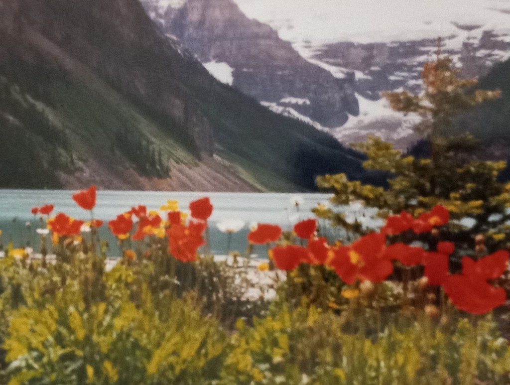
I took a photo of my photo and turned it into grayscale, discovering that the red poppies and the sunlit grass are the same value.
After doing 5 different value studies, I decided to use the lower one of the two, where the number of values is simplified down to three.

I’ve decided to remove the tree at the right — too much clutter, and to remove the snow-covered rocky mountain in the background, making it just (overcast) sky. This is so the flowers will be highlighted.
Below I’ve put together a grouping of colors. The mountains are fairly close to the poppies so I want them dark. I need to adjust the sky color, though, and perhaps make it more of a gray purple.