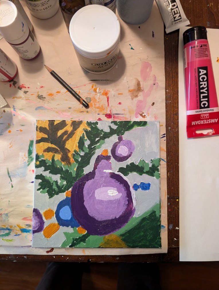
Well, of course I had to fix the thing because it looked like an infected wound — ugh. I acknowledge that one of my weaknesses as a beginning artist is fixating on following the reference photo too closely. True mark of a beginner, lol.
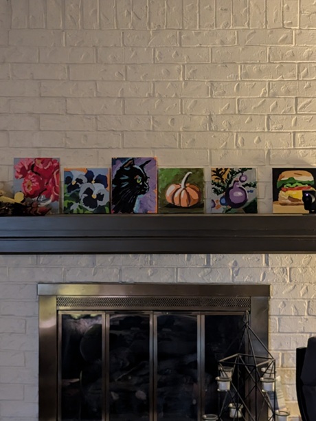
In any case, here is the fixed version, both close up and (currently) among the paintings on my mantel. From where I write this — my “studio” triples as 1) the dining room table, 2) my “office” when I work from home 2 days a week, and 3) my painting area, the ornament painting doesn’t look half bad. (I’m twice as far from my fireplace as from where I took the photo.)
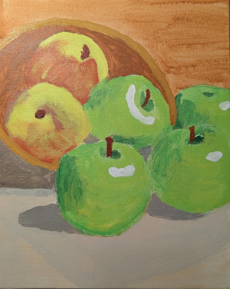
This bowl of apples was painted on a 9×12 linen panel and it’s based on a photo by Robson Melo on Unsplash. I need to adjust the color of the bowl in the middle left; at first I thought it was part of the shadow, but it’s not.
As I reflect on this painting, I think of it as “tight” rather than loose; too static. The red and yellow apples look like they could be peaches instead. And, finally, it looks to me like the paint soaked into the canvas too much — the canvas came pre-gessoed but perhaps I should have added another coat. The other option is to paint at least another layer; however, I got bored painting this one so I’m undecided as to whether I will.
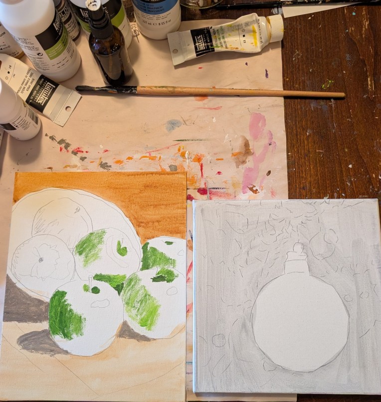
These are a few of the paintings I’m working on, on the side. I’m doing the apples on a 9×12 linen panel. It is based on a photo by Robson Melo on Unsplash. The Christmas ornament is on a 8×8 canvas panel, based on a photo by Markus Spiske on Unsplash.
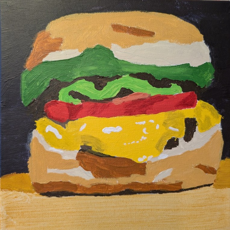
This painting is on an 8×8 stretched canvas, and is based on a photo by Federico Faccipieri on Unsplash. I did the background not as black, but rather a chromatic black (Burnt Sienna + Ultramarine Blue). This was fun to paint!
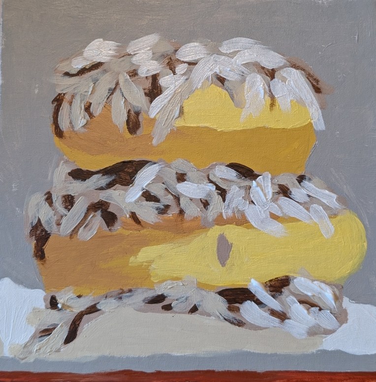
This painting (on an 8×8 canvas panel) is the last doughnut painting for a while (although I have a handful I still want to paint). Coconut doughnuts are by far my favorite — but of those, the best was Dunkin’s once-upon-a-time Toasted Coconut doughnut. I used to love those.
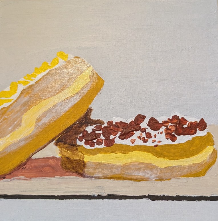
I actually cannot decide if the reference photo showed bacon bits or something like, say, cinnamon crunch. Since bacon bits actually sound more appealing to me (to cut the sweet of the doughnut), I went with that idea. This painting, on an 8×8 canvas panel, is based off a photo by Kivanc Erdirik on Unsplash.
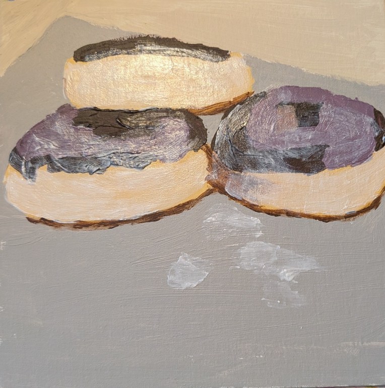
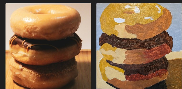
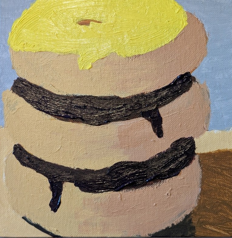
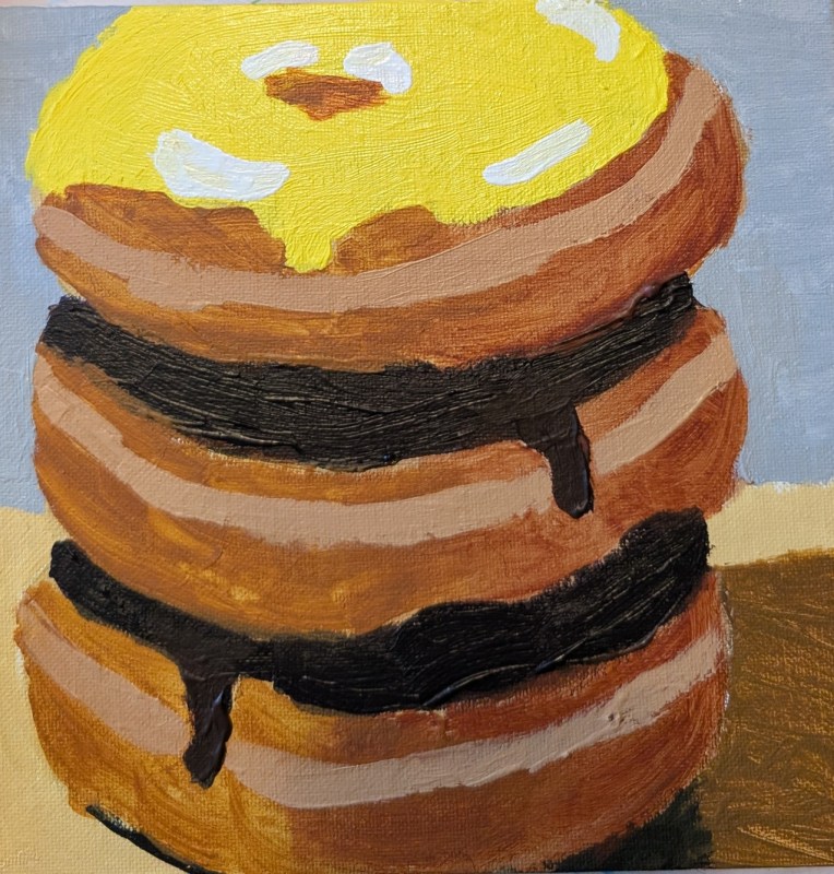
I struggled with this painting, and am going to show some of the struggle. It is based off a photo by Glen Carrie on Unsplash. My final painting is way down at the bottom of this post. I ended up essentially just using the shapes of the 3 doughnuts, and went off on my own, adding frosting to the top doughnut and ignoring the crumble topping of the bottom doughnut.
My first attempt in a side-by-side with the reference photo. This was just a fail — although I DID try the gloss medium mixed in with the yellow ochre paint on top. (Turns out you can’t mix it FAST; it will create air bubbles which then minimize the shine.)
The second attempt is below and I used Yellow Ochre mixed with white, and Raw Sienna (by Golden) mixed with white for the more shaded parts. Ultimately, completely unexciting, but at least the transparency (see above) was gone due to a second layer of paint. Last night, I watched a YouTube video by Marla Baggetta called How to Paint Donuts in Acrylic (I took her online acrylic painting course a few years ago, plus some of her pastel classes). Anyway, for the chocolate frosting, she mixed a touch of Dioxazine Purple with Burnt Umber so I tried that for this version of the painting. (In HER reference photo, the purple cast of the chocolate is easily seen, but I like the deeper dark the mix brings.)
Finally, here is the painting I am calling done. I painted over the above painting, using Raw Sienna and Burnt Sienna without any white. I added another coat of yellow “frosting”, and added a middle seam to the doughnuts, touched up the chocolate frosting, and then the highlights.
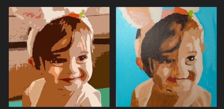
This was done on an 8×8 canvas panel in shades of Golden’s Burnt Umber and Liquitex Raw Sienna. The actual color of the background is not turquoise, but rather a mint green (Phthalo Green Blue Shade and Titanium White) along the lines of the green color in the Adobe “Cutouts” image below.
I cropped the original photo to focus on the face, then used the Cutouts option within Adobe Photo Essentials, and then transferred the image to the canvas panel. What is most off from the photo is the nose and mouth; I’ll have to redo that and see if I can make it more exact to the contours of the child’s face.