This painting was done on a 6×8 canvas panel, based on a photo by Jeremy Ricketts on Unsplash.


This painting was done on a 6×8 canvas panel, based on a photo by Jeremy Ricketts on Unsplash.
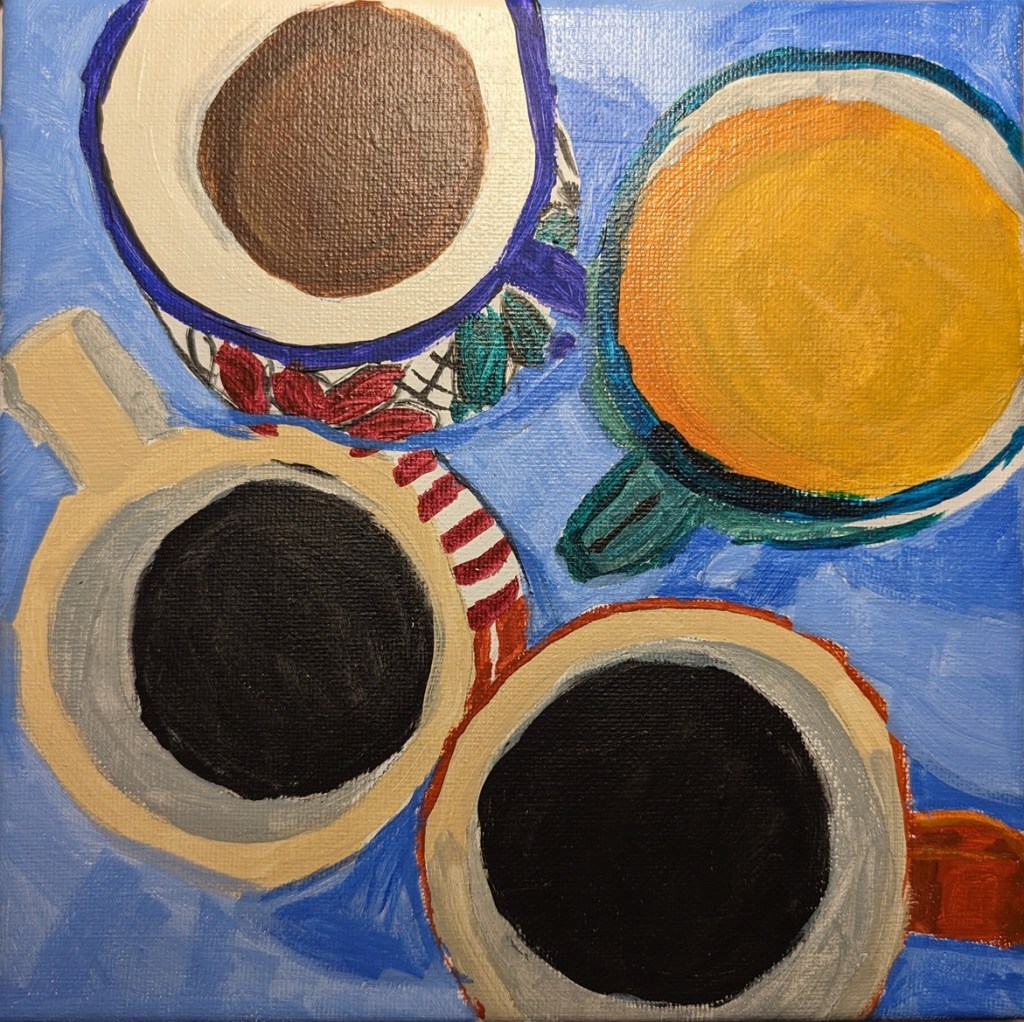
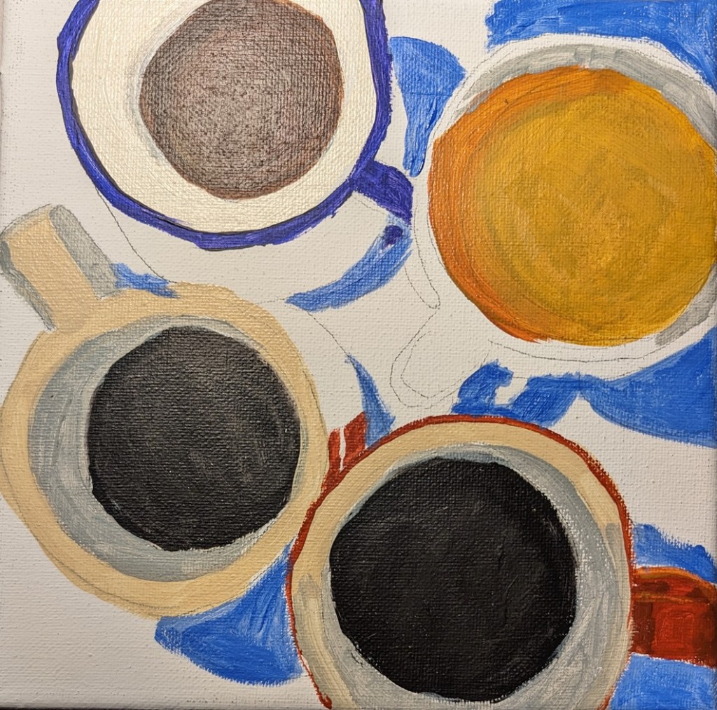
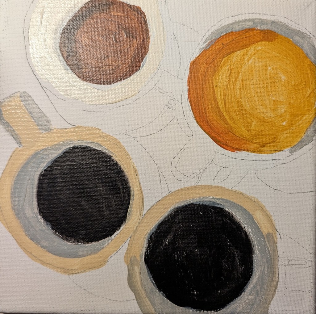
I discovered Teddi Parker after listening to a podcast at Learn to Paint Podcast. And then I found her Instagram, and her website. In looking at her work, I was struck by one with 4 cups of coffee: black and bubbly, mildly creamy and one quite milky. I believe hers was done using acrylic house paint. In any case, I wanted to copy her different coffee colors, the bubbles, the shadows in the mugs, and the highlights.
This was done strictly as a study, on an 8×8 canvas.

I own Carol Marine’s book Daily Painting: Paint Small and Often To Become a More Creative, Productive, and Successful Artist and admire her style. (She has paintings for sale on the Daily PaintWorks website. ) Anyway, now I can’t remember where I found the original image for this copy: either her book or the website.
My main focus in trying to copy here was my brushwork. I wanted my brush strokes to follow the form of the apple, or the length of the cloth, or the direction of the shadow, etc. I painted this on a 6×6 birch panel which I gessoed before drawing the image. I used burnt sienna, Mars black, cad-free yellow medium, and Titanium White. The 2 brushes I used were fairly small; hence too many brush strokes!
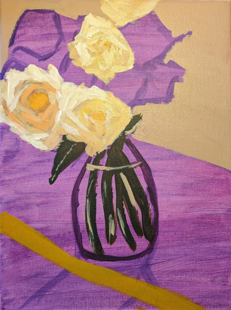
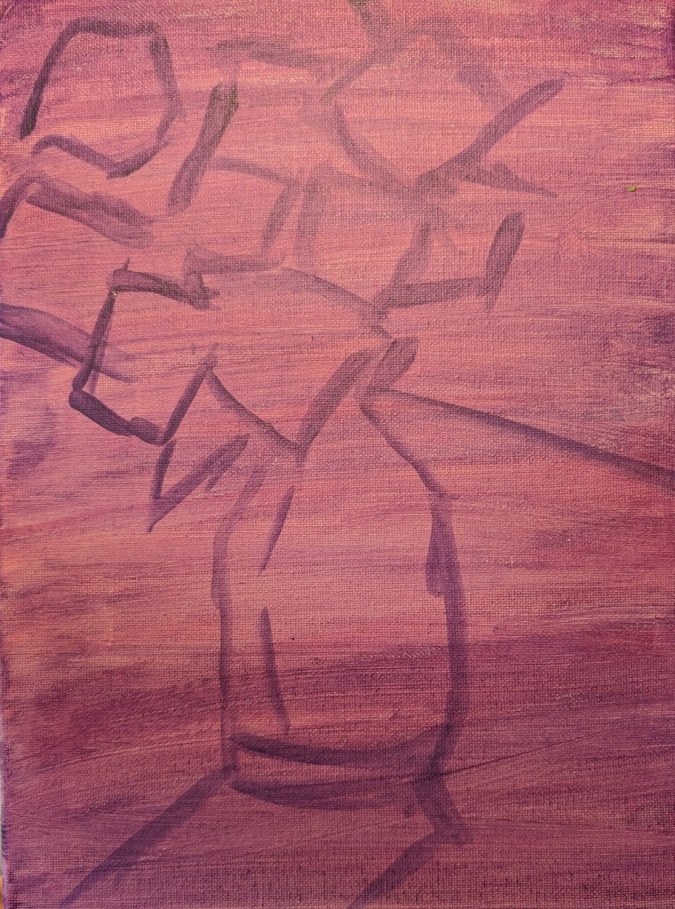
I painted this bouquet of roses from Jed Dorsey’s online class at Acrylic University. I’m fairly happy with the roses, not so much with the reflections in the vase. But this was fun!
9×12 stretched canvas. I copied Dorsey’s violet underpainting, but I don’t think I’d use that color next time. The violet color is truer in the half-painted image than in the initial drawing out image.

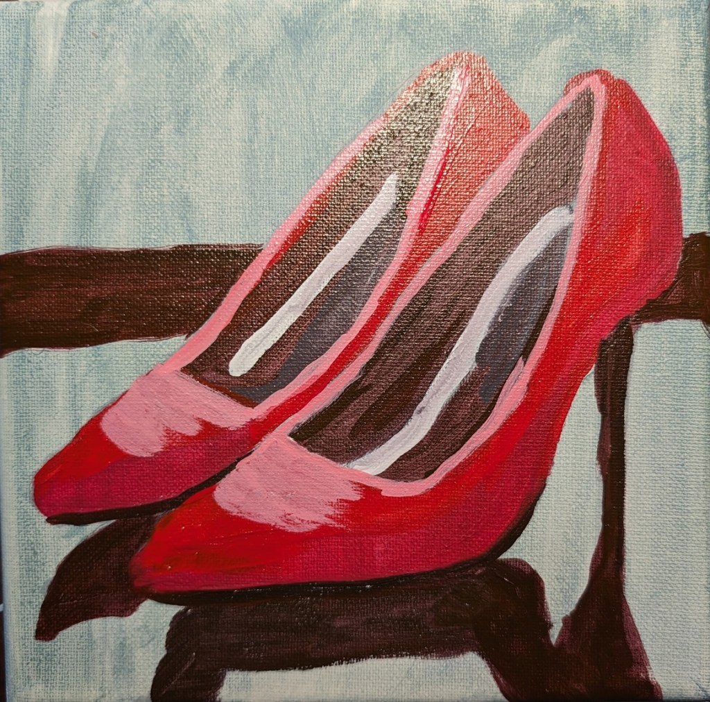
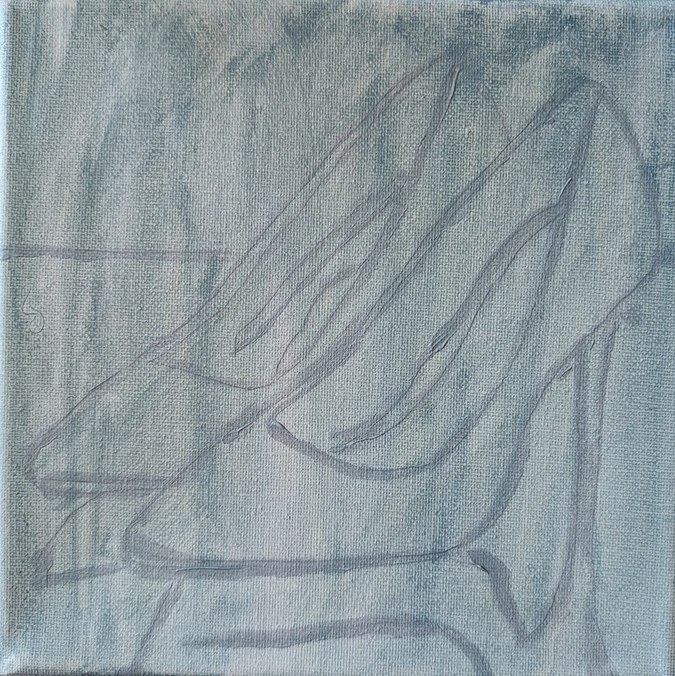
Once upon a time, I had a pair of red shoes like this. My 8×8 painting is based on a photo by Emily Pottiger on Unsplash. I kept my palette limited.
Background color — Ultramarine Blue, Cad-free Yellow Medium, Titanium White
Shoes — Anthraquinone Red, Naphthol Red, Phthalo Green Blue Shade, Titanium White
There’s a few things I need to tidy up… the stiletto heel needs to be straighter; the drawing was better. The shadow of the leftmost shoe should be straighter, as should the divider line (for lack of a better phrase).

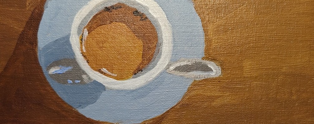
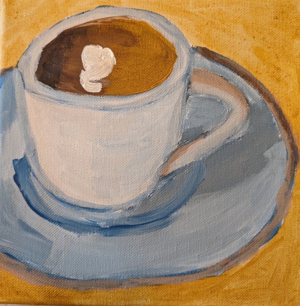
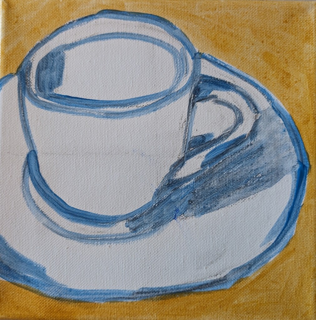
I painted this cup of coffee, based on a photo by Jeremy Yap on Unsplash, on an 8×8 canvas, with cerulean blue as the primary blue.
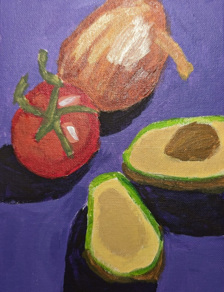
I finished the “Guacamole” paint-along from PaintCoach’s Patreon page. The background in this photo is bluer than in reality.
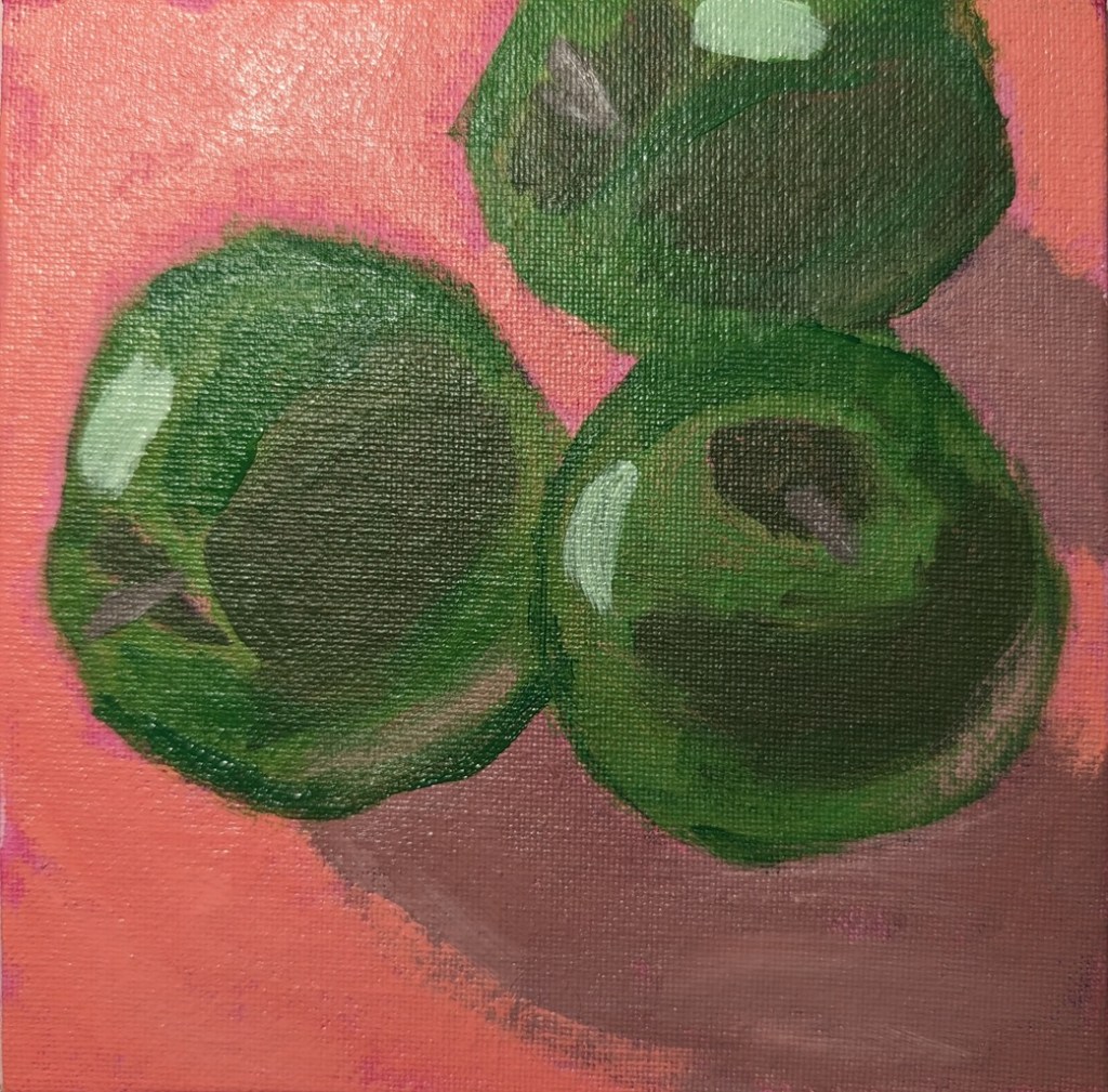
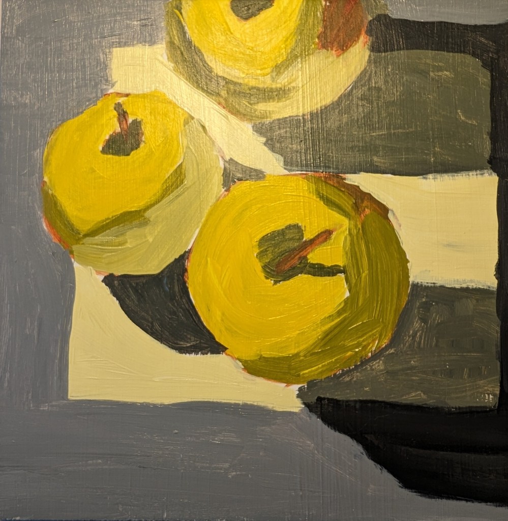
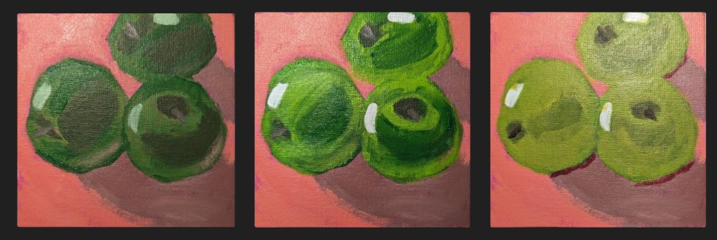
So, after making my apples too green (and dark) with mostly Winsor & Newton Sap Green (and some yellow, believe it or not, I tried a “convenience” color (Yellow Green from Amsterdam). That got me closer, but at that point, I was over-painting the original dark green apples. The third try, I got closer to the color I wanted, but I ceased paying attention to the darker shapes in the reference image (including the shadows).
The only thing I’m relatively satisfied with right now is the dark area around the apple stems. AND that I finally got reasonably close to the local color of the apples.
I need to paint this again from scratch, but frankly, I’m temporarily sick of apples! 🙂

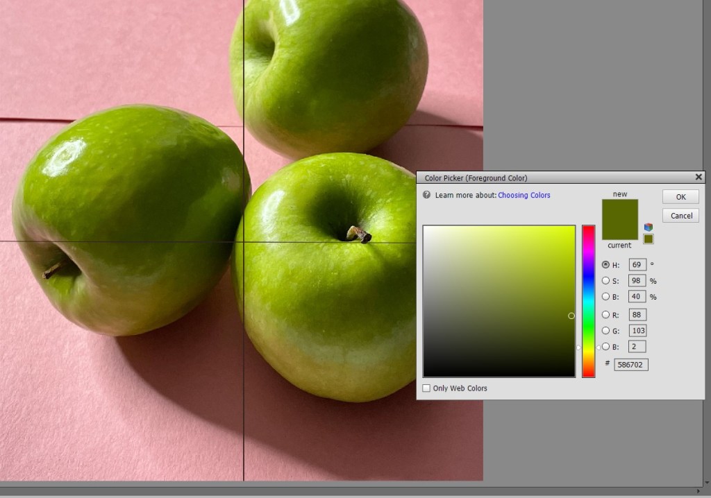
Here are the value comparisons between the reference photo and the original painted green apples, and the reference compared to the final painting.

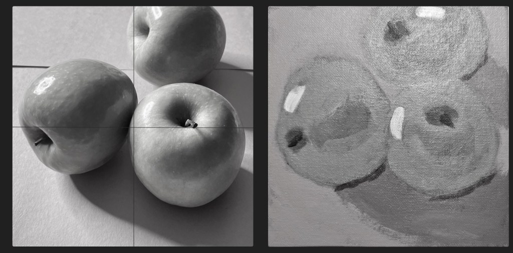
Originally, my lights were too dark, while some darks (the cast shadows) weren’t dark enough. Now my lights are okay but the darks aren’t dark enough. And the apple at the left is misshapen.
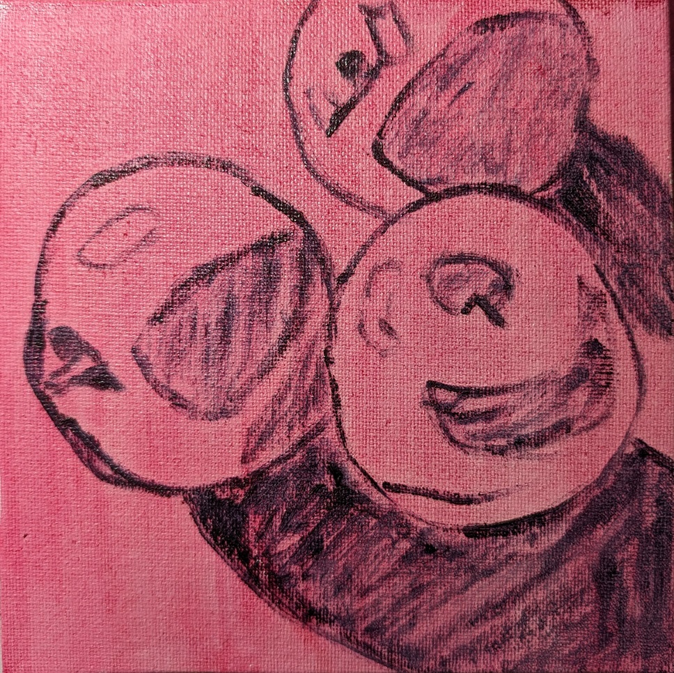
This is another paint-along from PaintCoach’s Patreon page. I painted what I thought I saw, not what I actually saw. “Green” apples are green, right? Wrong. They’re mostly yellow. The image from Adobe Photoshop Essentials shows the darkest green as being mostly an olive color. (Actually, with photos the way they are, the darkest areas showed up as black, so I “color-picked” the edges of the shadow.)
Anyway, this image testing came AFTER my first attempt here — and the quinacridone magenta wash, and Payne’s gray outline to start did not help anything. Ugh.