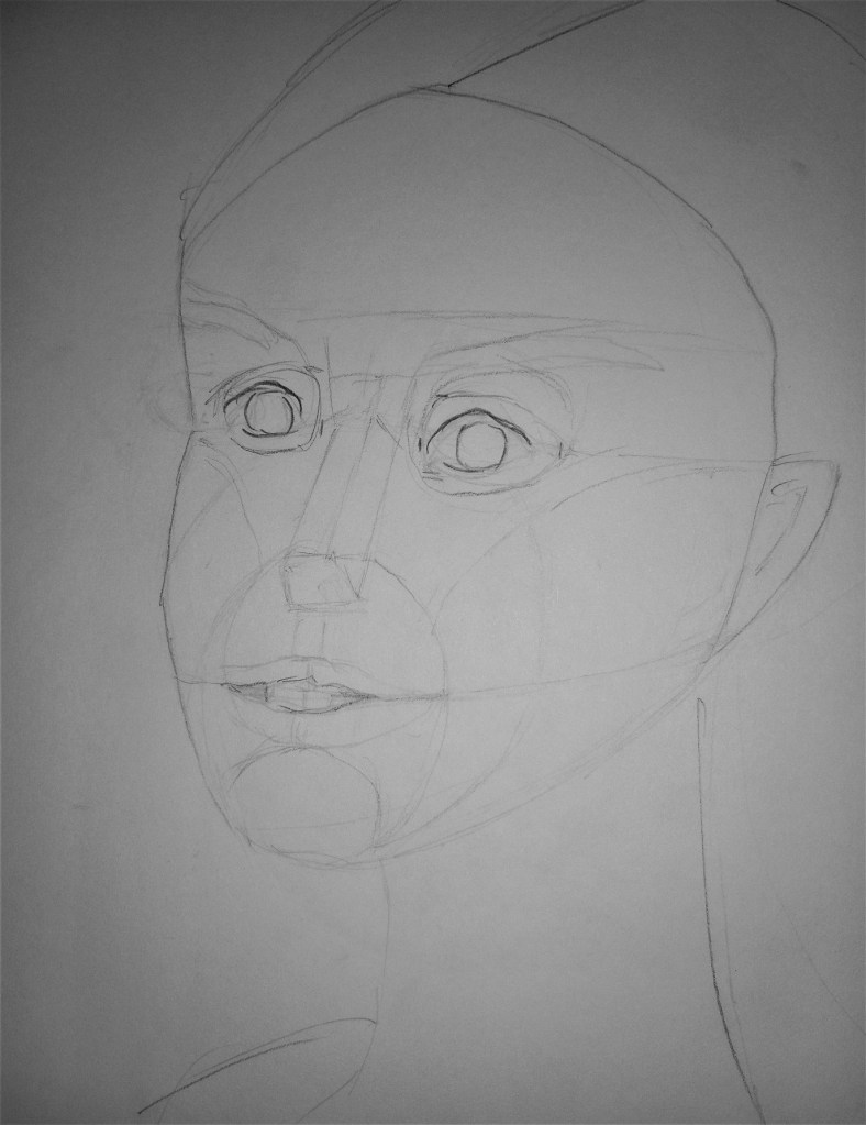
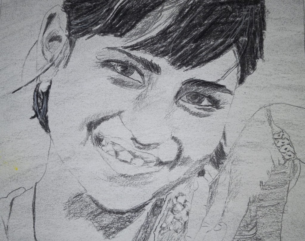
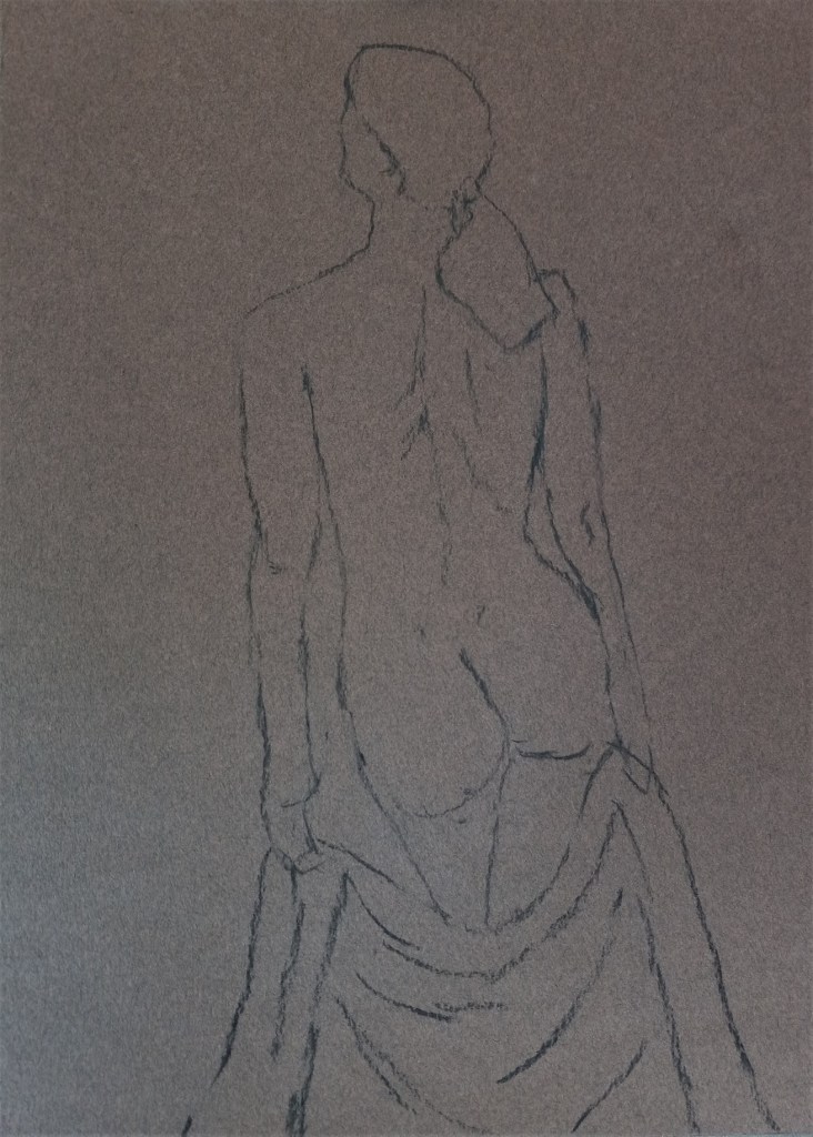
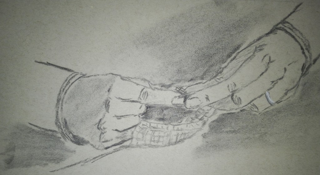
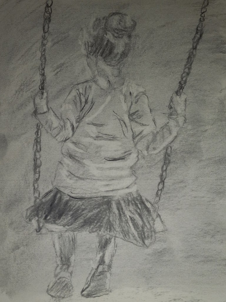
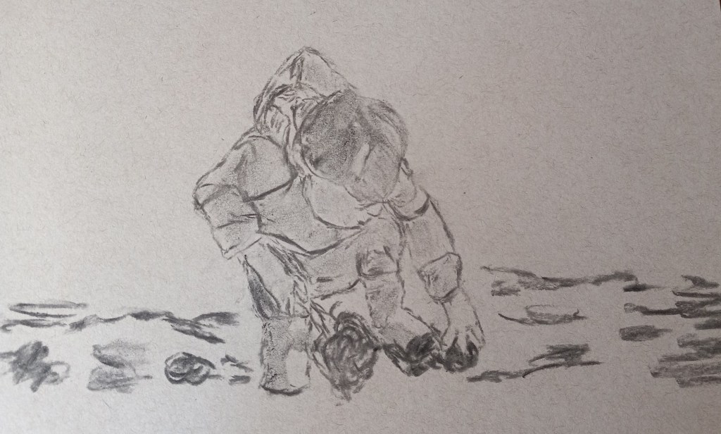
It’s been some time since I’ve posted to this blog, but I’ve been doing a fair amount of sketching by copying from illustrations in childhood favorite books, and from some of the example drawings in art instruction books by Barrington Barber. Something best kept in a sketchbook and not posted to social media.
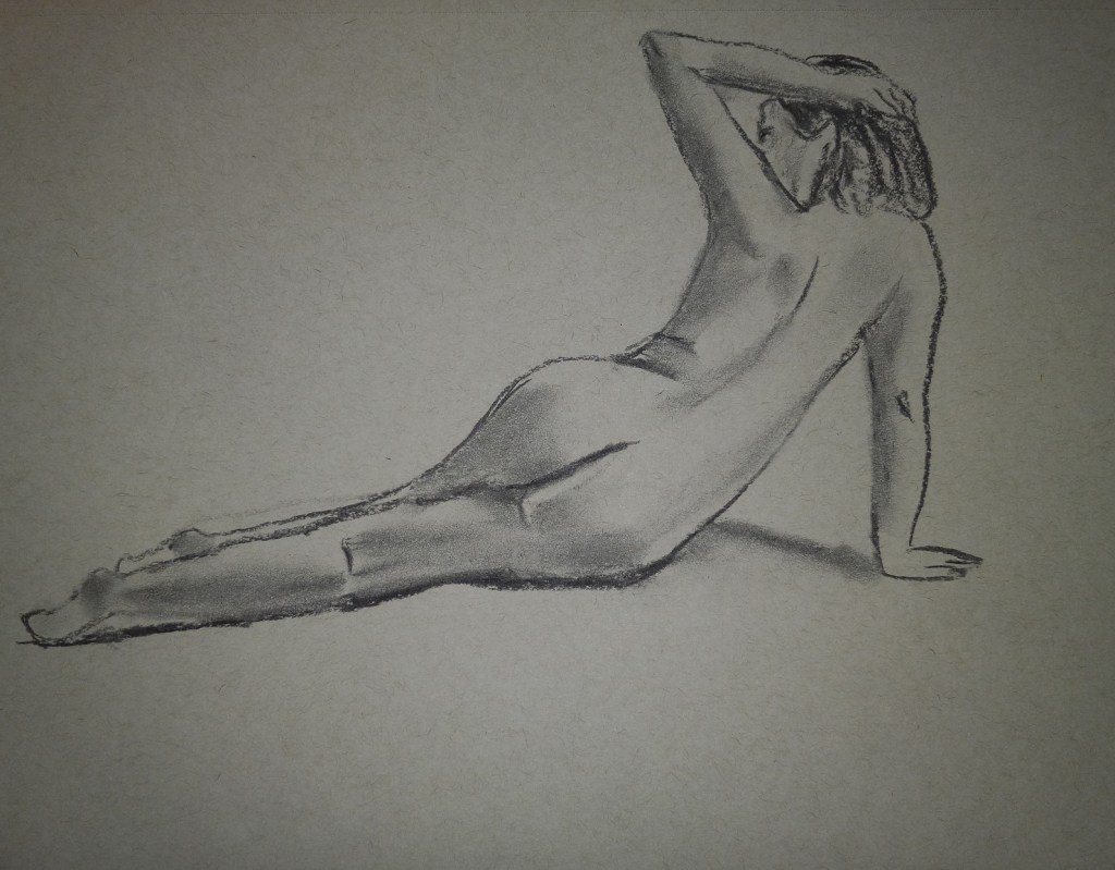
Of course, like every other beginning artist who does some copying, I eventually got bored! So, now I’m back to charcoal (from graphite) and starting to work on more portraits. With the portrait below, I used charcoal pencils, willow sticks, compressed sticks, and white “charcoal”. I’m about to start taking the learn-at-your-own-pace online course Charcoal Like Mad taught by Kara Bullock.
That ugly outline of a rectangle crossing the eyebrow and nose on the image is actually from the gummy tag identifying the color of this Canson Mi-Teintes paper (cinnamon). Ugh! But the paper has sat in my closet for about 2 years now, and the closet is the warmest room in the house in summer, coldest in winter. Time to use the stuff up.
In the meantime, this is just a warm-up to get back in the flow, and playing with charcoal.
My work is based on a Pixabay image by Anastasia Gepp.