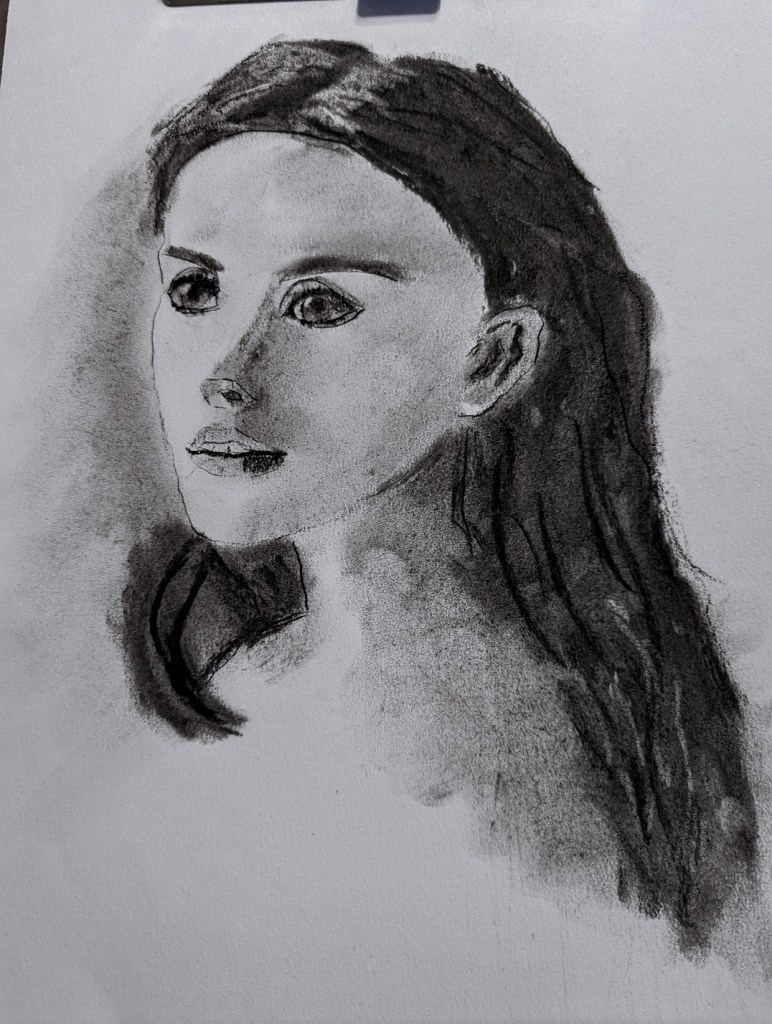
This charcoal pencil sketch is based on an image by sarahbernier3140 from Pixabay, which I intend to paint at some point soon.


This charcoal pencil sketch is based on an image by sarahbernier3140 from Pixabay, which I intend to paint at some point soon.
These pastel paintings were done based off an image by นิธิ วีระสันติ from Pixabay.
I used the same pastel palette for both (mostly) — Blick, Richeson, and Terry Ludwig sticks.
The paper on the left is Art Spectrum Colourfix, and the paper on the right — which I found easier to work with — is Clairefontaine Pastelmat.

This was painted on a 6×6 canvas panel and was inspired by an image by u_co44impxvh from Pixabay.

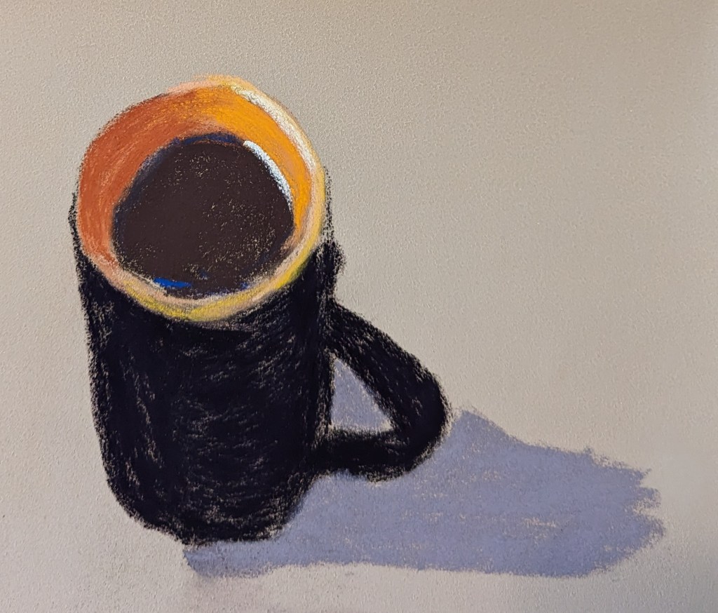
I did this painting in soft pastel based on an Image by Chil Vera from Pixabay.
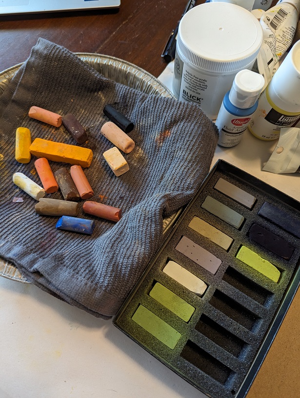
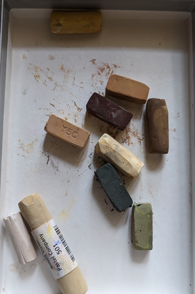
It’s on a “Slate” colored 6×8 4-ply Pastel Premier board that I bought some time ago when I trying out soft pastels. (So far, I’m still favoring acrylic paints, but this was fun to do!) The pastels I used are shown at right.

I wanted to try a monotonal work; this was done on a 6×8 canvas. The painting is based on an image by experimentMR from Pixabay.
I think it looks better at a distance.


This is my first animal “portrait”, based on an image by Nikki Luijpers from Pixabay.
I love black Labs! Never had one, but a roomie from 40 years ago had a black Lab named Emma, and I just loved that dog! BEST DOG EVER.
This quick study was done on 6×8 gessoboard, which I gessoed again to get rid of the smooth surface, and then painted over with Neutral Gray 5.

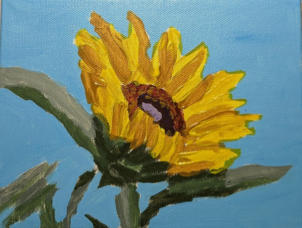
Here’s the finished sunflower.
I used Yellow Ochre for the shaded parts of the petals, and Liquitex Soft Body Yellow Azo Med (PY 74) for the brighter parts of the petals. The yellow is fairly transparent, so I deliberately wanted to leave brush marks to give some additional definition to the petals.
I may come back around and paint over the greenish areas where I overpainted the yellow on to the background. Then again, maybe not, as from afar it looks a bit like shadow. We’ll see.
Based on an image by Couleur from Pixabay
The main difference between this portrait and the one I posted a few days ago — besides the color of the paper and the lack of sticker residue — is that rather than using the white “charcoal” pencil, I used the eraser to lift the color for the highlights in the eyes, and the earring.
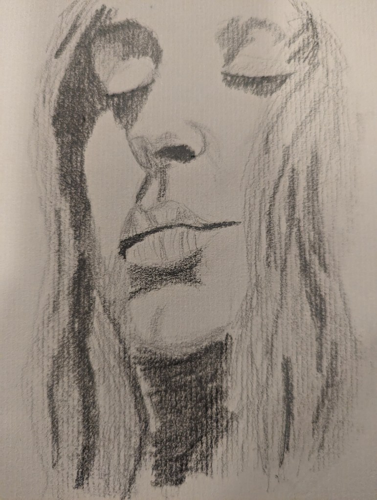
The image is from Anastasia Gepp on Pixabay.