Christmas Ornaments: my own version

I used a Hahnemühle non-sanded pastel paper from my sampler set to draw the pair of ornaments taken from my fireplace decorations.

I took a photo of the entire easel scene; you can see the reference objects on the left. I also took a photo of the ornaments, and the color palette I used.

I was painting from life rather than the photo reference; the photo looks somewhat bluer and I was standing at a slightly different position taking the photo than when I was actually pasteling.

Christmas ornaments: Follow-along with Marla Baggetta

I watched Marla Baggetta’s YouTube video from December 2019 in which she did a pastel painting of Christmas tree ornaments. I then attempted to copy her work to get a feel for how she laid colors for each ornament.

My copied work was done on Canson Mi-Teintes (the Red Earth shade) on the “honeycomb” textured side because I messed up the initial drawing on the smooth side. The initial drawing was done using vine charcoal, and then I used the sticks shown below for color. It looks best from far away!

Next up is trying a painting using some of my own ornaments.

My First Landscape

Today I did my own landscape painting based on a photo of a sunrise I took several years ago in our backyard.

I used Clairefontaine Ingres paper, which is unsanded, and not too bad. It was a pale tan color (and part of my unsanded paper sample I purchased from Jackson’s Art a year ago.) The initial drawing was done in vine charcoal. And I kept the size to 8×6.

Follow-Along: Karen Margulis Landscape

Today I watched a YouTube video (click here) by Karen Margulis about successful strategies for a daily painting habit. She demonstrated painting a landscape in pastel in 20 minutes and after I watched it once I decided to follow-along and try my hand at her style.

Below are step-by-step pictures of my attempt. I used a portion of my Canson Touch board in Twilight color. Karen’s painting is much superior to mine, but this was actually fun! It really did take 20 minutes. AND I feel ready to give a shot to doing a painting using one of my own photos.

The big tree really only looks like a tree from a distance, so I included a distant shot. I don’t yet have the skill Margulis has so I would want to draw out my trees a bit more. I can’t quite make the connection from abstract value shape to something I view as a tree after painting.

Follow-Along: Gail Sibley’s Red Bowl

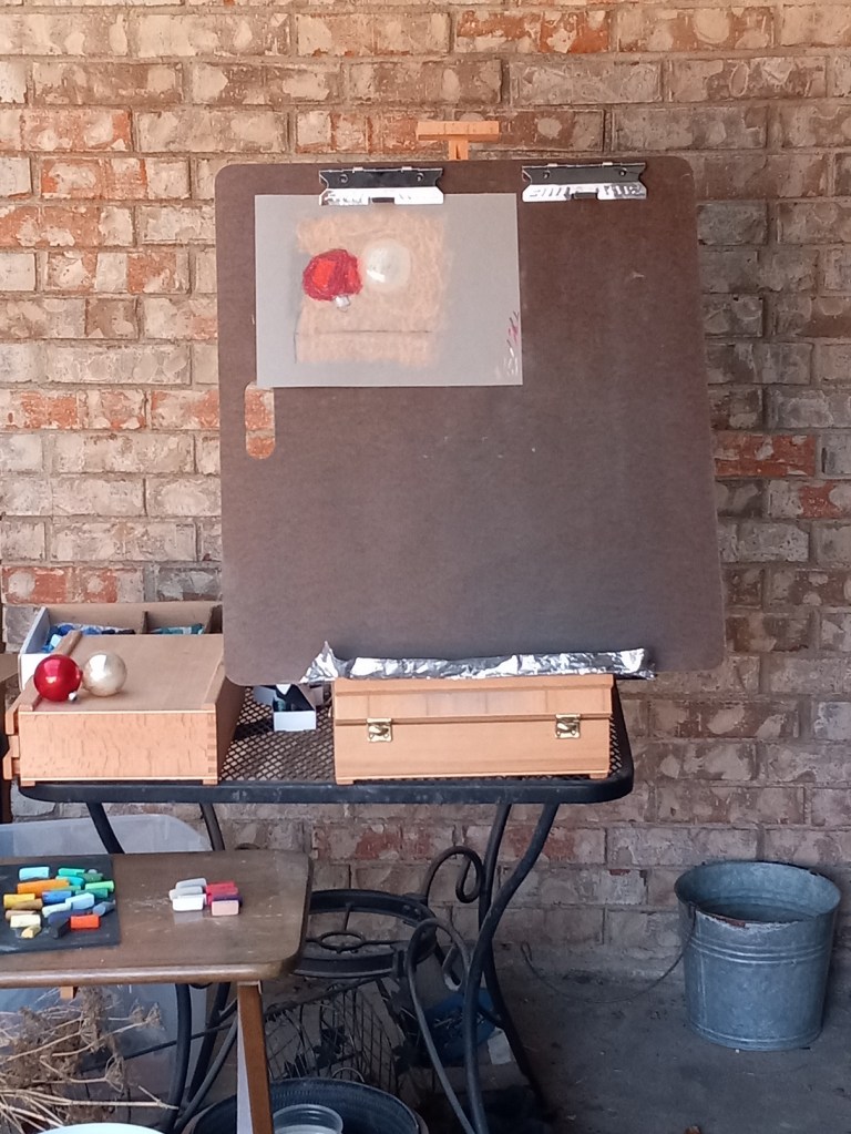
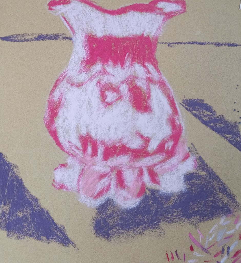
Gail Sibley has a video on YouTube wherein she uses white pastel paper, and a set of Terry Ludwig’s “Best Loved Basics” to paint a red-orange bowl with a fork balanced on it.

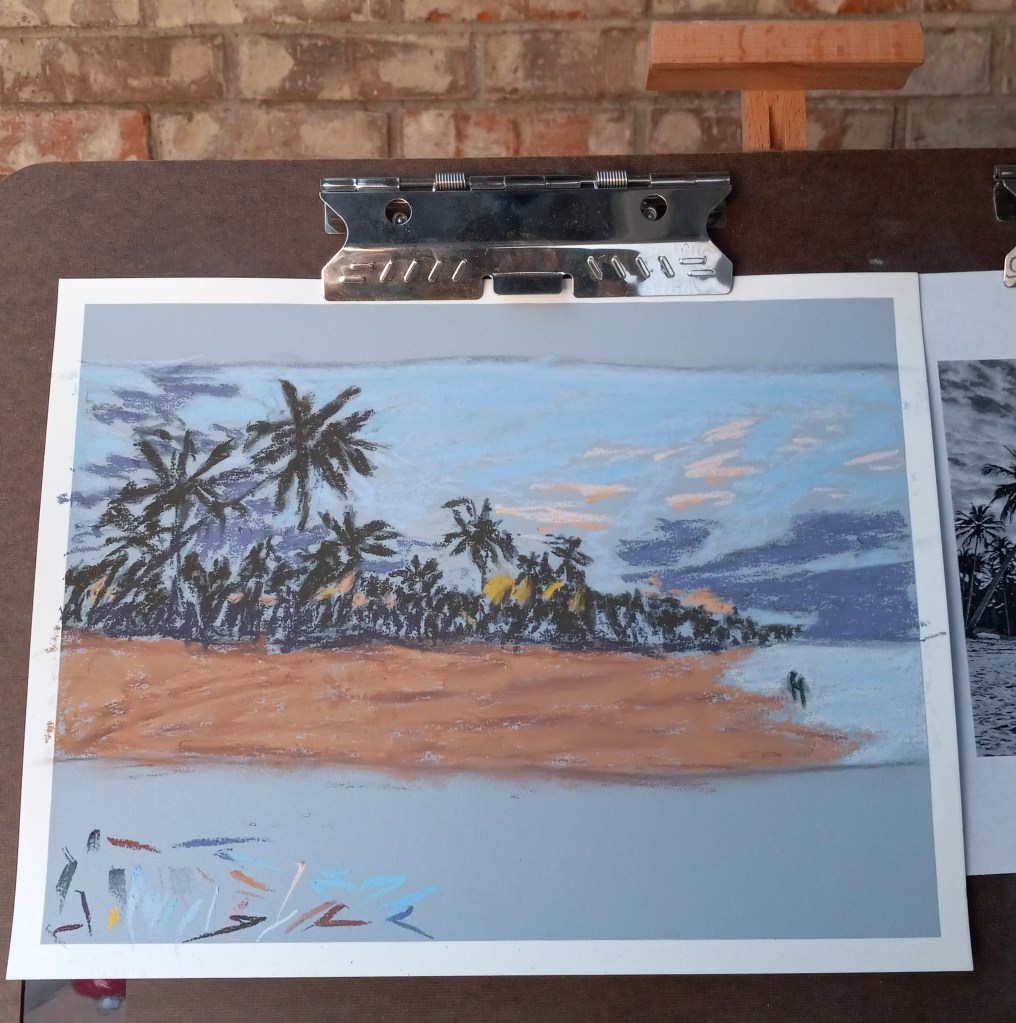
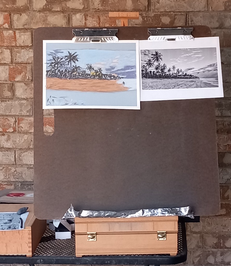
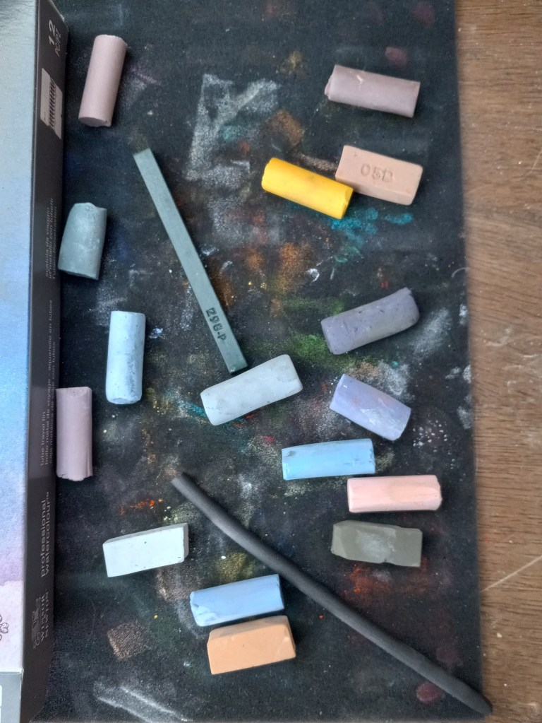
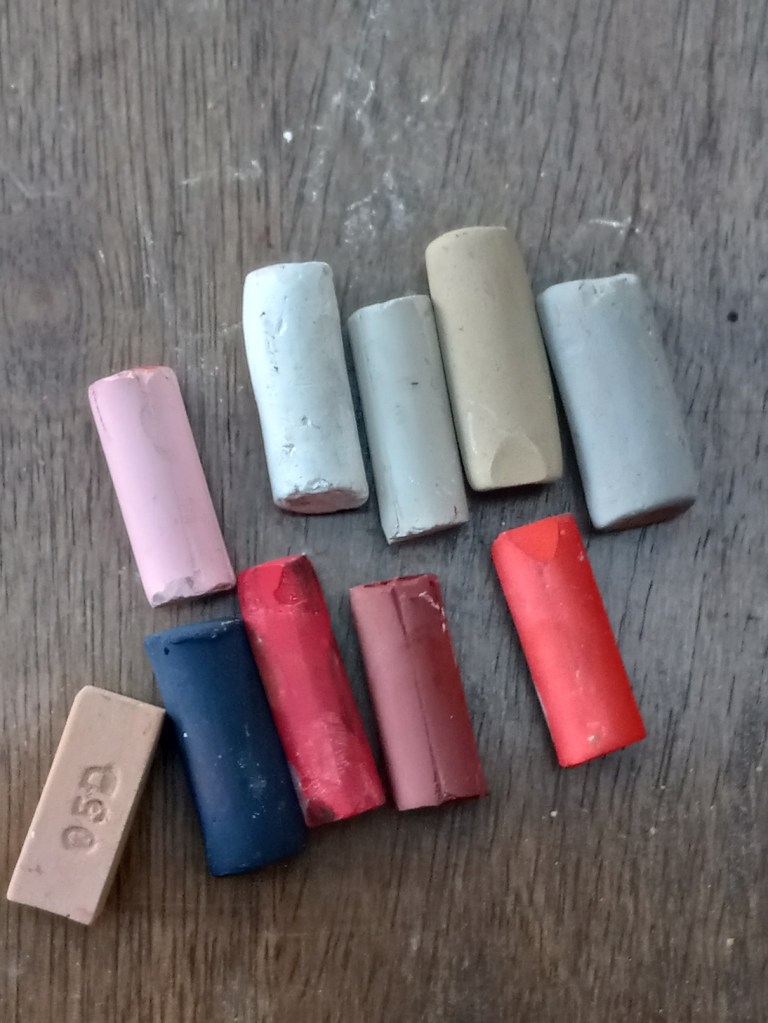
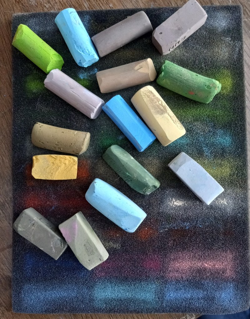
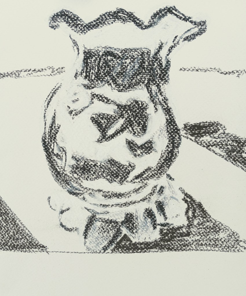
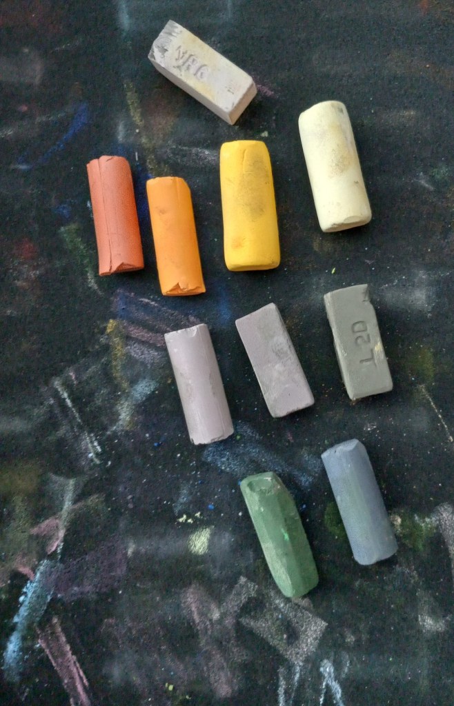
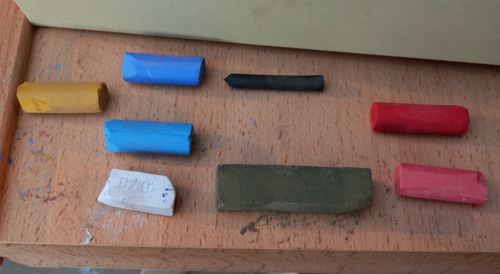
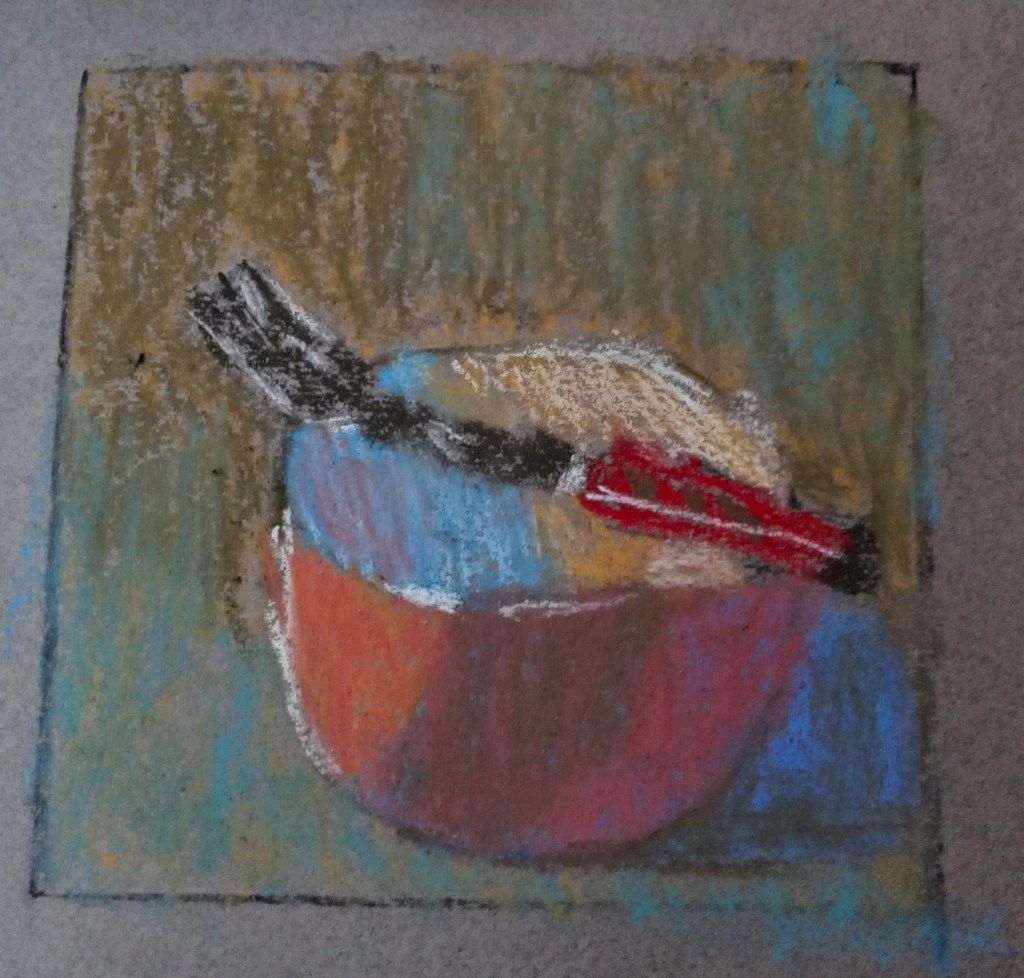
I decided to try my own hand at painting the red bowl. The paper I used was a gray-toned Canson Mi Teintes, and, since I don’t have Terry Ludwig pastels, I used a random set of 8 pastels (only 7 shown), making my best guess as to a close match to what Gail was using. I used vine charcoal to sketch the bowl on the pastel paper, and 2B charcoal pencil in the preliminary planning sketch.

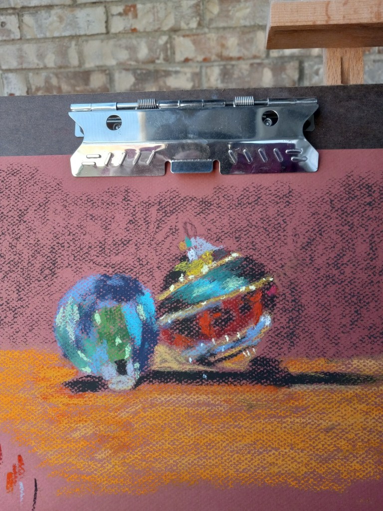
I also created a grayscale version of the photo of the bowl, and the values are skewed. The background should not be darker than the cast shadow. Ditto for the shadow in the middle of the bowl, appearing like a gray stripe. It should not have been darker than the cast shadow.

I may tweak this painting tomorrow, if the paper can hold any more pastel.