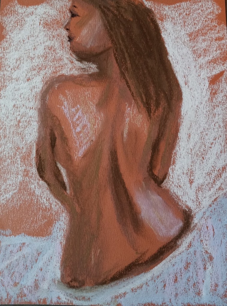
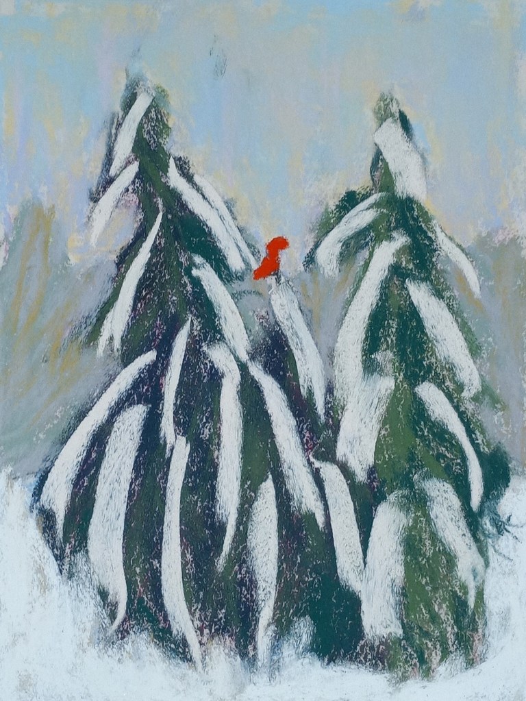
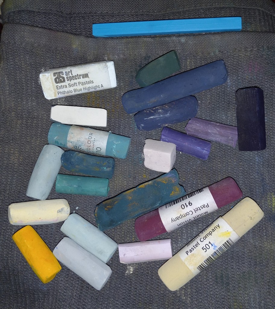
This study was inspired by an image by Yann Allegre on Unsplash. I used the same pastels as I used for my previous effort, but I added a more detailed underpainting using NuPastels, after sketching the trees with vine charcoal.
I used a turquoise NuPastel for the underpainting of the fir trees, and the fact that it peeks through is about the only thing satisfying about this effort. The photo doesn’t show the snow well, but I used yellows, pinks and light blues as the snow rather than straight white. The snow on the branches was actually a very pale yellow color — almost white — and a Blue Earth pastel.
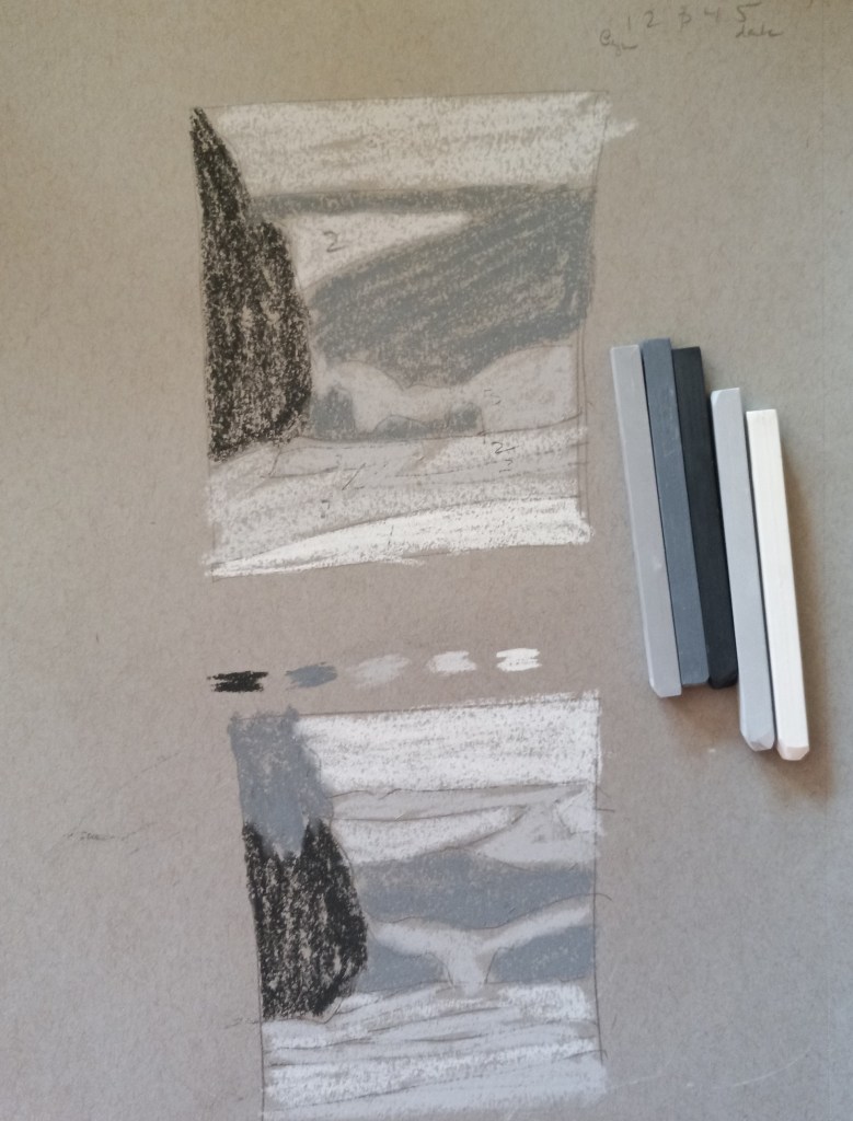
In any case, the first chapter is about shape interpretation, and the first exercise is to “simplify and differentiate with limited values”. Albala has you do a painting in black and white, using 5 values (so the 3 mid-values are grays). He has you to choose a photo, and then put it in grayscale, squint and determine the no more than 5 values (to simplify). So, I used his photo example first without turning the page to see his proposed value study.
Here is my attempt, and then below it is my copy of how he did the 5 values from his photo in the book. The first thing I realized, after looking at his examples and his comments, is that i totally focus on trying to match the photo. The sky in the example photo is fairly overcast and looks like a “2” value (on a scale of 1 to 5, with 1 being the brightest), whereas the ground at the bottom of the photo looks brightest. But in reality the sky should be the lightest brightest value, so you have to adjust the proposed painting and not necessarily match the photo!
This realization also enforces another idea — there’s a reason landscape painters do paintings “en plein air”. If I were outside doing a value study (or painting) from life, it would be obvious that the sky is the lightest value and you don’t want the ground “fighting” the sky! This can be a downside of photographs.
Below that example, I used my own photo — taken in Sonoma County at a winery (I forget which one) — and my attempt at the 5 values the way I would paint it.
I got the darkest values, and the lightest values. The darker ones have a lot of good browns, while the lighter ones can be used for sand and snow — if I stay with doing landscapes.
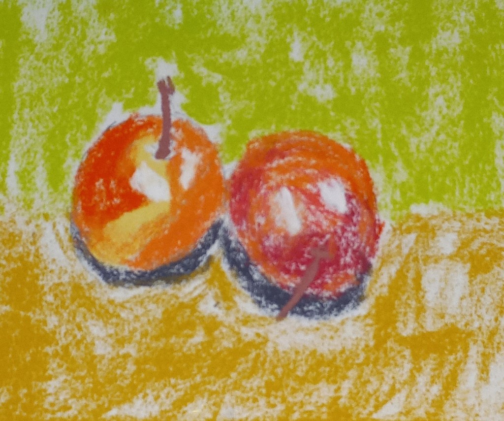
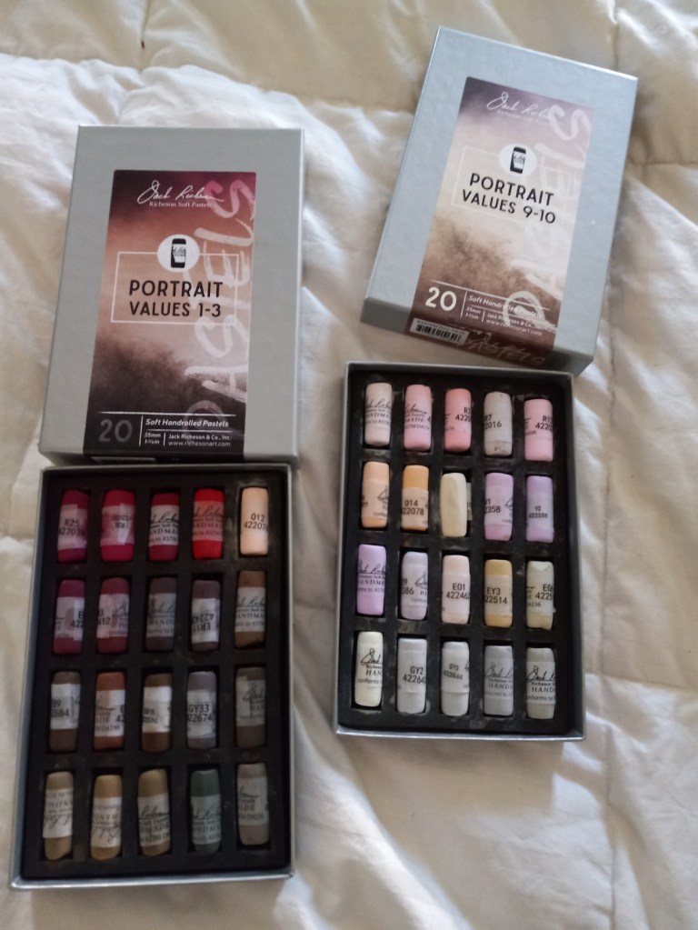
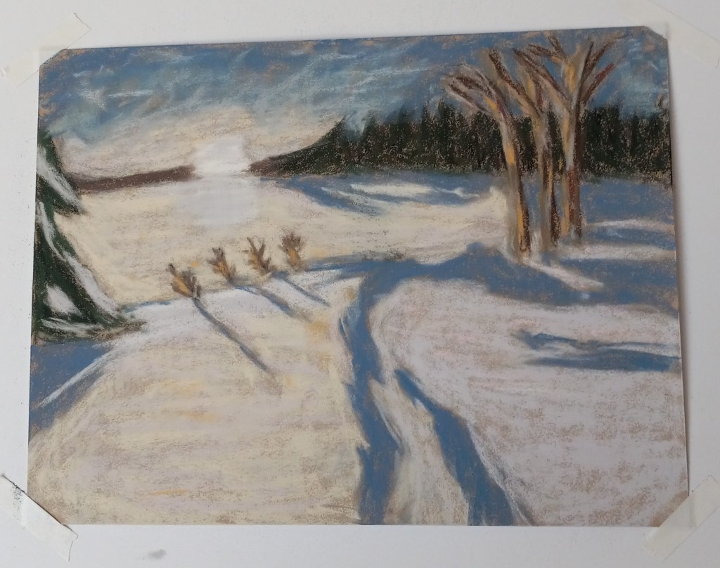
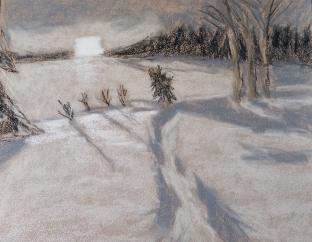
Here is my snowscape done in color. The snow is partly pink, blue and yellow, and very nearly white where the small bushes are. I removed the little pine tree at the suggestion of a member of Karen Margulis’ Patreon group for pastel classes. Most of the pastels used were Richeson hand-rolled, which is fast becoming my favorite brand.
(I have the comparison between the value study and the color version below. The original image was by Alain Audet from Pixabay.)
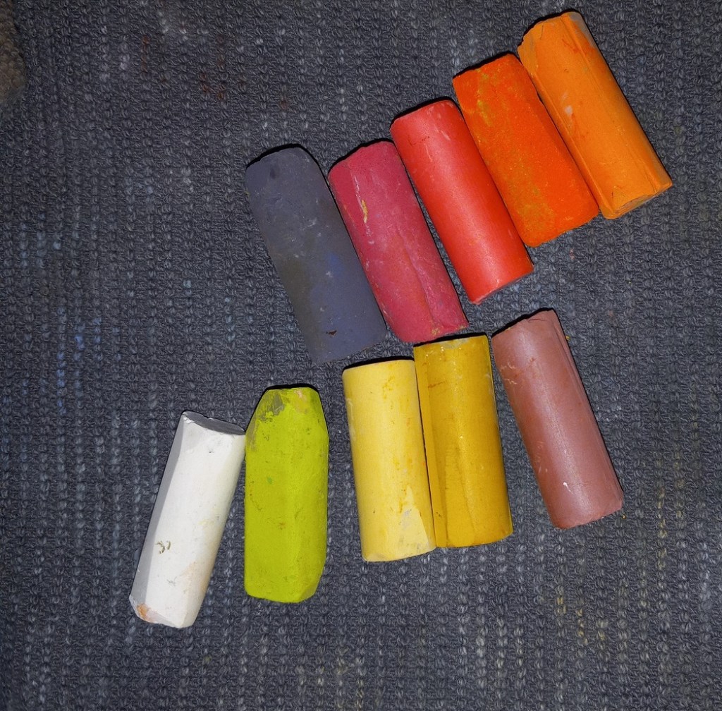
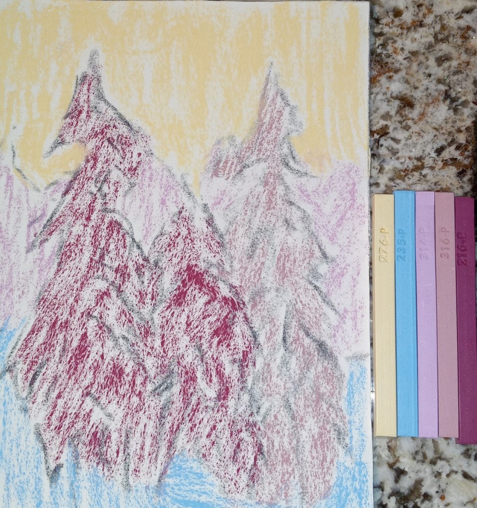
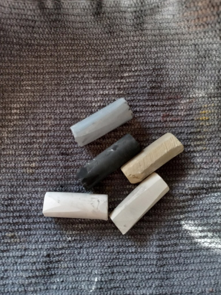
Today, on Karen Margulis‘ Patreon page, she challenged us to do a painting using only hard pastels like NuPastels, Rembrandts, Cretacolor, etc. Well, my Dick Blick Artist’s Soft Pastels are roughly the hardness of Rembrandts, so I chose to use those.
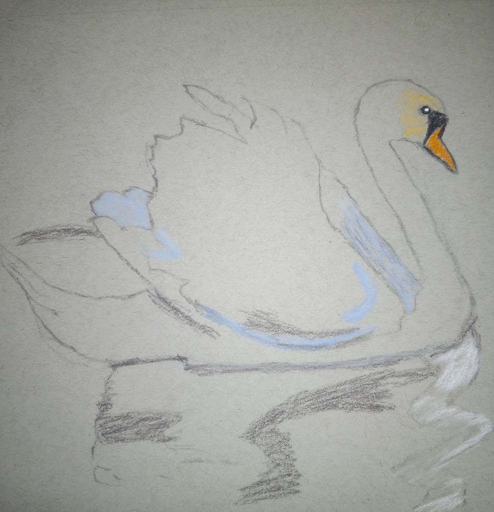
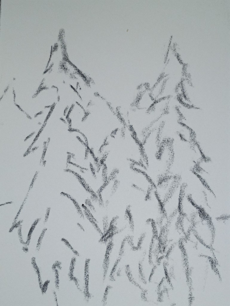
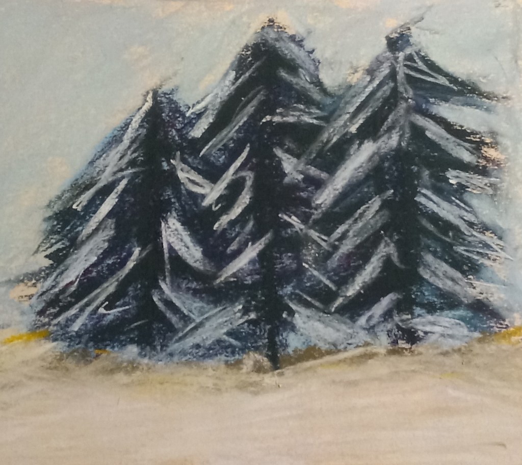
Then I decided to do a value study for a snowscape based off a Pixabay image by Alain Audet from Pixabay. I may end up using this as an underpainting for that snowscape, but I suppose it could stand alone. I did this on Sand-colored Pastelmat, 9×12.