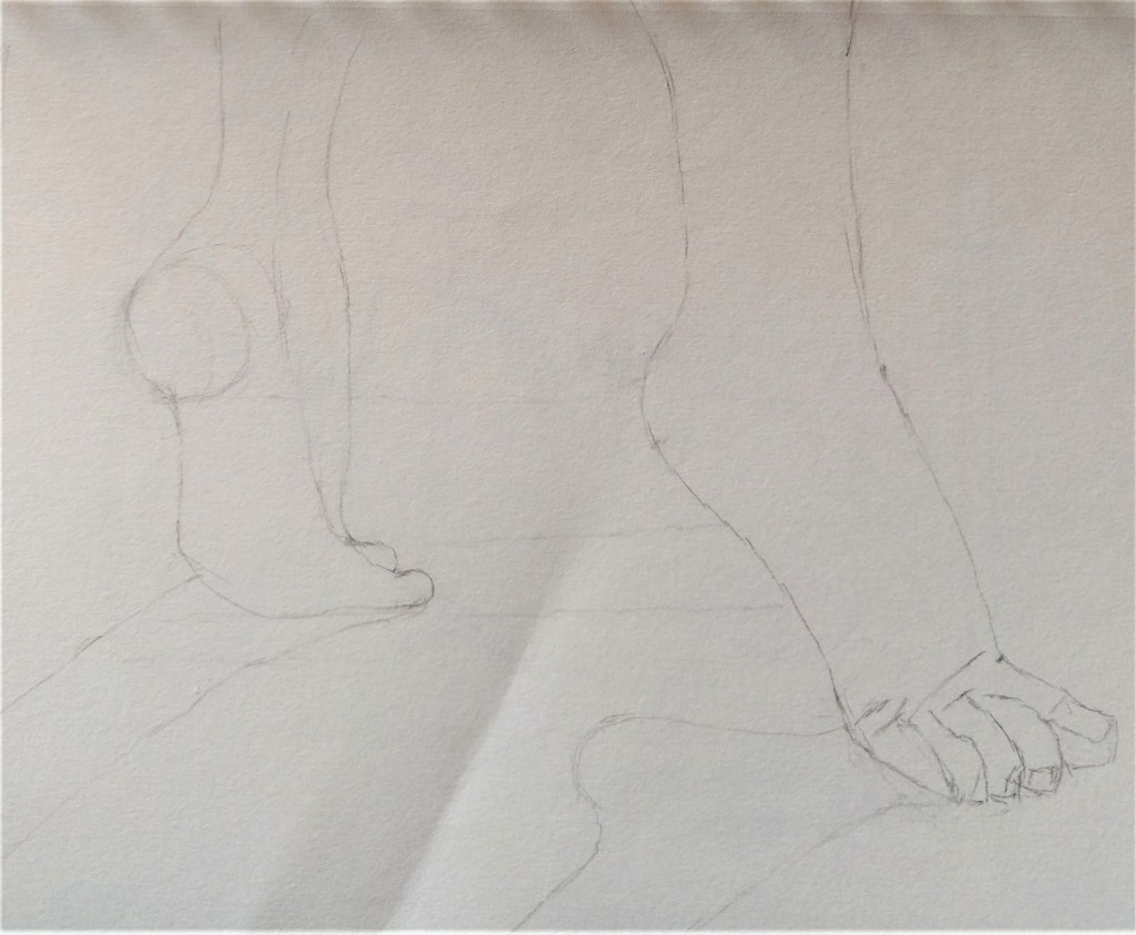
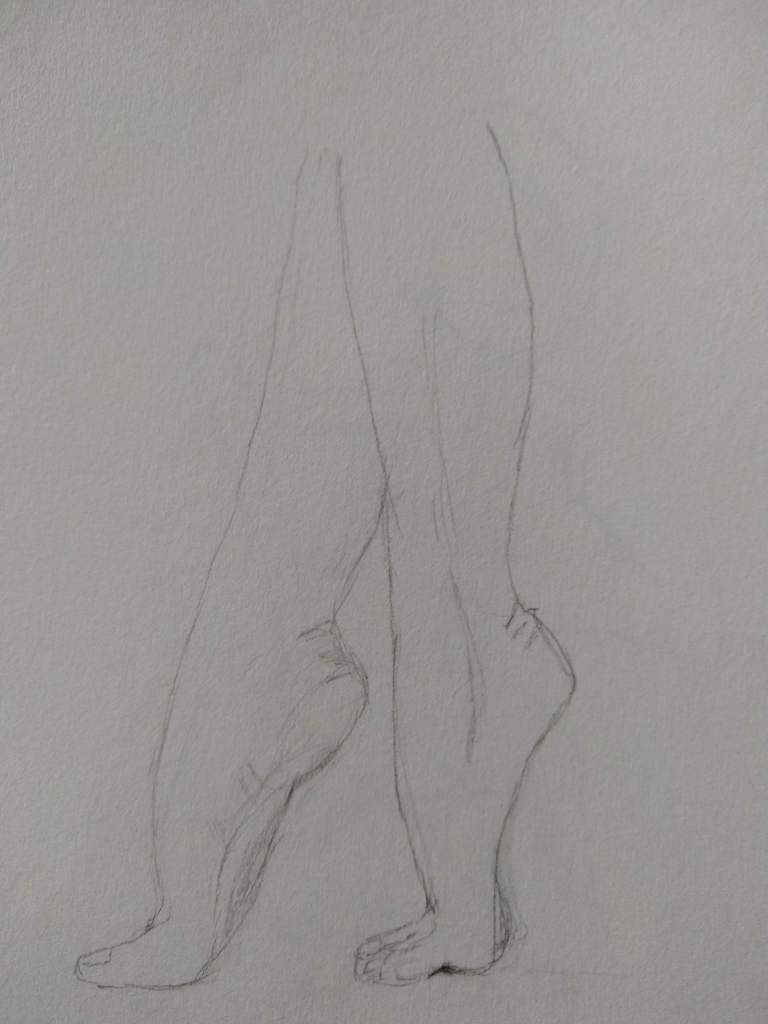
This piece, like the one posted yesterday, is also from the “Studies in Charcoal” by Joann Boon Thomas. Same supplies — vine charcoal and toned paper. I definitely need to practice hands and feet.
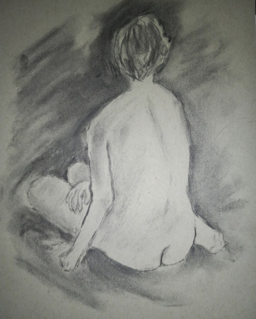

This piece, like the one posted yesterday, is also from the “Studies in Charcoal” by Joann Boon Thomas. Same supplies — vine charcoal and toned paper. I definitely need to practice hands and feet.
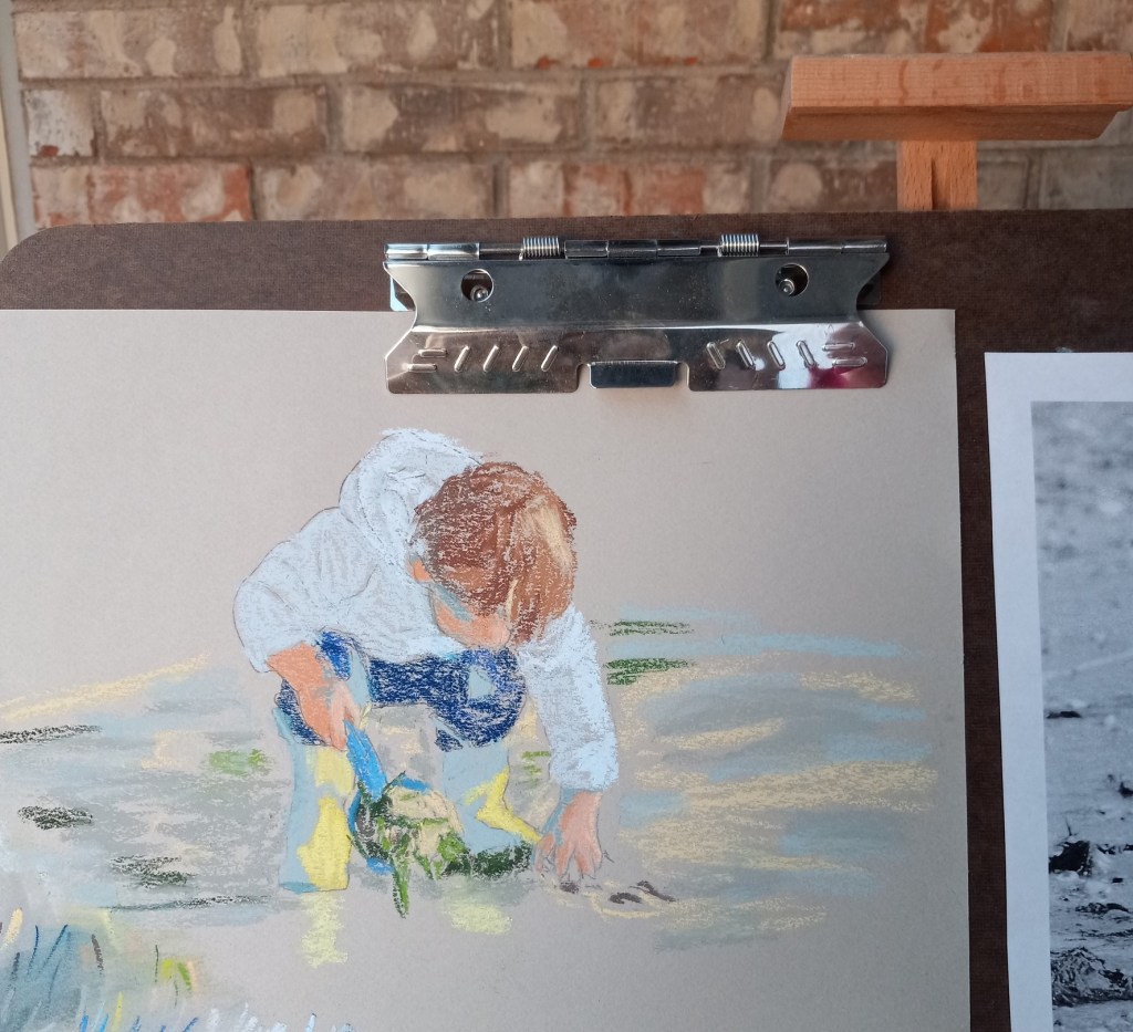
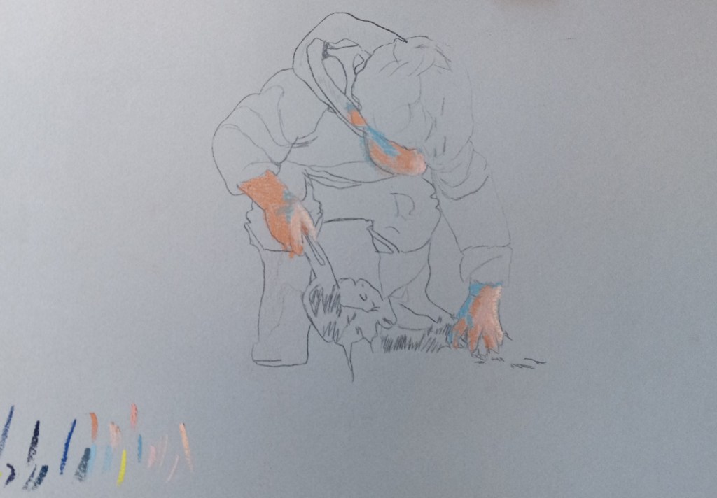
I was uneasy about my color selection for the little boy’s rubber boots — the part in shadow. The color constancy illusion would lead one to think the entire boot is yellow, but if you squint and then look at the photo, the boot in shadow is clearly not the same yellow as the boot in sunlight. So, at first I used a bluish-gray for the boot in shadow.
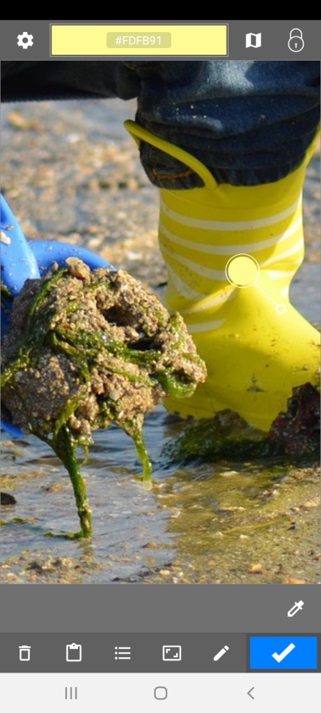
Then I remembered, I have the “Color Grab” app on my Android phone! I can check the suggested color, and then see if I have a pastel to match.
“Color Grab” showed the shadowed boot to be a yellow green, as shown in the first screen grab (see the small and larger white circles). Then you click on the Hex code for the color, and, if a listing of approximate paint colors is available, they will be listed. That display is what I used to approximate a pastel stick color.
I then added the yellow green color to the boot, but I need to blend it in.
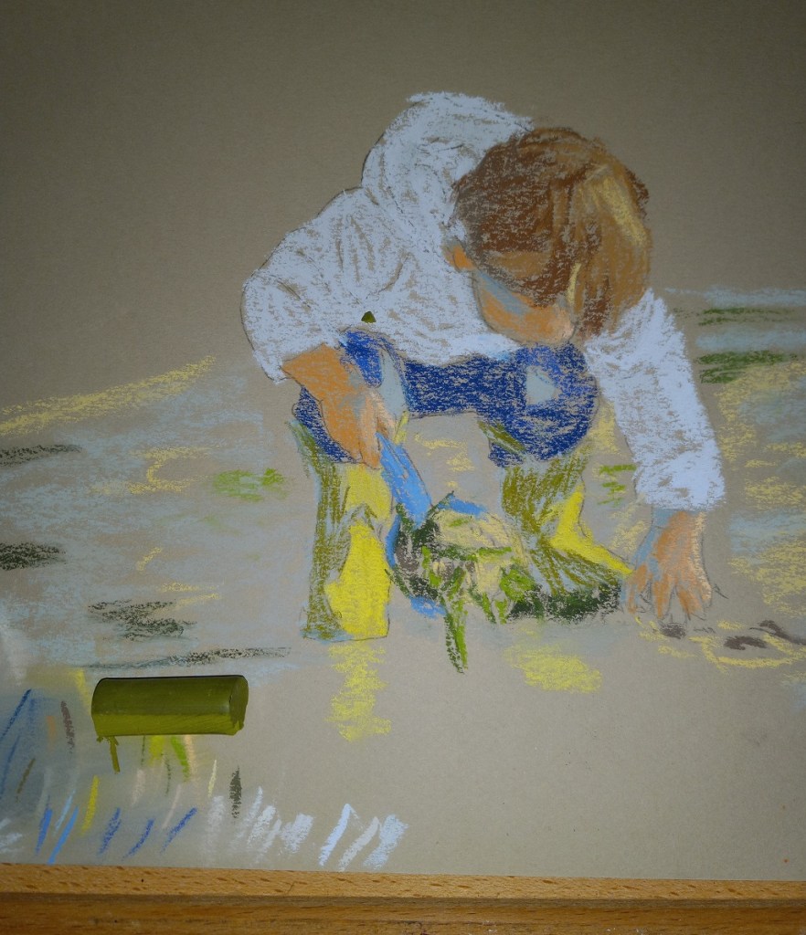


In addition, the sunlit part of the boot is actually a whiter (paler) yellow, as shown by the screen grab, so I will need to adjust as appropriate there.

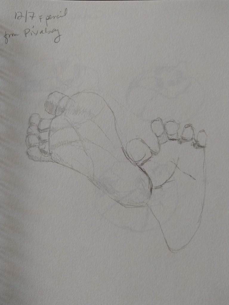
This pastel painting was based on an image by Nadine Doerlé from Pixabay.
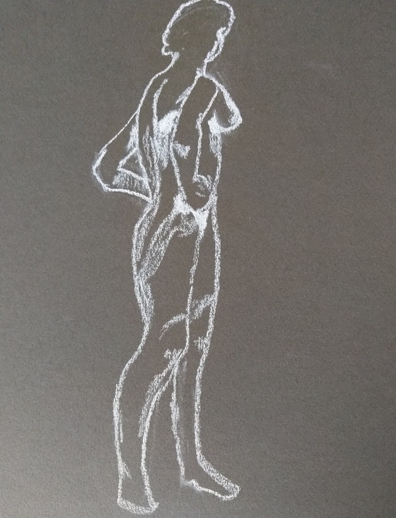
I used one of the assorted gray shades from my pack of Canson Mi-Teintes paper (the smooth side). I used graphite for the drawing, and pastel sticks from Blue Earth, Unison, Blick, and Sennelier.
This is the first time I’ve done a pastel of a human figure.


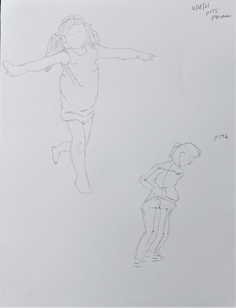
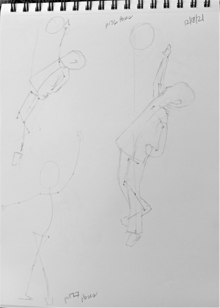
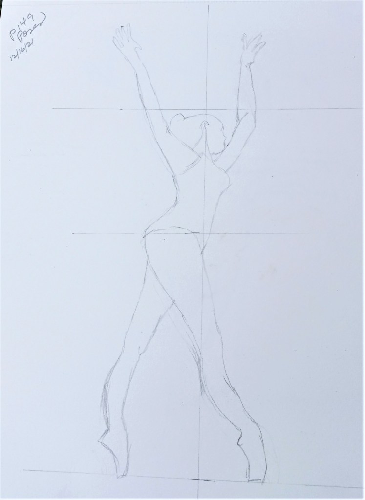
These sketches and figures are based off poses found in The Complete Book of Poses for Artists: A comprehensive photographic and illustrated reference book for learning to draw more than 500 poses, by Ken & Stephanie Goldman (Walter Foster Publishing, 2017).
I left the center-of-balance line in the sketch of the boy with the basketball; in the first sketch he is way off kilter in an unnatural pose.

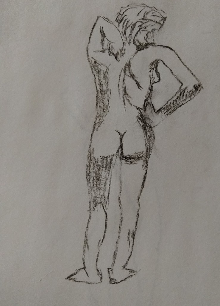
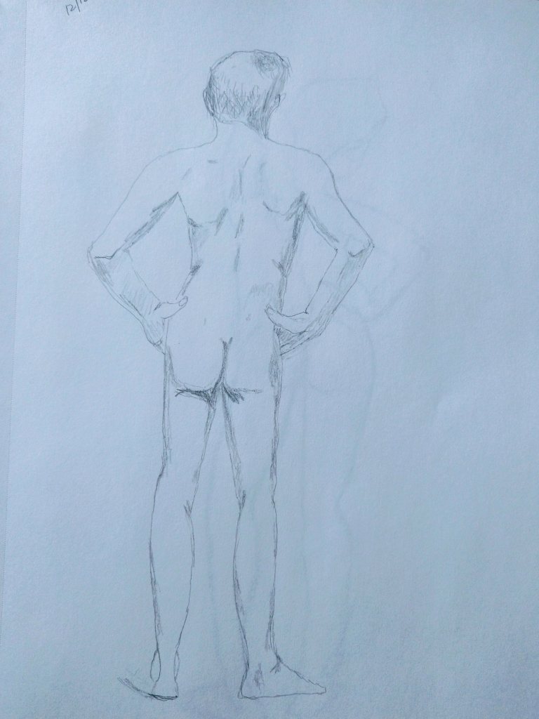
I was reading Mary Whyte’s book Painting Portraits and Figures in Watercolor (pub. 2011 by Watson-Guptill) and in it she talks about how imperative it is to watercolor painting to have good drawing skills, particularly if you are painting portraits or human figures. I suppose the same is true for other media, like pastel or oils. So, to that end, I did some drawing today.
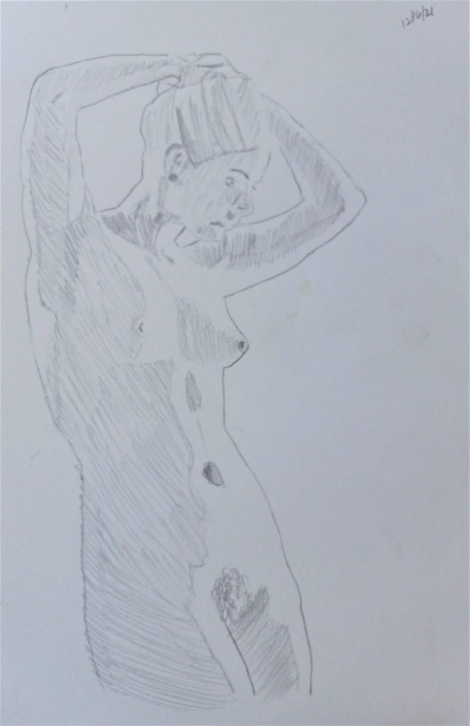

Some of the drawings I’ve done of the human figure, referring primarily to books by Giovanni Civardi on drawing the nude, and the human figure. Compressed charcoal (upper left), graphite (upper right) and white Conte crayon on Strathmore gray-toned paper (bottom right).
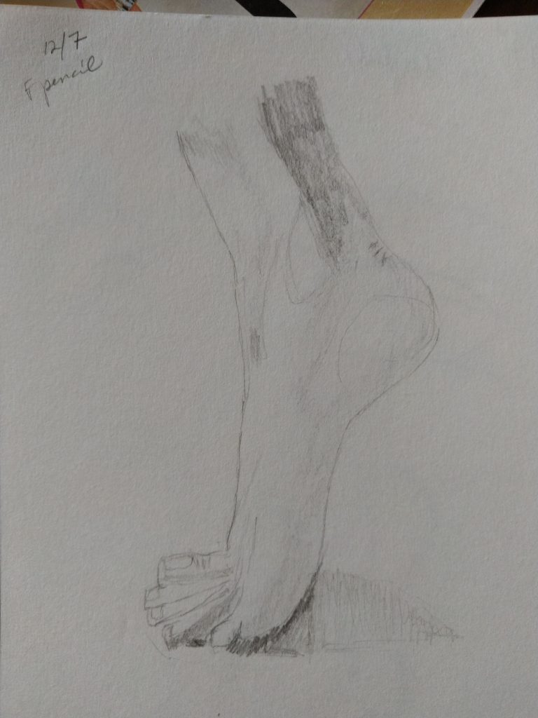
Upper left drawing is based on an arttutor.com reference photo. The newborn’s feet are drawn from a photo by sippakorn on Pixabay.
