More ArtRage Vitae… Copying a Master

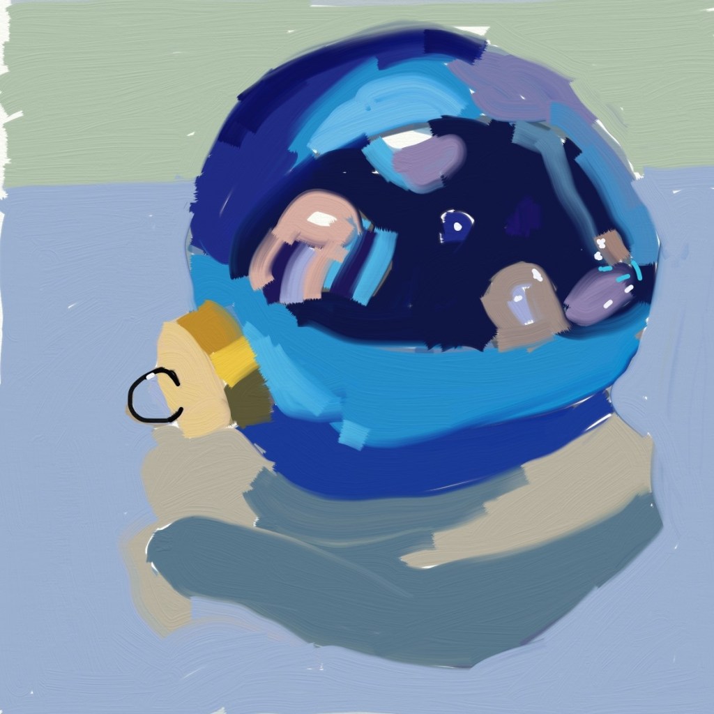
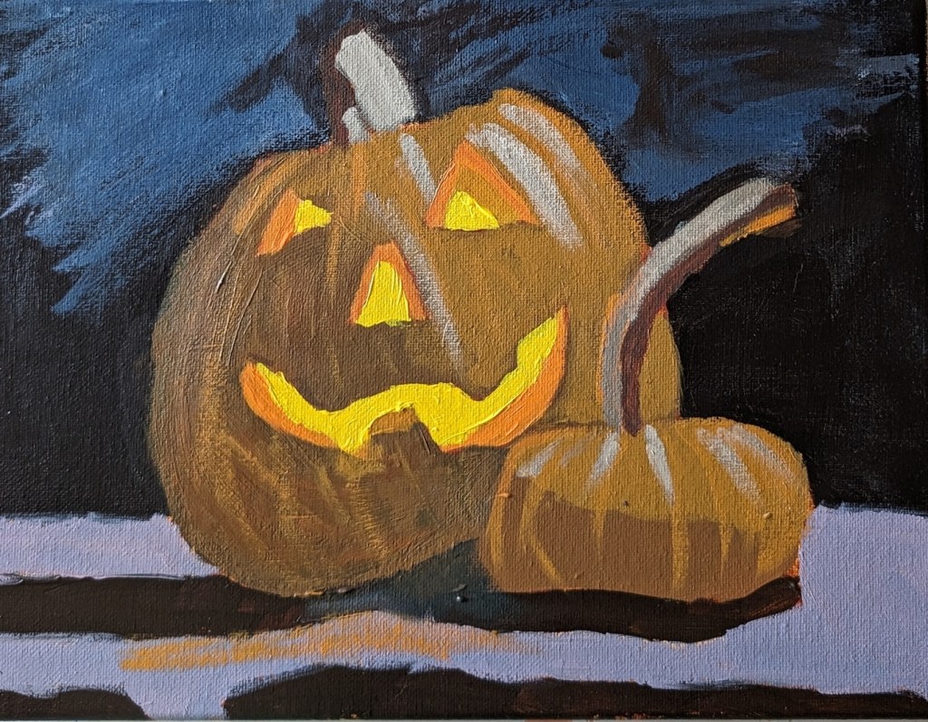
Today I tried painting a Christmas ornament in ArtRage Vitae, and I used as a reference a painting by Teddi Parker, which you can see here.

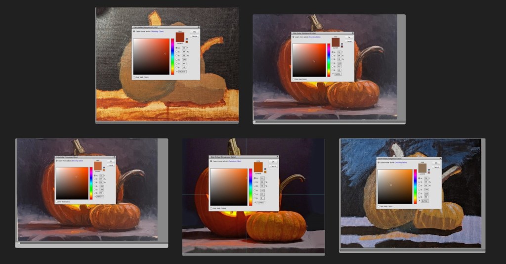
As with the sketch of Simba, I struggled a bit. In the Simba drawing, I used the felt pen tool; in this case I used the square flat brush, and widened the stroke.

It should be obvious that Teddi’s painting (master copy) is on the right.

The funny thing is, it actually felt like I was painting, despite using my finger tip! But I want to get back to the brush tomorrow.

Snowman!

This snowman (painted on an 8×8 canvas) was inspired in part by snowmen done in pastel by Karen Margulis. It’s been warmer than normal here for December, but we might actually have a freeze tomorrow. No sign of snow, though. (Sigh.) So I thought painting a snowman would put me in a winter mood.

I’m not sure if you can tell, but the (viewer’s) right side of the snowman is a gray-white, while the (viewer’s) left side of the snowman is a sky blue-white mix.

The other colors are Pyrrole Red (straight from the tube), Yellow Ochre (mixed with the red for the carrot stick nose), Sap Green and Mars Black (straight from the tube) and the lavender background is a dash of Dioxazine Purple with Titanium White.

One Last Halloween Project… Work in Progress

This is based on a new Halloween-themed Patreon post from PaintCoach. I’m using a 9×12 canvas, and I did a tone of Pale Umber (Winsor & Newton Galeria) thinned out with water. As with the skull and pumpkin painting in my previous post, I sketched it out with willow charcoal. The background in this case is Ivory Black rather than a chromatic black of Burnt Sienna and Indanthrene Blue. Near the bottom, I’m using Raw Umber.

Jack O’Lantern II.. The Re-Do

I mentioned in yesterday’s post that I realized that I needed to use a color closer to Burnt Sienna as my desaturated orange; my desaturated “orange” was simply too brown and yellow.

In any case, while it was fresh on my mind, I decided to do a quickie painting of another jack o’lantern, skipping the smaller one and just focusing on getting the colors correct. I used a 6×6 Ampersand Gessoboard that I had toned with yellow ochre several months ago.

The color of the surface the pumpkin sits on is actually a bit more lavender than blue; the photo lighting is a bit off. And I really dislike the slippery Gessoboard!

Jack O’Lantern.. Complete

So I’m done with the jack o’lantern. The overall point was to make the lit-up eyes, nose and mouth “pop” by desaturating the orange. But it feels too desaturated to me, not to mention too yellow. Sigh!

Sure enough, yes, the colors are completely off. Turns out the burnt sienna I used to mark out the value map was really closer to the color I wanted for the big pumpkin! It’s also closer to the color in the photo, as well as the color Chris (the PaintCoach) used.